Preview image. Unlock full-res
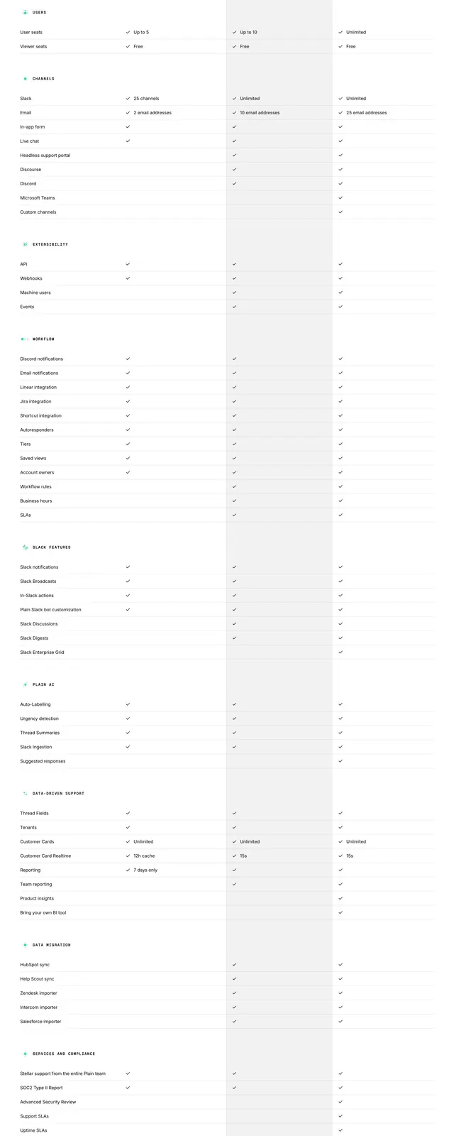
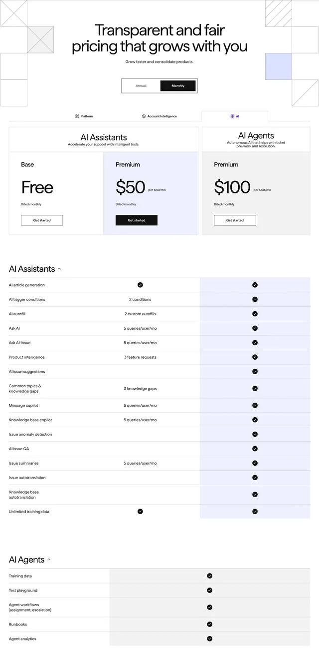
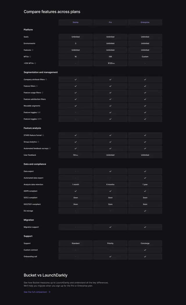
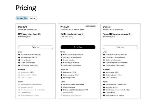
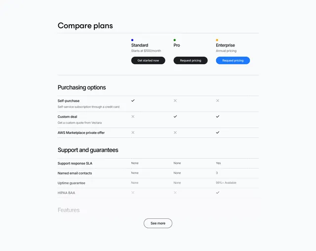
Light feature-comparison pricing table with three plan columns, grouped rows and check or cross marks per feature.
Summary
A clean light pricing comparison table with three plan columns and feature rows grouped into labeled sections, using checks and crosses for inclusion. Its strength is calm, dense readability driven entirely by hairline dividers.
Visual description
Left-aligned oversized black heading "Compare plans" sits above the table. Three plan columns (Standard, Pro, Enterprise) each show a small colored dot, the plan name, a price or pricing note, and a pill button, where Enterprise uses a filled blue button and the others use dark buttons. Below, features are organized into labeled groups: "Purchasing options", "Support and guarantees" and a faded "Features" header at the bottom. Each row has a left feature label with optional grey sub-text and per-plan cells filled with black checkmarks, grey crosses, or short text values like "None", "Yes", "3" and "99%+ Available". Thin dotted dividers separate every row. A centered ghost "See more" pill button closes the visible table.
Key takeaway
Grouping comparison rows under quiet section labels so a long table stays navigable, and reusing the plan buttons as a sticky header at the top of the table. The dotted row dividers keep dense data legible without heavy lines.
Reuse notes
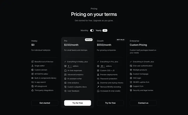
Ideal as the deep-detail companion below a card-based pricing block for a technical product with many spec dimensions. The "See more" pattern lets you truncate a long matrix gracefully. Needs consistent check/cross/text formatting to stay scannable.