Preview image. Unlock full-res
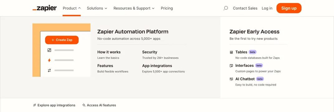
Product mega-menu with platform overview graphic, 2x2 feature links, and early-access beta product list with purple badges.
Summary
An open Product mega-menu splits platform education and a 2x2 link grid on the left from an Early Access beta list on the right, with utility links along the bottom edge.
Visual description
White header with Product active under orange underline and upward caret. Full-width light gray dropdown divides into two zones. Left shows an orange UI illustration with Create Zap button, Zapier Automation Platform heading, no-code subline, and four 2x2 links for How it works, Security, Features, and App integrations with gray descriptions. Right column lists Zapier Early Access with Tables, Interfaces, and AI Chatbot entries, each with icon, purple beta badge, and short description. Footer row inside dropdown offers Explore app integrations and Access AI features with small icons.
Key takeaway
Pair a visual product teaser with scannable link grids, then isolate experimental betas in their own column with distinct badges. The bottom utility strip keeps high-intent paths visible without crowding the main grid.
Reuse notes
Reference for complex SaaS nav with multiple product lines. Works when information architecture is stable; too many columns without visual separation becomes unreadable.