Preview image. Unlock full-res
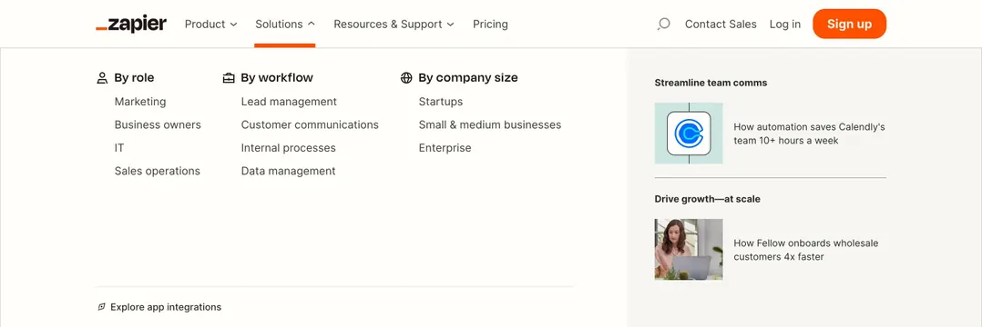
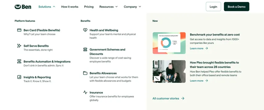
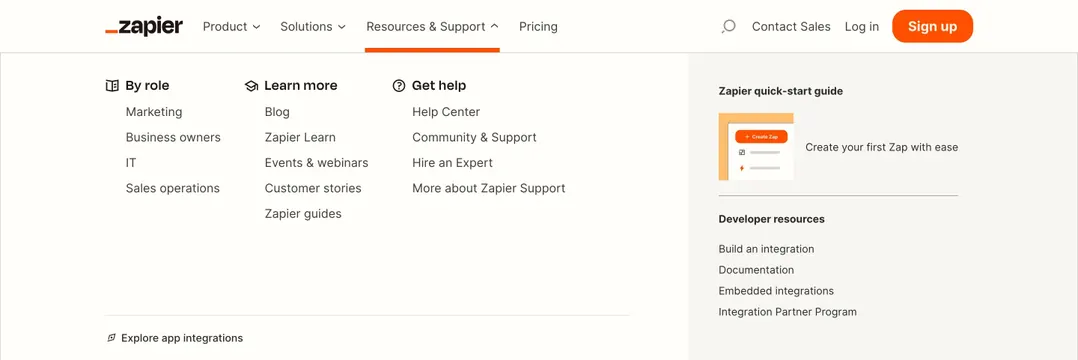
Resources mega-menu with three help columns on white and a gray sidebar for quick-start guide and developer links.
Summary
An open Resources and Support dropdown organizes role, learning, and help links in three columns beside a gray featured sidebar for onboarding and developer docs.
Visual description
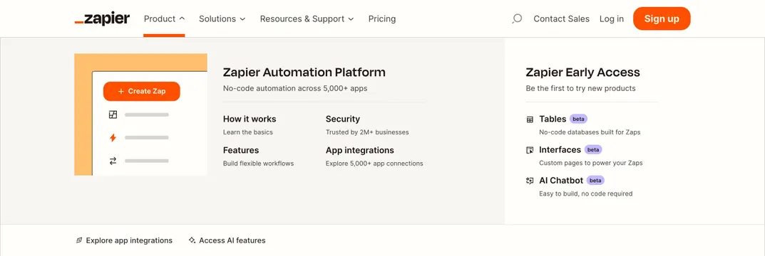
Navbar shows Resources and Support active with orange underline. Wide dropdown on off-white background: left three columns headed By role, Learn more, and Get help, each with icon and vertical link lists covering marketing, blog, help center, community, and expert hire paths. Right sidebar on light gray highlights Zapier quick-start guide with small UI illustration and Create your first Zap copy, plus Developer resources links for integrations, documentation, embedded integrations, and partner program. Bottom footer link reads Explore app integrations with compass icon.
Key takeaway
Separate self-serve learning from sales-adjacent help using column headers with icons, then promote one onboarding path in a tinted sidebar. The sidebar contrast makes a single featured guide impossible to miss.
Reuse notes
Strong pattern for mature SaaS sites balancing education, support, and developer audiences. Sidebar feature must stay singular; multiple promos would collapse the hierarchy.