Preview image. Unlock full-res
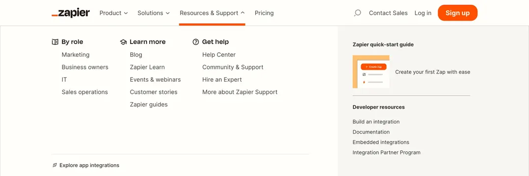
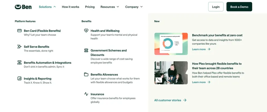
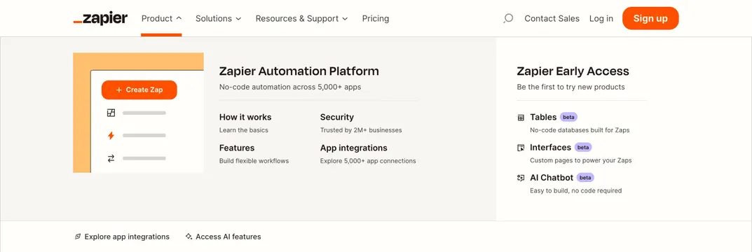
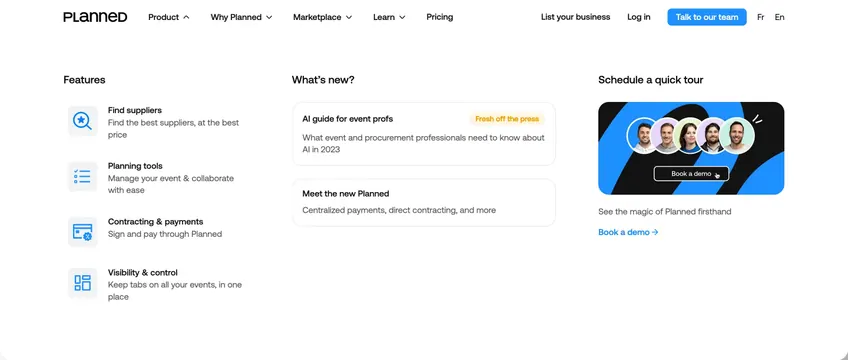
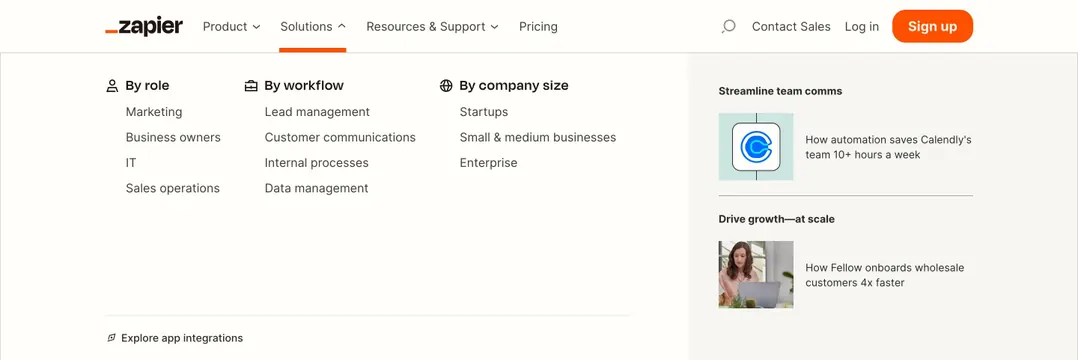
Solutions mega-menu grouping links by role, workflow, and company size with a gray case-study sidebar featuring customer logos.
Summary
An open Solutions dropdown uses three taxonomy columns for role, workflow, and company size, with a right sidebar showcasing two customer case studies.
Visual description
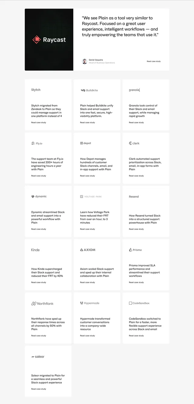
Header shows Solutions active with orange underline and upward caret. Dropdown spans nearly full width on white: three icon-headed columns list Marketing through Enterprise segments, workflow categories like lead management and data management, and company-size tiers. Bottom-left utility link Explore app integrations with compass icon. Right gray panel features two stacked case studies: Calendly logo with time-saved headline, then Fellow thumbnail with onboarding speed stat, separated by a thin divider.
Key takeaway
Taxonomize solutions three ways in parallel columns so visitors self-identify quickly, then prove relevance with logo-led micro case studies in a tinted rail. Keeps the menu informative without feeling like a sitemap dump.
Reuse notes
Useful for B2B platforms selling to multiple personas. Case-study sidebar needs real logos and quantified outcomes; generic testimonials would weaken the proof.