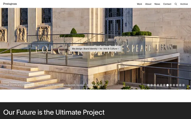
Preview image. Unlock full-res
Architectural Drafting on Blueprint
Color palette
Supporting palette color for small decorative accents when the core palette needs contrast. Do not promote it to the primary CTA color
Primary text, darker borders, subtle background tints on neutral elements. Establishes a highly legible, sober tone
Page backgrounds, card surfaces, ghost button backgrounds, and strong contrast text on darker elements
Muted secondary text, subtle decorative borders, footer text. Provides a softer contrast than primary text
Section backgrounds, filled action button backgrounds, card background for prominent content. Serves as a strong visual anchor
Darker background variations, input fields on dark themes. A soft black alternative
Subtle background for UI elements, light dividers
Card borders, subtle dividers. Mid-tone gray for structural elements
Iconography, muted headings, subtle borders. A slightly warmer gray for less emphasis
Typography
- Weights
- 400, 500
- Sizes
- 13px, 16px, 19px, 27px, 32px, 52px
- Line height
- 1, 1.05, 1.19, 1.2, 1.25, 1.32, 1.88
- Letter spacing
- -0.0200em, -0.0100em
- Fallback
- Arial, Helvetica, sans-serif
The primary typeface for all textual content, including headings, body text, navigation, and buttons. Its clean, sans-serif design and varied weights maintain legibility and a professional tone across different scales. Tight letter-spacing contributes to its compact, efficient feel, particularly in larger sizes.
Spacing & shape
Components
Text: Midnight Ink (#1a1a1a), Background: Canvas White (#ffffff), Border: 1px solid Midnight Ink (#1a1a1a). Padding: 8px vertical, 24px horizontal. Radius: 0px.
Text: Midnight Ink (#1a1a1a), Background: Canvas White (#ffffff). Radius: 9999px. Minimal padding around text.
Text: Midnight Ink (#1a1a1a), Background: rgba(0, 0, 0, 0.07). Padding: 6px vertical, 8px horizontal. Radius: 4px.
Text: Canvas White (#ffffff), Background: Pitch Black (#000000). Border: 1px solid Canvas White (#ffffff). Padding: 7px vertical. Radius: 4px. No horizontal padding, as it's designed for full-bleed or content-adaptive width.
Background: transparent (rgba(0,0,0,0)). No border or shadow. Radius: 0px. Padding: 0px. Used for visual content grids.
Background: Pitch Black (#000000). No border or shadow. Radius: 8px. Padding: 24px on all sides. Used for displaying project previews.
Text: Canvas White (#ffffff), Background: Charcoal (#222222). Border: 1px solid Canvas White (#ffffff). Radius: 0px. Padding: 0px. Typically full width for inline text input.
Guidelines
- Prioritize high contrast between text and background using only Midnight Ink (#1a1a1a) on Canvas White (#ffffff) or Canvas White (#ffffff) on Pitch Black (#000000).
- Maintain geometric precision by using 0px radius for primary containers and text boundaries, reserving 4px and 8px for specific button and card elements.
- Use Plain typeface with 'kern' and 'case' font features for all typography to ensure visual consistency and tight letter-spacing.
- Apply Pitch Black (#000000) for hero sections and full-width content blocks to create strong visual anchors and differentiate sections.
- Use a default padding of 8px around most elements to maintain a sense of order and density.
- Employ the Pill Button Inverse (9999px radius) sparingly for distinctive, small, content-agnostic labels or filters.
- Ensure all interactive elements have a clear hover/active state, even if implied by color change or subtle border adjustment, not just an accent color.
- Avoid decorative shadows or complex gradients; the design relies on flat surfaces and direct contrast.
- Do not introduce new color hues; strictly adhere to the monochromatic palette with the limited accent of Pentagram Blue (#007aff) for highly interactive components.
- Do not use generic system fonts; always utilize 'Plain' with its specific letter spacing and font features.
- Do not deviate from the established border radii; avoid rounded corners on elements not explicitly defined (buttons, cards).
- Avoid sparse layouts with excessive whitespace; the density is 'compact', implying efficient use of space.
- Do not create filled buttons in colors other than Pitch Black (#000000); other buttons are ghost or soft-background.
- Do not use type tracking wider than the defined values; the system leans into tight letter-spacing to reinforce its precise aesthetic.
About this system
ShowHide
Pentagram employs a rigorous, authoritative visual aesthetic characterized by high contrast neutrals and a precise typographic hierarchy. The design emphasizes clarity through stark monochromatic palettes, sharp edges, and minimal ornamentation. Components are typically unstyled or outlined, maintaining a lightweight feel, with subtle interactive states. This approach projects a serious, intellectual, and focused brand presence.
The page structure employs a max-width contained layout at 1728px, fostering a focused content experience within generous margins. The hero section is full-bleed, often featuring large-scale photography with overlaid minimal text. Section rhythm is driven by alternating Pitch Black (#000000) and Canvas White (#ffffff) backgrounds, creating clear visual segmentation without explicit dividers. Content is largely arranged in a grid system, ranging from 2-column text/image layouts to dense 3-column card grids for project features, maintaining consistent 24px gutters. The layout can switch to full-width horizontal scrolling display for certain content blocks (not shown in screenshots but implied by component usage). Navigation is a sticky top bar, minimal and unadorned, providing essential links.
The imagery features high-quality photography as visual showcases for projects, often full-bleed or contained within structured blocks. Product shots and architectural photography are common, meticulously framed and lit, often revealing textures and built environments. There's an absence of lifestyle photography, focusing instead on the visual output of design work itself. Icons, when present, are minimal, outlined, and monochromatic, seamlessly integrating with the UI without adding color. Imagery is primarily explanatory, showcasing project outcomes rather than decorative atmosphere, often presented framed within distinct cards or sections to isolate one project from another.
Reminiscent of AIGA, Paula Scher portfolio, Manual (design agency).
# Pentagram — Style Reference
> Architectural Drafting on Blueprint

**Theme:** light

**Site:** https://pentagram.com

Pentagram employs a rigorous, authoritative visual aesthetic characterized by high contrast neutrals and a precise typographic hierarchy. The design emphasizes clarity through stark monochromatic palettes, sharp edges, and minimal ornamentation. Components are typically unstyled or outlined, maintaining a lightweight feel, with subtle interactive states. This approach projects a serious, intellectual, and focused brand presence.

## Tokens — Colors

| Name | Value | Token | Role |
|------|------|------|------|
| Pentagram Blue | `#007aff` | `--color-pentagram-blue` | Supporting palette color for small decorative accents when the core palette needs contrast. Do not promote it to the primary CTA color |
| Midnight Ink | `#1a1a1a` | `--color-midnight-ink` | Primary text, darker borders, subtle background tints on neutral elements. Establishes a highly legible, sober tone |
| Canvas White | `#ffffff` | `--color-canvas-white` | Page backgrounds, card surfaces, ghost button backgrounds, and strong contrast text on darker elements |
| Stone Gray | `#8c8c8c` | `--color-stone-gray` | Muted secondary text, subtle decorative borders, footer text. Provides a softer contrast than primary text |
| Pitch Black | `#000000` | `--color-pitch-black` | Section backgrounds, filled action button backgrounds, card background for prominent content. Serves as a strong visual anchor |
| Charcoal | `#222222` | `--color-charcoal` | Darker background variations, input fields on dark themes. A soft black alternative |
| Silver Mist | `#e3e4e5` | `--color-silver-mist` | Subtle background for UI elements, light dividers |
| Deep Graphite | `#333333` | `--color-deep-graphite` | Card borders, subtle dividers. Mid-tone gray for structural elements |
| Soft Stone | `#767676` | `--color-soft-stone` | Iconography, muted headings, subtle borders. A slightly warmer gray for less emphasis |

## Tokens — Typography

### Plain
- **Substitute:** Arial, Helvetica, sans-serif
- **Weights:** 400, 500
- **Sizes:** 13px, 16px, 19px, 27px, 32px, 52px
- **Line height:** 1, 1.05, 1.19, 1.2, 1.25, 1.32, 1.88
- **Letter spacing:** -0.0200em, -0.0100em
- **Role:** The primary typeface for all textual content, including headings, body text, navigation, and buttons. Its clean, sans-serif design and varied weights maintain legibility and a professional tone across different scales. Tight letter-spacing contributes to its compact, efficient feel, particularly in larger sizes.

## Tokens — Type Scale

Perfect Fourth (1.333) from 16px base.

| Role | Size | Line height | Letter spacing |
|------|------|------|------|
| caption | 13px | 1.32 | -0.26px |
| body | 16px | 1.25 | -0.16px |
| subheading | 19px | 1.2 | -0.19px |
| heading | 27px | 1.19 | -0.54px |
| heading-lg | 32px | 1.05 | -0.64px |
| display | 52px | 1 | -1.04px |

## Tokens — Spacing

- **Max width:** 1728px
- **Section gap:** 96px
- **Card padding:** 24px
- **Element gap:** 8px

## Tokens — Radius

- **Default:** 4px
- **Buttons:** 4px
- **Cards:** 8px
- **pillButtons:** 9999px

## Layout

The page structure employs a max-width contained layout at 1728px, fostering a focused content experience within generous margins. The hero section is full-bleed, often featuring large-scale photography with overlaid minimal text. Section rhythm is driven by alternating Pitch Black (#000000) and Canvas White (#ffffff) backgrounds, creating clear visual segmentation without explicit dividers. Content is largely arranged in a grid system, ranging from 2-column text/image layouts to dense 3-column card grids for project features, maintaining consistent 24px gutters. The layout can switch to full-width horizontal scrolling display for certain content blocks (not shown in screenshots but implied by component usage). Navigation is a sticky top bar, minimal and unadorned, providing essential links.

## Imagery

The imagery features high-quality photography as visual showcases for projects, often full-bleed or contained within structured blocks. Product shots and architectural photography are common, meticulously framed and lit, often revealing textures and built environments. There's an absence of lifestyle photography, focusing instead on the visual output of design work itself. Icons, when present, are minimal, outlined, and monochromatic, seamlessly integrating with the UI without adding color. Imagery is primarily explanatory, showcasing project outcomes rather than decorative atmosphere, often presented framed within distinct cards or sections to isolate one project from another.

## Components

### Ghost Button Inverse
*Interactive elements for secondary actions or navigation.*

Text: Midnight Ink (#1a1a1a), Background: Canvas White (#ffffff), Border: 1px solid Midnight Ink (#1a1a1a). Padding: 8px vertical, 24px horizontal. Radius: 0px.

### Pill Button Inverse
*Small, contained labels or filters.*

Text: Midnight Ink (#1a1a1a), Background: Canvas White (#ffffff). Radius: 9999px. Minimal padding around text.

### Soft Tag Button
*Categorization or filter tags with a subtle background.*

Text: Midnight Ink (#1a1a1a), Background: rgba(0, 0, 0, 0.07). Padding: 6px vertical, 8px horizontal. Radius: 4px.

### Filled Action Button
*Primary calls to action with high visual weight.*

Text: Canvas White (#ffffff), Background: Pitch Black (#000000). Border: 1px solid Canvas White (#ffffff). Padding: 7px vertical. Radius: 4px. No horizontal padding, as it's designed for full-bleed or content-adaptive width.

### Clear Card
*Container for content where the background is part of the overall page design.*

Background: transparent (rgba(0,0,0,0)). No border or shadow. Radius: 0px. Padding: 0px. Used for visual content grids.

### Project Detail Card
*Structured content blocks for individual projects.*

Background: Pitch Black (#000000). No border or shadow. Radius: 8px. Padding: 24px on all sides. Used for displaying project previews.

### Dark Input Field
*User input fields on darker backgrounds.*

Text: Canvas White (#ffffff), Background: Charcoal (#222222). Border: 1px solid Canvas White (#ffffff). Radius: 0px. Padding: 0px. Typically full width for inline text input.

## Guidelines

### Do

- Prioritize high contrast between text and background using only Midnight Ink (#1a1a1a) on Canvas White (#ffffff) or Canvas White (#ffffff) on Pitch Black (#000000).
- Maintain geometric precision by using 0px radius for primary containers and text boundaries, reserving 4px and 8px for specific button and card elements.
- Use Plain typeface with 'kern' and 'case' font features for all typography to ensure visual consistency and tight letter-spacing.
- Apply Pitch Black (#000000) for hero sections and full-width content blocks to create strong visual anchors and differentiate sections.
- Use a default padding of 8px around most elements to maintain a sense of order and density.
- Employ the Pill Button Inverse (9999px radius) sparingly for distinctive, small, content-agnostic labels or filters.
- Ensure all interactive elements have a clear hover/active state, even if implied by color change or subtle border adjustment, not just an accent color.

### Don't

- Avoid decorative shadows or complex gradients; the design relies on flat surfaces and direct contrast.
- Do not introduce new color hues; strictly adhere to the monochromatic palette with the limited accent of Pentagram Blue (#007aff) for highly interactive components.
- Do not use generic system fonts; always utilize 'Plain' with its specific letter spacing and font features.
- Do not deviate from the established border radii; avoid rounded corners on elements not explicitly defined (buttons, cards).
- Avoid sparse layouts with excessive whitespace; the density is 'compact', implying efficient use of space.
- Do not create filled buttons in colors other than Pitch Black (#000000); other buttons are ghost or soft-background.
- Do not use type tracking wider than the defined values; the system leans into tight letter-spacing to reinforce its precise aesthetic.

## Agent Prompt Guide

Quick Color Reference:
text: #1a1a1a
background: #ffffff
border: #1a1a1a
accent: #007aff
primary action: #000000 (filled action)

Example Component Prompts:
1. Create a hero section: Pitch Black (#000000) background. Centered title 'Our Future is the Ultimate Project' at 52px Plain weight 500, Canvas White (#ffffff), letter-spacing -1.04px. Subtitle below at 19px Plain weight 400, Stone Gray (#8c8c8c), line height 1.2, letter spacing -0.19px.
2. Create a 'Project Detail Card': 8px radius. Background: Pitch Black (#000000). Padding: 24px. Inside, use a heading 'Grale' at 27px Plain weight 500, Canvas White (#ffffff), letter-spacing -0.54px. Below it, a body text 'Brand identity for an award-winning technology...' at 13px Plain weight 400, Stone Gray (#8c8c8c), line height 1.32, letter-spacing -0.26px. The image inside should have 0px radius.
3. Create a 'Filled Action Button' with the text 'Read More': Background: Pitch Black (#000000), text Canvas White (#ffffff), 1px solid Canvas White (#ffffff) border, 4px radius. Font: 16px Plain weight 500, line height 1.25, letter spacing -0.16px. No horizontal padding.
More like this









Keep what you find
A free account saves references to boards and can send you a weekly email of picks based on what you save.
To see every result, go Pro.