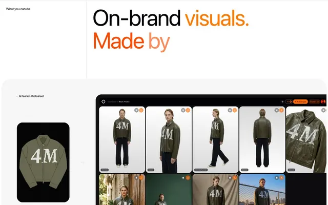
Preview image. Unlock full-res
White canvas, sharp shadows, and a burst of sunset.
Color palette
Primary surface for dark mode sections and accent backgrounds, bold text where high contrast is needed. Serves as a rich, dark canvas
Headline accents and prominent decorative elements. Evokes warmth and energy; Used for hero text emphasis and dynamic visual sections, creating a vibrant, energetic overlay
Highlighting elements, secondary accent within gradients
Accent in gradients, introducing a cool transition; Secondary gradient, providing a cooler transition for illustrative elements or background effects
Start color for specific gradients, marking a dynamic range; Complex, multi-stop gradient for abstract or conceptual visuals, conveying depth and digital motion
Start color for specific gradients, suggesting intensity; Dramatic gradient for elements requiring strong visual impact or a sense of urgency
Primary page background, card surfaces, ghost button backgrounds, and inverse text on dark elements. Defines the main canvas
Primary text color, especially for headings and body text on light backgrounds. Provides strong readability
Secondary surface background, used for cards and UI elements that subtly recede from the main white canvas. Provides subtle visual separation
Subtle borders and dividers for UI elements, providing structure without harsh lines. Also used for background distinctions
Secondary text color for descriptive labels, helper text, and less prominent information. Creates a softer textual contrast
Subtle text for captions, footnotes, or minor interface elements
Link color, fine borders, and icon fills, used sparingly for ultimate contrast
Typography
- Weights
- 400, 500
- Sizes
- 8px, 10px, 11px, 12px, 13px, 14px, 15px, 17px, 20px, 27px, 43px, 53px, 73px, 100px
- Line height
- 0.94, 1, 1.05, 1.15, 1.2, 1.25, 1.5
- Letter spacing
- -0.031em at 100px, gradually reducing to -0.009em at smaller sizes
- Fallback
- system-ui
Primary typeface for all headings, body text, and interactive elements. Its wide range of weights and negative letter-spacing at large sizes creates a distinct modern, precise, and compact feel.
- Weights
- 400
- Sizes
- 14px
- Line height
- 1.39
- Letter spacing
- normal
- Fallback
- Helvetica Neue
Fallback or secondary font for specific UI elements, ensuring broad compatibility and clear readability where SF Pro Display may not be available or suitable.
Spacing & shape
Components
Pill-shaped, #020108 background, #ffffff text, with 12px vertical and 20px horizontal padding. Radius of 1317.53px ensures a full pill shape. Font is SF Pro Display weight 500, with a tight letter-spacing.
Pill-shaped, #ffffff background, #020108 text, with a 1px #020108 border. Padding is 12px vertical, 20px horizontal. Radius of 1317.53px. Font is SF Pro Display weight 500.
Rounded rectangles with Canvas Fog (#f7f7f7) background and 6.65px border-radius. No internal padding, relying on child element margins for spacing.
Rounded rectangles with Canvas Fog (#f7f7f7) background and large 39.93px border-radius. Features significant internal padding of 66.54px.
Cloud White (#ffffff) background with 19.96px border-radius. No internal padding, ideal for showcasing visuals directly.
Transparent background, #020108 text, with 0px padding and 0px border-radius. Uses SF Pro Display at small sizes.
Cloud White (#ffffff) background, #333333 text, with 0px padding and 1.33px border-radius. Font is Arial 400.
Guidelines
- Use Cloud White (#ffffff) as the primary canvas for most new sections.
- Apply Midnight Coal (#020108) for high-contrast text and interactive backgrounds.
- Ensure all interactive elements, especially buttons, use the extreme 1317.53px radius for a pill-shaped appearance.
- Utilize SF Pro Display with its defined letter-spacing for all textual content to maintain the precise, compact aesthetic.
- Employ Canvas Fog (#f7f7f7) for background elements that need to subtly differentiate from the main page while remaining light.
- Incorporate the Sunset Orange gradient (linear-gradient(rgb(249, 74, 0), rgb(253, 123, 3))) selectively to highlight key headlines or calls to value.
- Organize content into distinct cards, using either the 6.65px (Default Content Card) or 19.96px (Product Image Card) corner radii for appropriate visual hierarchy.
- Avoid using harsh, saturated colors outside of the defined accent gradients or Sunset Orange specific text accents.
- Do not introduce complex drop shadows; rely on the crisp contrast and defined borders for visual depth.
- Refrain from using generic rectangular shapes; embrace the pill-shaped buttons and varied card radii.
- Do not deviate from the specified negative letter-spacing values for SF Pro Display, as it is crucial to the typographic identity.
- Avoid dense, text-heavy blocks without visual breaks or clear hierarchy; keep information scannable.
- Do not use subtle, low-contrast text on light backgrounds; always ensure strong readability with Ash Grey (#333333) or Midnight Coal (#020108).
- Avoid gradients for non-decorative elements; reserve them for impactful headlines and illustrative sections.
About this system
ShowHide
Fourmula.ai presents a visually striking design built on a stark white canvas, where elements like cards and interactive components float with a distinct sense of elevation facilitated by crisp, contained shadows. Typography is precise and impactful, using strong contrast against backgrounds. The overall impression is one of efficiency and directness, punctuated by vibrant, warm color accents that highlight key interactions and sections, creating a dynamic yet focused user experience.
The page layout is primarily a max-width contained model (defaulting to a breakpoint that allows the main content to breathe without truly full-bleed, except for certain hero elements). The hero section often features a centered headline over a background, or a split text-and-visual arrangement. Section rhythm is marked by consistent, comfortable vertical spacing, creating an airy feel. Content sections frequently alternate between text-left/image-right compositions and horizontally scrolling UI demonstrations within cards. Card grids are used for features, demonstrating the tool's output. The navigation is a minimalist top bar, staying clean and unobtrusive.
This design system primarily uses product-focused imagery and UI screenshots. Photography is typically high-key, product-centric, with tight crops and clear lighting, often on clean backdrops or within a UI context. The product is always the hero, without lifestyle elements. UI screenshots are presented contained within cards, often with rounded corners, and demonstrate the software's functionality directly. Icons, where present, are minimal and vector-based, typically filled or strong outlines in Ink Black or Cloud White for high contrast. Imagery's role is explanatory, showcasing product capabilities and quality, maintaining a clear, functional aesthetic.
Reminiscent of Rive, Linear, Stripe, Vercel.
# AI Product Generation — Style Reference
> White canvas, sharp shadows, and a burst of sunset.

**Theme:** light

**Site:** https://fourmula.ai

Fourmula.ai presents a visually striking design built on a stark white canvas, where elements like cards and interactive components float with a distinct sense of elevation facilitated by crisp, contained shadows. Typography is precise and impactful, using strong contrast against backgrounds. The overall impression is one of efficiency and directness, punctuated by vibrant, warm color accents that highlight key interactions and sections, creating a dynamic yet focused user experience.

## Tokens — Colors

| Name | Value | Token | Role |
|------|------|------|------|
| Midnight Coal | `#020108` | `--color-midnight-coal` | Primary surface for dark mode sections and accent backgrounds, bold text where high contrast is needed. Serves as a rich, dark canvas |
| Sunset Orange | `#f94a00` | `--color-sunset-orange` | Headline accents and prominent decorative elements. Evokes warmth and energy; Used for hero text emphasis and dynamic visual sections, creating a vibrant, energetic overlay |
| Desert Gold | `#fd7b03` | `--color-desert-gold` | Highlighting elements, secondary accent within gradients |
| Sky Blue | `#48a3d1` | `--color-sky-blue` | Accent in gradients, introducing a cool transition; Secondary gradient, providing a cooler transition for illustrative elements or background effects |
| Rich Amethyst | `#3a54ff` | `--color-rich-amethyst` | Start color for specific gradients, marking a dynamic range; Complex, multi-stop gradient for abstract or conceptual visuals, conveying depth and digital motion |
| Deep Crimson | `#9a0101` | `--color-deep-crimson` | Start color for specific gradients, suggesting intensity; Dramatic gradient for elements requiring strong visual impact or a sense of urgency |
| Cloud White | `#ffffff` | `--color-cloud-white` | Primary page background, card surfaces, ghost button backgrounds, and inverse text on dark elements. Defines the main canvas |
| Ash Grey | `#333333` | `--color-ash-grey` | Primary text color, especially for headings and body text on light backgrounds. Provides strong readability |
| Canvas Fog | `#f7f7f7` | `--color-canvas-fog` | Secondary surface background, used for cards and UI elements that subtly recede from the main white canvas. Provides subtle visual separation |
| Stone Whisper | `#d7d7d6` | `--color-stone-whisper` | Subtle borders and dividers for UI elements, providing structure without harsh lines. Also used for background distinctions |
| Muted Slate | `#818084` | `--color-muted-slate` | Secondary text color for descriptive labels, helper text, and less prominent information. Creates a softer textual contrast |
| Deep Plum | `#5d5c61` | `--color-deep-plum` | Subtle text for captions, footnotes, or minor interface elements |
| Ink Black | `#000000` | `--color-ink-black` | Link color, fine borders, and icon fills, used sparingly for ultimate contrast |

## Tokens — Typography

### SF Pro Display
- **Substitute:** system-ui
- **Weights:** 400, 500
- **Sizes:** 8px, 10px, 11px, 12px, 13px, 14px, 15px, 17px, 20px, 27px, 43px, 53px, 73px, 100px
- **Line height:** 0.94, 1, 1.05, 1.15, 1.2, 1.25, 1.5
- **Letter spacing:** -0.031em at 100px, gradually reducing to -0.009em at smaller sizes
- **Role:** Primary typeface for all headings, body text, and interactive elements. Its wide range of weights and negative letter-spacing at large sizes creates a distinct modern, precise, and compact feel.

### Arial
- **Substitute:** Helvetica Neue
- **Weights:** 400
- **Sizes:** 14px
- **Line height:** 1.39
- **Letter spacing:** normal
- **Role:** Fallback or secondary font for specific UI elements, ensuring broad compatibility and clear readability where SF Pro Display may not be available or suitable.

## Tokens — Type Scale

Perfect Fifth (1.5) from 14px base.

| Role | Size | Line height | Letter spacing |
|------|------|------|------|
| body | 14px | 1.39 | -0.01em |
| subheading | 20px | 1.2 | -0.013em |
| heading-sm | 27px | 1.15 | -0.015em |
| heading | 43px | 1.05 | -0.02em |
| heading-lg | 73px | 1 | -0.03em |
| display | 100px | 0.94 | -0.031em |

## Tokens — Spacing

- **Section gap:** 40px
- **Card padding:** 27px
- **Element gap:** 20px

## Tokens — Radius

- **Buttons:** 1317.53px
- **Images:** 26.62px
- **badges:** 1.33px
- **cards-lg:** 19.96px
- **cards-sm:** 6.65px
- **footer-elements:** 119.78px
- **promo-cards:** 39.93px

## Layout

The page layout is primarily a max-width contained model (defaulting to a breakpoint that allows the main content to breathe without truly full-bleed, except for certain hero elements). The hero section often features a centered headline over a background, or a split text-and-visual arrangement. Section rhythm is marked by consistent, comfortable vertical spacing, creating an airy feel. Content sections frequently alternate between text-left/image-right compositions and horizontally scrolling UI demonstrations within cards. Card grids are used for features, demonstrating the tool's output. The navigation is a minimalist top bar, staying clean and unobtrusive.

## Imagery

This design system primarily uses product-focused imagery and UI screenshots. Photography is typically high-key, product-centric, with tight crops and clear lighting, often on clean backdrops or within a UI context. The product is always the hero, without lifestyle elements. UI screenshots are presented contained within cards, often with rounded corners, and demonstrate the software's functionality directly. Icons, where present, are minimal and vector-based, typically filled or strong outlines in Ink Black or Cloud White for high contrast. Imagery's role is explanatory, showcasing product capabilities and quality, maintaining a clear, functional aesthetic.

## Components

### Primary Filled Button
*Call to action button for key interactions.*

Pill-shaped, #020108 background, #ffffff text, with 12px vertical and 20px horizontal padding. Radius of 1317.53px ensures a full pill shape. Font is SF Pro Display weight 500, with a tight letter-spacing.

### Outline Ghost Button
*Secondary call to action, less prominent than filled.*

Pill-shaped, #ffffff background, #020108 text, with a 1px #020108 border. Padding is 12px vertical, 20px horizontal. Radius of 1317.53px. Font is SF Pro Display weight 500.

### Default Content Card
*Container for content blocks.*

Rounded rectangles with Canvas Fog (#f7f7f7) background and 6.65px border-radius. No internal padding, relying on child element margins for spacing.

### Accent Content Card (Large Radius)
*Prominent content container, drawing more attention.*

Rounded rectangles with Canvas Fog (#f7f7f7) background and large 39.93px border-radius. Features significant internal padding of 66.54px.

### Product Image Card
*Container for product images or visual assets.*

Cloud White (#ffffff) background with 19.96px border-radius. No internal padding, ideal for showcasing visuals directly.

### Minimal Badge
*Non-interactive informational label.*

Transparent background, #020108 text, with 0px padding and 0px border-radius. Uses SF Pro Display at small sizes.

### Light Informational Badge
*Subtle informational label, often static.*

Cloud White (#ffffff) background, #333333 text, with 0px padding and 1.33px border-radius. Font is Arial 400.

## Guidelines

### Do

- Use Cloud White (#ffffff) as the primary canvas for most new sections.
- Apply Midnight Coal (#020108) for high-contrast text and interactive backgrounds.
- Ensure all interactive elements, especially buttons, use the extreme 1317.53px radius for a pill-shaped appearance.
- Utilize SF Pro Display with its defined letter-spacing for all textual content to maintain the precise, compact aesthetic.
- Employ Canvas Fog (#f7f7f7) for background elements that need to subtly differentiate from the main page while remaining light.
- Incorporate the Sunset Orange gradient (linear-gradient(rgb(249, 74, 0), rgb(253, 123, 3))) selectively to highlight key headlines or calls to value.
- Organize content into distinct cards, using either the 6.65px (Default Content Card) or 19.96px (Product Image Card) corner radii for appropriate visual hierarchy.

### Don't

- Avoid using harsh, saturated colors outside of the defined accent gradients or Sunset Orange specific text accents.
- Do not introduce complex drop shadows; rely on the crisp contrast and defined borders for visual depth.
- Refrain from using generic rectangular shapes; embrace the pill-shaped buttons and varied card radii.
- Do not deviate from the specified negative letter-spacing values for SF Pro Display, as it is crucial to the typographic identity.
- Avoid dense, text-heavy blocks without visual breaks or clear hierarchy; keep information scannable.
- Do not use subtle, low-contrast text on light backgrounds; always ensure strong readability with Ash Grey (#333333) or Midnight Coal (#020108).
- Avoid gradients for non-decorative elements; reserve them for impactful headlines and illustrative sections.

## Agent Prompt Guide

Quick Color Reference:
text: #333333
background: #ffffff
border: #d7d7d6
accent: #f94a00
primary action: no distinct CTA color

Example Component Prompts:
No distinct primary action color was observed; use the extracted neutral button treatments instead of inventing a filled CTA color.
2. Design a feature card: Default Content Card (#f7f7f7 background, 6.65px radius), containing a subheading 'AI Fashion Photoshoot' in SF Pro Display at 20px, weight 500, #333333. Below that, an image card with an image on a #ffffff background, 19.96px radius.
3. Create a badge: Minimal Badge with 'How It Works' text in Midnight Coal (#020108) using SF Pro Display at 14px weight 400, with 0px padding and 0px radius.

## Gradient System

The application of gradients is highly deliberate and functional, primarily serving to inject energy and highlight key textual information or decorative elements. The 'Fiery Sunset Gradient' (linear-gradient(rgb(249, 74, 0), rgb(253, 123, 3))) is the primary accent gradient, signaling importance and calls to value. Secondary gradients like 'Ocean Dusk Gradient' (linear-gradient(rgb(72, 163, 209), rgb(253, 123, 3))) are used for less prominent, visually interesting accents, often in background or illustrative contexts. Gradients are never used for interactive states or accessibility purposes.
More like this




Keep what you find
A free account saves references to boards and can send you a weekly email of picks based on what you save.
To see every result, go Pro.