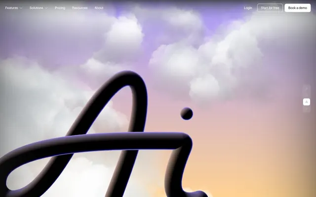
Preview image. Unlock full-res
Expansive sky, clean canvas.
Color palette
Heading accents, decorative border elements — a muted, sophisticated blue that hints at depth without being overtly bold
Outlined action buttons, active link states, interactive indicators — a bright, functional blue that makes interactive elements accessible and clear
Page backgrounds, elevated card surfaces, active states — acts as a luminous digital canvas that captures details
Primary text, prominent icons, dark outlined elements – provides strong contrast against lighter surfaces
Subtle background for input fields, secondary card surfaces — a soft, almost imperceptible base layer
Strongest textual contrast, borders for ghost buttons, deepest shadow effects — sparingly used for maximum impact
Typography
- Weights
- 500
- Sizes
- 12px, 13px, 14px, 16px, 20px
- Line height
- 1.1, 1.4, 1.5
- Letter spacing
- normal
- Fallback
- Inter
Dominant body text, buttons, navigation items across various sizes. Its 500 weight provides a clear, confident voice for everyday UI.
- Weights
- 900
- Sizes
- 259px
- Line height
- 0.85
- Letter spacing
- normal
- Fallback
- Oswald
Extremely large, impactful display text for hero sections or brand statements. Its compressed heavy weight creates a monumental, almost architectural feel.
- Weights
- 400, 500
- Sizes
- 20px, 32px, 56px
- Line height
- 1, 1.1, 1.5
- Letter spacing
- normal
- Fallback
- Dancing Script
Distinctive, flowing script for stylistic flourishes, brand elements, or unique headings. Its cursive nature adds a touch of organic elegance against the structured UI.
- Weights
- 500
- Sizes
- 20px, 32px
- Line height
- 1.1, 1.5
- Letter spacing
- normal
- Fallback
- Montserrat
Specialized headings and prominent body text. The name 'TNT' suggests an underlying impactful quality, used to draw attention to key messages.
Spacing & shape
Components
backgroundColor: rgba(0,0,0,0), color: #ffffff, borderColor: #ffffff, borderRadius: 0px, padding: 0px 16px 0px 16px. Underlines on hover/active.
backgroundColor: rgba(0,0,0,0), color: #1b1b1b, borderColor: #2b7fff, borderRadius: 8px, padding: 0px 0px 0px 0px. The outline provides visual punch.
backgroundColor: rgba(0,0,0,0), borderRadius: 0px, boxShadow: none, padding: 0px.
backgroundColor: #f5f5f5, borderRadius: 12px, boxShadow: none, padding: 20px. Uses a soft background for distinction.
backgroundColor: rgba(0,0,0,0), borderRadius: 14px, boxShadow: none, padding: 0px.
backgroundColor: #f5f5f5, color: #1b1b1b, borderTopColor: rgba(0,0,0,0.1), borderRadius: 4px, padding: 10px.
Guidelines
- Use 'Cloud Canvas' (#ffffff) for all main page backgrounds and elevated card surfaces.
- Apply 'Midnight Ink' (#1b1b1b) for primary text elements to ensure strong readability.
- Employ 'Control' font at 500 weight for all body text and common UI labels.
- Utilize 'Vivid Azure' (#2b7fff) exclusively for borders of primary outlined actions and active link states.
- Round corners with 8px radius for all buttons and navigation items.
- Implement a base element gap of 8px (2 base units) between most UI elements for consistent comfortable density.
- Use 'Control Compressed' at 259px size and 900 weight for high-impact display headlines to command attention.
- Do not use saturated brand colors (#426188, #2b7fff) for large background areas or extensive text blocks.
- Avoid arbitrary border radii; stick to 4px for inputs, 8px for buttons, and 14px for significant cards.
- Do not introduce heavy drop shadows, as the system relies on subtle surface changes and crisp contrast for hierarchy.
- Refrain from using 'Charcoal Void' (#000000) for body text; reserve it for distinct headings or strong outlines.
- Do not deviate from the specified font families or weights for their intended roles to maintain typographic identity.
- Avoid tight spacing; maintain a minimum 8px element gap and 48px section gap for comfortable visual separation.
- Do not create filled primary buttons; the system emphasizes outlined chromatic actions with 'Vivid Azure' borders.
About this system
ShowHide
Air's design system evokes a digital canvas under an expansive, almost dreamlike sky. It marries a high-contrast dark text with clean, slightly rounded white and muted gray surfaces. Typography mixes confident, weighty statements with lighter, more fluid headings, creating a dynamic yet composed visual hierarchy. Accents are sparingly applied but impactful, often appearing as subtle outlines or functional indicators, maintaining an overall atmosphere of refined utility.
The overarching page layout is full-bleed, using an atmospheric gradient background behind a centered content container for most sections. The hero features an expansive full-viewport background with large, centered marketing text. Section rhythm is marked by consistent vertical spacing of 48px, often with alternating background colors or distinct visual treatments separating blocks. Content arranges into clear, often two-column text-left/visual-right sections, with features presented in grid-like structures featuring cards. Navigation is a sticky top bar with ghost buttons, transitioning to outlined buttons or color changes on interaction, maintaining a relatively minimal profile.
The site uses a mix of abstract 3D renders with soft, atmospheric gradients for hero sections, and clean, contained product screenshots for demonstrating functionality. Photography is minimal, if present. Icons are primarily outlined or ghost-style with a moderate stroke weight, often in 'Midnight Ink' or 'Cloud Canvas' to match the overall monochrome UI, with 'Vivid Azure' accents for interactive states. Imagery is generally contained within defined areas or sections, serving both atmospheric and explanatory roles without excessive layering or full-bleed treatment outside the hero.
Reminiscent of Figma, Linear, Notion, Coda.
# Air — Style Reference
> Expansive sky, clean canvas.

**Theme:** dark

**Site:** https://air.inc

Air's design system evokes a digital canvas under an expansive, almost dreamlike sky. It marries a high-contrast dark text with clean, slightly rounded white and muted gray surfaces. Typography mixes confident, weighty statements with lighter, more fluid headings, creating a dynamic yet composed visual hierarchy. Accents are sparingly applied but impactful, often appearing as subtle outlines or functional indicators, maintaining an overall atmosphere of refined utility.

## Tokens — Colors

| Name | Value | Token | Role |
|------|------|------|------|
| Sky Blue | `#426188` | `--color-sky-blue` | Heading accents, decorative border elements — a muted, sophisticated blue that hints at depth without being overtly bold |
| Vivid Azure | `#2b7fff` | `--color-vivid-azure` | Outlined action buttons, active link states, interactive indicators — a bright, functional blue that makes interactive elements accessible and clear |
| Cloud Canvas | `#ffffff` | `--color-cloud-canvas` | Page backgrounds, elevated card surfaces, active states — acts as a luminous digital canvas that captures details |
| Midnight Ink | `#1b1b1b` | `--color-midnight-ink` | Primary text, prominent icons, dark outlined elements – provides strong contrast against lighter surfaces |
| Vapor Gray | `#f5f5f5` | `--color-vapor-gray` | Subtle background for input fields, secondary card surfaces — a soft, almost imperceptible base layer |
| Charcoal Void | `#000000` | `--color-charcoal-void` | Strongest textual contrast, borders for ghost buttons, deepest shadow effects — sparingly used for maximum impact |

## Tokens — Typography

### Control
- **Substitute:** Inter
- **Weights:** 500
- **Sizes:** 12px, 13px, 14px, 16px, 20px
- **Line height:** 1.1, 1.4, 1.5
- **Letter spacing:** normal
- **Role:** Dominant body text, buttons, navigation items across various sizes. Its 500 weight provides a clear, confident voice for everyday UI.

### Control Compressed
- **Substitute:** Oswald
- **Weights:** 900
- **Sizes:** 259px
- **Line height:** 0.85
- **Letter spacing:** normal
- **Role:** Extremely large, impactful display text for hero sections or brand statements. Its compressed heavy weight creates a monumental, almost architectural feel.

### Control Cursive
- **Substitute:** Dancing Script
- **Weights:** 400, 500
- **Sizes:** 20px, 32px, 56px
- **Line height:** 1, 1.1, 1.5
- **Letter spacing:** normal
- **Role:** Distinctive, flowing script for stylistic flourishes, brand elements, or unique headings. Its cursive nature adds a touch of organic elegance against the structured UI.

### Control TNT
- **Substitute:** Montserrat
- **Weights:** 500
- **Sizes:** 20px, 32px
- **Line height:** 1.1, 1.5
- **Letter spacing:** normal
- **Role:** Specialized headings and prominent body text. The name 'TNT' suggests an underlying impactful quality, used to draw attention to key messages.

## Tokens — Type Scale

| Role | Size | Line height | Letter spacing |
|------|------|------|------|
| caption | 12px | 1.1 | — |
| body | 14px | 1.5 | — |
| heading | 20px | 1.5 | — |
| heading-lg | 32px | 1.1 | — |
| display | 259px | 0.85 | — |

## Tokens — Spacing

- **Section gap:** 48px
- **Card padding:** 24px
- **Element gap:** 8px

## Tokens — Radius

- **Buttons:** 8px
- **Inputs:** 4px
- **Cards:** 14px
- **Images:** 11px

## Layout

The overarching page layout is full-bleed, using an atmospheric gradient background behind a centered content container for most sections. The hero features an expansive full-viewport background with large, centered marketing text. Section rhythm is marked by consistent vertical spacing of 48px, often with alternating background colors or distinct visual treatments separating blocks. Content arranges into clear, often two-column text-left/visual-right sections, with features presented in grid-like structures featuring cards. Navigation is a sticky top bar with ghost buttons, transitioning to outlined buttons or color changes on interaction, maintaining a relatively minimal profile.

## Imagery

The site uses a mix of abstract 3D renders with soft, atmospheric gradients for hero sections, and clean, contained product screenshots for demonstrating functionality. Photography is minimal, if present. Icons are primarily outlined or ghost-style with a moderate stroke weight, often in 'Midnight Ink' or 'Cloud Canvas' to match the overall monochrome UI, with 'Vivid Azure' accents for interactive states. Imagery is generally contained within defined areas or sections, serving both atmospheric and explanatory roles without excessive layering or full-bleed treatment outside the hero.

## Components

### Ghost Navigation Button
*Primary navigation and subtle calls to action.*

backgroundColor: rgba(0,0,0,0), color: #ffffff, borderColor: #ffffff, borderRadius: 0px, padding: 0px 16px 0px 16px. Underlines on hover/active.

### Outlined Action Button
*Primary calls to action for interactive elements.*

backgroundColor: rgba(0,0,0,0), color: #1b1b1b, borderColor: #2b7fff, borderRadius: 8px, padding: 0px 0px 0px 0px. The outline provides visual punch.

### Basic Card
*Content grouping for informational blocks with minimal visual adornment.*

backgroundColor: rgba(0,0,0,0), borderRadius: 0px, boxShadow: none, padding: 0px.

### Elevated Content Card
*Card for featuring key content sections.*

backgroundColor: #f5f5f5, borderRadius: 12px, boxShadow: none, padding: 20px. Uses a soft background for distinction.

### Hero Image Card
*Large, immersive card for images or visual content.*

backgroundColor: rgba(0,0,0,0), borderRadius: 14px, boxShadow: none, padding: 0px.

### Standard Input Field
*User entry fields for forms.*

backgroundColor: #f5f5f5, color: #1b1b1b, borderTopColor: rgba(0,0,0,0.1), borderRadius: 4px, padding: 10px.

## Guidelines

### Do

- Use 'Cloud Canvas' (#ffffff) for all main page backgrounds and elevated card surfaces.
- Apply 'Midnight Ink' (#1b1b1b) for primary text elements to ensure strong readability.
- Employ 'Control' font at 500 weight for all body text and common UI labels.
- Utilize 'Vivid Azure' (#2b7fff) exclusively for borders of primary outlined actions and active link states.
- Round corners with 8px radius for all buttons and navigation items.
- Implement a base element gap of 8px (2 base units) between most UI elements for consistent comfortable density.
- Use 'Control Compressed' at 259px size and 900 weight for high-impact display headlines to command attention.

### Don't

- Do not use saturated brand colors (#426188, #2b7fff) for large background areas or extensive text blocks.
- Avoid arbitrary border radii; stick to 4px for inputs, 8px for buttons, and 14px for significant cards.
- Do not introduce heavy drop shadows, as the system relies on subtle surface changes and crisp contrast for hierarchy.
- Refrain from using 'Charcoal Void' (#000000) for body text; reserve it for distinct headings or strong outlines.
- Do not deviate from the specified font families or weights for their intended roles to maintain typographic identity.
- Avoid tight spacing; maintain a minimum 8px element gap and 48px section gap for comfortable visual separation.
- Do not create filled primary buttons; the system emphasizes outlined chromatic actions with 'Vivid Azure' borders.

## Agent Prompt Guide

Quick Color Reference:
text: #1b1b1b
background: #ffffff
border: #1b1b1b
accent: #426188
primary action: #2b7fff (outlined action border)

Example Component Prompts:
1. Create an Outlined Primary Action: Transparent background, #2b7fff border and text, 9999px radius, compact pill padding. Use it for the main CTA instead of a filled button.
2. Design an elevated content card: background-color: #f5f5f5, border-radius: 12px, padding: 20px. Place a 'Midnight Ink' #1b1b1b heading (Control 500, 20px, 1.5 line-height) and 'Midnight Ink' #1b1b1b body text (Control 500, 14px, 1.5 line-height) inside.
3. Implement an input field: background-color: #f5f5f5, text color: #1b1b1b, border-color: rgba(0,0,0,0.1), border-radius: 4px, padding: 10px. Placeholder text color should be a lighter neutral from the palette (e.g., a subdued gray version of #1b1b1b).
4. Create a hero section: Full-bleed background with a subtle gradient (no specific color available from tokens, suggest a light sky purple to orange, e.g., linear-gradient(135deg, #a7b7e8, #f5d7b5)). Overlay a large 'Control Compressed' 900 weight 259px headline in #1b1b1b, normal letter-spacing, line-height 0.85. Below, add a secondary 'Control Cursive' 500 weight 56px heading in #1b1b1b, normal letter-spacing, line-height 1.1.
More like this




Keep what you find
A free account saves references to boards and can send you a weekly email of picks based on what you save.
To see every result, go Pro.