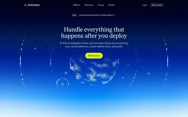
Preview image. Unlock full-res
Electric storm over a blueprint — vivid neon signal cutting through deep navy atmosphere, then snapping to precise technical daylight.
Color palette
Primary text, heading color on light surfaces, nav text, icon fills, input text, border color across cards and form elements — the structural ink of the entire light-mode UI
Blue action color for filled buttons, selected navigation states, and focused conversion moments.
Full-bleed hero background — dark navy at top fading through electric blue to lighter cyan near bottom, creating depth behind the dot-pattern globe illustration
Green action color for filled buttons, selected navigation states, and focused conversion moments.
Ghost button borders in dark hero mode, subtle icon stroke tints, very-light atmospheric surface wash in the hero region
Supporting palette color for small decorative accents when the core palette needs contrast.
Primary page background, card fill for feature sections, section backgrounds in the light product UI
Elevated card surfaces above the ghost canvas — product UI cards, floating pill badges, modal-level surfaces
Secondary body text, muted labels, icon fills at reduced emphasis
Tertiary text, hairline border fills, subtle strokes on dividers and icon outlines
Mid-tone text in body copy within darker surface contexts, muted border strokes
Hairline borders on buttons and cards in the light theme, icon stroke at minimum visibility
Typography
- Weights
- 400, 450, 480
- Sizes
- 13px, 14px, 15px, 16px, 17px, 18px, 20px, 22px, 24px, 28px
- Line height
- 1
- Letter spacing
- -0.016em at smallest sizes, -0.015em mid-range, -0.010em at 20-24px, -0.005em at 28px
- Fallback
- Inter Variable or DM Sans
All UI text: navigation, buttons, body copy, labels, badges, inputs, card headings up to 28px. The weight range 400–480 is narrower than most variable fonts use — 480 acts as a 'medium' without the visual jump of a true 600 bold, giving the UI a composed, unshowy density. Used with tight tracking (-0.016em to -0.005em) at all sizes.
- Weights
- 400
- Sizes
- 32px, 40px, 46px, 48px
- Line height
- 1.04
- Letter spacing
- -0.010em uniformly across all display sizes
- Fallback
- Freight Display Pro or Fraunces
Hero and section display headlines exclusively. At weight 400 with OpenType features ss04/ss06/ss09/ss10/ss11 active, this serif alternative adds a high-craft editorial quality that contrasts sharply with the utilitarian sans UI — infrastructure tooling brands almost never use a serif at display scale, making this a signature differentiator.
Spacing & shape
Elevation
Components
Pill shape (radius 9999px), #d0f100 fill, #1b2540 text at abcdFont 15px weight 480, padding 0 24px, vertical height ~40px. Shadow stack: rgba(24,37,66,0.32) 0px 1px 3px, rgba(24,37,66,0.44) 0px 12px 24px -12px with inset ice highlights rgba(219,247,255,0.48) 0px 0.5px 0.5px. The bright yellow-green against dark navy in the hero creates a stop-sign level of contrast unusual for infrastructure SaaS.
Pill shape (radius 9999px), transparent fill (#rgba(0,0,0,0)), #fafeff text and border, padding 0 12px. Inset white glow: rgba(255,255,255,0.08) 0px 0px 16px 8px inset layered 4x. Used exclusively against the dark hero gradient.
Pill shape (radius 9999px), transparent fill, #1b2540 text and border, padding 8px 24px. Border drawn via box-shadow: rgba(255,255,255,0.72) 0px 1px 1px inset, rgba(4,33,80,0.04) 0px 0px 0px 1px. Sits on #f8f9fc canvas.
Pill shape (radius 9999px), #001033 fill, #fafeff text. Zero padding variant — height determined by content. Used in the sticky nav against the dark hero background.
radius 20px, #ffffff fill, shadow: rgba(0,39,80,0.03) 0px 56px 72px -16px, rgba(0,39,80,0.03) 0px 32px 32px -16px, rgba(0,39,80,0.04) 0px 6px 12px -3px, rgba(0,39,80,0.04) 0px 0px 0px 1px. The outermost 1px ring shadow acts as a border substitute — no explicit border-color needed.
radius 16px, #f8f9fc fill, no shadow. Appears as a slightly-recessed container on the white page background, relying on the 1-step gray difference (#f8f9fc vs #ffffff) for separation.
radius 6px, rgba(12,38,77,0.02) fill, no shadow. Used for monospace-adjacent labels inside product UI illustrations. Nearly invisible background — purely structural grouping.
radius 16px, rgba(255,255,255,0.01) fill, #1b2540 text at 14px, padding 12px 20px 12px 12px. Shadow: rgba(0,39,80,0.08) 0px 6px 16px -3px, rgba(0,39,80,0.04) 0px 0px 0px 1px. The outer 1px shadow ring creates the border; the heavy-ish vertical shadow makes these float visibly above the product canvas.
Pill shape (radius 9999px), #ffffff fill with inset white highlight rgba(255,255,255,0.88) 0px 1px 1px, outer shadow rgba(0,39,80,0.04) 0px 0px 0px 1px as border ring. Sits centered above the hero headline. Contains a 'New' label chip + announcement text in abcdFont 14px.
No visible text labels in collapsed state. Icons at ~24px in #6b7184 stroke color. Active icon gets the Chartreuse Pulse (#d0f100) fill background chip. Spacing between icons: 8px gaps.
radius 0px (sharp corners), transparent background, #1b2540 text and border color, padding 15px 20px. The zero-radius inputs contrast with the otherwise all-pill UI, suggesting form contexts are intentionally more austere than action contexts.
Guidelines
- Use 9999px radius on ALL buttons and interactive pill elements — this applies across both dark and light surfaces without exception.
- Reserve #d0f100 exclusively for the primary CTA fill; never use it for decorative elements, icons, or backgrounds other than action buttons.
- Apply blue-tinted shadows using rgba(0,39,80,...) for all card elevation — never use neutral black-based shadows like rgba(0,0,0,...) on light surfaces.
- Use ivarTextFont with font-feature-settings 'ss04','ss06','ss09','ss10','ss11' only at 32px and above; abcdFont handles everything below 32px.
- Maintain the hero-to-light transition as the singular dark section — subsequent sections stay on #f8f9fc with #ffffff elevated cards; do not add additional dark bands.
- Apply letter-spacing -0.016em to -0.005em on abcdFont across all sizes; avoid default browser tracking which makes the type feel unset.
- Use the 1px outer shadow ring (rgba(0,39,80,0.04) 0px 0px 0px 1px) as a border substitute on cards and badges — avoid explicit border-color properties.
- Don't use #d0f100 in hero sections or dark backgrounds for decorative illustration fills — it appears only as a filled button background.
- Don't apply radius other than 9999px to buttons — even small utility buttons in the product UI use the pill shape.
- Don't mix ivarTextFont into body copy or UI labels below 32px; the serif is strictly a display instrument.
- Don't use more than two surface levels in light sections (#f8f9fc canvas + #ffffff card) — the design system has almost no mid-tone fill colors between these two steps.
- Don't create dark sections beyond the hero; the page's rhythm depends on a single dramatic dark entry followed by sustained light product canvas.
- Don't use black-based text (#000000 or near-black) — all text is #1b2540, even at maximum emphasis, preserving the blue-navy chromatic identity in the type.
- Don't set input borders to rounded — inputs use 0px radius by design, creating deliberate contrast against the pill-heavy button and badge language.
About this system
ShowHide
Antimetal operates in two visual modes that coexist on one page: a deep navy-to-electric-blue hero that feels like staring into a server rack at night, and a near-white #f8f9fc product surface that reads like a technical dashboard in daylight. The transition between these modes is dramatic and intentional — dark atmospheric entry, then immediate pivot to a light, data-dense product UI. The single color that bridges both modes is a vivid chartreuse (#d0f100) used exclusively on primary CTAs, creating an almost jarring contrast against both the dark hero and the light product surface. Typography is custom throughout: abcdFont handles all UI at tight tracking (-0.016em), while ivarTextFont with OpenType alternates takes headlines at display sizes, giving the largest text a slightly editorial, high-craft quality uncommon in infrastructure tooling. Elevation is achieved through layered blue-tinted shadows (rgba(0,39,80,...)) rather than dark fills, so even raised surfaces feel part of the same chromatic family.
Max-width approximately 1200px, centered. The hero is full-bleed dark spanning the full viewport height with the gradient from deep navy to electric blue — headline and CTA are centered over the dot-globe illustration. Below the fold, the page switches to the #f8f9fc light canvas with generous vertical section gaps (~80px). Feature sections use alternating 2-column layouts (text-left / product-screenshot-right, then reversed) rather than full-width stacks. Product UI showcase cards occupy roughly 60% of the viewport width when shown in context. A 3-column icon+text feature grid appears in the 'Ship more, break less' section. Navigation is a top sticky bar: logo left, center nav links (Platform, Resources, Pricing, Careers), right side 'Log in' ghost + 'Book a demo' pill. The nav bar uses the same dark navy (#001033) as the hero, becoming a transparent overlay that only distinguishes itself via the nav items.
The hero section uses a large, glowing dot-matrix globe illustration rendered in white dots on the blue gradient — abstract, technical, zero-lifestyle photography. It evokes network topology or infrastructure mapping without showing any literal servers or people. Below the hero, the product UI itself is the imagery: cropped dashboard screenshots showing the Antimetal interface with sidebar navigation, issue detail panels, and alert badge flows. These are contained within rounded-corner cards (20px radius) at modest scale, suggesting real product depth without overwhelming. Small decorative illustrations appear in feature sections — simple flat icons with green/orange/blue fills for 'Fix' and 'Prevent' concepts. Icon style is outlined with moderate stroke weight, monochrome in most contexts, occasionally using brand-accent fills for active states. The overall balance is heavily text-and-UI-dominant; decorative imagery exists purely to contextualize the product, not as atmospheric surface treatment.
Reminiscent of Linear, Vercel, Incident.io, Grafana, Datadog.
# Antimetal — Style Reference
> Electric storm over a blueprint — vivid neon signal cutting through deep navy atmosphere, then snapping to precise technical daylight.

**Theme:** mixed

**Site:** https://antimetal.com

Antimetal operates in two visual modes that coexist on one page: a deep navy-to-electric-blue hero that feels like staring into a server rack at night, and a near-white #f8f9fc product surface that reads like a technical dashboard in daylight. The transition between these modes is dramatic and intentional — dark atmospheric entry, then immediate pivot to a light, data-dense product UI. The single color that bridges both modes is a vivid chartreuse (#d0f100) used exclusively on primary CTAs, creating an almost jarring contrast against both the dark hero and the light product surface. Typography is custom throughout: abcdFont handles all UI at tight tracking (-0.016em), while ivarTextFont with OpenType alternates takes headlines at display sizes, giving the largest text a slightly editorial, high-craft quality uncommon in infrastructure tooling. Elevation is achieved through layered blue-tinted shadows (rgba(0,39,80,...)) rather than dark fills, so even raised surfaces feel part of the same chromatic family.

## Tokens — Colors

| Name | Value | Token | Role |
|------|------|------|------|
| Midnight Navy | `#1b2540` | `--color-midnight-navy` | Primary text, heading color on light surfaces, nav text, icon fills, input text, border color across cards and form elements — the structural ink of the entire light-mode UI |
| Deep Cosmos | `#001033` | `--color-deep-cosmos` | Blue action color for filled buttons, selected navigation states, and focused conversion moments. |
| Hero Gradient | `#0050f8` | `--color-hero-gradient` | Full-bleed hero background — dark navy at top fading through electric blue to lighter cyan near bottom, creating depth behind the dot-pattern globe illustration |
| Chartreuse Pulse | `#d0f100` | `--color-chartreuse-pulse` | Green action color for filled buttons, selected navigation states, and focused conversion moments. |
| Ice Veil | `#e0f6ff` | `--color-ice-veil` | Ghost button borders in dark hero mode, subtle icon stroke tints, very-light atmospheric surface wash in the hero region |
| Blue Glow Radial | `#0080f8` | `--color-blue-glow-radial` | Supporting palette color for small decorative accents when the core palette needs contrast. |
| Ghost Canvas | `#f8f9fc` | `--color-ghost-canvas` | Primary page background, card fill for feature sections, section backgrounds in the light product UI |
| Pure Surface | `#ffffff` | `--color-pure-surface` | Elevated card surfaces above the ghost canvas — product UI cards, floating pill badges, modal-level surfaces |
| Slate Ink | `#6b7184` | `--color-slate-ink` | Secondary body text, muted labels, icon fills at reduced emphasis |
| Ash Medium | `#7c8293` | `--color-ash-medium` | Tertiary text, hairline border fills, subtle strokes on dividers and icon outlines |
| Storm Gray | `#596075` | `--color-storm-gray` | Mid-tone text in body copy within darker surface contexts, muted border strokes |
| Fog Border | `#b1b5c0` | `--color-fog-border` | Hairline borders on buttons and cards in the light theme, icon stroke at minimum visibility |

## Tokens — Typography

### abcdFont
- **Substitute:** Inter Variable or DM Sans
- **Weights:** 400, 450, 480
- **Sizes:** 13px, 14px, 15px, 16px, 17px, 18px, 20px, 22px, 24px, 28px
- **Line height:** 1
- **Letter spacing:** -0.016em at smallest sizes, -0.015em mid-range, -0.010em at 20-24px, -0.005em at 28px
- **Role:** All UI text: navigation, buttons, body copy, labels, badges, inputs, card headings up to 28px. The weight range 400–480 is narrower than most variable fonts use — 480 acts as a 'medium' without the visual jump of a true 600 bold, giving the UI a composed, unshowy density. Used with tight tracking (-0.016em to -0.005em) at all sizes.

### ivarTextFont
- **Substitute:** Freight Display Pro or Fraunces
- **Weights:** 400
- **Sizes:** 32px, 40px, 46px, 48px
- **Line height:** 1.04
- **Letter spacing:** -0.010em uniformly across all display sizes
- **Role:** Hero and section display headlines exclusively. At weight 400 with OpenType features ss04/ss06/ss09/ss10/ss11 active, this serif alternative adds a high-craft editorial quality that contrasts sharply with the utilitarian sans UI — infrastructure tooling brands almost never use a serif at display scale, making this a signature differentiator.

## Tokens — Type Scale

Major Third (1.25) from 16px base.

| Role | Size | Line height | Letter spacing |
|------|------|------|------|
| caption | 13px | 1 | -0.21px |
| body | 16px | 1.5 | -0.16px |
| subheading | 18px | 1.33 | -0.09em |
| heading-sm | 22px | 1.29 | -0.22px |
| heading | 28px | 1.17 | -0.14px |
| heading-lg | 40px | 1.05 | -0.4px |
| display | 48px | 1.04 | -0.48px |

## Tokens — Spacing

- **Max width:** 1200px
- **Section gap:** 80px
- **Card padding:** 20px
- **Element gap:** 8px

## Tokens — Radius

- **Buttons:** 9999px
- **Inputs:** 0px
- **Cards:** 20px
- **badges:** 16px
- **cardsMedium:** 16px
- **cardsSmall:** 6px
- **pillLarge:** 60px

## Tokens — Elevation

- **Feature Card (Elevated):** `rgba(0, 39, 80, 0.03) 0px 56px 72px -16px, rgba(0, 39, 80, 0.03) 0px 32px 32px -16px, rgba(0, 39, 80, 0.04) 0px 6px 12px -3px, rgba(0, 39, 80, 0.04) 0px 0px 0px 1px`
- **Badge Pill (Floating):** `rgba(0, 39, 80, 0.08) 0px 6px 16px -3px, rgba(0, 39, 80, 0.04) 0px 0px 0px 1px`
- **Light Ghost Button:** `rgba(255, 255, 255, 0.72) 0px 1px 1px 0px inset, rgba(4, 33, 80, 0.02) 0px 8px 16px 0px, rgba(4, 33, 80, 0.03) 0px 4px 12px 0px, rgba(4, 33, 80, 0.06) 0px 1px 2px 0px, rgba(4, 33, 80, 0.04) 0px 0px 0px 1px`
- **Chartreuse CTA Button:** `rgba(24, 37, 66, 0.32) 0px 1px 3px 0px, rgba(24, 37, 66, 0.12) 0px 0.5px 0.5px 0px, rgba(24, 37, 66, 0.44) 0px 12px 24px -12px, rgba(219, 247, 255, 0.06) 0px 8px 16px 0px inset, rgba(219, 247, 255, 0.48) 0px 0.5px 0.5px 0px inset`
- **Dark Ghost Button:** `rgba(255, 255, 255, 0.08) 0px 0px 16px 8px inset, rgba(255, 255, 255, 0.08) 0px 0px 8px 4px inset, rgba(255, 255, 255, 0.08) 0px 0px 4px 2px inset, rgba(255, 255, 255, 0.12) 0px 0px 2px 1px inset`

## Layout

Max-width approximately 1200px, centered. The hero is full-bleed dark spanning the full viewport height with the gradient from deep navy to electric blue — headline and CTA are centered over the dot-globe illustration. Below the fold, the page switches to the #f8f9fc light canvas with generous vertical section gaps (~80px). Feature sections use alternating 2-column layouts (text-left / product-screenshot-right, then reversed) rather than full-width stacks. Product UI showcase cards occupy roughly 60% of the viewport width when shown in context. A 3-column icon+text feature grid appears in the 'Ship more, break less' section. Navigation is a top sticky bar: logo left, center nav links (Platform, Resources, Pricing, Careers), right side 'Log in' ghost + 'Book a demo' pill. The nav bar uses the same dark navy (#001033) as the hero, becoming a transparent overlay that only distinguishes itself via the nav items.

## Imagery

The hero section uses a large, glowing dot-matrix globe illustration rendered in white dots on the blue gradient — abstract, technical, zero-lifestyle photography. It evokes network topology or infrastructure mapping without showing any literal servers or people. Below the hero, the product UI itself is the imagery: cropped dashboard screenshots showing the Antimetal interface with sidebar navigation, issue detail panels, and alert badge flows. These are contained within rounded-corner cards (20px radius) at modest scale, suggesting real product depth without overwhelming. Small decorative illustrations appear in feature sections — simple flat icons with green/orange/blue fills for 'Fix' and 'Prevent' concepts. Icon style is outlined with moderate stroke weight, monochrome in most contexts, occasionally using brand-accent fills for active states. The overall balance is heavily text-and-UI-dominant; decorative imagery exists purely to contextualize the product, not as atmospheric surface treatment.

## Components

### Chartreuse CTA Button
*Primary conversion action — 'Book a demo', 'Start saving time'*

Pill shape (radius 9999px), #d0f100 fill, #1b2540 text at abcdFont 15px weight 480, padding 0 24px, vertical height ~40px. Shadow stack: rgba(24,37,66,0.32) 0px 1px 3px, rgba(24,37,66,0.44) 0px 12px 24px -12px with inset ice highlights rgba(219,247,255,0.48) 0px 0.5px 0.5px. The bright yellow-green against dark navy in the hero creates a stop-sign level of contrast unusual for infrastructure SaaS.

### Dark Ghost Button
*Secondary action on dark hero — navigation items, 'Log in'*

Pill shape (radius 9999px), transparent fill (#rgba(0,0,0,0)), #fafeff text and border, padding 0 12px. Inset white glow: rgba(255,255,255,0.08) 0px 0px 16px 8px inset layered 4x. Used exclusively against the dark hero gradient.

### Light Ghost Button
*Secondary action on light surface — 'Explore', inline CTAs*

Pill shape (radius 9999px), transparent fill, #1b2540 text and border, padding 8px 24px. Border drawn via box-shadow: rgba(255,255,255,0.72) 0px 1px 1px inset, rgba(4,33,80,0.04) 0px 0px 0px 1px. Sits on #f8f9fc canvas.

### Dark Solid Button
*Tertiary dark-mode CTA — 'Book a demo' nav variant on dark header*

Pill shape (radius 9999px), #001033 fill, #fafeff text. Zero padding variant — height determined by content. Used in the sticky nav against the dark hero background.

### Feature Card (Elevated)
*Primary product UI showcase card in light sections*

radius 20px, #ffffff fill, shadow: rgba(0,39,80,0.03) 0px 56px 72px -16px, rgba(0,39,80,0.03) 0px 32px 32px -16px, rgba(0,39,80,0.04) 0px 6px 12px -3px, rgba(0,39,80,0.04) 0px 0px 0px 1px. The outermost 1px ring shadow acts as a border substitute — no explicit border-color needed.

### Section Background Card
*Content grouping surface in light feature sections*

radius 16px, #f8f9fc fill, no shadow. Appears as a slightly-recessed container on the white page background, relying on the 1-step gray difference (#f8f9fc vs #ffffff) for separation.

### Code / Data Chip
*Inline code references, small data containers*

radius 6px, rgba(12,38,77,0.02) fill, no shadow. Used for monospace-adjacent labels inside product UI illustrations. Nearly invisible background — purely structural grouping.

### Badge Pill (Floating)
*Status labels, category tags — 'Urgent', 'Production', alert count badges*

radius 16px, rgba(255,255,255,0.01) fill, #1b2540 text at 14px, padding 12px 20px 12px 12px. Shadow: rgba(0,39,80,0.08) 0px 6px 16px -3px, rgba(0,39,80,0.04) 0px 0px 0px 1px. The outer 1px shadow ring creates the border; the heavy-ish vertical shadow makes these float visibly above the product canvas.

### Announcement Banner Pill
*Top-of-page product announcement — 'New / Introducing...' link*

Pill shape (radius 9999px), #ffffff fill with inset white highlight rgba(255,255,255,0.88) 0px 1px 1px, outer shadow rgba(0,39,80,0.04) 0px 0px 0px 1px as border ring. Sits centered above the hero headline. Contains a 'New' label chip + announcement text in abcdFont 14px.

### Sidebar Navigation Icon
*Vertical product sidebar — icon-only navigation in the product UI*

No visible text labels in collapsed state. Icons at ~24px in #6b7184 stroke color. Active icon gets the Chartreuse Pulse (#d0f100) fill background chip. Spacing between icons: 8px gaps.

### Text Input
*Form fields — email or search inputs*

radius 0px (sharp corners), transparent background, #1b2540 text and border color, padding 15px 20px. The zero-radius inputs contrast with the otherwise all-pill UI, suggesting form contexts are intentionally more austere than action contexts.

## Guidelines

### Do

- Use 9999px radius on ALL buttons and interactive pill elements — this applies across both dark and light surfaces without exception.
- Reserve #d0f100 exclusively for the primary CTA fill; never use it for decorative elements, icons, or backgrounds other than action buttons.
- Apply blue-tinted shadows using rgba(0,39,80,...) for all card elevation — never use neutral black-based shadows like rgba(0,0,0,...) on light surfaces.
- Use ivarTextFont with font-feature-settings 'ss04','ss06','ss09','ss10','ss11' only at 32px and above; abcdFont handles everything below 32px.
- Maintain the hero-to-light transition as the singular dark section — subsequent sections stay on #f8f9fc with #ffffff elevated cards; do not add additional dark bands.
- Apply letter-spacing -0.016em to -0.005em on abcdFont across all sizes; avoid default browser tracking which makes the type feel unset.
- Use the 1px outer shadow ring (rgba(0,39,80,0.04) 0px 0px 0px 1px) as a border substitute on cards and badges — avoid explicit border-color properties.

### Don't

- Don't use #d0f100 in hero sections or dark backgrounds for decorative illustration fills — it appears only as a filled button background.
- Don't apply radius other than 9999px to buttons — even small utility buttons in the product UI use the pill shape.
- Don't mix ivarTextFont into body copy or UI labels below 32px; the serif is strictly a display instrument.
- Don't use more than two surface levels in light sections (#f8f9fc canvas + #ffffff card) — the design system has almost no mid-tone fill colors between these two steps.
- Don't create dark sections beyond the hero; the page's rhythm depends on a single dramatic dark entry followed by sustained light product canvas.
- Don't use black-based text (#000000 or near-black) — all text is #1b2540, even at maximum emphasis, preserving the blue-navy chromatic identity in the type.
- Don't set input borders to rounded — inputs use 0px radius by design, creating deliberate contrast against the pill-heavy button and badge language.

## Agent Prompt Guide

**Quick Color Reference**
- text: #1b2540
- background (light): #f8f9fc
- background (dark hero): #001033
- border / shadow ring: rgba(0,39,80,0.04) as 1px outer shadow
- accent: #e0f6ff (ghost button borders on dark)
- primary action: #d0f100 (filled action)

**Example Component Prompts**

1. Create a Primary Action Button: #d0f100 background, #6b7184 text, 9999px radius, compact pill padding. Use this filled treatment for the main CTA.

3. **Alert Badge Pill:** 16px radius, rgba(255,255,255,0.01) fill, #1b2540 text at 14px abcdFont weight 450, padding 12px 20px 12px 12px, shadow rgba(0,39,80,0.08) 0px 6px 16px -3px + rgba(0,39,80,0.04) 0px 0px 0px 1px. Use for status labels like 'Urgent', 'Production', alert counts.

4. **Sticky Navigation Bar:** #001033 background. Logo left in #fafeff. Center nav: abcdFont 15px weight 400, #fafeff, letter-spacing -0.015em, 8px gap between items. Right: ghost pill ('Log in') with transparent fill + #e0f6ff border, #fafeff text; filled pill ('Book a demo') with #d0f100 fill, #1b2540 text, 9999px radius, padding 0 16px.

5. **Product UI Dashboard Card:** White #ffffff fill, 20px radius, shadow rgba(0,39,80,0.03) 0px 56px 72px -16px + 4-layer shadow stack. Internal sidebar icons at #6b7184, 24px, outlined style. Active icon state: #d0f100 background chip behind icon. Issue title at 22px abcdFont weight 480, #1b2540. Tab labels at 14px weight 400 #6b7184.

## Animation Philosophy

Motion is expressive and deliberate — not decorative micro-transitions. The dominant duration is 0.6s (72 instances) with a spring easing (linear() with overshoot) for element entrances, and 1s for atmospheric animations like the dot-globe. The spring curve linear(0 0%, 0.026 1.8%, 0.108 3.9%, 0.59 12.2%, 0.792 16.5%, 0.931 21%, 0.978 23.4%, 1.01 25.9%, 1.033 29.3%, 1.04 33.3%, 1.001 56.9%, 1 100%) creates a slight overshoot snap — the UI elements feel like they physically arrive rather than ease in. Named animations include home-fix-list-items-animation (staggered list item entry) and mask-size (revealing content through a growing mask). Commonly transitioned properties include transform, scale, translate, and rotate together (15 instances each), suggesting coordinated multi-property entrance animations rather than individual property fades.
More like this





Keep what you find
A free account saves references to boards and can send you a weekly email of picks based on what you save.
To see every result, go Pro.