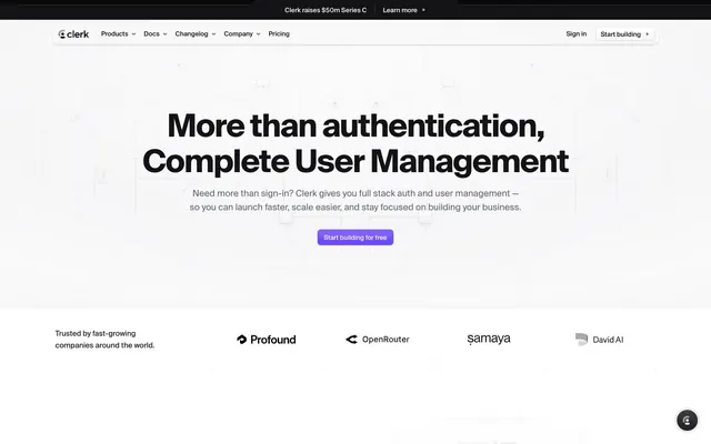
Preview image. Unlock full-res
Developer's Prism. A system that refracts a single beam of brand identity into two distinct light and dark spectrums for different audiences.
Color palette
Primary CTAs, active states, key highlights — a single sharp point of interaction against neutral backgrounds.
Abstract background gradient for the hero section, creating a soft, ethereal atmosphere.
Accent color for code syntax highlighting and occasional illustrative details.
Accent color used within gradients and for code syntax highlighting.
Light theme backgrounds, text on dark backgrounds and buttons.
Off-white background for subtle section differentiation on the light theme.
Light borders and subtle UI rule lines.
Default border color for inputs and UI dividers in the light theme.
Secondary text, placeholders, and icon fills on light backgrounds.
Tertiary text and subtle metadata.
Secondary dark button backgrounds.
Card and component surfaces in the dark theme.
Primary text on light backgrounds, and the base background color for the dark theme.
Display headlines and high-contrast primary text.
Error messages and destructive action indicators.
Typography
- Weights
- 400, 450, 500, 600, 700
- Sizes
- 10px, 11px, 12px, 13px, 15px, 16px, 18px, 20px, 32px, 64px
- Line height
- 1, 1.12, 1.13, 1.23, 1.25, 1.33, 1.4, 1.45, 1.5, 1.53, 1.54, 1.56, 1.6, 1.64, 1.8, 1.82, 1.85
- Letter spacing
- -2.24px at 64px, -0.48px at 32px, normal at smaller sizes
- Fallback
- Geist (Vercel)
The primary font for all headings and prominent UI text. Its geometric structure provides a technical, precise feel. The negative letter-spacing at display sizes is a signature choice, making headlines feel dense and authoritative.
- Weights
- 400, 500, 700
- Sizes
- 10px, 11px, 12px, 13px, 16px, 17px
- Line height
- 1.27, 1.3, 1.33, 1.38, 1.4, 1.41, 1.45, 1.5, 1.82
- Letter spacing
- -0.0100em, 0.0100em
- Fallback
- system-ui
Used for body copy and less prominent interface text where readability is prioritized over strong typographic character.
- Weights
- 400, 500, 600, 700
- Sizes
- 10px, 11px, 12px, 16px, 18px, 22px
- Line height
- 1.22, 1.27, 1.33, 1.4, 1.45, 1.5, 1.6, 1.64, 1.67, 1.82
- Fallback
- Inter (Google Fonts)
A secondary sans-serif for UI components, likely within embedded widgets or third-party integrations.
- Weights
- 400, 500, 600
- Sizes
- 10px, 11px, 12px
- Line height
- 1.33, 1.4, 1.45, 1.64, 1.82, 2
- Letter spacing
- +0.1em at all sizes
- Fallback
- Source Code Pro
Monospace font for code snippets. The generous letter-spacing (0.1em) makes it feel open and clear.
Spacing & shape
Elevation
Components
backgroundColor: Clerk Violet (#6c47ff), color: White (#ffffff), borderRadius: 6px, padding: 12px 24px (inferred), no border. Font is geistNumbers weight 500.
backgroundColor: Charcoal (#42434d), color: White (#ffffff), borderRadius: 6px, padding: 10px 12px. Font is geistNumbers.
backgroundColor: transparent, color: Deep Space (#131316), borderRadius: 0px. Often used for navigation items like 'Sign in'.
backgroundColor: Onyx (#212126) or Ash (#eeeef0), color: Graphite (#9394a1) or White (#ffffff), borderRadius: 9999px, padding: 4px 12px.
backgroundColor: White (#ffffff), borderRadius: 12px, padding: 32px (inferred), boxShadow: rgba(0, 0, 0, 0.1) 0px 1px 3px 0px, rgba(0, 0, 0, 0.1) 0px 1px 2px -1px.
backgroundColor: White (#ffffff), color: Deep Space (#131316), borderRadius: 6px, border: 1px solid Slate (#d9d9de), padding: 8px 12px. On focus, border-color changes to Clerk Violet (#6c47ff).
Contained within a rectangular, sharp-edged container with a subtle 1px border of Slate (#d9d9de) or similar light gray.
Guidelines
- Use the dual theme structure: light for top-level marketing, dark for in-depth feature sections.
- Apply negative letter-spacing to all `geistNumbers` headlines larger than 24px.
- Reserve `Clerk Violet (#6c47ff)` exclusively for primary CTAs and interactive focus states.
- On dark surfaces, use inset `box-shadow` with a subtle white color to create the signature 'pressed-in' highlight.
- Use a `6px` radius for interactive elements like buttons and inputs, and a larger `12px` for container cards.
- Maintain generous `96-128px` vertical spacing between page sections.
- For dark theme cards, use `Onyx (#212126)` for the background and `Iron (#5e5f6e)` for text to achieve a lower-contrast, glowing effect.
- Don't use drop shadows in the dark theme; use inset highlights instead.
- Don't apply `Clerk Violet` to large fields of color or body text.
- Don't mix radii; stick to the `6px/12px/9999px` system.
- Don't build pages using only one theme; the light/dark transition is a core part of the identity.
- Don't use pure black (#000000) for dark theme backgrounds; use `Deep Space (#131316)` for the page background and `Onyx (#212126)` for cards.
- Don't use photography; rely on UI mockups and abstract gradients.
- Don't round the corners of top-level navigation, header, or footer containers.
About this system
ShowHide
This design system operates on a principle of duality, presenting a bright, airy marketing facade that transitions into a dark, technical core. The light theme uses expansive white space and a singular, arresting violet accent for calls-to-action, creating focus and clarity. The dark theme, used for feature showcases, creates depth and a high-tech feel not with shadows, but with layered near-black surfaces and subtle, glowing inset highlights, giving components a 'pressed-into-glass' look. Typography is dominated by the geometric precision of Geist, with tight negative tracking on headlines to feel dense and technical. The system's identity is this shift from open and inviting to focused and sophisticated.
The layout is contained within a 1280px max-width, with content centered. The hero section is a special case, featuring a full-bleed radial gradient background behind centered text. Page structure follows a clear rhythm, alternating between expansive white sections for marketing content and dense, dark sections for technical feature grids. Content is organized in simple, balanced compositions, typically centered stacks or 2- and 3-column grids for feature lists. Navigation is handled by a standard, sharp-edged top header that remains conventional.
This is a text-and-UI-dominant design. Imagery consists almost exclusively of product component screenshots and abstract background gradients. There is no photography. UI mockups are presented cleanly, often within styled containers or cards that match the page's theme. The visual language is explanatory and product-focused, using graphical elements to demonstrate functionality rather than create atmospheric mood. Icons are likely to be simple, solid, and single-color fills.
Reminiscent of Vercel, Linear, Stripe, Supabase.
# Clerk — Style Reference
> Developer's Prism. A system that refracts a single beam of brand identity into two distinct light and dark spectrums for different audiences.

**Theme:** mixed

**Site:** https://clerk.com

This design system operates on a principle of duality, presenting a bright, airy marketing facade that transitions into a dark, technical core. The light theme uses expansive white space and a singular, arresting violet accent for calls-to-action, creating focus and clarity. The dark theme, used for feature showcases, creates depth and a high-tech feel not with shadows, but with layered near-black surfaces and subtle, glowing inset highlights, giving components a 'pressed-into-glass' look. Typography is dominated by the geometric precision of Geist, with tight negative tracking on headlines to feel dense and technical. The system's identity is this shift from open and inviting to focused and sophisticated.

## Tokens — Colors

| Name | Value | Token | Role |
|------|------|------|------|
| Clerk Violet | `#6c47ff` | `--color-clerk-violet` | Primary CTAs, active states, key highlights — a single sharp point of interaction against neutral backgrounds. |
| Hero Aurora | `#6248f6` | `--color-hero-aurora` | Abstract background gradient for the hero section, creating a soft, ethereal atmosphere. |
| Neon Cyan | `#5de3ff` | `--color-neon-cyan` | Accent color for code syntax highlighting and occasional illustrative details. |
| Lemon Glow | `#fff963` | `--color-lemon-glow` | Accent color used within gradients and for code syntax highlighting. |
| White | `#ffffff` | `--color-white` | Light theme backgrounds, text on dark backgrounds and buttons. |
| Paper | `#f7f7f8` | `--color-paper` | Off-white background for subtle section differentiation on the light theme. |
| Ash | `#eeeef0` | `--color-ash` | Light borders and subtle UI rule lines. |
| Slate | `#d9d9de` | `--color-slate` | Default border color for inputs and UI dividers in the light theme. |
| Graphite | `#9394a1` | `--color-graphite` | Secondary text, placeholders, and icon fills on light backgrounds. |
| Tungsten | `#747686` | `--color-tungsten` | Tertiary text and subtle metadata. |
| Charcoal | `#42434d` | `--color-charcoal` | Secondary dark button backgrounds. |
| Onyx | `#212126` | `--color-onyx` | Card and component surfaces in the dark theme. |
| Deep Space | `#131316` | `--color-deep-space` | Primary text on light backgrounds, and the base background color for the dark theme. |
| Black | `#000000` | `--color-black` | Display headlines and high-contrast primary text. |
| Error Red | `#ef4444` | `--color-error-red` | Error messages and destructive action indicators. |

## Tokens — Typography

### geistNumbers
- **Substitute:** Geist (Vercel)
- **Weights:** 400, 450, 500, 600, 700
- **Sizes:** 10px, 11px, 12px, 13px, 15px, 16px, 18px, 20px, 32px, 64px
- **Line height:** 1, 1.12, 1.13, 1.23, 1.25, 1.33, 1.4, 1.45, 1.5, 1.53, 1.54, 1.56, 1.6, 1.64, 1.8, 1.82, 1.85
- **Letter spacing:** -2.24px at 64px, -0.48px at 32px, normal at smaller sizes
- **Role:** The primary font for all headings and prominent UI text. Its geometric structure provides a technical, precise feel. The negative letter-spacing at display sizes is a signature choice, making headlines feel dense and authoritative.

### ui-sans-serif
- **Substitute:** system-ui
- **Weights:** 400, 500, 700
- **Sizes:** 10px, 11px, 12px, 13px, 16px, 17px
- **Line height:** 1.27, 1.3, 1.33, 1.38, 1.4, 1.41, 1.45, 1.5, 1.82
- **Letter spacing:** -0.0100em, 0.0100em
- **Role:** Used for body copy and less prominent interface text where readability is prioritized over strong typographic character.

### Inter
- **Substitute:** Inter (Google Fonts)
- **Weights:** 400, 500, 600, 700
- **Sizes:** 10px, 11px, 12px, 16px, 18px, 22px
- **Line height:** 1.22, 1.27, 1.33, 1.4, 1.45, 1.5, 1.6, 1.64, 1.67, 1.82
- **Role:** A secondary sans-serif for UI components, likely within embedded widgets or third-party integrations.

### soehneMono
- **Substitute:** Source Code Pro
- **Weights:** 400, 500, 600
- **Sizes:** 10px, 11px, 12px
- **Line height:** 1.33, 1.4, 1.45, 1.64, 1.82, 2
- **Letter spacing:** +0.1em at all sizes
- **Role:** Monospace font for code snippets. The generous letter-spacing (0.1em) makes it feel open and clear.

## Tokens — Type Scale

| Role | Size | Line height | Letter spacing |
|------|------|------|------|
| caption | 13px | 1.54 | — |
| body-sm | 15px | 1.53 | — |
| subheading | 18px | 1.56 | — |
| heading | 20px | 1.4 | — |
| heading-lg | 32px | 1.25 | -0.48px |
| display | 64px | 1.12 | -2.24px |

## Tokens — Spacing

- **Max width:** 1280px
- **Section gap:** 96-128px
- **Card padding:** 24px

## Tokens — Radius

- **Buttons:** 6px
- **Inputs:** 6px
- **Cards:** 12px
- **pills:** 9999px

## Tokens — Elevation

- **Light Theme Card:** `rgba(0, 0, 0, 0.1) 0px 1px 3px 0px, rgba(0, 0, 0, 0.1) 0px 1px 2px -1px`
- **Dark Theme Card Highlight:** `rgba(255, 255, 255, 0.024) 0px 1px 0px 0px inset, rgba(255, 255, 255, 0.024) 0px 0px 0px 1px inset`
- **Feature Image Card:** `rgba(19, 19, 22, 0.05) 0px 0px 0px 1px, rgba(0, 0, 0, 0.08) 0px 5px 15px 0px, rgba(25, 28, 33, 0.2) 0px 15px 35px -5px`

## Layout

The layout is contained within a 1280px max-width, with content centered. The hero section is a special case, featuring a full-bleed radial gradient background behind centered text. Page structure follows a clear rhythm, alternating between expansive white sections for marketing content and dense, dark sections for technical feature grids. Content is organized in simple, balanced compositions, typically centered stacks or 2- and 3-column grids for feature lists. Navigation is handled by a standard, sharp-edged top header that remains conventional.

## Imagery

This is a text-and-UI-dominant design. Imagery consists almost exclusively of product component screenshots and abstract background gradients. There is no photography. UI mockups are presented cleanly, often within styled containers or cards that match the page's theme. The visual language is explanatory and product-focused, using graphical elements to demonstrate functionality rather than create atmospheric mood. Icons are likely to be simple, solid, and single-color fills.

## Components

### Primary CTA Button Group

### Create Account Auth Card

### Dark Feature Cards Grid — Authentication

### Primary CTA Button
*The main call to action.*

backgroundColor: Clerk Violet (#6c47ff), color: White (#ffffff), borderRadius: 6px, padding: 12px 24px (inferred), no border. Font is geistNumbers weight 500.

### Dark Secondary Button
*Secondary action in dark contexts.*

backgroundColor: Charcoal (#42434d), color: White (#ffffff), borderRadius: 6px, padding: 10px 12px. Font is geistNumbers.

### Light Ghost Button
*Tertiary action or nav link.*

backgroundColor: transparent, color: Deep Space (#131316), borderRadius: 0px. Often used for navigation items like 'Sign in'.

### Pill Tag
*A tag or small status indicator.*

backgroundColor: Onyx (#212126) or Ash (#eeeef0), color: Graphite (#9394a1) or White (#ffffff), borderRadius: 9999px, padding: 4px 12px.

### Login Modal Card
*Container for authentication forms.*

backgroundColor: White (#ffffff), borderRadius: 12px, padding: 32px (inferred), boxShadow: rgba(0, 0, 0, 0.1) 0px 1px 3px 0px, rgba(0, 0, 0, 0.1) 0px 1px 2px -1px.

### Light Input Field
*Standard text input for forms.*

backgroundColor: White (#ffffff), color: Deep Space (#131316), borderRadius: 6px, border: 1px solid Slate (#d9d9de), padding: 8px 12px. On focus, border-color changes to Clerk Violet (#6c47ff).

### Logo Cloud Item
*Displays a partner or customer logo.*

Contained within a rectangular, sharp-edged container with a subtle 1px border of Slate (#d9d9de) or similar light gray.

## Guidelines

### Do

- Use the dual theme structure: light for top-level marketing, dark for in-depth feature sections.
- Apply negative letter-spacing to all `geistNumbers` headlines larger than 24px.
- Reserve `Clerk Violet (#6c47ff)` exclusively for primary CTAs and interactive focus states.
- On dark surfaces, use inset `box-shadow` with a subtle white color to create the signature 'pressed-in' highlight.
- Use a `6px` radius for interactive elements like buttons and inputs, and a larger `12px` for container cards.
- Maintain generous `96-128px` vertical spacing between page sections.
- For dark theme cards, use `Onyx (#212126)` for the background and `Iron (#5e5f6e)` for text to achieve a lower-contrast, glowing effect.

### Don't

- Don't use drop shadows in the dark theme; use inset highlights instead.
- Don't apply `Clerk Violet` to large fields of color or body text.
- Don't mix radii; stick to the `6px/12px/9999px` system.
- Don't build pages using only one theme; the light/dark transition is a core part of the identity.
- Don't use pure black (#000000) for dark theme backgrounds; use `Deep Space (#131316)` for the page background and `Onyx (#212126)` for cards.
- Don't use photography; rely on UI mockups and abstract gradients.
- Don't round the corners of top-level navigation, header, or footer containers.

## Agent Prompt Guide

### Quick Color Reference
- **Text (Light BG):** `Deep Space (#131316)`
- **Text (Dark BG):** `White (#ffffff)`
- **Background (Light):** `White (#ffffff)`
- **Background (Dark):** `Deep Space (#131316)`
- **CTA Button:** `Clerk Violet (#6c47ff)`
- **Border:** `Slate (#d9d9de)`

### Example Component Prompts
1.  **Hero Section:** "Create a hero section with a centered layout. The background should use the 'Hero Aurora' radial gradient: `radial-gradient(189.26% 126.1% at 49.27% 0%, rgba(108, 71, 255, 0) 10%, rgba(255, 249, 99, 0.15) 34%, rgba(98, 72, 246, 0.24) 67.53%, rgba(98, 72, 246, 0) 95.38%)`. Use 'geistNumbers' font. Main headline is 64px, weight 700, color Black (#000000), letter-spacing -2.24px. Sub-headline is 20px, weight 400, color Iron (#5e5f6e). Add a Primary CTA Button below."
2.  **Primary CTA Button:** "Create a button with text 'Start building for free'. Use 'geistNumbers' font, weight 500, size 16px, color White (#ffffff). The button background is Clerk Violet (#6c47ff) with a 6px border-radius and 12px 24px padding."
3.  **Dark Feature Card:** "Create a card with a 12px border-radius and 24px padding. The background color is Onyx (#212126). Add an inset highlight using this box-shadow: `rgba(255, 255, 255, 0.024) 0px 1px 0px 0px inset, rgba(255, 255, 255, 0.024) 0px 0px 0px 1px inset`. Card heading is 'geistNumbers', 18px, weight 500, color White (#ffffff). Body text is 'ui-sans-serif', 15px, weight 400, color Iron (#5e5f6e)."
More like this



Keep what you find
A free account saves references to boards and can send you a weekly email of picks based on what you save.
To see every result, go Pro.