Preview image. Unlock full-res
Digital engineering lab
Color palette
Primary call-to-action button backgrounds and accent points, bringing energy and focus to interactive elements
Complex multi-stop gradient for hero backgrounds or prominent feature sections, creating a dynamic, deep blue visual field
Informational text links, badge accents, and decorative icon fills, a brighter, more open blue than Electric Blue
Deep blue-black background for hero sections and elevated cards, providing a grounded dark mode base
Primary background for light mode sections, card surfaces, and primary button text
Subtle borders, dividers, and background elements in light mode, indicating UI separation
Primary body text, heading black for full contrast, and icon fills
Secondary text, dark navigation elements, and muted icon fills, offering a softer alternative to Ink Black
Muted helper text, secondary icon colors, and subtle UI elements
Light background fill predominantly
Light-touch shadows and subtle background elements, providing very faint depth
Muted UI surface for disabled controls, low-emphasis panels, and placeholder blocks. Do not promote it to the primary CTA color
Code snippet text, offering a distinct, slightly green-tinted dark gray for monospace content
Subtle background gradient for light sections or hero elements, providing volume and visual interest
Typography
- Weights
- 400, 500, 600, 700
- Sizes
- 9px, 10px, 12px, 13px, 14px, 16px
- Line height
- 1.07, 1.33, 1.43, 1.5, 1.54, 1.57, 1.63, 1.67, 1.78, 1.83, 2.4
- Letter spacing
- -0.01em at 16px, -0.005em at 12px
- Fallback
- system-ui, sans-serif
Primary UI font for body text, navigation items, buttons, tables, and small headings. Its clean, functional legibility ensures clarity across varied information-dense components. Features 'cv01' and 'ss01' for nuanced character forms.
- Weights
- 400, 500
- Sizes
- 18px, 24px, 36px, 48px, 64px, 74px
- Line height
- 1.08, 1.13, 1.14, 1.22, 1.33, 1.78
- Letter spacing
- -0.015em at 74px, -0.01em at 48px
- Fallback
- Inter, system-ui, sans-serif
Used for prominent headings, drawing attention with its distinct, technically-inspired letterforms, especially at larger sizes. Specific stylistic sets ('ss02', 'ss05', 'ss10', 'ss11') define its unique character.
- Weights
- 400, 500
- Sizes
- 10px, 11px, 12px, 14px, 16px
- Line height
- 1.45, 1.5, 1.57, 2, 2.4, 2.67
- Letter spacing
- 0.03em at 10px, -0.01em at 14px
- Fallback
- ui-monospace, monospace
Dedicated monospace font for code blocks, terminal output, and technical labels, maintaining a consistent width for precise alignment. The subtle positive letter-spacing at smaller sizes enhances readability.
Spacing & shape
Elevation
Components
Background: Electric Blue (#0036ff), Text: Canvas White (#ffffff), Padding: 7px vertical, 16px horizontal; Radius: 999px.
Background: transparent, Text: Ink Black (#000000), Border: 1px solid Silver Mist (#e5e7eb) Top/Left/Right/Bottom, Padding: 16px vertical, 20px horizontal; Radius: 0px.
Background: transparent, Text: Ink Black (#000000), Border: 1px solid Polar Mist (#d6d6db) Top/Left/Right/Bottom, Padding: 7px vertical, 8-10px horizontal; Radius: 6px.
Background: transparent, Text: Graphite (#141414), Border: 1px solid rgba(0, 0, 0, 0.06), Padding: 7px vertical, 8px horizontal; Radius: 6px.
Background: Midnight Void (#05061b) with 0.5 opacity, Padding: 6px all sides, Radius: 24px. Features complex inner and outer shadows for significant depth.
Background: Canvas White (#ffffff) with 0.88 opacity, Padding: 32px vertical, 36px horizontal; Radius: 20px. Uses soft, multi-layer shadows for subtle lift.
Background: Canvas White (#ffffff), Text: Sky Blue (#0093ff), Padding: 4px vertical, 10-12px horizontal; Radius: 999px.
Background: rgba(255, 255, 255, 0.08) or rgba(255, 255, 255, 0.04), Text: Ink Black (#000000), Padding: 4px vertical, 8px horizontal; Radius: 999px.
Guidelines
- Prioritize Electric Blue (#0036ff) exclusively for primary calls-to-action and essential interactive states.
- Use a 999px border-radius for all primary buttons and badges to achieve a distinctly rounded, 'pill' aesthetic.
- Apply the Midnight Void (#05061b) for hero sections and dark mode cards to ground the interface in deep, cool tones.
- Employ Aeonik Pro with font-feature-settings 'ss02', 'ss05', 'ss10', 'ss11' for all main headlines to maintain its unique character.
- Ensure all body text and UI elements consistently use the Inter typeface with appropriate weight and size from the defined scale.
- Use Silver Mist (#e5e7eb) for all hairline borders and subtle dividers, maintaining visual separation without heavy lines.
- Whenever displaying code or terminal-like content, use Geist Mono with 0.03em letter-spacing at smaller sizes for legibility.
- Do not introduce new saturated colors; adhere strictly to Electric Blue and Sky Blue for chromatic accents.
- Avoid using harsh, opaque black shadows; prefer soft, multi-layered, often slightly tinted shadows from the defined list.
- Do not deviate from the specified border radii; mixing different radius styles will undermine component consistency.
- Never use primary text colors (#000000, #141414) on pure white (#ffffff) backgrounds in code or terminal UI components.
- Do not apply bold or black backgrounds to ghost buttons; they are defined by a transparent background with a neutral border.
- Avoid generic system fonts; always map text to Inter, Aeonik Pro, or Geist Mono as appropriate.
- Do not use white as a dominant background color in the hero section; it's reserved for light-themed feature sections.
About this system
ShowHide
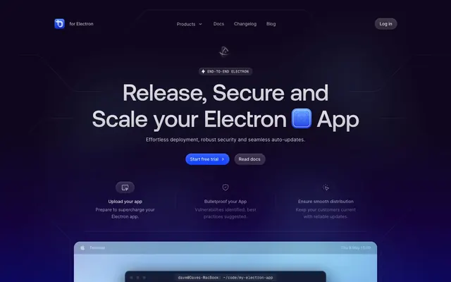
ToDesktop employs a 'digital engineering lab' aesthetic, characterized by a dominant dark, cool blue background contrasting with crisp white and light gray interfaces. Subtle internal shadows create a sense of depth on surfaces, while a vivid Electric Blue serves as the primary accent for interactive elements and brand highlights. Typography is precise and utilitarian, fostering a high-tech, functional atmosphere. The design balances a serious, technical tone with moments of vibrant clarity.
Reminiscent of Vercel, Linear, GitHub, Plausible Analytics.
# ToDesktop — Style Reference
> Digital engineering lab

**Theme:** mixed

**Site:** https://www.todesktop.com

ToDesktop employs a 'digital engineering lab' aesthetic, characterized by a dominant dark, cool blue background contrasting with crisp white and light gray interfaces. Subtle internal shadows create a sense of depth on surfaces, while a vivid Electric Blue serves as the primary accent for interactive elements and brand highlights. Typography is precise and utilitarian, fostering a high-tech, functional atmosphere. The design balances a serious, technical tone with moments of vibrant clarity.

## Tokens — Colors

| Name | Value | Token | Role |
|------|------|------|------|
| Electric Blue | `#0036ff` | `--color-electric-blue` | Primary call-to-action button backgrounds and accent points, bringing energy and focus to interactive elements |
| Deep Blue Gradient | `#0f071d` | `--color-deep-blue-gradient` | Complex multi-stop gradient for hero backgrounds or prominent feature sections, creating a dynamic, deep blue visual field |
| Sky Blue | `#0093ff` | `--color-sky-blue` | Informational text links, badge accents, and decorative icon fills, a brighter, more open blue than Electric Blue |
| Midnight Void | `#05061b` | `--color-midnight-void` | Deep blue-black background for hero sections and elevated cards, providing a grounded dark mode base |
| Canvas White | `#ffffff` | `--color-canvas-white` | Primary background for light mode sections, card surfaces, and primary button text |
| Silver Mist | `#e5e7eb` | `--color-silver-mist` | Subtle borders, dividers, and background elements in light mode, indicating UI separation |
| Ink Black | `#000000` | `--color-ink-black` | Primary body text, heading black for full contrast, and icon fills |
| Graphite | `#141414` | `--color-graphite` | Secondary text, dark navigation elements, and muted icon fills, offering a softer alternative to Ink Black |
| Cloud Gray | `#656565` | `--color-cloud-gray` | Muted helper text, secondary icon colors, and subtle UI elements |
| Faded White | `#e6fff7` | `--color-faded-white` | Light background fill predominantly |
| Light Steel | `#c2c2c9` | `--color-light-steel` | Light-touch shadows and subtle background elements, providing very faint depth |
| Polar Mist | `#d6d6db` | `--color-polar-mist` | Muted UI surface for disabled controls, low-emphasis panels, and placeholder blocks. Do not promote it to the primary CTA color |
| Ash Code | `#384642` | `--color-ash-code` | Code snippet text, offering a distinct, slightly green-tinted dark gray for monospace content |
| Clean White Gradient | `#f7f7f7` | `--color-clean-white-gradient` | Subtle background gradient for light sections or hero elements, providing volume and visual interest |

## Tokens — Typography

### Inter
- **Substitute:** system-ui, sans-serif
- **Weights:** 400, 500, 600, 700
- **Sizes:** 9px, 10px, 12px, 13px, 14px, 16px
- **Line height:** 1.07, 1.33, 1.43, 1.5, 1.54, 1.57, 1.63, 1.67, 1.78, 1.83, 2.4
- **Letter spacing:** -0.01em at 16px, -0.005em at 12px
- **Role:** Primary UI font for body text, navigation items, buttons, tables, and small headings. Its clean, functional legibility ensures clarity across varied information-dense components. Features 'cv01' and 'ss01' for nuanced character forms.

### Aeonik Pro
- **Substitute:** Inter, system-ui, sans-serif
- **Weights:** 400, 500
- **Sizes:** 18px, 24px, 36px, 48px, 64px, 74px
- **Line height:** 1.08, 1.13, 1.14, 1.22, 1.33, 1.78
- **Letter spacing:** -0.015em at 74px, -0.01em at 48px
- **Role:** Used for prominent headings, drawing attention with its distinct, technically-inspired letterforms, especially at larger sizes. Specific stylistic sets ('ss02', 'ss05', 'ss10', 'ss11') define its unique character.

### Geist Mono
- **Substitute:** ui-monospace, monospace
- **Weights:** 400, 500
- **Sizes:** 10px, 11px, 12px, 14px, 16px
- **Line height:** 1.45, 1.5, 1.57, 2, 2.4, 2.67
- **Letter spacing:** 0.03em at 10px, -0.01em at 14px
- **Role:** Dedicated monospace font for code blocks, terminal output, and technical labels, maintaining a consistent width for precise alignment. The subtle positive letter-spacing at smaller sizes enhances readability.

## Tokens — Type Scale

Perfect Fifth (1.5) from 16px base.

| Role | Size | Line height | Letter spacing |
|------|------|------|------|
| body | 16px | 1.5 | -0.04em |
| subheading | 18px | 1.78 | — |
| heading | 24px | 1.33 | — |
| heading-lg | 36px | 1.22 | -0.54px |
| display | 74px | 1.08 | -1.11px |

## Tokens — Spacing

- **Section gap:** 64px
- **Card padding:** 12px
- **Element gap:** 8px

## Tokens — Radius

- **Buttons:** 999px
- **Cards:** 24px
- **badges:** 999px
- **content:** 20px
- **large:** 32px
- **medium:** 14px
- **none:** 0px
- **small:** 6px

## Tokens — Elevation

- **Hero Card - Dark Elevated:** `rgba(255, 255, 255, 0.06) 0px 1px 3px 0px inset, rgba(255, 255, 255, 0.06) 0px 0.5px 0.5px 0px inset, rgba(2, 9, 44, 0.24) 0px 16px 56px 0px, rgba(1, 9, 44, 0.24) 0px 4px 16px 0px, rgba(2, 9, 44, 0.24) 0px 1px 2px 0px, rgba(5, 6, 27, 0.52) 0px 0px 0px 1px`
- **Feature Card - White Frosted:** `rgba(0, 0, 0, 0.02) 0px 6px 6px -3px, rgba(0, 0, 0, 0.02) 0px 3px 3px -1.5px, rgba(0, 0, 0, 0.03) 0px 1px 1px -0.5px, rgba(0, 0, 0, 0.04) 0px 12px 12px -3px`
- **Interactive Button (various):** `rgba(255, 255, 255, 0.12) 0px 1px 2px -0.5px inset, rgba(255, 255, 255, 0.16) 0px 0.5px 0.5px 0px inset, rgba(255, 255, 255, 0.16) 0px 8px 24px -4px inset, rgba(9, 1, 20, 0.03) 0px 8px 8px -3px, rgba(9, 1, 20, 0.03) 0px 5px 5px -2.5px, rgba(8, 1, 20, 0.03) 0px 3px 3px -1.5px, rgba(8, 1, 20, 0.03) 0px 2px 2px -1px, rgba(8, 1, 20, 0.03) 0px 1px 1px -0.5px, rgba(8, 1, 20, 0.03) 0px 0.5px 0.5px 0px`

## Components

### Primary Action Button
*Filled button indicating primary calls to action.*

Background: Electric Blue (#0036ff), Text: Canvas White (#ffffff), Padding: 7px vertical, 16px horizontal; Radius: 999px.

### Ghost Button
*Secondary action button, visually lighter.*

Background: transparent, Text: Ink Black (#000000), Border: 1px solid Silver Mist (#e5e7eb) Top/Left/Right/Bottom, Padding: 16px vertical, 20px horizontal; Radius: 0px.

### Pill Outline Button
*Outlined button with a distinct pill shape.*

Background: transparent, Text: Ink Black (#000000), Border: 1px solid Polar Mist (#d6d6db) Top/Left/Right/Bottom, Padding: 7px vertical, 8-10px horizontal; Radius: 6px.

### Navigation Link Button
*Small, subtly interactive navigation button.*

Background: transparent, Text: Graphite (#141414), Border: 1px solid rgba(0, 0, 0, 0.06), Padding: 7px vertical, 8px horizontal; Radius: 6px.

### Hero Card - Dark Elevated
*Prominent card for key product features, elevated in background.*

Background: Midnight Void (#05061b) with 0.5 opacity, Padding: 6px all sides, Radius: 24px. Features complex inner and outer shadows for significant depth.

### Feature Card - White Frosted
*Card for light-themed features, with a frosted glass effect.*

Background: Canvas White (#ffffff) with 0.88 opacity, Padding: 32px vertical, 36px horizontal; Radius: 20px. Uses soft, multi-layer shadows for subtle lift.

### Info Badge - Sky Blue Text
*Small informational tag with blue text.*

Background: Canvas White (#ffffff), Text: Sky Blue (#0093ff), Padding: 4px vertical, 10-12px horizontal; Radius: 999px.

### Ghost Badge - Dark Background
*Subtle badge for categorization or status in dark areas.*

Background: rgba(255, 255, 255, 0.08) or rgba(255, 255, 255, 0.04), Text: Ink Black (#000000), Padding: 4px vertical, 8px horizontal; Radius: 999px.

## Guidelines

### Do

- Prioritize Electric Blue (#0036ff) exclusively for primary calls-to-action and essential interactive states.
- Use a 999px border-radius for all primary buttons and badges to achieve a distinctly rounded, 'pill' aesthetic.
- Apply the Midnight Void (#05061b) for hero sections and dark mode cards to ground the interface in deep, cool tones.
- Employ Aeonik Pro with font-feature-settings 'ss02', 'ss05', 'ss10', 'ss11' for all main headlines to maintain its unique character.
- Ensure all body text and UI elements consistently use the Inter typeface with appropriate weight and size from the defined scale.
- Use Silver Mist (#e5e7eb) for all hairline borders and subtle dividers, maintaining visual separation without heavy lines.
- Whenever displaying code or terminal-like content, use Geist Mono with 0.03em letter-spacing at smaller sizes for legibility.

### Don't

- Do not introduce new saturated colors; adhere strictly to Electric Blue and Sky Blue for chromatic accents.
- Avoid using harsh, opaque black shadows; prefer soft, multi-layered, often slightly tinted shadows from the defined list.
- Do not deviate from the specified border radii; mixing different radius styles will undermine component consistency.
- Never use primary text colors (#000000, #141414) on pure white (#ffffff) backgrounds in code or terminal UI components.
- Do not apply bold or black backgrounds to ghost buttons; they are defined by a transparent background with a neutral border.
- Avoid generic system fonts; always map text to Inter, Aeonik Pro, or Geist Mono as appropriate.
- Do not use white as a dominant background color in the hero section; it's reserved for light-themed feature sections.

## Agent Prompt Guide

Quick Color Reference:
text: #000000
background: #ffffff
border: #e5e7eb
accent: #0093ff
primary action: #0036ff (filled action)

Example Component Prompts:
1. Create a Primary Action Button: #0036ff background, #ffffff text, 9999px radius, compact pill padding. Use this filled treatment for the main CTA.
2. Create a Feature Card: Background: Canvas White (#ffffff, 0.88 opacity), Radius: 20px, Padding: 32px vertical, 36px horizontal. Shadow: rgba(0, 0, 0, 0.02) 0px 6px 6px -3px, rgba(0, 0, 0, 0.02) 0px 3px 3px -1.5px, rgba(0, 0, 0, 0.03) 0px 1px 1px -0.5px, rgba(0, 0, 0, 0.04) 0px 12px 12px -3px. Headline (e.g. 'Upload your app') using Aeonik Pro, 24px, weight 500, #000000. Body text below (e.g. 'Prepare to supercharge your Electron app.') using Inter, 14px, weight 400, Cloud Gray (#656565).
More like this







Keep what you find
A free account saves references to boards and can send you a weekly email of picks based on what you save.
To see every result, go Pro.