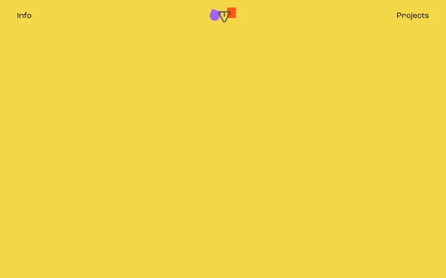
Preview image. Unlock full-res
sunny sketchpad, outlined whimsy
Color palette
Page background, hero canvas, footer background — a muted, almost pastel yellow that defines the brand's primary visual space
Dark borders and separators for elevated surfaces and inverted UI. Do not promote it to the primary CTA color
Subtle background for specific sections or elements, offering a slightly richer yellow than the main canvas
Typography
- Weights
- 400
- Sizes
- 9px, 26px, 123px
- Line height
- 1
- Fallback
- Arial
The sole typeface for all text elements including navigation, headings, body, and buttons. Its singular weight implies a consistent, unembellished tone across the interface, prioritizing clarity and directness over typographic hierarchy through weight.
Spacing & shape
Components
Text in Midnight Ink (#000000) set at 26px with a line height of 1.0. No background, serving as interactive text.
A ghost button with a full pill shape (428.571px radius). The text is Midnight Ink (#000000) and the button has a 1.5px solid Midnight Ink (#000000) border. Padding is 14px on all sides.
Large text at 123px, weight 400, in Midnight Ink (#000000), utilizing the Kostic typeface to immediately convey brand personality.
Guidelines
- Use Lemon Peel (#f5f5e3) as the default background for all page content, creating a consistent 'sketchpad' feel.
- Apply Kostic typeface at weight 400 for all text elements to maintain typographic consistency.
- Ensure all interactive elements, particularly buttons, have a border-radius of 428.571px to achieve a distinct pill shape.
- Utilize Midnight Ink (#000000) for all text and UI outlines to provide maximum contrast against the background.
- Maintain a comfortable density with a standard element gap of 24px and section gaps of 86px for clear content separation.
- Employ a 1.5px solid border in Midnight Ink (#000000) for all outlined elements.
- Use a base line height of 1.0 across all text to keep a tight, compact typographic appearance.
- Avoid introducing gradients; the design system relies on flat, high-contrast colors.
- Do not use additional font weights or families; the Kostic font with its singular weight is the only approved typeface.
- Refrain from using shadows or elevation effects; the visual style emphasizes a flat, two-dimensional aesthetic.
- Do not add complex interactive states that involve significant color changes; interactions should be subtle and primarily outline-based.
- Avoid using any color other than Lemon Peel (#f5f5e3), Buttercup (#f4d748), or Midnight Ink (#000000) for UI elements.
- Do not break the established spacing rhythm; consistent use of 24px for elements and 86px for sections is crucial.
- Avoid adding new radii values; stick to 17.1429px for general elements and 428.571px for pill-shaped components.
About this system
ShowHide
Antonio Uve presents a playful, high-contrast digital notebook aesthetic. A bold primary background color dominates the canvas, creating an immediate and memorable visual statement. Typography is kept minimal, relying on a single, distinctive font to carry the identity. Interaction elements are subtle, often featuring ghost-like outlines and large radii, maintaining a light and airy feel despite the strong background color.
The page uses a full-bleed layout, where the primary Lemon Peel background extends edge-to-edge. Content appears to be centered horizontally with significant vertical spacing between sections. The hero section features a prominent, centered headline. Navigation is a simple top bar with left ('Info') and right ('Projects') aligned links, all in a ghost-like text style. There is a focused content area with no complex grid structures apparent, emphasizing singular messages or sections. Elements are stacked vertically, creating a comfortable, unhurried rhythm.
The site primarily features vector-based illustrations and 'silly animations' where color is vibrant and forms the core of the content rather than being a UI element. Icons are simple, outlined, and minimal, often incorporating the brand's primary colors.
Reminiscent of Mr. Doodle, Lisa Frank (modern interpretation), Playful portfolio sites from graphic designers.
# Antonio Uve — Style Reference
> sunny sketchpad, outlined whimsy

**Theme:** light

**Site:** https://antoniouve.com

Antonio Uve presents a playful, high-contrast digital notebook aesthetic. A bold primary background color dominates the canvas, creating an immediate and memorable visual statement. Typography is kept minimal, relying on a single, distinctive font to carry the identity. Interaction elements are subtle, often featuring ghost-like outlines and large radii, maintaining a light and airy feel despite the strong background color.

## Tokens — Colors

| Name | Value | Token | Role |
|------|------|------|------|
| Lemon Peel | `#f5f5e3` | `--color-lemon-peel` | Page background, hero canvas, footer background — a muted, almost pastel yellow that defines the brand's primary visual space |
| Midnight Ink | `#000000` | `--color-midnight-ink` | Dark borders and separators for elevated surfaces and inverted UI. Do not promote it to the primary CTA color |
| Buttercup | `#f4d748` | `--color-buttercup` | Subtle background for specific sections or elements, offering a slightly richer yellow than the main canvas |

## Tokens — Typography

### Kostic
- **Substitute:** Arial
- **Weights:** 400
- **Sizes:** 9px, 26px, 123px
- **Line height:** 1
- **Role:** The sole typeface for all text elements including navigation, headings, body, and buttons. Its singular weight implies a consistent, unembellished tone across the interface, prioritizing clarity and directness over typographic hierarchy through weight.

## Tokens — Spacing

- **Section gap:** 86px
- **Card padding:** 14px
- **Element gap:** 24px

## Tokens — Radius

- **Default:** 17.1429px
- **Buttons:** 428.571px

## Layout

The page uses a full-bleed layout, where the primary Lemon Peel background extends edge-to-edge. Content appears to be centered horizontally with significant vertical spacing between sections. The hero section features a prominent, centered headline. Navigation is a simple top bar with left ('Info') and right ('Projects') aligned links, all in a ghost-like text style. There is a focused content area with no complex grid structures apparent, emphasizing singular messages or sections. Elements are stacked vertically, creating a comfortable, unhurried rhythm.

## Imagery

The site primarily features vector-based illustrations and 'silly animations' where color is vibrant and forms the core of the content rather than being a UI element. Icons are simple, outlined, and minimal, often incorporating the brand's primary colors.

## Components

### Ghost Navigation Link
*Navigation items in the header and footer*

Text in Midnight Ink (#000000) set at 26px with a line height of 1.0. No background, serving as interactive text.

### Pill Ghost Button
*Interactive action buttons (e.g., 'Email', 'Instagram')*

A ghost button with a full pill shape (428.571px radius). The text is Midnight Ink (#000000) and the button has a 1.5px solid Midnight Ink (#000000) border. Padding is 14px on all sides.

### Hero Headline
*Primary visual statement on the hero section*

Large text at 123px, weight 400, in Midnight Ink (#000000), utilizing the Kostic typeface to immediately convey brand personality.

## Guidelines

### Do

- Use Lemon Peel (#f5f5e3) as the default background for all page content, creating a consistent 'sketchpad' feel.
- Apply Kostic typeface at weight 400 for all text elements to maintain typographic consistency.
- Ensure all interactive elements, particularly buttons, have a border-radius of 428.571px to achieve a distinct pill shape.
- Utilize Midnight Ink (#000000) for all text and UI outlines to provide maximum contrast against the background.
- Maintain a comfortable density with a standard element gap of 24px and section gaps of 86px for clear content separation.
- Employ a 1.5px solid border in Midnight Ink (#000000) for all outlined elements.
- Use a base line height of 1.0 across all text to keep a tight, compact typographic appearance.

### Don't

- Avoid introducing gradients; the design system relies on flat, high-contrast colors.
- Do not use additional font weights or families; the Kostic font with its singular weight is the only approved typeface.
- Refrain from using shadows or elevation effects; the visual style emphasizes a flat, two-dimensional aesthetic.
- Do not add complex interactive states that involve significant color changes; interactions should be subtle and primarily outline-based.
- Avoid using any color other than Lemon Peel (#f5f5e3), Buttercup (#f4d748), or Midnight Ink (#000000) for UI elements.
- Do not break the established spacing rhythm; consistent use of 24px for elements and 86px for sections is crucial.
- Avoid adding new radii values; stick to 17.1429px for general elements and 428.571px for pill-shaped components.

## Agent Prompt Guide

Quick Color Reference:
text: #000000
background: #f5f5e3
border: #000000
accent: no distinct accent color
primary action: no distinct CTA color

Example Component Prompts:
1. Create a navigation header with two links: 'Info' on the left and 'Projects' on the right. Both links should use Kostic, weight 400, 26px, color #000000. The header background should be Lemon Peel (#f5f5e3).
2. Generate a hero section with the headline 'Illustrations & silly animations'. The headline should use Kostic, weight 400, 123px, color #000000, centered on a Lemon Peel (#f5f5e3) background.
3. Design a contact button labeled 'Email Email'. It should be a pill-shaped ghost button with a 428.571px border-radius, 1.5px solid #000000 border, 14px padding, and text in Kostic, weight 400, 26px, color #000000.
More like this









Keep what you find
A free account saves references to boards and can send you a weekly email of picks based on what you save.
To see every result, go Pro.