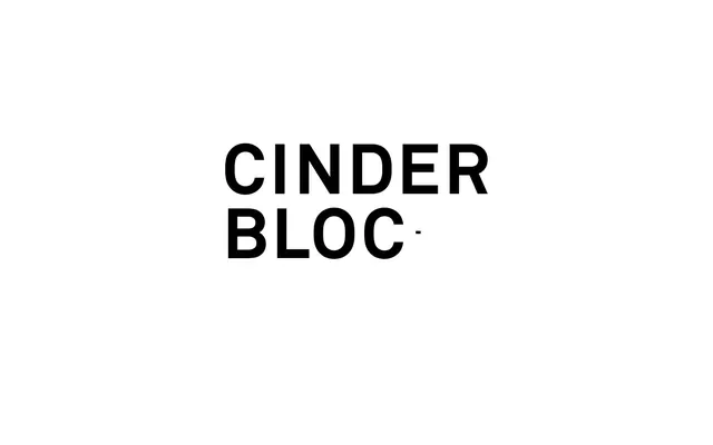
Preview image. Unlock full-res
Type-driven architectural blueprint. Bold, stacked type on a crisp field, structured by precise lines.
Color palette
Supporting palette color for small decorative accents when the core palette needs contrast. Do not promote it to the primary CTA color
Identified as `--alias-secondary` but not visibly used, likely a secondary brand accent for highlights or functional elements
Page backgrounds, heading backgrounds, primary surface for content blocks
Primary text, strong borders, foundational contrast against Canvas White. It defines the authoritative tone
Secondary text, subtle borders around headings, and decorative divider lines. Provides visual relief without diluting the high-contrast feel
Tertiary text and less dominant borders, offering a slightly softer alternative to Ink Black for details
Supporting palette color for small decorative accents when the core palette needs contrast.
Typography
- Weights
- 300, 400
- Sizes
- 15px, 16px, 62px
- Line height
- 1.2, 1.29
- Letter spacing
- 0.08em
- Fallback
- Inter
All textual content, from headings to body text and links. Its strong geometric character and generous letter-spacing reinforce the brand's precise and deliberate communication style. Weight 300 provides a lighter touch for some headings, while 400 maintains legibility for body text.
Spacing & shape
Components
Uses Ink Black (#000000) for text at 62px, weight 400. Features a 3px Ash Gray (#939598) bottom border, creating a subtle visual anchor for important information.
Text is Ink Black (#000000) or Ash Gray (#939598), at 16px with AkkuratLLWeb (weight 400), 0.08em letter-spacing. Underlines appear on hover/active, or for some portfolio links in Ash Gray.
A hairline divider, typically 1px, using Ash Gray (#939598) or Charcoal Gray (#595959) to subtly segment content.
Guidelines
- Use AkkuratLLWeb family for all text elements, maintaining 0.08em letter-spacing throughout.
- Prioritize Ink Black (#000000) for primary text and strong visual elements against Canvas White (#ffffff).
- Employ Ash Gray (#939598) for secondary text and subtle, structural borders.
- Maintain a compact density, allowing typography to dictate primary rhythm rather than large empty spaces.
- Implement a 3px border for interactive elements using Ash Gray (#939598) to indicate clickable areas without using background fills.
- When a border radius is needed, use 100px on all elements to create pill-shaped or fully rounded corners.
- Avoid using multiple font families; AkkuratLLWeb is the sole typographic voice.
- Do not introduce strong accent colors from the `--alias-primary` or `--alias-secondary` unless explicitly for functional, interactive states or defined brand accents.
- Refrain from heavy shadow usage; the design relies on contrast and borders for depth.
- Do not use generic border radii; 100px should be the default for any rounded elements.
- Avoid large, image-heavy sections; the layout supports text-dominant communication.
- Do not deviate from the high-contrast pairing of Ink Black text on Canvas White backgrounds for primary content.
About this system
ShowHide
CINDERBLOC embodies a minimalist, high-contrast aesthetic, building a visual language around robust black typography on a stark white canvas. Information is communicated directly through strong typographic forms and subtle gray accents. The design emphasizes solid borders and compact layouts, creating an impression of precision and clarity. Color is used sparingly, primarily for functional text contrast and subtle visual organization.
The page exhibits a max-width, center-aligned container for content. The hero section is characterized by large, stacked, and often left-aligned black typography on a white background. Sections are separated by distinct horizontal borders and clear vertical stacking, suggesting a clean, almost grid-like structure for presenting information. The navigation is implied to be minimal and text-based, likely a sticky top bar or off-canvas menu due to the lack of visible primary navigation.
No imagery or graphics are present in the provided context, suggesting a purely typographic and UI-driven visual system. If imagery were to be introduced, it should likely be high-contrast, black and white photography or minimalist abstract graphics to align with the stark aesthetic. Icons, if used, would be outlined and monochrome.
Reminiscent of AIGA, Helvetica Now, Pentagram, Manual (agency).
# CINDERBLOC — Style Reference
> Type-driven architectural blueprint. Bold, stacked type on a crisp field, structured by precise lines.

**Theme:** light

**Site:** https://www.cinderbloc.com

CINDERBLOC embodies a minimalist, high-contrast aesthetic, building a visual language around robust black typography on a stark white canvas. Information is communicated directly through strong typographic forms and subtle gray accents. The design emphasizes solid borders and compact layouts, creating an impression of precision and clarity. Color is used sparingly, primarily for functional text contrast and subtle visual organization.

## Tokens — Colors

| Name | Value | Token | Role |
|------|------|------|------|
| Deep Teal | `#062e37` | `--color-deep-teal` | Supporting palette color for small decorative accents when the core palette needs contrast. Do not promote it to the primary CTA color |
| Sunbeam Yellow | `#f5d452` | `--color-sunbeam-yellow` | Identified as `--alias-secondary` but not visibly used, likely a secondary brand accent for highlights or functional elements |
| Canvas White | `#ffffff` | `--color-canvas-white` | Page backgrounds, heading backgrounds, primary surface for content blocks |
| Ink Black | `#000000` | `--color-ink-black` | Primary text, strong borders, foundational contrast against Canvas White. It defines the authoritative tone |
| Ash Gray | `#939598` | `--color-ash-gray` | Secondary text, subtle borders around headings, and decorative divider lines. Provides visual relief without diluting the high-contrast feel |
| Charcoal Gray | `#595959` | `--color-charcoal-gray` | Tertiary text and less dominant borders, offering a slightly softer alternative to Ink Black for details |
| Fog | `#eeeded` | `--color-fog` | Supporting palette color for small decorative accents when the core palette needs contrast. |

## Tokens — Typography

### AkkuratLLWeb
- **Substitute:** Inter
- **Weights:** 300, 400
- **Sizes:** 15px, 16px, 62px
- **Line height:** 1.2, 1.29
- **Letter spacing:** 0.08em
- **Role:** All textual content, from headings to body text and links. Its strong geometric character and generous letter-spacing reinforce the brand's precise and deliberate communication style. Weight 300 provides a lighter touch for some headings, while 400 maintains legibility for body text.

## Tokens — Type Scale

| Role | Size | Line height | Letter spacing |
|------|------|------|------|
| caption | 15px | 1.29 | — |
| body-sm | 16px | 1.29 | — |
| body | 62px | 1.29 | — |

## Tokens — Spacing

- **Element gap:** 3-18px

## Tokens — Radius

- **Default:** 100px

## Layout

The page exhibits a max-width, center-aligned container for content. The hero section is characterized by large, stacked, and often left-aligned black typography on a white background. Sections are separated by distinct horizontal borders and clear vertical stacking, suggesting a clean, almost grid-like structure for presenting information. The navigation is implied to be minimal and text-based, likely a sticky top bar or off-canvas menu due to the lack of visible primary navigation.

## Imagery

No imagery or graphics are present in the provided context, suggesting a purely typographic and UI-driven visual system. If imagery were to be introduced, it should likely be high-contrast, black and white photography or minimalist abstract graphics to align with the stark aesthetic. Icons, if used, would be outlined and monochrome.

## Components

### Primary Heading with Border
*Section titles and portfolio item names.*

Uses Ink Black (#000000) for text at 62px, weight 400. Features a 3px Ash Gray (#939598) bottom border, creating a subtle visual anchor for important information.

### Navigation Link
*Site navigation and sub-navigation items.*

Text is Ink Black (#000000) or Ash Gray (#939598), at 16px with AkkuratLLWeb (weight 400), 0.08em letter-spacing. Underlines appear on hover/active, or for some portfolio links in Ash Gray.

### Horizontal Divider
*Visual separation between content blocks or navigational elements.*

A hairline divider, typically 1px, using Ash Gray (#939598) or Charcoal Gray (#595959) to subtly segment content.

## Guidelines

### Do

- Use AkkuratLLWeb family for all text elements, maintaining 0.08em letter-spacing throughout.
- Prioritize Ink Black (#000000) for primary text and strong visual elements against Canvas White (#ffffff).
- Employ Ash Gray (#939598) for secondary text and subtle, structural borders.
- Maintain a compact density, allowing typography to dictate primary rhythm rather than large empty spaces.
- Implement a 3px border for interactive elements using Ash Gray (#939598) to indicate clickable areas without using background fills.
- When a border radius is needed, use 100px on all elements to create pill-shaped or fully rounded corners.

### Don't

- Avoid using multiple font families; AkkuratLLWeb is the sole typographic voice.
- Do not introduce strong accent colors from the `--alias-primary` or `--alias-secondary` unless explicitly for functional, interactive states or defined brand accents.
- Refrain from heavy shadow usage; the design relies on contrast and borders for depth.
- Do not use generic border radii; 100px should be the default for any rounded elements.
- Avoid large, image-heavy sections; the layout supports text-dominant communication.
- Do not deviate from the high-contrast pairing of Ink Black text on Canvas White backgrounds for primary content.

## Agent Prompt Guide

Quick Color Reference:
text: #000000
background: #ffffff
border: #939598
accent: #062e37
primary action: no distinct CTA color

Example Component Prompts:
1. Create a page section title: AkkuratLLWeb, weight 400, 62px, line-height 1.2, Ink Black (#000000). Add a 3px bottom border in Ash Gray (#939598).
2. Create a navigation link: AkkuratLLWeb, weight 400, 16px, line-height 1.29, 0.08em letter-spacing, Ash Gray (#939598).
3. Create a descriptive text block: AkkuratLLWeb, weight 400, 15px, line-height 1.29, 0.08em letter-spacing, Charcoal Gray (#595959), set on a Canvas White (#ffffff) background.
More like this









Keep what you find
A free account saves references to boards and can send you a weekly email of picks based on what you save.
To see every result, go Pro.