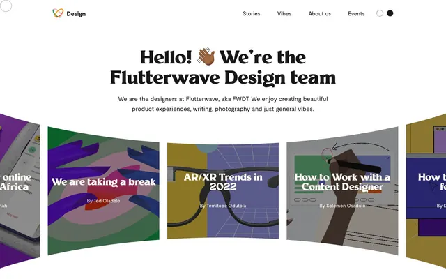
Preview image. Unlock full-res
High-contrast digital artboard
Color palette
Primary action background (buttons, certain interactive elements) – a vivid yellow that stands out against the neutral palette
Page background, primary surface for content blocks
Primary body text, borders, navigation elements. Provides strong contrast against light surfaces
Headings, prominent text, and specific text elements. This muted violet-black color adds a subtle visual richness without compromising readability
Secondary background surfaces, muted dividers, subtle card backgrounds
Tertiary background surfaces, hints of background texture
Strongest accent for text on buttons and specific icon elements, acting as a true black for maximum definition
Typography
- Weights
- 400, 500, 600, 700
- Sizes
- 12px, 14px, 16px, 18px, 20px, 22px
- Line height
- 1.18, 1.2, 1.6, 1.63
- Letter spacing
- -0.036em
- Fallback
- Inter
Primary body text, links, descriptions, and secondary headings. Its consistent tracking across sizes helps maintain a structured yet legible appearance.
- Weights
- 700, 800
- Sizes
- 32px, 60px
- Line height
- 1.2
- Letter spacing
- -0.025em at 60px, -0.013em at 32px
- Fallback
- Montserrat
Prominent headings and display text. Its bold weights and tight negative letter-spacing create a confident, assertive visual voice for key messages.
- Weights
- 400
- Sizes
- 14px, 16px
- Line height
- 1.2
- Letter spacing
- normal
- Fallback
- Roboto
Functional text for icons and buttons where space is constrained and a neutral, legible voice is required. Likely a brand-specific utility font.
Spacing & shape
Components
Background: Marigold Glow (#f5a623), Text: Eclipse (#000000). Border Radius: 0px 5px 5px 0px. Padding: 1px 6px. Type: Flutterwave, 16px, weight 400.
Background: Silver Mist (#b5b5b5) or Storm Gray opaque variations (e.g., rgba(128, 128, 128, 0.58)). Border Radius: 5px. Text: White. No padding on card itself, content is full-bleed to the edge of the card.
Background: Cloud Canvas (#fff9f1). Border Radius: 5px. Title text: Deep Ink (#12122c). Details text: Storm Gray (#171717). Image at top, text content below.
Background: Transparent (rgba(0, 0, 0, 0)), Text: Storm Gray (#171717). Border: 1px Storm Gray (#171717). Border Radius: 5px 0px 0px 5px. Padding: 20px 32px.
Guidelines
- Use Cloud Canvas (#fff9f1) as the default page background for sections, ensuring strong contrast with text.
- Apply a consistent 5px border radius to all interactive elements, cards, and input fields for a soft, unified edge treatment.
- Utilize Millik (700-800 weight) with tight letter-spacing for all primary headings, reinforcing a bold and confident tone.
- Reserve Marigold Glow (#f5a623) exclusively for primary action backgrounds, making calls-to-action highly visible.
- Maintain a clear visual hierarchy by rendering primary body text in Storm Gray (#171717) and headings in Deep Ink (#12122c), both on Cloud Canvas backgrounds.
- Avoid using highly saturated colors for large background areas; maintain a light, neutral canvas.
- Do not deviate from the specified negative letter-spacing for Millik headings, as this is a key typographic characteristic.
- Do not use Marigold Glow (#f5a623) for text or borders; it is strictly an action background color.
- Do not introduce heavy shadows or gradients; rely on color contrast and subtle surface variations for depth.
- Do not use generic system fonts; stick to Moderat, Millik, and Flutterwave for a consistent brand voice.
About this system
ShowHide
Flutterwave Design employs a high-contrast, clean canvas aesthetic, featuring bold headlines and a structured layout. The visual design emphasizes readability with dark typography on a predominantly light background, punctuated by a single vivid yellow accent for interactive elements. Imagery is abstract and often uses strong color blocking, contributing to a modern, almost digital-art feel. Components are compact and functional, supporting a dense yet organized information delivery.
The page primarily employs a max-width contained layout, likely around 1200-1400px, but with notable full-bleed sections, particularly the hero. The hero section features a prominent centered headline over a background that integrates a visually dynamic, curved carousel of content cards, creating a sense of movement and depth. Vertical rhythm is established through consistent section gaps, creating distinct content blocks. Content arrangement often utilizes a 3-column card grid for 'Latest Stories' and 'Vibes' sections, which balances visual information. Navigation is a simple top bar with left-aligned branding and right-aligned text links. Overall, the layout feels spacious yet structured, using strong visual sections to guide the user.
Imagery primarily consists of abstract, often colorful illustrations with strong graphic qualities. These visuals use broad color blocking and clean lines, creating a digital-art aesthetic rather than realistic depictions. Photography, if present, is usually tightly cropped and product-focused without lifestyle context. Icons are typically solid or filled, with a medium stroke weight where outlines exist, often using neutral colors or subtle brand accents. The role of imagery is decorative and atmospheric, contributing heavily to the brand's visual identity, often serving as visual anchors within content blocks or as hero elements. Density is moderate, with images typically contained within defined areas, complementing text rather than dominating the layout.
Reminiscent of Stripe, Figma, Linear, Vercel.
# Flutterwave Design — Style Reference
> High-contrast digital artboard

**Theme:** light

**Site:** https://www.flutterwave.design

Flutterwave Design employs a high-contrast, clean canvas aesthetic, featuring bold headlines and a structured layout. The visual design emphasizes readability with dark typography on a predominantly light background, punctuated by a single vivid yellow accent for interactive elements. Imagery is abstract and often uses strong color blocking, contributing to a modern, almost digital-art feel. Components are compact and functional, supporting a dense yet organized information delivery.

## Tokens — Colors

| Name | Value | Token | Role |
|------|------|------|------|
| Marigold Glow | `#f5a623` | `--color-marigold-glow` | Primary action background (buttons, certain interactive elements) – a vivid yellow that stands out against the neutral palette |
| Cloud Canvas | `#fff9f1` | `--color-cloud-canvas` | Page background, primary surface for content blocks |
| Storm Gray | `#171717` | `--color-storm-gray` | Primary body text, borders, navigation elements. Provides strong contrast against light surfaces |
| Deep Ink | `#12122c` | `--color-deep-ink` | Headings, prominent text, and specific text elements. This muted violet-black color adds a subtle visual richness without compromising readability |
| Silver Mist | `#b5b5b5` | `--color-silver-mist` | Secondary background surfaces, muted dividers, subtle card backgrounds |
| Ash Stone | `#8b8b8b` | `--color-ash-stone` | Tertiary background surfaces, hints of background texture |
| Eclipse | `#000000` | `--color-eclipse` | Strongest accent for text on buttons and specific icon elements, acting as a true black for maximum definition |

## Tokens — Typography

### Moderat
- **Substitute:** Inter
- **Weights:** 400, 500, 600, 700
- **Sizes:** 12px, 14px, 16px, 18px, 20px, 22px
- **Line height:** 1.18, 1.2, 1.6, 1.63
- **Letter spacing:** -0.036em
- **Role:** Primary body text, links, descriptions, and secondary headings. Its consistent tracking across sizes helps maintain a structured yet legible appearance.

### Millik
- **Substitute:** Montserrat
- **Weights:** 700, 800
- **Sizes:** 32px, 60px
- **Line height:** 1.2
- **Letter spacing:** -0.025em at 60px, -0.013em at 32px
- **Role:** Prominent headings and display text. Its bold weights and tight negative letter-spacing create a confident, assertive visual voice for key messages.

### Flutterwave
- **Substitute:** Roboto
- **Weights:** 400
- **Sizes:** 14px, 16px
- **Line height:** 1.2
- **Letter spacing:** normal
- **Role:** Functional text for icons and buttons where space is constrained and a neutral, legible voice is required. Likely a brand-specific utility font.

## Tokens — Type Scale

Major Third (1.25) from 16px base.

| Role | Size | Line height | Letter spacing |
|------|------|------|------|
| caption | 12px | 1.18 | -0.432px |
| body-sm | 14px | 1.2 | -0.504px |
| body | 16px | 1.6 | -0.576px |
| subheading | 18px | 1.63 | -0.648px |
| heading-sm | 20px | 1.2 | -0.72px |
| heading | 22px | 1.2 | -0.792px |
| heading-lg | 32px | 1.2 | -0.416px |
| display | 60px | 1.2 | -0.78px |

## Tokens — Spacing

- **Section gap:** 60px
- **Card padding:** 20px
- **Element gap:** 10px

## Tokens — Radius

- **Buttons:** 5px
- **Inputs:** 5px
- **Cards:** 5px
- **other:** 5px

## Layout

The page primarily employs a max-width contained layout, likely around 1200-1400px, but with notable full-bleed sections, particularly the hero. The hero section features a prominent centered headline over a background that integrates a visually dynamic, curved carousel of content cards, creating a sense of movement and depth. Vertical rhythm is established through consistent section gaps, creating distinct content blocks. Content arrangement often utilizes a 3-column card grid for 'Latest Stories' and 'Vibes' sections, which balances visual information. Navigation is a simple top bar with left-aligned branding and right-aligned text links. Overall, the layout feels spacious yet structured, using strong visual sections to guide the user.

## Imagery

Imagery primarily consists of abstract, often colorful illustrations with strong graphic qualities. These visuals use broad color blocking and clean lines, creating a digital-art aesthetic rather than realistic depictions. Photography, if present, is usually tightly cropped and product-focused without lifestyle context. Icons are typically solid or filled, with a medium stroke weight where outlines exist, often using neutral colors or subtle brand accents. The role of imagery is decorative and atmospheric, contributing heavily to the brand's visual identity, often serving as visual anchors within content blocks or as hero elements. Density is moderate, with images typically contained within defined areas, complementing text rather than dominating the layout.

## Components

### Subscribe Button
*Primary call-to-action button, featuring a distinct compound radius.*

Background: Marigold Glow (#f5a623), Text: Eclipse (#000000). Border Radius: 0px 5px 5px 0px. Padding: 1px 6px. Type: Flutterwave, 16px, weight 400.

### Article Card (Curved Carousel)
*Display individual articles within a visually engaging, curved hero carousel.*

Background: Silver Mist (#b5b5b5) or Storm Gray opaque variations (e.g., rgba(128, 128, 128, 0.58)). Border Radius: 5px. Text: White. No padding on card itself, content is full-bleed to the edge of the card.

### Standard Article Card
*Display individual articles in a grid layout, focusing on visual clarity and content hierarchy.*

Background: Cloud Canvas (#fff9f1). Border Radius: 5px. Title text: Deep Ink (#12122c). Details text: Storm Gray (#171717). Image at top, text content below.

### Subscription Input Field
*User input field for email subscriptions, paired with a button.*

Background: Transparent (rgba(0, 0, 0, 0)), Text: Storm Gray (#171717). Border: 1px Storm Gray (#171717). Border Radius: 5px 0px 0px 5px. Padding: 20px 32px.

## Guidelines

### Do

- Use Cloud Canvas (#fff9f1) as the default page background for sections, ensuring strong contrast with text.
- Apply a consistent 5px border radius to all interactive elements, cards, and input fields for a soft, unified edge treatment.
- Utilize Millik (700-800 weight) with tight letter-spacing for all primary headings, reinforcing a bold and confident tone.
- Reserve Marigold Glow (#f5a623) exclusively for primary action backgrounds, making calls-to-action highly visible.
- Maintain a clear visual hierarchy by rendering primary body text in Storm Gray (#171717) and headings in Deep Ink (#12122c), both on Cloud Canvas backgrounds.

### Don't

- Avoid using highly saturated colors for large background areas; maintain a light, neutral canvas.
- Do not deviate from the specified negative letter-spacing for Millik headings, as this is a key typographic characteristic.
- Do not use Marigold Glow (#f5a623) for text or borders; it is strictly an action background color.
- Do not introduce heavy shadows or gradients; rely on color contrast and subtle surface variations for depth.
- Do not use generic system fonts; stick to Moderat, Millik, and Flutterwave for a consistent brand voice.

## Agent Prompt Guide

Quick Color Reference:
text: #171717
background: #fff9f1
border: #171717
accent: #12122c
primary action: #f5a623 (filled action)

Example Component Prompts:
1. Create a hero section: Cloud Canvas (#fff9f1) background. Headline 'Hello! 👋🏾 We’re the Flutterwave Design team' in Millik, 60px, weight 800, Deep Ink (#12122c), letter-spacing -0.78px. Body text 'We are the designers at Flutterwave...' in Moderat, 18px, weight 400, Storm Gray (#171717), letter-spacing -0.648px.
2. Create a 'Subscribe' input block: Input field with transparent background rgba(0,0,0,0), Storm Gray (#171717) text at 16px Moderat, 1px Storm Gray (#171717) border, 5px 0px 0px 5px radius, 20px 32px padding. Paired with a button right next to it: Marigold Glow (#f5a623) background, Eclipse (#000000) text for 'Subscribe', 0px 5px 5px 0px radius, 1px 6px padding, Flutterwave font.
3. Create a standard article card: Cloud Canvas (#fff9f1) prominent background. Outer border radius 5px. Headline in Deep Ink (#12122c) at 22px Moderat, weight 600. Helper text 'By Author Name' below in Storm Gray (#171717) at 14px Moderat, weight 400.
More like this









Keep what you find
A free account saves references to boards and can send you a weekly email of picks based on what you save.
To see every result, go Pro.