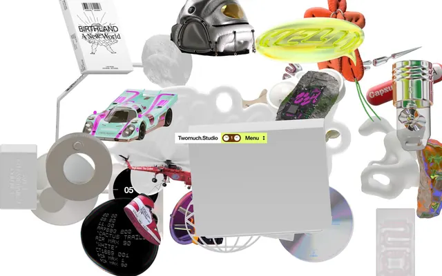
Preview image. Unlock full-res
Digital Art Assemblage
Color palette
Interactive highlights, active states, accent backgrounds for attention-grabbing elements
Accent backgrounds for specific decorative elements or product details, subtle fill color for intricate graphic components
Primary page background, elevated card surfaces, clean text base
Container backgrounds, secondary surface fills, default button states
Hairline borders, subtle dividers, inactive states
Muted button states, inactive interactive borders
Primary text, headings, icons, strong UI elements for high contrast
Typography
- Weights
- 500
- Sizes
- 12px, 14px, 16px, 18px, 20px, 22px
- Line height
- 0.9, 1, 1.05, 1.33, 1.43
- Letter spacing
- -0.0400em for 22px, -0.0340em for 20px, -0.0300em for 18px, -0.0270em for 16px, -0.0240em for 14px, and normal for 12px
- Fallback
- Space Grotesk
All textual content, from body to headlines. Its compact, confident structure provides clarity amidst the visual chaos, with tighter tracking at larger sizes to maintain density.
Spacing & shape
Components
backgroundColor: #f4f4f4, color: #000000, borderRadius: 0px, padding: 0px.
backgroundColor: #d9d9d9, color: #000000, borderRadius: 0px, padding: 0px.
backgroundColor: rgba(0, 0, 0, 0), color: #000000, borderRadius: 0px, padding: 8px.
backgroundColor: #ffffff, color: #000000, borderRadius: 0px, padding: 6px 8px.
backgroundColor: #e2ff70, padding: 4px, borderRadius: 9999px. Text color: #000000.
backgroundColor: #ffffff, border: 1px solid #e5e7eb, borderRadius: 0px, padding: 8px.
color: #000000, fontSize: 16px, borderBottom: 1px solid #e5e7eb on hover.
Guidelines
- Prioritize 'Ink Black' (#000000) for all primary text and headings against lighter backgrounds to maintain high contrast and legibility.
- Use 'Canvas White' (#ffffff) as the default background for most content areas, providing a neutral base for complex visuals.
- Apply 'Border Ash' (#e5e7eb) for all hairline borders and subtle dividers to define content areas without adding heavy visual weight.
- Utilize 'Digital Lime' (#e2ff70) exclusively for interactive elements like active navigation items, menu indicators, and 'Shop' buttons, ensuring clear affordance.
- Maintain a compact density using a 4px base unit for all internal component spacing and 8px for element gaps to keep information tight.
- Employ ABCMonumentGrotesk (or Space Grotesk) at weight 500 for all typography, with specific letter-spacing adjustments as defined in the type scale to control visual density.
- Design all interactive buttons and cards with a 0px border radius, except for small circular elements which get a 9999px radius, creating a stark, functional aesthetic.
- Do not introduce additional saturated colors beyond 'Digital Lime' (#e2ff70) or 'Clay Earth' (#68340e) into the UI, as the visual style relies on minimal accentuation.
- Avoid using drop shadows or heavy elevation; surfaces should remain flat or defined by subtle borders.
- Do not use generic typography; all text must adhere to the specified ABCMonumentGrotesk (or Space Grotesk) profiles to maintain the system's precise, dense feel.
- Steer clear of rounded corners on primary content cards or buttons; maintain a sharp, angular aesthetic for structural elements.
- Do not include large, decorative imagery that competes with the layered product visuals; imagery should serve content or clear brand identity.
- Avoid open, airy layouts. The design system is dense and uses tight spacing; larger gaps should be intentional and rare.
- Do not use highly saturated hero banners that detract from the visual 'collage'; backgrounds should remain largely neutral or monochromatic.
About this system
ShowHide
TWOMUCH.STUDIO embraces a digital collage aesthetic, leveraging a chaotic white canvas heavily populated with overlapping 3D objects, renders, and varied media. The UI elements are starkly minimalist and functional: monochrome, unadorned typography, and rectangular card surfaces, serving as stoic anchors within the visual deluge. The system emphasizes clear delineation of interactive elements through a single vivid lime accent, creating functional clarity amidst the visual noise.
The page maintains a compact, contained layout with a maximum width of 300px, heavily featuring a dense, overlapping arrangement of visual content. The hero section is characterized by a central brand identity and menu within a light background, surrounded by a chaotic, full-bleed assemblage of 3D objects and digital art. Content sections flow seamlessly with minimal vertical gaps, creating an information-dense feel. Interaction points are small, discrete textual or numerical buttons positioned within the visual noise. The overall rhythm is one of visual saturation within a constrained UI, with no distinct grid patterns for content organization beyond the overlapping elements.
The site's visual language is characterized by an eclectic mix of 3D renders, product photography with a studio-like cleanliness, and abstract graphics. Imagery is typically raw, unmasked, and presented as overlapping elements on a white canvas, creating a digital collage effect. Product shots are contained and focused on the object itself, rather than lifestyle context. Icons, where present, appear as monochrome text or simple outlines. The role of imagery is primarily decorative atmosphere and product showcase, with a high density that makes visuals often dominant over text.
Reminiscent of Off-White (website aesthetic), Gucci (experimental digital campaigns), Balenciaga (digital presentations), Studio VØR.
# TWOMUCH.STUDIO — Style Reference
> Digital Art Assemblage

**Theme:** light

**Site:** https://twomuch.studio

TWOMUCH.STUDIO embraces a digital collage aesthetic, leveraging a chaotic white canvas heavily populated with overlapping 3D objects, renders, and varied media. The UI elements are starkly minimalist and functional: monochrome, unadorned typography, and rectangular card surfaces, serving as stoic anchors within the visual deluge. The system emphasizes clear delineation of interactive elements through a single vivid lime accent, creating functional clarity amidst the visual noise.

## Tokens — Colors

| Name | Value | Token | Role |
|------|------|------|------|
| Digital Lime | `#e2ff70` | `--color-digital-lime` | Interactive highlights, active states, accent backgrounds for attention-grabbing elements |
| Clay Earth | `#68340e` | `--color-clay-earth` | Accent backgrounds for specific decorative elements or product details, subtle fill color for intricate graphic components |
| Canvas White | `#ffffff` | `--color-canvas-white` | Primary page background, elevated card surfaces, clean text base |
| Subtle Gray | `#f4f4f4` | `--color-subtle-gray` | Container backgrounds, secondary surface fills, default button states |
| Border Ash | `#e5e7eb` | `--color-border-ash` | Hairline borders, subtle dividers, inactive states |
| Warm Gray | `#dedede` | `--color-warm-gray` | Muted button states, inactive interactive borders |
| Ink Black | `#000000` | `--color-ink-black` | Primary text, headings, icons, strong UI elements for high contrast |

## Tokens — Typography

### ABCMonumentGrotesk
- **Substitute:** Space Grotesk
- **Weights:** 500
- **Sizes:** 12px, 14px, 16px, 18px, 20px, 22px
- **Line height:** 0.9, 1, 1.05, 1.33, 1.43
- **Letter spacing:** -0.0400em for 22px, -0.0340em for 20px, -0.0300em for 18px, -0.0270em for 16px, -0.0240em for 14px, and normal for 12px
- **Role:** All textual content, from body to headlines. Its compact, confident structure provides clarity amidst the visual chaos, with tighter tracking at larger sizes to maintain density.

## Tokens — Type Scale

Major Second (1.125) from 16px base.

| Role | Size | Line height | Letter spacing |
|------|------|------|------|
| caption | 12px | 1.43 | — |
| body-sm | 14px | 1.43 | -0.34px |
| body | 16px | 1.33 | -0.43px |
| subheading | 18px | 1.05 | -0.54px |
| heading | 20px | 1 | -0.68px |
| display | 22px | 0.9 | -0.88px |

## Tokens — Spacing

- **Max width:** 300px
- **Card padding:** 8px
- **Element gap:** 4px

## Tokens — Radius

- **Default:** 0px
- **elements:** 4px
- **pill:** 9999px

## Layout

The page maintains a compact, contained layout with a maximum width of 300px, heavily featuring a dense, overlapping arrangement of visual content. The hero section is characterized by a central brand identity and menu within a light background, surrounded by a chaotic, full-bleed assemblage of 3D objects and digital art. Content sections flow seamlessly with minimal vertical gaps, creating an information-dense feel. Interaction points are small, discrete textual or numerical buttons positioned within the visual noise. The overall rhythm is one of visual saturation within a constrained UI, with no distinct grid patterns for content organization beyond the overlapping elements.

## Imagery

The site's visual language is characterized by an eclectic mix of 3D renders, product photography with a studio-like cleanliness, and abstract graphics. Imagery is typically raw, unmasked, and presented as overlapping elements on a white canvas, creating a digital collage effect. Product shots are contained and focused on the object itself, rather than lifestyle context. Icons, where present, appear as monochrome text or simple outlines. The role of imagery is primarily decorative atmosphere and product showcase, with a high density that makes visuals often dominant over text.

## Components

### Default Button
*Informational or secondary action buttons*

backgroundColor: #f4f4f4, color: #000000, borderRadius: 0px, padding: 0px.

### Hover Button
*Interacted state for informational buttons*

backgroundColor: #d9d9d9, color: #000000, borderRadius: 0px, padding: 0px.

### Ghost Button
*Minimalist interactive elements, often for pagination or navigation*

backgroundColor: rgba(0, 0, 0, 0), color: #000000, borderRadius: 0px, padding: 8px.

### Accent Button
*Small, contained informational buttons often for menu or numbers*

backgroundColor: #ffffff, color: #000000, borderRadius: 0px, padding: 6px 8px.

### Menu Box
*Interactive menu indicator, often containing a numerical count*

backgroundColor: #e2ff70, padding: 4px, borderRadius: 9999px. Text color: #000000.

### Card Surface
*Content container for project details or informational blocks*

backgroundColor: #ffffff, border: 1px solid #e5e7eb, borderRadius: 0px, padding: 8px.

### Interactive Link
*Navigational or primary links*

color: #000000, fontSize: 16px, borderBottom: 1px solid #e5e7eb on hover.

## Guidelines

### Do

- Prioritize 'Ink Black' (#000000) for all primary text and headings against lighter backgrounds to maintain high contrast and legibility.
- Use 'Canvas White' (#ffffff) as the default background for most content areas, providing a neutral base for complex visuals.
- Apply 'Border Ash' (#e5e7eb) for all hairline borders and subtle dividers to define content areas without adding heavy visual weight.
- Utilize 'Digital Lime' (#e2ff70) exclusively for interactive elements like active navigation items, menu indicators, and 'Shop' buttons, ensuring clear affordance.
- Maintain a compact density using a 4px base unit for all internal component spacing and 8px for element gaps to keep information tight.
- Employ ABCMonumentGrotesk (or Space Grotesk) at weight 500 for all typography, with specific letter-spacing adjustments as defined in the type scale to control visual density.
- Design all interactive buttons and cards with a 0px border radius, except for small circular elements which get a 9999px radius, creating a stark, functional aesthetic.

### Don't

- Do not introduce additional saturated colors beyond 'Digital Lime' (#e2ff70) or 'Clay Earth' (#68340e) into the UI, as the visual style relies on minimal accentuation.
- Avoid using drop shadows or heavy elevation; surfaces should remain flat or defined by subtle borders.
- Do not use generic typography; all text must adhere to the specified ABCMonumentGrotesk (or Space Grotesk) profiles to maintain the system's precise, dense feel.
- Steer clear of rounded corners on primary content cards or buttons; maintain a sharp, angular aesthetic for structural elements.
- Do not include large, decorative imagery that competes with the layered product visuals; imagery should serve content or clear brand identity.
- Avoid open, airy layouts. The design system is dense and uses tight spacing; larger gaps should be intentional and rare.
- Do not use highly saturated hero banners that detract from the visual 'collage'; backgrounds should remain largely neutral or monochromatic.

## Agent Prompt Guide

**Quick Color Reference**
text: #000000
background: #ffffff
border: #e5e7eb
accent: #e2ff70
primary action: #e2ff70 (filled action)

**3-5 Example Component Prompts**
1. Create a `Digital Lime` menu box: `backgroundColor: #e2ff70, padding: 4px, borderRadius: 9999px, color: #000000, fontFamily: ABCMonumentGrotesk, weight: 500, size: 16px, letterSpacing: -0.43px`.
2. Create a `Default Button` with 'More Info' text: `backgroundColor: #f4f4f4, color: #000000, borderRadius: 0px, padding: 0px, fontFamily: ABCMonumentGrotesk, weight: 500, size: 16px, letterSpacing: -0.43px`.
3. Create a `Card Surface` for a project detail: `backgroundColor: #ffffff, border: 1px solid #e5e7eb, borderRadius: 0px, padding: 8px, color: #000000, fontFamily: ABCMonumentGrotesk, weight: 500` for content.
More like this









Keep what you find
A free account saves references to boards and can send you a weekly email of picks based on what you save.
To see every result, go Pro.