Preview image. Unlock full-res
Deep space console
Color palette
Brand accent color for links, borders of interactive elements, and key highlights. Creates visual attention against the dark neutrals
Decorative gradient for headers or significant visual elements
Primary page background, base surface for links, darkest tone in the UI
Default button background, card backgrounds, and slightly elevated surfaces
Input borders, card borders, and subtle separating lines
Outlined button borders, secondary dividers
Faded secondary text, ghost button text, decorative icons
Primary text color for body copy, interactive states for text elements, and default borders
Navigation text, crisp text in low-contrast areas, button hover states, icon strokes
Headline text, high-contrast text elements, input text; Subtle background texture or element fill for cards or graphic elements
Icon fills in certain contexts, part of shadow definitions
Typography
- Weights
- 400, 500, 700
- Sizes
- 10px, 12px, 13px, 14px, 16px, 20px, 28px, 36px
- Line height
- 1, 1.08, 1.17, 1.2, 1.45, 1.5, 1.55, 1.6, 1.85
- Letter spacing
- -0.01
- Fallback
- Inter
Versatile text font used for body copy, navigation, buttons, and most UI elements. Its compact metrics and varied weights provide clarity and efficiency in a data-rich environment.
- Weights
- 500, 700
- Sizes
- 40px, 53px
- Line height
- 1.08, 1.1
- Letter spacing
- -0.01
- Fallback
- Inter
Used for prominent page headlines and key visual statements. Its display-specific optimizations enhance readability and visual impact at larger sizes, maintaining a precise, engineering-like aesthetic.
Spacing & shape
Elevation
Components
Filled button for primary actions. Background: Graphite Panel (#151621), Text: Ash Text (#939db8). Padding: 12px vertical, 24px horizontal. Border radius: 9999px. No shadow.
Ghost button for secondary actions. Background: transparent. Text: Muted Ash (#646e87). Padding: 8px vertical, 6px horizontal. No border or radius defined, implies square edges unless contextually inherited.
Small, rounded ghost button with transparent background, Cloud Whisper (#c9d3ee) text, and a 10px border radius. Padding: 0px vertical, 24px horizontal. No shadow.
Outlined button often used for accent links or calls to action. Background: transparent. Border: 1px solid Focus Violet (#98a4f7). Text: Focus Violet (#98a4f7). Padding: 12px vertical, 24px horizontal. Border radius: 9999px.
Standard content card. Background: Graphite Panel (#151621). Border radius: 16px. Padding: 20px on all sides. No shadow.
Input field with a subtle dark background and white text. Background: rgba(0.594223, 0.00140271, -0.0566696, 0.1) which is near-black with 10% opacity. Border: 1px solid Steel Overlay (#1f2433). Text: Pure White (#ffffff). Border radius: 12px. Padding: 0px vertical, 20px horizontal.
Guidelines
- Maintain a clear visual hierarchy by layering neutral background colors: Midnight Abyss (#0f101a) for base, Graphite Panel (#151621) for cards, and Steel Overlay (#1f2433) for borders.
- Use Focus Violet (#98a4f7) sparingly and strategically for brand accents, links, and active states to guide user attention within the dark UI.
- Adopt the rounded, pill-shaped '9999px' border radius for all actionable buttons to ensure a consistent, friendly form.
- Apply Helvetica Now Text font with a -0.01em letter-spacing consistently across all body and UI elements for a compact, technical feel.
- Center-align primary headlines and section titles, especially in full-width hero sections, to create a strong focal point.
- Utilize a base spacing unit of 4px to maintain consistent density and alignment across all components and layouts.
- Implement the linear blue-violet gradient (linear-gradient(353deg, rgb(91, 99, 211) 17.51%, rgb(124, 135, 247) 183.08%)) only for major decorative elements like hero backgrounds or section separators to prevent visual noise.
- Avoid using saturated chromatic colors other than Focus Violet (#98a4f7) unless those colors are explicitly for semantic status indicators.
- Do not introduce strong drop shadows; rely on subtle inset shadows (rgba(255, 255, 255, 0.25) 0px 1px 3px 0px inset) or border differences for elevation.
- Do not deviate from the established type scale; maintain the precise letter-spacing and line heights for a consistent typographic rhythm.
- Do not use sharp 0px border radii on interactive elements or cards; the system prioritizes soft, rounded shapes.
- Avoid large, impactful photos or illustrations that break the product's dark, UI-focused aesthetic; prioritize product screenshots and abstract visuals.
- Do not use generic, default blue link colors; ensure all links are styled with Focus Violet (#98a4f7) or Cloud Whisper (#c9d3ee) for consistent branding.
- Refrain from using complex, multi-color decorative gradients casually; reserve them for impactful moments where their presence enhances, not distracts.
About this system
ShowHide
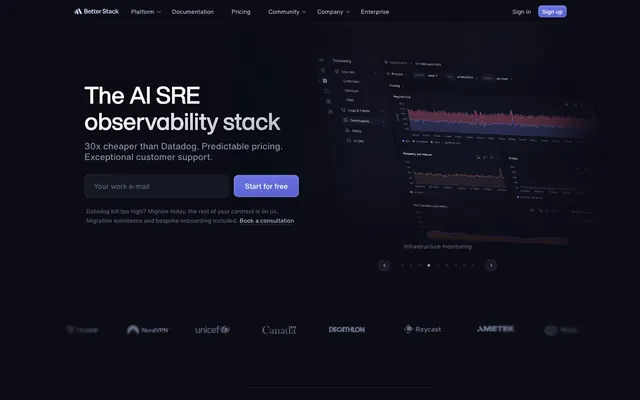
Better Stack employs a 'deep space console' aesthetic, built on a dark, near-black canvas layered with subtly differentiated dark gray surfaces. Typography is compact and precise, maintaining excellent contrast. A single vivid violet hue provides functional accents for interactive elements and brand highlights, creating moments of focus within the muted interface. Components are lightweight with large border radii, suggesting touch-friendly forms on a data-dense, technical interface.
The page maintains a max-width of 1320px, with content consistently centered. The hero section is full-bleed with a dark background, featuring a prominent, centered headline and a call to action immediately below. Subsequent sections typically follow a 2-column or text-left/image-right alternating pattern. Vertical rhythm is established by consistent section gaps, with elements frequently grouped into cards that receive 20px of padding. Navigation is a persistent top bar, sticky on scroll, with clear text links.
Imagery is functional and product-focused, primarily consisting of dark-themed UI screenshots that showcase the Better Stack platform. These embeds are contained within cards or placed alongside text. Iconography is minimalist, often monochrome or in Cloud Whisper (#c9d3ee), with clear, outlined styles, appearing at a small to medium stroke weight. No full-bleed photography or complex illustrations are present. The density of imagery is low, with visuals serving explanatory roles rather than decorative atmosphere, letting the UI and typography dominate.
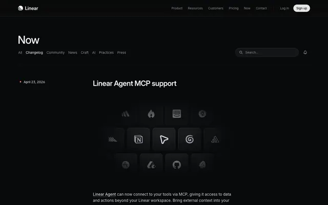
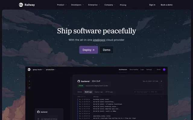
Reminiscent of Linear, Vercel, Supabase, Stripe (dark mode).
# Better Stack — Style Reference
> Deep space console

**Theme:** dark

**Site:** https://betterstack.com

Better Stack employs a 'deep space console' aesthetic, built on a dark, near-black canvas layered with subtly differentiated dark gray surfaces. Typography is compact and precise, maintaining excellent contrast. A single vivid violet hue provides functional accents for interactive elements and brand highlights, creating moments of focus within the muted interface. Components are lightweight with large border radii, suggesting touch-friendly forms on a data-dense, technical interface.

## Tokens — Colors

| Name | Value | Token | Role |
|------|------|------|------|
| Focus Violet | `#98a4f7` | `--color-focus-violet` | Brand accent color for links, borders of interactive elements, and key highlights. Creates visual attention against the dark neutrals |
| Blue Violet Gradient | `#5b63d3` | `--color-blue-violet-gradient` | Decorative gradient for headers or significant visual elements |
| Midnight Abyss | `#0f101a` | `--color-midnight-abyss` | Primary page background, base surface for links, darkest tone in the UI |
| Graphite Panel | `#151621` | `--color-graphite-panel` | Default button background, card backgrounds, and slightly elevated surfaces |
| Steel Overlay | `#1f2433` | `--color-steel-overlay` | Input borders, card borders, and subtle separating lines |
| Faded Steel | `#262935` | `--color-faded-steel` | Outlined button borders, secondary dividers |
| Muted Ash | `#646e87` | `--color-muted-ash` | Faded secondary text, ghost button text, decorative icons |
| Ash Text | `#939db8` | `--color-ash-text` | Primary text color for body copy, interactive states for text elements, and default borders |
| Cloud Whisper | `#c9d3ee` | `--color-cloud-whisper` | Navigation text, crisp text in low-contrast areas, button hover states, icon strokes |
| Pure White | `#ffffff` | `--color-pure-white` | Headline text, high-contrast text elements, input text; Subtle background texture or element fill for cards or graphic elements |
| Zero Black | `#000000` | `--color-zero-black` | Icon fills in certain contexts, part of shadow definitions |

## Tokens — Typography

### Helvetica Now Text
- **Substitute:** Inter
- **Weights:** 400, 500, 700
- **Sizes:** 10px, 12px, 13px, 14px, 16px, 20px, 28px, 36px
- **Line height:** 1, 1.08, 1.17, 1.2, 1.45, 1.5, 1.55, 1.6, 1.85
- **Letter spacing:** -0.01
- **Role:** Versatile text font used for body copy, navigation, buttons, and most UI elements. Its compact metrics and varied weights provide clarity and efficiency in a data-rich environment.

### Helvetica Now Display
- **Substitute:** Inter
- **Weights:** 500, 700
- **Sizes:** 40px, 53px
- **Line height:** 1.08, 1.1
- **Letter spacing:** -0.01
- **Role:** Used for prominent page headlines and key visual statements. Its display-specific optimizations enhance readability and visual impact at larger sizes, maintaining a precise, engineering-like aesthetic.

## Tokens — Type Scale

Perfect Fourth (1.333) from 14px base.

| Role | Size | Line height | Letter spacing |
|------|------|------|------|
| caption | 10px | 1.5 | — |
| body | 14px | 1.5 | — |
| body-lg | 16px | 1.6 | — |
| subheading | 20px | 1.55 | -0.2px |
| heading | 28px | 1.17 | -0.28px |
| heading-lg | 36px | 1.2 | -0.36px |
| display | 53px | 1.08 | -0.53px |

## Tokens — Spacing

- **Max width:** 1320px
- **Section gap:** 40px
- **Card padding:** 20px
- **Element gap:** 20px

## Tokens — Radius

- **General:** 10px
- **Buttons:** 9999px
- **Inputs:** 10px
- **Cards:** 16px
- **dialogs:** 16px

## Tokens — Elevation

- **Nav, Button:** `inset 0px 1px 3px 0px rgba(255, 255, 255, 0.25)`

## Layout

The page maintains a max-width of 1320px, with content consistently centered. The hero section is full-bleed with a dark background, featuring a prominent, centered headline and a call to action immediately below. Subsequent sections typically follow a 2-column or text-left/image-right alternating pattern. Vertical rhythm is established by consistent section gaps, with elements frequently grouped into cards that receive 20px of padding. Navigation is a persistent top bar, sticky on scroll, with clear text links.

## Imagery

Imagery is functional and product-focused, primarily consisting of dark-themed UI screenshots that showcase the Better Stack platform. These embeds are contained within cards or placed alongside text. Iconography is minimalist, often monochrome or in Cloud Whisper (#c9d3ee), with clear, outlined styles, appearing at a small to medium stroke weight. No full-bleed photography or complex illustrations are present. The density of imagery is low, with visuals serving explanatory roles rather than decorative atmosphere, letting the UI and typography dominate.

## Components

### Primary Filled Button
*Button*

Filled button for primary actions. Background: Graphite Panel (#151621), Text: Ash Text (#939db8). Padding: 12px vertical, 24px horizontal. Border radius: 9999px. No shadow.

### Ghost Button
*Button*

Ghost button for secondary actions. Background: transparent. Text: Muted Ash (#646e87). Padding: 8px vertical, 6px horizontal. No border or radius defined, implies square edges unless contextually inherited.

### Small Pill Button
*Button*

Small, rounded ghost button with transparent background, Cloud Whisper (#c9d3ee) text, and a 10px border radius. Padding: 0px vertical, 24px horizontal. No shadow.

### Accent Outlined Button
*Button*

Outlined button often used for accent links or calls to action. Background: transparent. Border: 1px solid Focus Violet (#98a4f7). Text: Focus Violet (#98a4f7). Padding: 12px vertical, 24px horizontal. Border radius: 9999px.

### Informative Card
*Card*

Standard content card. Background: Graphite Panel (#151621). Border radius: 16px. Padding: 20px on all sides. No shadow.

### Input Field
*Input*

Input field with a subtle dark background and white text. Background: rgba(0.594223, 0.00140271, -0.0566696, 0.1) which is near-black with 10% opacity. Border: 1px solid Steel Overlay (#1f2433). Text: Pure White (#ffffff). Border radius: 12px. Padding: 0px vertical, 20px horizontal.

## Guidelines

### Do

- Maintain a clear visual hierarchy by layering neutral background colors: Midnight Abyss (#0f101a) for base, Graphite Panel (#151621) for cards, and Steel Overlay (#1f2433) for borders.
- Use Focus Violet (#98a4f7) sparingly and strategically for brand accents, links, and active states to guide user attention within the dark UI.
- Adopt the rounded, pill-shaped '9999px' border radius for all actionable buttons to ensure a consistent, friendly form.
- Apply Helvetica Now Text font with a -0.01em letter-spacing consistently across all body and UI elements for a compact, technical feel.
- Center-align primary headlines and section titles, especially in full-width hero sections, to create a strong focal point.
- Utilize a base spacing unit of 4px to maintain consistent density and alignment across all components and layouts.
- Implement the linear blue-violet gradient (linear-gradient(353deg, rgb(91, 99, 211) 17.51%, rgb(124, 135, 247) 183.08%)) only for major decorative elements like hero backgrounds or section separators to prevent visual noise.

### Don't

- Avoid using saturated chromatic colors other than Focus Violet (#98a4f7) unless those colors are explicitly for semantic status indicators.
- Do not introduce strong drop shadows; rely on subtle inset shadows (rgba(255, 255, 255, 0.25) 0px 1px 3px 0px inset) or border differences for elevation.
- Do not deviate from the established type scale; maintain the precise letter-spacing and line heights for a consistent typographic rhythm.
- Do not use sharp 0px border radii on interactive elements or cards; the system prioritizes soft, rounded shapes.
- Avoid large, impactful photos or illustrations that break the product's dark, UI-focused aesthetic; prioritize product screenshots and abstract visuals.
- Do not use generic, default blue link colors; ensure all links are styled with Focus Violet (#98a4f7) or Cloud Whisper (#c9d3ee) for consistent branding.
- Refrain from using complex, multi-color decorative gradients casually; reserve them for impactful moments where their presence enhances, not distracts.

## Agent Prompt Guide

Quick Color Reference:
text: #939db8
background: #0f101a
border: #1f2433
accent: #98a4f7
primary action: #151621 (filled action)

Example Component Prompts:
1. Create a Primary Action Button: #151621 background, #ffffff text, 9999px radius, compact pill padding. Use this filled treatment for the main CTA.
2. Design an Informative Card: background Graphite Panel (#151621), 16px border radius, 20px padding. Inside, place a heading (Helvetica Now Display, 40px, weight 500, Pure White (#ffffff)) and body text (Helvetica Now Text, 14px, weight 400, Ash Text (#939db8)).
3. Render an Input Field: background rgba(0.594223, 0.00140271, -0.0566696, 0.1), border 1px solid Steel Overlay (#1f2433), text Pure White (#ffffff), 12px border radius, 0px vertical 20px horizontal padding.
More like this





Keep what you find
A free account saves references to boards and can send you a weekly email of picks based on what you save.
To see every result, go Pro.