Preview image. Unlock full-res
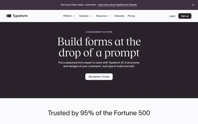
Publishing house meets product dashboard — serif headlines borrowed from a literary journal, UI chrome stripped to bare minimum so the type can own every screen.
Color palette
Primary text, hero background, CTA button fill — the near-black with a warm violet undertone prevents the harshness of pure black while maintaining AAA contrast on cream
Hero section background variant, elevated surface in dark contexts
Section eyebrow labels ('AI ENGAGEMENT PLATFORM', 'DATA COLLECTION', 'INTEGRATIONS') — saturated purple used exclusively for categorical labeling, never on interactive elements
Subtle purple tints in light contexts, decorative highlights
Page background, light section backgrounds, reversed text on dark surfaces
Card surfaces, integration logo pills, elevated elements in light sections
Secondary text, ghost button borders and labels
Dividers, subtle borders in dark contexts
Secondary body text, footnotes
Placeholder text, disabled states
Light borders, dividers in cream backgrounds
Alternating section backgrounds, subtle surface differentiation from cream canvas
Typography
- Weights
- 400
- Sizes
- 64px, 72px, 80px
- Line height
- 1
- Letter spacing
- -1.98px at 64px, -1.01px at 72px, -0.96px at 80px
- Fallback
- Playfair Display, Freight Display Pro
Display and hero headlines exclusively. A classical editorial serif at weight 400 — most SaaS sites use a geometric sans at 700+ for headlines; Tobias at regular weight makes Typeform's headings feel authored, not announced. The tight negative tracking (-1.98px at 64px, -2.24px at 72px, -2.48px at 80px) is essential — without it, the serif reads loose and archaic.
- Weights
- 350
- Sizes
- 14px, 16px, 20px
- Line height
- 1.1
- Fallback
- Inter var at weight 350, Neue Haas Grotesk
Large section headings where serif would be too literary — weight 350 is lighter than any standard system font weight, creating headers that are large but not heavy, letting white space carry visual weight instead of stroke width.
- Weights
- 400
- Sizes
- 16px
- Line height
- 1
- Fallback
- Inter, Aktiv Grotesk
Body copy, navigation, buttons, labels, captions. The workhorse sans-serif. ss01 and ss11 OpenType features active — these are likely alternate glyph sets that distinguish it from a plain geometric sans. At 14px for eyebrow labels (uppercase-tracked), at 16px for body, at 20px for subheadings.
- Weights
- 700
- Sizes
- 14px
- Line height
- 1.2
- Fallback
- Inter 700
Bold emphasis in body contexts, strong labels.
Spacing & shape
Components
Background #2a222b, text #faf9fb, border-radius 12px, padding 8px 24px. TWK Lausanne 400 at 16px. The near-black fill with cream text is restrained — no color accent on CTAs, letting the form contrast with surrounding light sections do the work.
Transparent background, text #222222, no border-radius (0px), minimal padding 0px 8px. Used for Platform/Solutions/Resources dropdown triggers. Invisible until needed — the nav reads as pure text.
TWK Lausanne 400 at 14px, uppercase, letter-spacing wide, color #9454ab (Violet Mist). No background, no pill, no border — pure typographic color accent. This is the only place saturated purple appears in content.
White (#ffffff) background, border #d4d1d5, border-radius 24px, padding 12px 24px. Logos rendered at grayscale/monochrome. The rounded-rectangle container unifies disparate brand marks into a cohesive grid.
Background #2a222b, full viewport width, centered content. Heading in Tobias 400 at 64-80px, color #faf9fb with negative tracking. Subheading in TWK Lausanne 400 at 20px, color #faf9fb. CTA button inherits primary button style but the border becomes #faf9fb on the dark surface.
Background #faf9fb or #f5f3f6, padding 64px vertical. Headings in Tobias 400 at 64px, #2a222b. Two-column layout: text left, product visual right. Contains section eyebrow, heading, body copy at 16px, and CTA button.
Border-radius 24px, background #f5f3f6 or light lavender tint (#f9f2fd from CSS tokens), no hard border visible. Acts as a contained viewport for product UI. Padding internal 24px. Shadow minimal or absent.
Background #faf9fb, height ~72px. Logo left. Center nav links in TWK Lausanne 400 16px #2a222b. Right side: 'Log in' ghost text, 'Sign up' filled button (#2a222b, #faf9fb text, 12px radius, 8px 24px padding). Sticky on scroll.
Background cream or white, centered. Stat value in Tobias 400 at 64px #2a222b with -1.98px tracking. Supporting text in TWK Lausanne 400 16px #655d67 (Ash). No card container — floats on section background.
Guidelines
- Use Tobias 400 with negative letter-spacing (-1.98px at 64px minimum) for all display headlines — do not substitute a heavier weight sans-serif
- Reserve #9454ab exclusively for section eyebrow labels in uppercase TWK Lausanne 14px — never use it on buttons, links, or backgrounds
- Apply 12px radius to all button variants and 24px radius to all card containers — do not use pill (9999px) or sharp (0px) radius anywhere in the UI
- Alternate sections between #2a222b dark surfaces and #faf9fb/#f5f3f6 light surfaces — never stack two dark sections or two identical-tone light sections consecutively
- Maintain TWK Lausanne font-feature-settings of '"clig", "liga", "ss01", "ss11"' at all sizes — these alternate glyphs are part of the brand identity
- Use #2a222b (not pure #000000) for all primary text and dark backgrounds — the warm violet undertone is the brand's chromatic signature
- Keep CTAs in near-black fill regardless of section — on dark backgrounds use #faf9fb text with #faf9fb border; on light backgrounds same fill, no change
- Do not use saturated purple (#9454ab, #b66dd5) on buttons, hover states, or backgrounds — it exists only as typographic ink for category labels
- Do not use Tobias for body copy, captions, or UI labels — it is display-only; all functional text uses TWK Lausanne
- Do not add box-shadows to cards or buttons — elevation is expressed through background color contrast (dark surface vs light surface), not shadows
- Do not use weight 600+ in TWK Lausanne for headlines — heavy-weight sans headings contradict the editorial register the Tobias/Lausanne pairing establishes
- Do not use pill-shaped buttons (border-radius > 12px) for CTAs — the 12px radius is intentionally understated so typography leads, not the button shape
- Do not place colored backgrounds (purple, green, yellow) behind large content sections — only #2a222b, #faf9fb, #f5f3f6, and #ffffff are valid section backgrounds
- Do not set display headlines without negative letter-spacing — Tobias at -0em tracking reads archaic; the tightened tracking is what makes it feel contemporary
About this system
ShowHide
Typeform operates in a register of editorial authority — a publishing house that also ships software. The hero section is a deep aubergine-black (#2a222b) that transitions to an almost-white cream (#faf9fb), creating a palette that feels like parchment under lamplight rather than a typical SaaS light-on-dark flip. The defining signature is the Tobias serif at display sizes: a classical editorial typeface with tight negative tracking (-0.031em at 64px) sitting alongside the geometric sans-serif TWK Lausanne, creating a deliberate tension between print heritage and digital utility. Buttons are low-key 12px radius rectangles in near-black — not pill-shaped, not sharp — quiet enough to let the typography lead. Purple (#9454ab) appears sparingly as a section label color for category eyebrows, never as a primary CTA, acting more like an editorial accent ink than a conversion color.
Max-width 1536px, centered with horizontal padding of 48px. Hero is full-bleed #2a222b with centered text stack — eyebrow label, display headline, body copy, CTA, all center-aligned. Below hero: alternating cream (#faf9fb) and slightly tinted (#f5f3f6) bands with 64px vertical padding each. Content sections use a two-column split: text left (heading + body + CTA), product visual right. The integrations section breaks into a multi-row logo grid (6-7 columns) with a centered heading above. Navigation is a fixed-height (~72px) sticky top bar with logo left, centered links, auth buttons right. Section rhythm is consistent: eyebrow → large heading → body → CTA, with 16px gaps between stacked text elements and 48px gap before the CTA.
Product UI screenshots are the primary visual content — shown inside 24px-radius containers with lavender-tinted (#f9f2fd) backgrounds, not floating freely. No lifestyle photography on the main marketing page. Integration logos are displayed as monochrome marks inside white rounded-rectangle pills, neutralizing their varied brand colors into a cohesive grid. Icons use a thin outlined style consistent with TWK Lausanne's light stroke character. Imagery is purely explanatory — every visual element depicts the product interface, not aspirational context. Image density is low: each section has at most one product preview, occupying roughly half the column width in a two-column layout, with generous whitespace dominating.
Reminiscent of Notion, Linear, Framer, Webflow.
# Typeform — Style Reference
> Publishing house meets product dashboard — serif headlines borrowed from a literary journal, UI chrome stripped to bare minimum so the type can own every screen.

**Theme:** mixed

**Site:** https://typeform.com

Typeform operates in a register of editorial authority — a publishing house that also ships software. The hero section is a deep aubergine-black (#2a222b) that transitions to an almost-white cream (#faf9fb), creating a palette that feels like parchment under lamplight rather than a typical SaaS light-on-dark flip. The defining signature is the Tobias serif at display sizes: a classical editorial typeface with tight negative tracking (-0.031em at 64px) sitting alongside the geometric sans-serif TWK Lausanne, creating a deliberate tension between print heritage and digital utility. Buttons are low-key 12px radius rectangles in near-black — not pill-shaped, not sharp — quiet enough to let the typography lead. Purple (#9454ab) appears sparingly as a section label color for category eyebrows, never as a primary CTA, acting more like an editorial accent ink than a conversion color.

## Tokens — Colors

| Name | Value | Token | Role |
|------|------|------|------|
| Aubergine Ink | `#2a222b` | `--color-aubergine-ink` | Primary text, hero background, CTA button fill — the near-black with a warm violet undertone prevents the harshness of pure black while maintaining AAA contrast on cream |
| Deep Plum | `#3e3040` | `--color-deep-plum` | Hero section background variant, elevated surface in dark contexts |
| Violet Mist | `#9454ab` | `--color-violet-mist` | Section eyebrow labels ('AI ENGAGEMENT PLATFORM', 'DATA COLLECTION', 'INTEGRATIONS') — saturated purple used exclusively for categorical labeling, never on interactive elements |
| Lavender Whisper | `#ddb7f0` | `--color-lavender-whisper` | Subtle purple tints in light contexts, decorative highlights |
| Cream Canvas | `#faf9fb` | `--color-cream-canvas` | Page background, light section backgrounds, reversed text on dark surfaces |
| Pure White | `#ffffff` | `--color-pure-white` | Card surfaces, integration logo pills, elevated elements in light sections |
| Charcoal | `#222222` | `--color-charcoal` | Secondary text, ghost button borders and labels |
| Slate Mid | `#564b58` | `--color-slate-mid` | Dividers, subtle borders in dark contexts |
| Ash | `#655d67` | `--color-ash` | Secondary body text, footnotes |
| Fog | `#837a85` | `--color-fog` | Placeholder text, disabled states |
| Mist | `#d4d1d5` | `--color-mist` | Light borders, dividers in cream backgrounds |
| Parchment | `#f5f3f6` | `--color-parchment` | Alternating section backgrounds, subtle surface differentiation from cream canvas |

## Tokens — Typography

### Tobias
- **Substitute:** Playfair Display, Freight Display Pro
- **Weights:** 400
- **Sizes:** 64px, 72px, 80px
- **Line height:** 1
- **Letter spacing:** -1.98px at 64px, -1.01px at 72px, -0.96px at 80px
- **Role:** Display and hero headlines exclusively. A classical editorial serif at weight 400 — most SaaS sites use a geometric sans at 700+ for headlines; Tobias at regular weight makes Typeform's headings feel authored, not announced. The tight negative tracking (-1.98px at 64px, -2.24px at 72px, -2.48px at 80px) is essential — without it, the serif reads loose and archaic.

### TWK Lausanne
- **Substitute:** Inter var at weight 350, Neue Haas Grotesk
- **Weights:** 350
- **Sizes:** 14px, 16px, 20px
- **Line height:** 1.1
- **Role:** Large section headings where serif would be too literary — weight 350 is lighter than any standard system font weight, creating headers that are large but not heavy, letting white space carry visual weight instead of stroke width.

### TWK Lausanne
- **Substitute:** Inter, Aktiv Grotesk
- **Weights:** 400
- **Sizes:** 16px
- **Line height:** 1
- **Role:** Body copy, navigation, buttons, labels, captions. The workhorse sans-serif. ss01 and ss11 OpenType features active — these are likely alternate glyph sets that distinguish it from a plain geometric sans. At 14px for eyebrow labels (uppercase-tracked), at 16px for body, at 20px for subheadings.

### TWK Lausanne
- **Substitute:** Inter 700
- **Weights:** 700
- **Sizes:** 14px
- **Line height:** 1.2
- **Role:** Bold emphasis in body contexts, strong labels.

## Tokens — Type Scale

Perfect Fourth (1.333) from 16px base.

| Role | Size | Line height | Letter spacing |
|------|------|------|------|
| caption | 14px | 1.2 | — |
| body | 16px | 1.49 | — |
| body-lg | 20px | 1.4 | — |
| heading-sm | 48px | 1.1 | — |
| heading | 64px | 1.1 | -1.98px |
| heading-lg | 72px | 1.1 | -1.01px |
| display | 80px | 1 | -0.96px |

## Tokens — Spacing

- **Max width:** 1536px
- **Section gap:** 64px
- **Element gap:** 16px

## Tokens — Radius

- **Buttons:** 12px
- **Cards:** 24px
- **Images:** 8px
- **pills:** 80px

## Layout

Max-width 1536px, centered with horizontal padding of 48px. Hero is full-bleed #2a222b with centered text stack — eyebrow label, display headline, body copy, CTA, all center-aligned. Below hero: alternating cream (#faf9fb) and slightly tinted (#f5f3f6) bands with 64px vertical padding each. Content sections use a two-column split: text left (heading + body + CTA), product visual right. The integrations section breaks into a multi-row logo grid (6-7 columns) with a centered heading above. Navigation is a fixed-height (~72px) sticky top bar with logo left, centered links, auth buttons right. Section rhythm is consistent: eyebrow → large heading → body → CTA, with 16px gaps between stacked text elements and 48px gap before the CTA.

## Imagery

Product UI screenshots are the primary visual content — shown inside 24px-radius containers with lavender-tinted (#f9f2fd) backgrounds, not floating freely. No lifestyle photography on the main marketing page. Integration logos are displayed as monochrome marks inside white rounded-rectangle pills, neutralizing their varied brand colors into a cohesive grid. Icons use a thin outlined style consistent with TWK Lausanne's light stroke character. Imagery is purely explanatory — every visual element depicts the product interface, not aspirational context. Image density is low: each section has at most one product preview, occupying roughly half the column width in a two-column layout, with generous whitespace dominating.

## Components

### Announcement Banner

### Feature Content Block

### Integrations Section

### Primary CTA Button
*Main call to action throughout the page*

Background #2a222b, text #faf9fb, border-radius 12px, padding 8px 24px. TWK Lausanne 400 at 16px. The near-black fill with cream text is restrained — no color accent on CTAs, letting the form contrast with surrounding light sections do the work.

### Ghost Navigation Button
*Secondary actions, nav-level text links with chevrons*

Transparent background, text #222222, no border-radius (0px), minimal padding 0px 8px. Used for Platform/Solutions/Resources dropdown triggers. Invisible until needed — the nav reads as pure text.

### Section Eyebrow Label
*Category identifier above section headings*

TWK Lausanne 400 at 14px, uppercase, letter-spacing wide, color #9454ab (Violet Mist). No background, no pill, no border — pure typographic color accent. This is the only place saturated purple appears in content.

### Integration Logo Pill
*Partner/integration logos in the integrations section*

White (#ffffff) background, border #d4d1d5, border-radius 24px, padding 12px 24px. Logos rendered at grayscale/monochrome. The rounded-rectangle container unifies disparate brand marks into a cohesive grid.

### Dark Hero Section
*Full-width page hero with dark background*

Background #2a222b, full viewport width, centered content. Heading in Tobias 400 at 64-80px, color #faf9fb with negative tracking. Subheading in TWK Lausanne 400 at 20px, color #faf9fb. CTA button inherits primary button style but the border becomes #faf9fb on the dark surface.

### Light Content Section
*Alternating content blocks in cream/white backgrounds*

Background #faf9fb or #f5f3f6, padding 64px vertical. Headings in Tobias 400 at 64px, #2a222b. Two-column layout: text left, product visual right. Contains section eyebrow, heading, body copy at 16px, and CTA button.

### Product Preview Card
*Embedded UI/screenshot previews in content sections*

Border-radius 24px, background #f5f3f6 or light lavender tint (#f9f2fd from CSS tokens), no hard border visible. Acts as a contained viewport for product UI. Padding internal 24px. Shadow minimal or absent.

### Primary Navigation Bar
*Top navigation with logo, links, and auth CTAs*

Background #faf9fb, height ~72px. Logo left. Center nav links in TWK Lausanne 400 16px #2a222b. Right side: 'Log in' ghost text, 'Sign up' filled button (#2a222b, #faf9fb text, 12px radius, 8px 24px padding). Sticky on scroll.

### Trust Stat Block
*Social proof number display*

Background cream or white, centered. Stat value in Tobias 400 at 64px #2a222b with -1.98px tracking. Supporting text in TWK Lausanne 400 16px #655d67 (Ash). No card container — floats on section background.

## Guidelines

### Do

- Use Tobias 400 with negative letter-spacing (-1.98px at 64px minimum) for all display headlines — do not substitute a heavier weight sans-serif
- Reserve #9454ab exclusively for section eyebrow labels in uppercase TWK Lausanne 14px — never use it on buttons, links, or backgrounds
- Apply 12px radius to all button variants and 24px radius to all card containers — do not use pill (9999px) or sharp (0px) radius anywhere in the UI
- Alternate sections between #2a222b dark surfaces and #faf9fb/#f5f3f6 light surfaces — never stack two dark sections or two identical-tone light sections consecutively
- Maintain TWK Lausanne font-feature-settings of '"clig", "liga", "ss01", "ss11"' at all sizes — these alternate glyphs are part of the brand identity
- Use #2a222b (not pure #000000) for all primary text and dark backgrounds — the warm violet undertone is the brand's chromatic signature
- Keep CTAs in near-black fill regardless of section — on dark backgrounds use #faf9fb text with #faf9fb border; on light backgrounds same fill, no change

### Don't

- Do not use saturated purple (#9454ab, #b66dd5) on buttons, hover states, or backgrounds — it exists only as typographic ink for category labels
- Do not use Tobias for body copy, captions, or UI labels — it is display-only; all functional text uses TWK Lausanne
- Do not add box-shadows to cards or buttons — elevation is expressed through background color contrast (dark surface vs light surface), not shadows
- Do not use weight 600+ in TWK Lausanne for headlines — heavy-weight sans headings contradict the editorial register the Tobias/Lausanne pairing establishes
- Do not use pill-shaped buttons (border-radius > 12px) for CTAs — the 12px radius is intentionally understated so typography leads, not the button shape
- Do not place colored backgrounds (purple, green, yellow) behind large content sections — only #2a222b, #faf9fb, #f5f3f6, and #ffffff are valid section backgrounds
- Do not set display headlines without negative letter-spacing — Tobias at -0em tracking reads archaic; the tightened tracking is what makes it feel contemporary

## Agent Prompt Guide

**Quick Color Reference**
- Page background: #faf9fb (Cream Canvas)
- Primary text: #2a222b (Aubergine Ink)
- Hero / CTA button background: #2a222b
- CTA button text / reversed text: #faf9fb
- Section eyebrow accent: #9454ab (Violet Mist)
- Borders / dividers: #d4d1d5
- Secondary text: #655d67

**Example Component Prompts**

1. **Hero Section**: Full-width background #2a222b. Eyebrow label: 'AI ENGAGEMENT PLATFORM' in TWK Lausanne 400 14px uppercase, color #9454ab, letter-spacing 0.08em, centered. Headline: Tobias 400 80px, color #faf9fb, line-height 1.0, letter-spacing -0.96px, centered, max-width 720px. Subtext: TWK Lausanne 400 20px, color #faf9fb, opacity 0.85, centered, max-width 560px, margin-top 24px. CTA button: background #faf9fb... wait — use background #2a222b with border 1px #faf9fb, text #faf9fb, border-radius 12px, padding 8px 24px, TWK Lausanne 400 16px, margin-top 32px.

2. **Content Section (light)**: Background #faf9fb, padding 64px 48px. Two-column: left column eyebrow label in #9454ab TWK Lausanne 14px uppercase + heading in Tobias 400 64px #2a222b letter-spacing -1.98px + body in TWK Lausanne 400 16px #2a222b line-height 1.49 + CTA button (#2a222b fill, #faf9fb text, 12px radius, 8px 24px padding). Right column: product screenshot in a #f9f2fd background container, border-radius 24px.

3. **Integration Logo Grid**: Background #faf9fb, centered heading Tobias 400 64px #2a222b. Grid of logo pills: each pill background #ffffff, border 1px #d4d1d5, border-radius 24px, padding 12px 24px, logo in #2a222b monochrome. Grid: 6-7 columns, gap 8px. Below grid: centered CTA button #2a222b fill, #faf9fb text, 12px radius.

4. **Announcement Banner**: Full-width, background #2a222b, padding 12px 48px, flex row centered. Text in TWK Lausanne 400 14px #faf9fb. Inline link text #ddb7f0 underlined. Dismiss icon right-aligned, #faf9fb, 16px.

5. **Section Eyebrow + Heading Stack**: Eyebrow: TWK Lausanne 400 14px, uppercase, letter-spacing 0.08em, color #9454ab, margin-bottom 8px. Heading: Tobias 400 64px, color #2a222b, letter-spacing -1.98px, line-height 1.10, margin-bottom 16px. Body: TWK Lausanne 400 16px, color #655d67, line-height 1.49, max-width 480px.
More like this




Keep what you find
A free account saves references to boards and can send you a weekly email of picks based on what you save.
To see every result, go Pro.