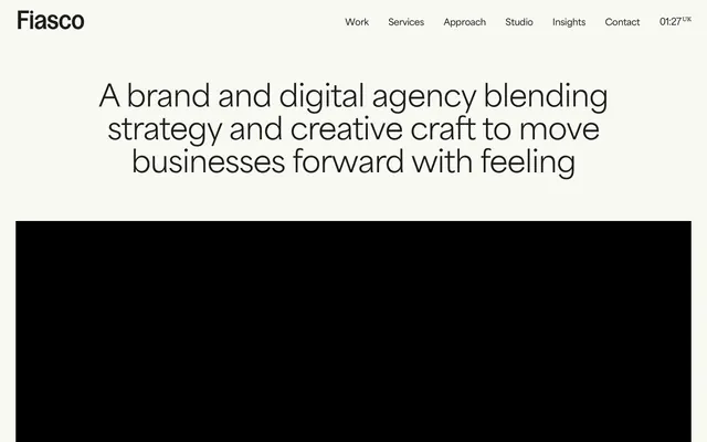
Preview image. Unlock full-res
Gallery canvas, warm minimal.
Color palette
Primary call-to-action button background, signaling interactivity and core user flow
Decorative background for cards or highlight elements — a vibrant, unexpected pop
Distinctive card background, decorative accents – muted yet playful
Decorative card background, often paired with neutral content
Orange wash for highlight backgrounds, decorative bands, and soft emphasis behind content. Do not promote it to the primary CTA color
Green wash for highlight backgrounds, decorative bands, and soft emphasis behind content
Page background, primary surface, light button border, input background
Primary text, almost-black button background, input text, default border for elements
Secondary surface, subtle background for sections and UI elements, navigation stroke
Input field borders, often an accent for accessibility on form elements
Footer background, dark section backgrounds
Typography
- Weights
- 400, 500, 600
- Sizes
- 12px, 13px, 14px, 18px, 20px, 30px, 60px, 80px
- Line height
- 1, 1.1, 1.2, 1.4, 1.43, 1.5, 1.6, 2.71
- Letter spacing
- -0.0290em, -0.0220em, -0.0200em, -0.0130em, -0.0050em
- Fallback
- Inter
Primary text across body, inputs, buttons, navigation, and core content; its variable weight supports hierarchy and emphasis without leaving its defined family.
- Weights
- 100, 400, 500
- Sizes
- 12px, 20px, 22px, 34px
- Line height
- 1.2, 1.4, 1.5, 2
- Letter spacing
- -0.0330em, -0.0200em, -0.0180em, -0.0120em, 0.0100em
- Fallback
- IBM Plex Sans
Header text and selected navigation elements. Its distinct narrow character and light weights add a refined, almost technical touch, distinguishing it from the body copy.
- Weights
- 400, 500, 700
- Sizes
- 16px, 17px, 19px, 40px
- Line height
- 0.8, 1.2, 1.3
- Letter spacing
- -0.0250em, -0.0210em, -0.0200em, -0.0100em
- Fallback
- Open Sans
Used for specific headings and internal links, Gooper provides a slightly more rounded, approachable feel than Area-Normal, reserving its bolder weights for impactful titles.
- Weights
- 400
- Sizes
- 10px
- Line height
- 1.1
- Letter spacing
- 0.1000em
- Fallback
- Roboto Condensed
Used for small, highly tracked labels or metadata, providing a technical and spaced-out stylistic choice that creates clear separation from main content blocks.
Spacing & shape
Elevation
Components
Rounded button with Soot Black text (#1d1e19) and a transparent background (rgba(29, 30, 25, 0.05)), featuring a 1px Soot Black border (#1d1e19) and fully rounded '800px' corners. Padding is 0px vertical and 12px horizontal.
Solid button with Action Blue background (#204ce5), white text (#FFFFFF), and fully rounded '800px' corners. Padding is 8px vertical and 20px horizontal.
Circular button with Soot Black background (#1d1e19) and Cloud Canvas text (#f8f9f3), fully rounded '800px'. Padding is 8px vertical and 20px horizontal.
Transparent background with 8px border-radius and no shadow. No intrinsic padding.
Transparent background with 0px border-radius and no shadow, used for full-width content display without visual containment.
Card with Candy Pink background (#fbc2d1), 8px border-radius, and no shadow. Features 0px vertical padding and 16px horizontal padding, with 20px bottom padding for content.
Input field with a translucent Cloud Canvas background (rgba(248, 249, 243, 0.25)) and Soot Black text (#1d1e19). Features a 1px Soot Black border (#1d1e19), 4px border-radius, and 12px vertical padding with 16px horizontal padding.
Input field with a white background (#FFFFFF) and Slate Border (#686e77), uses 3px border-radius. No intrinsic padding.
Guidelines
- Use Cloud Canvas (#f8f9f3) as the default page background for all primary content areas.
- Apply Soot Black (#1d1e19) for all primary text content to maintain strong contrast and readability.
- Ensure all text inputs utilize the 3px border-radius with a Slate Border (#686e77) on focus.
- Prioritize fully rounded '800px' corners for all buttons and tags, creating a soft, approachable aesthetic.
- For accentuation of content blocks, select from Accent Yellow (#fff714), Candy Pink (#fbc2d1), Sky Blue (#84bdff), Vivid Orange (#fd6b01), or Forest Green (#03ac47) as card backgrounds.
- Use 12px as the consistent `elementGap` for horizontal and vertical spacing between related components.
- Utilize Area-Normal font family for all body text, adjusting weights (400, 500, 600) and sizes (12-80px) to establish hierarchy.
- Avoid using primary brand colors for extensive backgrounds; reserve vibrant colors for deliberate highlights and accents.
- Do not introduce sharp corners or minimal radii where a rounded aesthetic (8px or 800px) is expected, particularly for cards and buttons.
- Do not deviate from the established font families; avoid system fonts or other custom typefaces.
- Do not use letter-spacing values less than -0.0330em or greater than 0.1000em, as found in OC Highway, for readability and brand consistency.
- Avoid large, intrusive shadows; apply soft, subtle elevation where needed, like rgba(18, 25, 97, 0.08) 0px 1px 4px 0px.
- Do not exceed the pageMaxWidth of 1440px for contained content, ensuring a focused reading experience.
- Do not use generic gray tones for input borders; always prefer Soot Black (#1d1e19) for default states and Slate Border (#686e77) for specific form elements.
About this system
ShowHide
Fiasco projects a refined, tactile aesthetic using a muted off-white canvas and discreet typographical hierarchy. The system prioritizes crisp, open layouts punctuated by occasional vibrant accent colors that appear as focused, deliberate flashes rather than overwhelming washes. Components often feature generous radii, conveying a soft, approachable feel despite the otherwise formal typography. The overall impression is one of crafted minimalism with attention to subtle detail and comfortable negative space.
The page adheres to a max-width 1440px centered model. The hero section often presents a large, centered headline over a background that alternates between full-bleed imagery and the Cloud Canvas. Sections maintain a consistent vertical rhythm, often delineated by distinct background colors or subtle changes in surface level. Content is structured in responsive grids, commonly a 2-column or 3-column arrangement for feature cards and portfolio items. Text-heavy blocks are centered or left-aligned within their containers, creating a spacious and comfortable reading experience. The primary navigation is a sticky top bar with minimal links and a discrete time display.
The visual language predominantly features clean, product-focused photography and abstract graphics. Photography consists of tight crops of technology or urban landscapes, often with a slightly desaturated, naturalistic color palette. Illustrations are minimal and graphic, serving as decorative accents or background elements. Icons are filled, monochrome, and have a clear, moderate stroke weight. Imagery primarily serves to create atmosphere or visually break up text, rather than being explicitly explanatory. The density is moderate, with images appearing in grid layouts, often within cards, interspersed with text blocks.
Reminiscent of Focus Lab, Huge Inc., Work & Co, North Kingdom.
# Fiasco — Style Reference
> Gallery canvas, warm minimal.

**Theme:** light

**Site:** https://fiasco.design

Fiasco projects a refined, tactile aesthetic using a muted off-white canvas and discreet typographical hierarchy. The system prioritizes crisp, open layouts punctuated by occasional vibrant accent colors that appear as focused, deliberate flashes rather than overwhelming washes. Components often feature generous radii, conveying a soft, approachable feel despite the otherwise formal typography. The overall impression is one of crafted minimalism with attention to subtle detail and comfortable negative space.

## Tokens — Colors

| Name | Value | Token | Role |
|------|------|------|------|
| Action Blue | `#204ce5` | `--color-action-blue` | Primary call-to-action button background, signaling interactivity and core user flow |
| Accent Yellow | `#fff714` | `--color-accent-yellow` | Decorative background for cards or highlight elements — a vibrant, unexpected pop |
| Candy Pink | `#fbc2d1` | `--color-candy-pink` | Distinctive card background, decorative accents – muted yet playful |
| Sky Blue | `#84bdff` | `--color-sky-blue` | Decorative card background, often paired with neutral content |
| Vivid Orange | `#fd6b01` | `--color-vivid-orange` | Orange wash for highlight backgrounds, decorative bands, and soft emphasis behind content. Do not promote it to the primary CTA color |
| Forest Green | `#03ac47` | `--color-forest-green` | Green wash for highlight backgrounds, decorative bands, and soft emphasis behind content |
| Cloud Canvas | `#f8f9f3` | `--color-cloud-canvas` | Page background, primary surface, light button border, input background |
| Soot Black | `#1d1e19` | `--color-soot-black` | Primary text, almost-black button background, input text, default border for elements |
| Ash Grey | `#e9eae2` | `--color-ash-grey` | Secondary surface, subtle background for sections and UI elements, navigation stroke |
| Slate Border | `#686e77` | `--color-slate-border` | Input field borders, often an accent for accessibility on form elements |
| Midnight Ink | `#151612` | `--color-midnight-ink` | Footer background, dark section backgrounds |

## Tokens — Typography

### Area-Normal
- **Substitute:** Inter
- **Weights:** 400, 500, 600
- **Sizes:** 12px, 13px, 14px, 18px, 20px, 30px, 60px, 80px
- **Line height:** 1, 1.1, 1.2, 1.4, 1.43, 1.5, 1.6, 2.71
- **Letter spacing:** -0.0290em, -0.0220em, -0.0200em, -0.0130em, -0.0050em
- **Role:** Primary text across body, inputs, buttons, navigation, and core content; its variable weight supports hierarchy and emphasis without leaving its defined family.

### HAL Timezone
- **Substitute:** IBM Plex Sans
- **Weights:** 100, 400, 500
- **Sizes:** 12px, 20px, 22px, 34px
- **Line height:** 1.2, 1.4, 1.5, 2
- **Letter spacing:** -0.0330em, -0.0200em, -0.0180em, -0.0120em, 0.0100em
- **Role:** Header text and selected navigation elements. Its distinct narrow character and light weights add a refined, almost technical touch, distinguishing it from the body copy.

### Gooper
- **Substitute:** Open Sans
- **Weights:** 400, 500, 700
- **Sizes:** 16px, 17px, 19px, 40px
- **Line height:** 0.8, 1.2, 1.3
- **Letter spacing:** -0.0250em, -0.0210em, -0.0200em, -0.0100em
- **Role:** Used for specific headings and internal links, Gooper provides a slightly more rounded, approachable feel than Area-Normal, reserving its bolder weights for impactful titles.

### OC Highway
- **Substitute:** Roboto Condensed
- **Weights:** 400
- **Sizes:** 10px
- **Line height:** 1.1
- **Letter spacing:** 0.1000em
- **Role:** Used for small, highly tracked labels or metadata, providing a technical and spaced-out stylistic choice that creates clear separation from main content blocks.

## Tokens — Type Scale

Perfect Fifth (1.5) from 10px base.

| Role | Size | Line height | Letter spacing |
|------|------|------|------|
| caption | 10px | 1.1 | 1px |
| body-lg | 14px | 1.6 | -0.28px |
| subheading | 19px | 1.2 | -0.38px |
| heading | 30px | 1.2 | -0.6px |
| heading-lg | 40px | 1.2 | -1px |
| display | 80px | 1 | -2.32px |

## Tokens — Spacing

- **Max width:** 1440px
- **Section gap:** 32px
- **Card padding:** 12px
- **Element gap:** 12px

## Tokens — Radius

- **Buttons:** 800px
- **Inputs:** 3px
- **Cards:** 8px
- **heroContainer:** 40px
- **links:** 44px

## Tokens — Elevation

- **Input fields, Secondary Buttons:** `rgba(18, 25, 97, 0.08) 0px 1px 4px 0px`
- **Hero sections, Cards:** `rgba(0, 0, 0, 0.16) 0px 28px 80px 0px`

## Layout

The page adheres to a max-width 1440px centered model. The hero section often presents a large, centered headline over a background that alternates between full-bleed imagery and the Cloud Canvas. Sections maintain a consistent vertical rhythm, often delineated by distinct background colors or subtle changes in surface level. Content is structured in responsive grids, commonly a 2-column or 3-column arrangement for feature cards and portfolio items. Text-heavy blocks are centered or left-aligned within their containers, creating a spacious and comfortable reading experience. The primary navigation is a sticky top bar with minimal links and a discrete time display.

## Imagery

The visual language predominantly features clean, product-focused photography and abstract graphics. Photography consists of tight crops of technology or urban landscapes, often with a slightly desaturated, naturalistic color palette. Illustrations are minimal and graphic, serving as decorative accents or background elements. Icons are filled, monochrome, and have a clear, moderate stroke weight. Imagery primarily serves to create atmosphere or visually break up text, rather than being explicitly explanatory. The density is moderate, with images appearing in grid layouts, often within cards, interspersed with text blocks.

## Components

### Subtle Ghost Button
*Secondary action or tag*

Rounded button with Soot Black text (#1d1e19) and a transparent background (rgba(29, 30, 25, 0.05)), featuring a 1px Soot Black border (#1d1e19) and fully rounded '800px' corners. Padding is 0px vertical and 12px horizontal.

### Primary Filled Button
*Call to action*

Solid button with Action Blue background (#204ce5), white text (#FFFFFF), and fully rounded '800px' corners. Padding is 8px vertical and 20px horizontal.

### Navigation Link Button
*Top-level navigation*

Circular button with Soot Black background (#1d1e19) and Cloud Canvas text (#f8f9f3), fully rounded '800px'. Padding is 8px vertical and 20px horizontal.

### Standard Card
*Content container*

Transparent background with 8px border-radius and no shadow. No intrinsic padding.

### Hero Section Card
*Prominent content container*

Transparent background with 0px border-radius and no shadow, used for full-width content display without visual containment.

### Accent Pink Card
*Highlight content*

Card with Candy Pink background (#fbc2d1), 8px border-radius, and no shadow. Features 0px vertical padding and 16px horizontal padding, with 20px bottom padding for content.

### Soft Input Field
*User input*

Input field with a translucent Cloud Canvas background (rgba(248, 249, 243, 0.25)) and Soot Black text (#1d1e19). Features a 1px Soot Black border (#1d1e19), 4px border-radius, and 12px vertical padding with 16px horizontal padding.

### Clean Input Field
*Standard user input*

Input field with a white background (#FFFFFF) and Slate Border (#686e77), uses 3px border-radius. No intrinsic padding.

## Guidelines

### Do

- Use Cloud Canvas (#f8f9f3) as the default page background for all primary content areas.
- Apply Soot Black (#1d1e19) for all primary text content to maintain strong contrast and readability.
- Ensure all text inputs utilize the 3px border-radius with a Slate Border (#686e77) on focus.
- Prioritize fully rounded '800px' corners for all buttons and tags, creating a soft, approachable aesthetic.
- For accentuation of content blocks, select from Accent Yellow (#fff714), Candy Pink (#fbc2d1), Sky Blue (#84bdff), Vivid Orange (#fd6b01), or Forest Green (#03ac47) as card backgrounds.
- Use 12px as the consistent `elementGap` for horizontal and vertical spacing between related components.
- Utilize Area-Normal font family for all body text, adjusting weights (400, 500, 600) and sizes (12-80px) to establish hierarchy.

### Don't

- Avoid using primary brand colors for extensive backgrounds; reserve vibrant colors for deliberate highlights and accents.
- Do not introduce sharp corners or minimal radii where a rounded aesthetic (8px or 800px) is expected, particularly for cards and buttons.
- Do not deviate from the established font families; avoid system fonts or other custom typefaces.
- Do not use letter-spacing values less than -0.0330em or greater than 0.1000em, as found in OC Highway, for readability and brand consistency.
- Avoid large, intrusive shadows; apply soft, subtle elevation where needed, like rgba(18, 25, 97, 0.08) 0px 1px 4px 0px.
- Do not exceed the pageMaxWidth of 1440px for contained content, ensuring a focused reading experience.
- Do not use generic gray tones for input borders; always prefer Soot Black (#1d1e19) for default states and Slate Border (#686e77) for specific form elements.

## Agent Prompt Guide

Quick Color Reference:
- text: #1d1e19
- background: #f8f9f3
- border: #1d1e19
- accent: #fff714
- primary action: #204ce5 (filled action)

Example Component Prompts:
- Create a section divider: 1px solid Ash Grey border (#e9eae2), 12px vertical elementGap from surrounding content.
- Create a feature card: Cloud Canvas background (#f8f9f3), 8px border-radius, 12px cardPadding. Headline (Gooper, 40px, 700, #1d1e19, letter-spacing -1.0px). Body text (Area-Normal, 14px, 400, #1d1e19, lineHeight 1.6).
- Create a Primary Action Button: #204ce5 background, #f8f9f3 text, 9999px radius, compact pill padding. Use this filled treatment for the main CTA.
- Create a tag button: Subtle Ghost Button (rgba(29, 30, 25, 0.05) background, #1d1e19 text, 1px #1d1e19 border, 800px radius, 0px vertical padding, 12px horizontal padding). Font: Area-Normal, 12px, 400, letter-spacing -0.35px.
- Create a text input field: Soft Input Field (rgba(248, 249, 243, 0.25) background, #1d1e19 text, 1px #1d1e19 border, 4px radius, 12px vertical padding, 16px horizontal padding). Font: Area-Normal, 14px, 400, lineHeight 1.6.
More like this




Keep what you find
A free account saves references to boards and can send you a weekly email of picks based on what you save.
To see every result, go Pro.