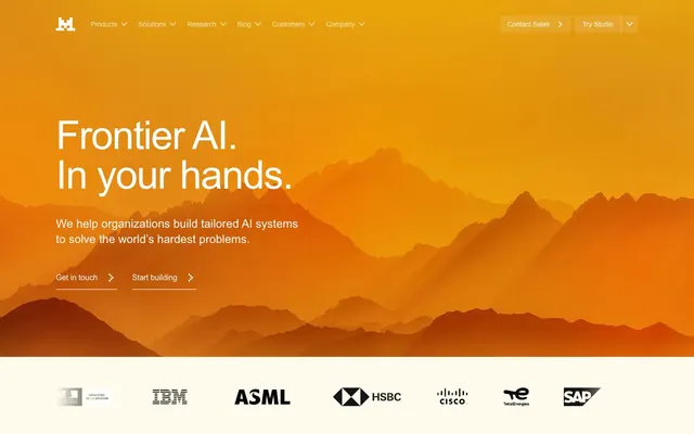
Preview image. Unlock full-res
Digital Desert Dawn — a stark, warm landscape where technology meets the wild.
Color palette
Hero background, creating an atmospheric, expansive focal point.
Accent color for icons, interactive indicators, subtle highlights, and brand presence — a vivid, almost neon orange.
Decorative background color, likely for abstract graphics or very subtle brand elements.
Decorative background color, likely for abstract graphics or very subtle brand elements.
Decorative background color, likely for abstract graphics or very subtle brand elements.
Primary page background, text container background — provides a warm, sandy base.
Primary text color for headings and body content, navigation elements, high-contrast buttons — a deep, rich black.
Button text on dark backgrounds, selected navigation states, specific content blocks.
Hover background for buttons, borders for high-contrast elements.
Secondary text, muted links, subtle button borders.
Secondary background color for UI elements, subtle dividers, accent areas.
Border color for subtle containers or interactive elements.
Typography
- Weights
- 400
- Sizes
- 14px, 16px, 24px, 32px, 38px, 48px, 56px, 82px
- Line height
- 0.95, 1, 1.15, 1.33, 1.43, 1.5
- Letter spacing
- -0.0250em
- Fallback
- Helvetica Neue, sans-serif
Primary typeface for all textual content. Its neutral, sans-serif character supports the technical focus while the slightly negative letter spacing for larger sizes creates a refined, impactful presence despite the classic font choice. Used for headlines, body text, buttons, and navigation.
Spacing & shape
Elevation
Components
Solid 'Midnight Ink' background (#1f1f1f) with 'Snowdrift' (#ffffff) text. No border radius (0px) creates a sharp, direct interaction. Padding is 12px on all sides. Text is Arial 14px, weight 400, with -0.0250em letter spacing.
Transparent background with 'Snowdrift' (#ffffff) text. Features a 1px bottom border in 'Desert Canvas' (#fffaeb). No border radius (0px). Padding is 16px vertical, 0px horizontal. Text is Arial 14px, weight 400, with -0.0250em letter spacing.
Transparent background with 'Midnight Ink' (#1f1f1f) text. Features a 1px bottom border in 'Midnight Ink' (#1f1f1f). No border radius (0px). Padding is 12px vertical, 0px horizontal. Text is Arial 14px, weight 400, with -0.0250em letter spacing.
Translucent 'Desert Canvas' background (rgba(255, 250, 235, 0.1)) with 'Snowdrift' (#ffffff) text. No border radius (0px). Padding is 8px vertical, 16px horizontal. Text is Arial 14px, weight 400, with -0.0250em letter spacing.
Uses 'Midnight Ink' (#1f1f1f) for text, 'Desert Canvas' (#fffaeb) as background. Font is Arial 16px, weight 400. No explicit padding or border is defined beyond inherited link styles, implying simple text links.
Text color 'Snowdrift' (#ffffff), Arial 82px, weight 400, line height 0.95, letter spacing -0.0250em. Set against the 'Horizon Gradient' background, it commands attention.
Text color 'Midnight Ink' (#1f1f1f), Arial 16px, weight 400, line height 1.50, letter spacing -0.0250em. Renders clearly on the 'Desert Canvas' background.
Background 'Desert Canvas' (#fffaeb) with text in 'Midnight Ink' (#1f1f1f). No apparent border or border-radius, relying on whitespace for definition. Inner text elements use 'Frontier Accent' (#fa520f) for small icons or leading indicators.
Uses 'Midnight Ink' (#1f1f1f) or 'Graphite' (#3c3c3c) for text on a 'Desert Canvas' (#fffaeb) background. Font is Arial 14px, weight 400. Subtle, without explicit padding, relying on semantic HTML and surrounding whitespace.
Guidelines
- Use 'Horizon Gradient' for hero sections or significant atmospheric backgrounds.
- Maintain 0px border radius across all buttons and interactive elements for a sharp aesthetic.
- Prioritize 'Midnight Ink' for all primary text content against light backgrounds for maximum legibility.
- Apply 'Frontier Accent' (#fa520f) sparingly, only for interactive elements or key icons.
- Ensure large headlines (>= 48px) utilize Arial 400 weight with -0.0250em letter spacing.
- Use 'Desert Canvas' (#fffaeb) as the primary page background.
- Structure content with ample 12px 'elementGap' between adjacent components like text and buttons.
- Avoid applying any border radius to UI elements; stick to 0px.
- Do not introduce new color gradients; adhere to 'Horizon Gradient' for atmospheric elements and a flat canvas for UI.
- Refrain from using any colors not specified in the palette, especially highly saturated hues, to maintain the muted, earth-toned brand identity.
- Do not use generic gray scales for text. Use the specific 'Midnight Ink' (#1f1f1f) and 'Graphite' (#3c3c3c) tokens.
- Avoid heavy drop shadows on elevated elements. If elevation is needed, rely on subtle background shifts.
- Do not vary line height from the specified values per type size to avoid disrupting vertical rhythm.
- Introduce white space around elements using the defined spacing tokens (e.g., 12px for elementGap) rather than relying on margin-auto or arbitrary values.
About this system
ShowHide
Mistral AI presents as a digital desert landscape at dawn. The warm, earthy gradient backgrounds evoke vast, untamed frontiers, grounding the advanced AI concepts in natural, expansive imagery. Heavy, dark typography on these warm backdrops creates stark contrast, emphasizing seriousness and weight. An almost absent border radius (0px) reinforces a pragmatic, unyielding aesthetic, while the single vivid orange accent color highlights interaction points, mimicking a critical glow against the muted tones.
The page follows a classic max-width centered layout, though the hero section spans full-bleed to establish an expansive atmosphere. The hero features a large, centered headline over the 'Horizon Gradient' background. Subsequent sections alternate between a primary 'Desert Canvas' background and a 'Sandstone Slab' for visual pacing. Content is arranged in alternating two-column layouts (text left, image/graphic right) and centered stacks. Feature sections often use simple bulleted lists or sequential blocks of text with small 'Frontier Accent' icons. Information density is moderate, with generous vertical spacing (sectionGap 89px) providing breathing room between content blocks. The header is a sticky top bar containing navigation and call-to-action buttons, while the footer is a multi-column layout.
The site heavily uses atmospheric, wide-landscape photography with an earthy, orange-yellow gradient overlay, reminiscent of desert mountains at dawn. These are full-bleed in hero sections, creating a sense of vastness and uncultivated potential. Elsewhere, the imagery is minimal, primarily focusing on abstract, pixelated block compositions in muted yellow tones (#fff0c2, #fffaeb) which serve as decorative, branded background patterns. Icons are monochrome, 'Frontier Accent' colored, outlined or filled, with a consistent stroke weight to match the sharp aesthetic. Imagery primarily serves to establish mood and brand identity, with an abstract rather than literal representation of AI.
Reminiscent of Anthropic, Databricks, Palantir, OpenAI.
# Frontier AI LLMs — Style Reference
> Digital Desert Dawn — a stark, warm landscape where technology meets the wild.

**Theme:** light

**Site:** https://mistral.ai

Mistral AI presents as a digital desert landscape at dawn. The warm, earthy gradient backgrounds evoke vast, untamed frontiers, grounding the advanced AI concepts in natural, expansive imagery. Heavy, dark typography on these warm backdrops creates stark contrast, emphasizing seriousness and weight. An almost absent border radius (0px) reinforces a pragmatic, unyielding aesthetic, while the single vivid orange accent color highlights interaction points, mimicking a critical glow against the muted tones.

## Tokens — Colors

| Name | Value | Token | Role |
|------|------|------|------|
| Horizon Gradient | `#b35d20` | `--color-horizon-gradient` | Hero background, creating an atmospheric, expansive focal point. |
| Frontier Accent | `#fa520f` | `--color-frontier-accent` | Accent color for icons, interactive indicators, subtle highlights, and brand presence — a vivid, almost neon orange. |
| Golden Streak | `#ffd900` | `--color-golden-streak` | Decorative background color, likely for abstract graphics or very subtle brand elements. |
| Sunbeam | `#ffae00` | `--color-sunbeam` | Decorative background color, likely for abstract graphics or very subtle brand elements. |
| Faded Red | `#e00400` | `--color-faded-red` | Decorative background color, likely for abstract graphics or very subtle brand elements. |
| Desert Canvas | `#fffaeb` | `--color-desert-canvas` | Primary page background, text container background — provides a warm, sandy base. |
| Midnight Ink | `#1f1f1f` | `--color-midnight-ink` | Primary text color for headings and body content, navigation elements, high-contrast buttons — a deep, rich black. |
| Snowdrift | `#ffffff` | `--color-snowdrift` | Button text on dark backgrounds, selected navigation states, specific content blocks. |
| Void Deep | `#000000` | `--color-void-deep` | Hover background for buttons, borders for high-contrast elements. |
| Graphite | `#3c3c3c` | `--color-graphite` | Secondary text, muted links, subtle button borders. |
| Sandstone Slab | `#fff0c2` | `--color-sandstone-slab` | Secondary background color for UI elements, subtle dividers, accent areas. |
| Pale Ochre | `#ecdaa2` | `--color-pale-ochre` | Border color for subtle containers or interactive elements. |

## Tokens — Typography

### Arial
- **Substitute:** Helvetica Neue, sans-serif
- **Weights:** 400
- **Sizes:** 14px, 16px, 24px, 32px, 38px, 48px, 56px, 82px
- **Line height:** 0.95, 1, 1.15, 1.33, 1.43, 1.5
- **Letter spacing:** -0.0250em
- **Role:** Primary typeface for all textual content. Its neutral, sans-serif character supports the technical focus while the slightly negative letter spacing for larger sizes creates a refined, impactful presence despite the classic font choice. Used for headlines, body text, buttons, and navigation.

## Tokens — Type Scale

| Role | Size | Line height | Letter spacing |
|------|------|------|------|
| body-sm | 14px | 1.43 | -0.42px |
| body | 16px | 1.5 | -0.48px |
| subheading | 24px | 1.33 | -0.72px |
| heading | 32px | 1.15 | -0.96px |
| heading-lg | 38px | 1.15 | -1.14px |
| display | 48px | 1 | -1.44px |
| display-lg | 56px | 0.95 | -1.68px |
| display-xl | 82px | 0.95 | -2.46px |

## Tokens — Spacing

- **Section gap:** 89px
- **Card padding:** 12px
- **Element gap:** 12px

## Tokens — Radius

- **all:** 0px

## Tokens — Elevation

- **Card/Container:** `box-shadow: rgba(127, 99, 21, 0.12) -8px 16px 39px 0px, rgba(127, 99, 21, 0.1) -33px 64px 72px 0px, rgba(127, 99, 21, 0.06) -73px 144px 97px 0px, rgba(127, 99, 21, 0.02) -130px 256px 115px 0px;`

## Layout

The page follows a classic max-width centered layout, though the hero section spans full-bleed to establish an expansive atmosphere. The hero features a large, centered headline over the 'Horizon Gradient' background. Subsequent sections alternate between a primary 'Desert Canvas' background and a 'Sandstone Slab' for visual pacing. Content is arranged in alternating two-column layouts (text left, image/graphic right) and centered stacks. Feature sections often use simple bulleted lists or sequential blocks of text with small 'Frontier Accent' icons. Information density is moderate, with generous vertical spacing (sectionGap 89px) providing breathing room between content blocks. The header is a sticky top bar containing navigation and call-to-action buttons, while the footer is a multi-column layout.

## Imagery

The site heavily uses atmospheric, wide-landscape photography with an earthy, orange-yellow gradient overlay, reminiscent of desert mountains at dawn. These are full-bleed in hero sections, creating a sense of vastness and uncultivated potential. Elsewhere, the imagery is minimal, primarily focusing on abstract, pixelated block compositions in muted yellow tones (#fff0c2, #fffaeb) which serve as decorative, branded background patterns. Icons are monochrome, 'Frontier Accent' colored, outlined or filled, with a consistent stroke weight to match the sharp aesthetic. Imagery primarily serves to establish mood and brand identity, with an abstract rather than literal representation of AI.

## Components

### CTA Button Group

### Feature List Cards

### Autonomous Work Feature Selector

### Primary Dark Button
*Call-to-action button for critical user journeys.*

Solid 'Midnight Ink' background (#1f1f1f) with 'Snowdrift' (#ffffff) text. No border radius (0px) creates a sharp, direct interaction. Padding is 12px on all sides. Text is Arial 14px, weight 400, with -0.0250em letter spacing.

### Ghost Accent Link Button
*Secondary action or navigation highlight, often appearing in hero or footer zones.*

Transparent background with 'Snowdrift' (#ffffff) text. Features a 1px bottom border in 'Desert Canvas' (#fffaeb). No border radius (0px). Padding is 16px vertical, 0px horizontal. Text is Arial 14px, weight 400, with -0.0250em letter spacing.

### Ghost Dark Link Button
*Secondary action or navigation, typically within light sections.*

Transparent background with 'Midnight Ink' (#1f1f1f) text. Features a 1px bottom border in 'Midnight Ink' (#1f1f1f). No border radius (0px). Padding is 12px vertical, 0px horizontal. Text is Arial 14px, weight 400, with -0.0250em letter spacing.

### Callout Tag Button
*Informational tags or minor calls to action.*

Translucent 'Desert Canvas' background (rgba(255, 250, 235, 0.1)) with 'Snowdrift' (#ffffff) text. No border radius (0px). Padding is 8px vertical, 16px horizontal. Text is Arial 14px, weight 400, with -0.0250em letter spacing.

### Navigation Link
*Primary navigation links in the header.*

Uses 'Midnight Ink' (#1f1f1f) for text, 'Desert Canvas' (#fffaeb) as background. Font is Arial 16px, weight 400. No explicit padding or border is defined beyond inherited link styles, implying simple text links.

### Hero Headline
*Dominant textual element on the primary landing page.*

Text color 'Snowdrift' (#ffffff), Arial 82px, weight 400, line height 0.95, letter spacing -0.0250em. Set against the 'Horizon Gradient' background, it commands attention.

### Body Paragraph
*Standard informative text block.*

Text color 'Midnight Ink' (#1f1f1f), Arial 16px, weight 400, line height 1.50, letter spacing -0.0250em. Renders clearly on the 'Desert Canvas' background.

### Feature Card (light)
*Used for informational content blocks in light sections.*

Background 'Desert Canvas' (#fffaeb) with text in 'Midnight Ink' (#1f1f1f). No apparent border or border-radius, relying on whitespace for definition. Inner text elements use 'Frontier Accent' (#fa520f) for small icons or leading indicators.

### Footer Link
*Navigation and informational links in the footer.*

Uses 'Midnight Ink' (#1f1f1f) or 'Graphite' (#3c3c3c) for text on a 'Desert Canvas' (#fffaeb) background. Font is Arial 14px, weight 400. Subtle, without explicit padding, relying on semantic HTML and surrounding whitespace.

## Guidelines

### Do

- Use 'Horizon Gradient' for hero sections or significant atmospheric backgrounds.
- Maintain 0px border radius across all buttons and interactive elements for a sharp aesthetic.
- Prioritize 'Midnight Ink' for all primary text content against light backgrounds for maximum legibility.
- Apply 'Frontier Accent' (#fa520f) sparingly, only for interactive elements or key icons.
- Ensure large headlines (>= 48px) utilize Arial 400 weight with -0.0250em letter spacing.
- Use 'Desert Canvas' (#fffaeb) as the primary page background.
- Structure content with ample 12px 'elementGap' between adjacent components like text and buttons.

### Don't

- Avoid applying any border radius to UI elements; stick to 0px.
- Do not introduce new color gradients; adhere to 'Horizon Gradient' for atmospheric elements and a flat canvas for UI.
- Refrain from using any colors not specified in the palette, especially highly saturated hues, to maintain the muted, earth-toned brand identity.
- Do not use generic gray scales for text. Use the specific 'Midnight Ink' (#1f1f1f) and 'Graphite' (#3c3c3c) tokens.
- Avoid heavy drop shadows on elevated elements. If elevation is needed, rely on subtle background shifts.
- Do not vary line height from the specified values per type size to avoid disrupting vertical rhythm.
- Introduce white space around elements using the defined spacing tokens (e.g., 12px for elementGap) rather than relying on margin-auto or arbitrary values.

## Agent Prompt Guide

Quick Color Reference:
- Text: #1f1f1f (Midnight Ink)
- Background: #fffaeb (Desert Canvas)
- CTA: #1f1f1f (Midnight Ink) for solid, #fa520f (Frontier Accent) for link indicators
- Border: #1f1f1f (Midnight Ink) or #ecdaa2 (Pale Ochre)
- Accent: #fa520f (Frontier Accent)

Example Component Prompts:
1. Create a hero section: Full-width, 'Horizon Gradient' background. Headline 'Frontier AI. In your hands.' in 'Snowdrift' (#ffffff) text, Arial 82px, weight 400, line height 0.95, letter spacing -2.46px. Subtext 'We help organizations build tailored AI systems to solve the world's hardest problems.' in 'Snowdrift' (#ffffff) text, Arial 16px, weight 400, line height 1.5, letter spacing -0.48px. Beneath, two 'Ghost Accent Link Button' variants: 'Get in touch' and 'Start building'.
2. Design a feature block: 'Desert Canvas' (#fffaeb) background. On the left, 'Your AI future belongs in your hands.' as heading in 'Midnight Ink' (#1f1f1f), Arial 56px, weight 400, line height 0.95, letter spacing -1.68px. On the right, a list of three points. Each point starts with a small 'Frontier Accent' (#fa520f) icon, then body text 'Make your AI your own. Train, distill, fine-tune, and build with state-of-the-art open source models.' in 'Midnight Ink' (#1f1f1f), Arial 16px, weight 400, line height 1.5, letter spacing -0.48px. Use 12px elementGap between icon and text, and between list items.
3. Build a primary navigation bar: Fixed at top, 'Desert Canvas' (#fffaeb) background. Brand logo (placeholder 'M' in 'Midnight Ink') on the left. Navigation links 'Products', 'Solutions', 'Research', 'Blog', 'Customers', 'Company' in 'Midnight Ink' (#1f1f1f), Arial 16px, weight 400, letter spacing -0.48px, with 24px horizontal elementGap. On the right, a 'Ghost Accent Link Button' labeled 'Contact Sales' and a 'Primary Dark Button' labeled 'Try Studio'.
4. Create a prominent dark CTA card: 'Midnight Ink' (#1f1f1f) background. Headline 'Autonomous work.' in 'Snowdrift' (#ffffff), Arial 32px, weight 400, line height 1.15, letter spacing -0.96px. Body text 'Chat, search, analyze, create—do more in one connected hub.' in 'Snowdrift' (#ffffff), Arial 16px, weight 400, line height 1.5, letter spacing -0.48px. Follow with a 'Primary Dark Button' with 'Snowdrift' text labeled 'Discover Le Chat'.
More like this




Keep what you find
A free account saves references to boards and can send you a weekly email of picks based on what you save.
To see every result, go Pro.