Preview image. Unlock full-res
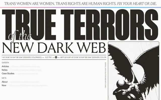
Distressed newsprint, black-and-white grid
Color palette
Decorative header accent, signifying a non-conformist digital identity
Dark borders and separators for elevated surfaces and inverted UI. Do not promote it to the primary CTA color
Page background, light surface backgrounds, secondary text, prominent section dividers
Secondary text, subheadings, and muted contextual information
Muted text, subtle borders, placeholder content
Subtle borders for cards and contained sections, creating a very light visual separation
Helper text, captions, and fine print
Inactive navigation items, less emphasized text elements
Very subtle narrative text, highly de-emphasized elements
Typography
- Weights
- 400, 700
- Sizes
- 12px, 16px, 20px, 24px, 32px
- Line height
- 1, 1.1, 1.2, 1.5
- Letter spacing
- -0.0100em
- Fallback
- Inter
Primary text, navigation links, body content, and smaller headings. Its contemporary sans-serif form provides clear readability amidst the otherwise stylized design.
- Weights
- 400
- Sizes
- 32px, 35px, 77px, 116px, 126px, 132px
- Line height
- 0.8, 0.9, 1.1, 1.2
- Letter spacing
- normal
- Fallback
- Anton
Large, impactful headlines with a distressed, condensed serif character, used to create a strong, almost confrontational visual presence.
- Weights
- 400
- Sizes
- 16px, 20px, 24px
- Line height
- 1.2, 1.3
- Letter spacing
- -0.0100em
- Fallback
- Merriweather
Complementary serif for body text and emphasized statements within more traditional paragraphs, bringing a classic but slightly rugged touch.
- Weights
- 400
- Sizes
- 226px, 371px
- Line height
- 0.75, 0.8
- Fallback
- Oswald
Overlays and background decorative text elements, used at extremely large scales for atmospheric effect, often partially obscured.
Spacing & shape
Components
Transparent background, 0px radius, no shadow. Padding 16px all sides. Emphasizes content over containment, blending into the background.
Transparent background, 12px border radius. Padding 32px top/bottom, 24px left/right. Provides a slightly softer, contained presentation for specific text blocks.
Text in Midnight Ink (#2a2722), Neue Montreal, 16px weight 400. Letter spacing -0.01em. On hover, text color should change to Graphite Text (#3e3b36) and a 1px solid Midnight Ink (#2a2722) border appears below.
A 2px solid line in Midnight Ink (#2a2722) or Canvas White (#fafafa), depending on background contrast, ensuring clear breaks.
Text in Midnight Ink (#2a2722), Neue Montreal, 16px weight 400, with a 1px solid Midnight Ink (#2a2722) border. Transparent background. No padding by default, border closely hugs text.
Text in Louize, 20px weight 400, line height 1.2. Centered alignment. Contained within a transparent card with 12px radius, with 2px solid Midnight Ink (#2a2722) border and 32px top/bottom, 24px left/right padding. Text color is Midnight Ink (#2a2722).
Guidelines
- Prioritize high contrast using Midnight Ink (#2a2722) and Canvas White (#fafafa) for all backgrounds and main text.
- Use Neue Montreal for all functional text and body copy to maintain legibility and a consistent modern feel.
- Apply Louize Display at large sizes (77px-132px) for primary headlines, embracing its distressed, imposing character.
- Maintain a clear separation between content blocks using 2px solid lines of either Midnight Ink (#2a2722) or Canvas White (#fafafa).
- Employ a 12px border radius only for specific content cards or overlays, keeping most UI elements sharp-edged.
- Ensure all interactive elements have a clear 1px or 2px Midnight Ink (#2a2722) border for definition, without relying on fill colors.
- Utilize 16px as the primary base for padding inside interactive containers and for general element spacing.
- Do not use soft shadows or elevation effects; the design relies on stark lines and dark/light contrast for visual hierarchy.
- Avoid decorative gradients or subtle background textures, beyond the specific 'Rainbow Band' accent.
- Do not introduce highly saturated colors for functional UI elements; color is reserved for decorative accents or very specific indicators.
- Avoid soft, organic shapes or large, friendly radii; maintain sharp corners for most UI elements.
- Do not use multiple font families for body text or navigation; stick to Neue Montreal for consistency in these areas.
- Avoid thin, lightweight dividers; use prominent 2px solid lines to emphasize separation.
- Do not center-align long blocks of body text; reserve centered alignment for short, editorial statements.
About this system
ShowHide
Henry.codes creates a dark, brutalist newsprint aesthetic, evoking a digital zine or an old-school BBS. The design uses stark monochrome contrast, large distressed display typography, and intentional visual chaos within a structured grid. Text blocks are dense, and the overall impression is one of raw, unfiltered information, avoiding typical 'clean' SaaS conventions. The system feels hand-coded, with a deliberate lack of smooth gradients, soft shadows, or rounded forms, opting for sharp edges and explicit separation.
The page primarily uses a full-bleed layout, allowing wide elements to stretch across the viewport, but often contains content within implied horizontal sections. The hero section is full-bleed, featuring large typographic elements. Content alternates between centered stacks and more complex, asymmetrical compositions, sometimes with text overlaying decorative background type. There's a strong vertical rhythm established through large section gaps and explicit horizontal dividers. Navigation is handled through fixed left-hand sidebars and top announcement bars, sometimes using a 'go home' link rather than a traditional logo. The layout feels like an untamed, yet structured, digital canvas, reminiscent of early web design with modern typographical flourishes.
This site uses stark, high-contrast, pixelated or halftone-style imagery, primarily in black and white. Images are often illustrative or abstract, occasionally featuring distressed textures or demonic/macabre motifs. They serve a decorative, atmospheric role rather than explanatory or product-showcasing. Visuals can be contained within defined areas, but also used as large, partially obscured background elements (like the 'Manuka' font). Icons, if present, are minimal, outlined, and monochromatic, matching the overall stark aesthetic. The density is image-light relative to text but impact-heavy when visuals do appear.
Reminiscent of Are.na, Brutalist Websites, The Practical Dev (DEV Community), Linus Tech Tips (Old Website).
# Henry — Style Reference
> Distressed newsprint, black-and-white grid

**Theme:** light

**Site:** https://henry.codes

Henry.codes creates a dark, brutalist newsprint aesthetic, evoking a digital zine or an old-school BBS. The design uses stark monochrome contrast, large distressed display typography, and intentional visual chaos within a structured grid. Text blocks are dense, and the overall impression is one of raw, unfiltered information, avoiding typical 'clean' SaaS conventions. The system feels hand-coded, with a deliberate lack of smooth gradients, soft shadows, or rounded forms, opting for sharp edges and explicit separation.

## Tokens — Colors

| Name | Value | Token | Role |
|------|------|------|------|
| Rainbow Band | `#c679c4` | `--color-rainbow-band` | Decorative header accent, signifying a non-conformist digital identity |
| Midnight Ink | `#2a2722` | `--color-midnight-ink` | Dark borders and separators for elevated surfaces and inverted UI. Do not promote it to the primary CTA color |
| Canvas White | `#fafafa` | `--color-canvas-white` | Page background, light surface backgrounds, secondary text, prominent section dividers |
| Graphite Text | `#3e3b36` | `--color-graphite-text` | Secondary text, subheadings, and muted contextual information |
| Ash Gray | `#9f9f9f` | `--color-ash-gray` | Muted text, subtle borders, placeholder content |
| Light Border | `#eeeeee` | `--color-light-border` | Subtle borders for cards and contained sections, creating a very light visual separation |
| Midtone Text | `#666666` | `--color-midtone-text` | Helper text, captions, and fine print |
| Muted Silver | `#b3b3b3` | `--color-muted-silver` | Inactive navigation items, less emphasized text elements |
| Faded Gray | `#a9a9a9` | `--color-faded-gray` | Very subtle narrative text, highly de-emphasized elements |

## Tokens — Typography

### Neue Montreal
- **Substitute:** Inter
- **Weights:** 400, 700
- **Sizes:** 12px, 16px, 20px, 24px, 32px
- **Line height:** 1, 1.1, 1.2, 1.5
- **Letter spacing:** -0.0100em
- **Role:** Primary text, navigation links, body content, and smaller headings. Its contemporary sans-serif form provides clear readability amidst the otherwise stylized design.

### Louize Display
- **Substitute:** Anton
- **Weights:** 400
- **Sizes:** 32px, 35px, 77px, 116px, 126px, 132px
- **Line height:** 0.8, 0.9, 1.1, 1.2
- **Letter spacing:** normal
- **Role:** Large, impactful headlines with a distressed, condensed serif character, used to create a strong, almost confrontational visual presence.

### Louize
- **Substitute:** Merriweather
- **Weights:** 400
- **Sizes:** 16px, 20px, 24px
- **Line height:** 1.2, 1.3
- **Letter spacing:** -0.0100em
- **Role:** Complementary serif for body text and emphasized statements within more traditional paragraphs, bringing a classic but slightly rugged touch.

### Manuka
- **Substitute:** Oswald
- **Weights:** 400
- **Sizes:** 226px, 371px
- **Line height:** 0.75, 0.8
- **Role:** Overlays and background decorative text elements, used at extremely large scales for atmospheric effect, often partially obscured.

## Tokens — Type Scale

Perfect Fifth (1.5) from 16px base.

| Role | Size | Line height | Letter spacing |
|------|------|------|------|
| caption | 12px | 1 | — |
| body | 16px | 1.5 | -0.16px |
| subheading | 20px | 1.2 | -0.2px |
| heading-sm | 24px | 1.2 | -0.24px |
| heading | 32px | 1.1 | -0.32px |
| heading-lg | 77px | 0.9 | — |
| display | 132px | 0.8 | — |

## Tokens — Spacing

- **Section gap:** 32px
- **Card padding:** 16px
- **Element gap:** 16px

## Tokens — Radius

- **Cards:** 12px
- **other:** 12px

## Layout

The page primarily uses a full-bleed layout, allowing wide elements to stretch across the viewport, but often contains content within implied horizontal sections. The hero section is full-bleed, featuring large typographic elements. Content alternates between centered stacks and more complex, asymmetrical compositions, sometimes with text overlaying decorative background type. There's a strong vertical rhythm established through large section gaps and explicit horizontal dividers. Navigation is handled through fixed left-hand sidebars and top announcement bars, sometimes using a 'go home' link rather than a traditional logo. The layout feels like an untamed, yet structured, digital canvas, reminiscent of early web design with modern typographical flourishes.

## Imagery

This site uses stark, high-contrast, pixelated or halftone-style imagery, primarily in black and white. Images are often illustrative or abstract, occasionally featuring distressed textures or demonic/macabre motifs. They serve a decorative, atmospheric role rather than explanatory or product-showcasing. Visuals can be contained within defined areas, but also used as large, partially obscured background elements (like the 'Manuka' font). Icons, if present, are minimal, outlined, and monochromatic, matching the overall stark aesthetic. The density is image-light relative to text but impact-heavy when visuals do appear.

## Components

### Text Content Card, Default
*Container for articles or body text.*

Transparent background, 0px radius, no shadow. Padding 16px all sides. Emphasizes content over containment, blending into the background.

### Text Content Card, Rounded
*Container for 'Brief Letter' and similar self-contained content.*

Transparent background, 12px border radius. Padding 32px top/bottom, 24px left/right. Provides a slightly softer, contained presentation for specific text blocks.

### Navigation Link, Primary
*Main navigation items in the sidebar or header.*

Text in Midnight Ink (#2a2722), Neue Montreal, 16px weight 400. Letter spacing -0.01em. On hover, text color should change to Graphite Text (#3e3b36) and a 1px solid Midnight Ink (#2a2722) border appears below.

### Section Divider Line
*Visual separation between major content blocks.*

A 2px solid line in Midnight Ink (#2a2722) or Canvas White (#fafafa), depending on background contrast, ensuring clear breaks.

### Ghost Button / Outlined Link
*Interactive elements with a minimal footprint, such as 'read more' or external links.*

Text in Midnight Ink (#2a2722), Neue Montreal, 16px weight 400, with a 1px solid Midnight Ink (#2a2722) border. Transparent background. No padding by default, border closely hugs text.

### Editorial Text Block
*Stylized introductory text or personal notes.*

Text in Louize, 20px weight 400, line height 1.2. Centered alignment. Contained within a transparent card with 12px radius, with 2px solid Midnight Ink (#2a2722) border and 32px top/bottom, 24px left/right padding. Text color is Midnight Ink (#2a2722).

## Guidelines

### Do

- Prioritize high contrast using Midnight Ink (#2a2722) and Canvas White (#fafafa) for all backgrounds and main text.
- Use Neue Montreal for all functional text and body copy to maintain legibility and a consistent modern feel.
- Apply Louize Display at large sizes (77px-132px) for primary headlines, embracing its distressed, imposing character.
- Maintain a clear separation between content blocks using 2px solid lines of either Midnight Ink (#2a2722) or Canvas White (#fafafa).
- Employ a 12px border radius only for specific content cards or overlays, keeping most UI elements sharp-edged.
- Ensure all interactive elements have a clear 1px or 2px Midnight Ink (#2a2722) border for definition, without relying on fill colors.
- Utilize 16px as the primary base for padding inside interactive containers and for general element spacing.

### Don't

- Do not use soft shadows or elevation effects; the design relies on stark lines and dark/light contrast for visual hierarchy.
- Avoid decorative gradients or subtle background textures, beyond the specific 'Rainbow Band' accent.
- Do not introduce highly saturated colors for functional UI elements; color is reserved for decorative accents or very specific indicators.
- Avoid soft, organic shapes or large, friendly radii; maintain sharp corners for most UI elements.
- Do not use multiple font families for body text or navigation; stick to Neue Montreal for consistency in these areas.
- Avoid thin, lightweight dividers; use prominent 2px solid lines to emphasize separation.
- Do not center-align long blocks of body text; reserve centered alignment for short, editorial statements.

## Agent Prompt Guide

Quick Color Reference:
text: #2a2722
background: #fafafa
border: #2a2722
accent: #c679c4 (gradient: linear-gradient(90deg, #c679c4, #fa3d1d, #ffb005))
primary action: no distinct CTA color

Example Component Prompts:
Create a primary navigation link titled 'Garden': Use Neue Montreal, 16px weight 400, letter spacing -0.16px, color Midnight Ink (#2a2722). Add a 2px solid Midnight Ink (#2a2722) border on hover.
Create an 'Editorial Note' card displaying a short passage: Use a transparent background card with 12px border radius. Add 32px vertical and 24px horizontal padding. Apply a 2px solid Midnight Ink (#2a2722) border. The text should use Louize, 20px weight 400, line height 1.2, in Midnight Ink (#2a2722) and be center-aligned.
Create a large section headline for 'Selected Works': Use Louize Display, 77px weight 400, normal letter spacing, color Midnight Ink (#2a2722). Ensure it is full-bleed or extends widely across the canvas.
More like this









Keep what you find
A free account saves references to boards and can send you a weekly email of picks based on what you save.
To see every result, go Pro.