Preview image. Unlock full-res
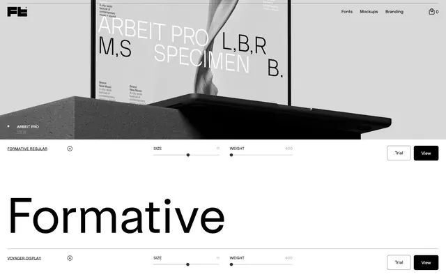
Gallery of Type on White Canvas
Color palette
Page backgrounds, input surfaces, base for content presentation
Primary text, button backgrounds, interactive borders, structural outlines — establishes high-contrast dominance
Muted UI elements, secondary borders, inactive states, subtle dividers, informational text
Link text, subtle background textures, borders that recede slightly from primary black
Muted link text, less prominent border elements
Typography
- Weights
- 300, 400, 500
- Sizes
- 12px, 14px, 158px
- Line height
- 1, 1.2, 1.25, 1.33, 1.43, 1.5, 1.57, 1.6, 1.71, 1.75, 1.86, 2
- Letter spacing
- -0.0200em at large sizes, varying to 0.0170em at smaller sizes
- Fallback
- Inter
General UI text, flexible content, navigation, and detailed information. Its variable weight allows for subtle hierarchy and expressive versatility.
- Weights
- 400
- Sizes
- 14px, 158px
- Line height
- 1
- Letter spacing
- -0.0200em at 158px, -0.0100em at 14px
- Fallback
- Bebas Neue
Primary display font for type specimens and prominent headlines. Its bold, condensed nature and tight tracking create a distinct, impactful visual statement.
- Weights
- 400
- Sizes
- 14px, 158px
- Line height
- 0.7, 1
- Letter spacing
- -0.1000em at 158px, -0.0200em at 14px
- Fallback
- Space Mono
Experimental display font for special specimens. Its unique, heavily tracked, and blocky character imparts a distinct, digital aesthetic.
- Weights
- 400
- Sizes
- 14px, 158px
- Line height
- 1
- Letter spacing
- -0.0200em at 158px, -0.0100em at 14px
- Fallback
- Montserrat
Display font for specific specimens, offering a refined, modern contrast to other display choices.
- Weights
- 400
- Sizes
- 14px, 115px
- Line height
- 1.2, 1.71
- Letter spacing
- normal
- Fallback
- Squarefont
Specialized display font with a blocky, geometric style for unique specimen showcases.
- Weights
- 400
- Sizes
- 14px, 158px
- Line height
- 1
- Letter spacing
- -0.0200em at 158px, -0.0100em at 14px
- Fallback
- Archivo
Display font used for showcasing type specimens, characterized by its clean, technical aesthetic.
- Weights
- 400
- Sizes
- 14px, 158px
- Line height
- 1
- Letter spacing
- -0.0200em
- Fallback
- IBM Plex Sans
Technical display font for specific specimens, presenting a structured and precise appearance.
- Weights
- 400
- Sizes
- 14px, 158px
- Line height
- 1.71
- Letter spacing
- normal
- Fallback
- Chivo
Display font with a distinct, confident stance for type specimens.
- Weights
- 400
- Sizes
- 16px
- Line height
- 1.5
- Letter spacing
- normal
- Fallback
- Work Sans
Fallback and general body text for broader readability and system integration.
- Weights
- 400, 500
- Sizes
- 12px, 14px, 16px
- Line height
- 1.33, 1.43, 1.5, 1.67, 1.71, 2, 2.17
- Letter spacing
- 0.017
Sterling — detected in extracted data but not described by AI
Spacing & shape
Components
Solid Midnight Black background (#000000) with Canvas White text (#ffffff). Rounded corners at 6px. Padding of 12px vertical, 24px horizontal. Uses SterlingVF font at 14px.
Canvas White text (#ffffff) on transparent background. No specific border radius. Uses SterlingVF font at varying sizes and weights for navigation. Horizontal padding of 12-24px.
Canvas White background (#ffffff) with Midnight Black text (#000000) and Midnight Black borders. No specific border radius. Uses SterlingVF font at default sizes.
Each panel features a large typeface sample with controls for size and weight. Background is Canvas White (#ffffff). Text color varies between Midnight Black (#000000) and Subtle Gray (#b7b7b7) for controls. No explicit radius, appears square.
Transparent background with a Midnight Black (#000000) border and text color. 6px border radius. Used for 'Trial' action, indicating a less prominent but still interactive element.
Guidelines
- Prioritize high contrast using Midnight Black (#000000) and Canvas White (#ffffff) for all main content and interactive elements.
- Use SterlingVF for general UI text, body content, and navigation, varying weights for hierarchy.
- Reserve bold, high-impact display fonts like Formative, Voyager, and AnthroVF for showcasing type specimens and major headlines.
- Apply a 6px border radius consistently to all interactive buttons and links.
- Maintain generous horizontal padding of 24px around block-level interactive elements like buttons.
- Employ Subtle Gray (#b7b7b7) for secondary information, muted controls, and dividers to introduce subtle visual breaks.
- Ensure letter-spacing is precisely managed for display fonts, using values like -0.0200em at large sizes to maintain impact.
- Avoid introducing chromatic colors; maintain a strictly monochromatic palette featuring only black, white, and various grays.
- Do not use generic system fonts; always specify custom fonts for headlines and body text.
- Never use soft shadows or complex gradients; rely on flat colors, crisp lines, and high contrast for visual hierarchy.
- Do not vary border radius across interactive elements; maintain a consistent 6px for buttons and links.
- Avoid dense or cluttered layouts; leverage ample whitespace to give design elements room to breathe.
- Do not use letter-spacing as a broad stylistic choice; apply it specifically to display typography for visual impact.
- Do not use Canvas White (#ffffff) as the primary action background; Midnight Black (#000000) is reserved for this role.
About this system
ShowHide
Studio Few embodies a stark, monochromatic aesthetic focused on typography. Surfaces are minimalist, predominantly white, creating a gallery-like backdrop for type specimens. Interaction elements are sharp, high-contrast, and leverage black as a primary action color, emphasizing clarity and directness. The overall feel is one of precise, confident design, allowing the varied and often experimental typefaces to be the central visual event.
The page primarily uses a full-bleed layout, particularly for hero sections and areas showcasing type specimens. Content is horizontally centered within a logical reading width when necessary, though explicit max-width is frequently overridden by full-width content blocks. The hero section features large, centered headlines paired with abstract graphic arrangements illustrating type. Sections often flow seamlessly into one another, with subtle visual breaks created by the shift in content or imagery alignment rather than strong dividers. Type specimen sections employ implicit grids for presenting individual fonts, using consistent vertical padding for rhythm. Navigation is a minimal top-bar, sticky header at the top right, providing unobtrusive access to key areas. The overall density is comfortable, allowing elements breathing room against the predominantly white canvas.
The visual language is characterized by minimalist, product-focused imagery. This primarily consists of abstract 3D renders or high-quality product mockups of screens showcasing typefaces. Imagery is typically monochrome or desaturated, often appearing on a stark white or light gray background, highlighting the typography itself as the primary visual. The treatment is full-bleed or contained in a way that emphasizes crisp edges and clean compositions. Icons are simple, outlined, and monochromatic, with a thin stroke weight, serving a functional rather than decorative role. Imagery acts as a sophisticated backdrop or direct showcase for the product (fonts), maintaining a strong sense of focus and eliminating distraction, making the site very text-dominant in its information display.
Reminiscent of Pangram Pangram Foundry, Future Fonts, Founders Grotesk (Colophon Foundry).
# Studio Few — Style Reference
> Gallery of Type on White Canvas

**Theme:** light

**Site:** https://studiofew.com

Studio Few embodies a stark, monochromatic aesthetic focused on typography. Surfaces are minimalist, predominantly white, creating a gallery-like backdrop for type specimens. Interaction elements are sharp, high-contrast, and leverage black as a primary action color, emphasizing clarity and directness. The overall feel is one of precise, confident design, allowing the varied and often experimental typefaces to be the central visual event.

## Tokens — Colors

| Name | Value | Token | Role |
|------|------|------|------|
| Canvas White | `#ffffff` | `--color-canvas-white` | Page backgrounds, input surfaces, base for content presentation |
| Midnight Black | `#000000` | `--color-midnight-black` | Primary text, button backgrounds, interactive borders, structural outlines — establishes high-contrast dominance |
| Subtle Gray | `#b7b7b7` | `--color-subtle-gray` | Muted UI elements, secondary borders, inactive states, subtle dividers, informational text |
| Anchor Gray | `#333333` | `--color-anchor-gray` | Link text, subtle background textures, borders that recede slightly from primary black |
| Faded Gray | `#858585` | `--color-faded-gray` | Muted link text, less prominent border elements |

## Tokens — Typography

### SterlingVF
- **Substitute:** Inter
- **Weights:** 300, 400, 500
- **Sizes:** 12px, 14px, 158px
- **Line height:** 1, 1.2, 1.25, 1.33, 1.43, 1.5, 1.57, 1.6, 1.71, 1.75, 1.86, 2
- **Letter spacing:** -0.0200em at large sizes, varying to 0.0170em at smaller sizes
- **Role:** General UI text, flexible content, navigation, and detailed information. Its variable weight allows for subtle hierarchy and expressive versatility.

### Formative
- **Substitute:** Bebas Neue
- **Weights:** 400
- **Sizes:** 14px, 158px
- **Line height:** 1
- **Letter spacing:** -0.0200em at 158px, -0.0100em at 14px
- **Role:** Primary display font for type specimens and prominent headlines. Its bold, condensed nature and tight tracking create a distinct, impactful visual statement.

### Voyager
- **Substitute:** Space Mono
- **Weights:** 400
- **Sizes:** 14px, 158px
- **Line height:** 0.7, 1
- **Letter spacing:** -0.1000em at 158px, -0.0200em at 14px
- **Role:** Experimental display font for special specimens. Its unique, heavily tracked, and blocky character imparts a distinct, digital aesthetic.

### AnthroVF
- **Substitute:** Montserrat
- **Weights:** 400
- **Sizes:** 14px, 158px
- **Line height:** 1
- **Letter spacing:** -0.0200em at 158px, -0.0100em at 14px
- **Role:** Display font for specific specimens, offering a refined, modern contrast to other display choices.

### BlokVF
- **Substitute:** Squarefont
- **Weights:** 400
- **Sizes:** 14px, 115px
- **Line height:** 1.2, 1.71
- **Letter spacing:** normal
- **Role:** Specialized display font with a blocky, geometric style for unique specimen showcases.

### ArbeitProContrastVF
- **Substitute:** Archivo
- **Weights:** 400
- **Sizes:** 14px, 158px
- **Line height:** 1
- **Letter spacing:** -0.0200em at 158px, -0.0100em at 14px
- **Role:** Display font used for showcasing type specimens, characterized by its clean, technical aesthetic.

### Arbeittechnikvf
- **Substitute:** IBM Plex Sans
- **Weights:** 400
- **Sizes:** 14px, 158px
- **Line height:** 1
- **Letter spacing:** -0.0200em
- **Role:** Technical display font for specific specimens, presenting a structured and precise appearance.

### ApexVF
- **Substitute:** Chivo
- **Weights:** 400
- **Sizes:** 14px, 158px
- **Line height:** 1.71
- **Letter spacing:** normal
- **Role:** Display font with a distinct, confident stance for type specimens.

### Work Sans
- **Substitute:** Work Sans
- **Weights:** 400
- **Sizes:** 16px
- **Line height:** 1.5
- **Letter spacing:** normal
- **Role:** Fallback and general body text for broader readability and system integration.

### Sterling
- **Weights:** 400, 500
- **Sizes:** 12px, 14px, 16px
- **Line height:** 1.33, 1.43, 1.5, 1.67, 1.71, 2, 2.17
- **Letter spacing:** 0.017
- **Role:** Sterling — detected in extracted data but not described by AI

## Tokens — Type Scale

| Role | Size | Line height | Letter spacing |
|------|------|------|------|
| caption | 12px | 1.71 | — |
| body | 14px | 1.5 | 0.17px |
| body-lg | 16px | 1.5 | — |
| display-sm | 115px | 1.2 | — |
| display | 158px | 1 | -2px |

## Tokens — Spacing

- **Section gap:** 64px
- **Card padding:** 24px
- **Element gap:** 16px

## Tokens — Radius

- **General:** 2px
- **Buttons:** 6px
- **links:** 6px

## Layout

The page primarily uses a full-bleed layout, particularly for hero sections and areas showcasing type specimens. Content is horizontally centered within a logical reading width when necessary, though explicit max-width is frequently overridden by full-width content blocks. The hero section features large, centered headlines paired with abstract graphic arrangements illustrating type. Sections often flow seamlessly into one another, with subtle visual breaks created by the shift in content or imagery alignment rather than strong dividers. Type specimen sections employ implicit grids for presenting individual fonts, using consistent vertical padding for rhythm. Navigation is a minimal top-bar, sticky header at the top right, providing unobtrusive access to key areas. The overall density is comfortable, allowing elements breathing room against the predominantly white canvas.

## Imagery

The visual language is characterized by minimalist, product-focused imagery. This primarily consists of abstract 3D renders or high-quality product mockups of screens showcasing typefaces. Imagery is typically monochrome or desaturated, often appearing on a stark white or light gray background, highlighting the typography itself as the primary visual. The treatment is full-bleed or contained in a way that emphasizes crisp edges and clean compositions. Icons are simple, outlined, and monochromatic, with a thin stroke weight, serving a functional rather than decorative role. Imagery acts as a sophisticated backdrop or direct showcase for the product (fonts), maintaining a strong sense of focus and eliminating distraction, making the site very text-dominant in its information display.

## Components

### Primary Filled Button
*Main call-to-action button, indicating primary actions.*

Solid Midnight Black background (#000000) with Canvas White text (#ffffff). Rounded corners at 6px. Padding of 12px vertical, 24px horizontal. Uses SterlingVF font at 14px.

### Navigation Link
*Header navigation items and inline links.*

Canvas White text (#ffffff) on transparent background. No specific border radius. Uses SterlingVF font at varying sizes and weights for navigation. Horizontal padding of 12-24px.

### Input Field
*Text input areas for filtering or data entry.*

Canvas White background (#ffffff) with Midnight Black text (#000000) and Midnight Black borders. No specific border radius. Uses SterlingVF font at default sizes.

### Type Specimen Panel
*Container for individual typeface demonstrations.*

Each panel features a large typeface sample with controls for size and weight. Background is Canvas White (#ffffff). Text color varies between Midnight Black (#000000) and Subtle Gray (#b7b7b7) for controls. No explicit radius, appears square.

### Ghost Button
*Secondary action or trial options.*

Transparent background with a Midnight Black (#000000) border and text color. 6px border radius. Used for 'Trial' action, indicating a less prominent but still interactive element.

## Guidelines

### Do

- Prioritize high contrast using Midnight Black (#000000) and Canvas White (#ffffff) for all main content and interactive elements.
- Use SterlingVF for general UI text, body content, and navigation, varying weights for hierarchy.
- Reserve bold, high-impact display fonts like Formative, Voyager, and AnthroVF for showcasing type specimens and major headlines.
- Apply a 6px border radius consistently to all interactive buttons and links.
- Maintain generous horizontal padding of 24px around block-level interactive elements like buttons.
- Employ Subtle Gray (#b7b7b7) for secondary information, muted controls, and dividers to introduce subtle visual breaks.
- Ensure letter-spacing is precisely managed for display fonts, using values like -0.0200em at large sizes to maintain impact.

### Don't

- Avoid introducing chromatic colors; maintain a strictly monochromatic palette featuring only black, white, and various grays.
- Do not use generic system fonts; always specify custom fonts for headlines and body text.
- Never use soft shadows or complex gradients; rely on flat colors, crisp lines, and high contrast for visual hierarchy.
- Do not vary border radius across interactive elements; maintain a consistent 6px for buttons and links.
- Avoid dense or cluttered layouts; leverage ample whitespace to give design elements room to breathe.
- Do not use letter-spacing as a broad stylistic choice; apply it specifically to display typography for visual impact.
- Do not use Canvas White (#ffffff) as the primary action background; Midnight Black (#000000) is reserved for this role.

## Agent Prompt Guide

Quick Color Reference:
text: #000000
background: #ffffff
border: #000000
accent: no distinct accent color
primary action: #000000 (filled action)

Example Component Prompts:
1. Create a primary action button: Midnight Black (#000000) background, Canvas White (#ffffff) text. SterlingVF font, weight 400, size 14px. 6px border radius. Padding 12px vertical, 24px horizontal.
2. Design a navigation link: Canvas White (#ffffff) text on transparent background. SterlingVF font, weight 400, size 14px. No specific radius. Padding 12px left/right.
3. Build a display type specimen: Formative font, weight 400, size 158px, letter-spacing -0.0200em, Midnight Black (#000000) text on Canvas White (#ffffff) background.
More like this









Keep what you find
A free account saves references to boards and can send you a weekly email of picks based on what you save.
To see every result, go Pro.