Preview image. Unlock full-res
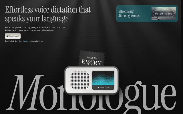
Midnight Terminal with Aqua Glow. A luminous aqua cursor on a deep, textured black screen, where retro-futuristic forms hint at precision and understated power.
Color palette
Interactive link text, highlighted text, subtle decorative borders, functional icon accents
Card background for emphasized informational blocks
Accented card backgrounds, decorative elements
Dark borders and separators for elevated surfaces and inverted UI. Do not promote it to the primary CTA color
Deep canvas for dark sections, primary dark surfaces, and high-contrast framing. Do not promote it to the primary CTA color; Background texture for visual depth, especially in header regions
Secondary surface background, subtle elevated elements
Filled button backgrounds, body text with low contrast, interactive element backgrounds
Card backgrounds, subtle background textures
Subtle shadow tints, secondary text elements
Primary headings and body text, accent borders, button text on dark backgrounds
Typography
- Weights
- 400
- Sizes
- 12px
- Line height
- 1.2
sans-serif — detected in extracted data but not described by AI
- Weights
- 400
- Sizes
- 28px, 30px, 32px, 40px, 48px, 64px, 70px, 72px, 96px, 393px, 403px
- Line height
- 0.9, 1, 1.1, 1.2, 1.3, 1.4
- Letter spacing
- -0.04em, -0.03em, -0.007em, -0.003em, -0.002em, 0.008em
Display and primary headings – large, expressive serif that commands attention and establishes brand presence. Use with tight tracking for impact.
- Weights
- 400
- Sizes
- 10px, 12px, 14px, 15px, 16px, 18px, 20px, 32px
- Line height
- 0.8, 1, 1.2, 1.4, 1.5
- Letter spacing
- -0.05em, -0.01em, -0.008em, -0.007em, -0.006em, 0.015em, 0.017em, 0.019em, 0.020em, 0.021em
Monospaced text for code blocks, secondary headings, and functional UI elements – providing a retro-tech feel and clear information hierarchy.
- Weights
- 400
- Sizes
- 17px
- Line height
- 1.4
- Letter spacing
- normal
- Fallback
- Inter
Primary body text – a modern sans-serif for clear readability and informational content.
- Weights
- 400
- Sizes
- 16px
- Line height
- 1.4
- Letter spacing
- -0.006em
- Fallback
- SF Pro Text
Secondary body text and detailed descriptive elements – for compact and precise information presentation consistent with Apple's ecosystem.
- Weights
- 400
- Sizes
- 16px
- Line height
- 1.5
system-ui — detected in extracted data but not described by AI
Spacing & shape
Elevation
Components
Solid `Dark Charcoal` (#282828) background with `Near White` (#ffffff) text, using a generous `100000px` border-radius for a pill shape. Padding is `18px` horizontal and `20px` vertical.
Transparent background with a `100000px` border-radius and a `Absolute Zero` (#000000) border of `6px` width. Text color uses the browser default link color, which is a rare artifact not part of the brand palette. **A brand-consistent approach would be to use Electric Aqua for text.**
Uses `Carbon Black` (#191919) as background with `10px` border-radius and `16px` padding on all sides. No visible box shadow, achieving a flat, embedded aesthetic.
Features a `Sea Glass` (#062f34) background with `16px` padding and `10px` border-radius. Used for informational blocks that require a subtle, calm highlight.
Utilizes a `Sky Burst` (#44ccff) background with `16px` padding and `10px` border-radius. Provides a more vivid, attention-grabbing background for key features.
Has a `Slate Gray` (#3f3f3f) background with prominent `52px` border-radius. Features a complex inset box shadow creating depth and a glossy effect. Padding is `12px` on all sides.
Features a transparent background with `Near White` (#ffffff) borders and `10px` border-radius. Padding is `16px` on all sides. When in an active state, it's typically highlighted by the `Electric Aqua` accent.
Guidelines
- Prioritize `Absolute Zero` (#000000) or `Deep Graphite` (#010101) as primary background colors for large sections.
- Use `Instrument Serif` for all primary headlines, leveraging its unique character and impactful size variations.
- Apply `DM Mono` for any code snippets, secondary headings, or UI labels to maintain the retro-tech aesthetic.
- Incorporate `Electric Aqua` (#19d0e8) sparingly for interactive elements, links, and small functional accents to provide a 'switched-on' feel.
- Use `10px` border-radius for cards and content containers, and `100000px` for all buttons to achieve a consistent pill shape.
- Employ the subtle inner shadow `rgba(0, 0, 0, 0.7) 3px 3px 2px 0px inset, rgba(255, 255, 255, 0.25) 3px 2px 2px 0px` on surfaces to add depth rather than heavy external shadows.
- Maintain a conservative compact density, using `10px` as a default `elementGap` between UI elements and `16px` for `cardPadding`.
- Avoid using bright or overly saturated colors outside of the designated `Electric Aqua` and `Sky Burst` accents.
- Do not introduce heavy drop shadows or strong external elevation as the design favors subtle inset shadows for depth.
- Refrain from using generic sans-serif fonts for headlines; `Instrument Serif` is key to the brand's typographic identity.
- Avoid large, content-heavy image banners; imagery should be contained, illustrative, or product-focused within the dark UI.
- Do not use multiple accent colors; stick to the `Electric Aqua` and `Sky Burst` for highlights to maintain focus.
- Avoid excessive use of gradients; if used, they should be subtle dark-to-dark transitions for background textures, not vivid multi-color displays.
- Do not use sharp corners; the design consistently uses rounded corners, with `10px` or `8px` being common for main containers and `100000px` for interactive elements.
About this system
ShowHide
Monologue evokes a 'hacker garage at midnight' aesthetic, blending retro tech charm with modern dark mode sophistication. The design utilizes a deep, multi-layered neutral palette of dark grays and blacks as its canvas, punctuated by selective, vivid aqua accents. Typography combines a classic serif for imposing headlines with a monospaced font for functional elements, creating a distinctive contrast. Components are minimal, often transparent or outlined, and sparingly employ subtle inner shadows for depth rather than heavy elevation.
The page primarily uses a max-width contained layout, likely around `1200px`, centered on the screen. The hero section is full-bleed dark, featuring prominent `Instrument Serif` headlines and a central product graphic or media player, with call-to-action buttons below it. Content sections often follow an alternating pattern of text on one side and a product screenshot/illustration on the other. Feature lists and other information are arranged in vertically stacked blocks, sometimes within cards. The overall rhythm is consistent vertical spacing between sections. Navigation is a sticky top bar, likely minimal in appearance. The density is compact, prioritizing information without feeling cramped, with clear visual separation between content blocks.
The visual language focuses on stylized product representations and abstract tech-inspired graphics. Photography is minimal, if present, and would likely be high-contrast and monochrome. Illustrations are flat, geometric, and often incorporate the vivid `Electric Aqua` accent color, suggesting digital interfaces or data visualization. Icons are outlined, simple, and functional, maintaining a high stroke weight for clarity within the dark theme. Imagery serves both decorative atmosphere and explanatory content, often highlighting product features or conceptual processes. The density is medium, with visuals integrated into content blocks rather than full-bleed, ensuring the UI remains the primary focus.
Reminiscent of Raycast, Linear, Notion (dark mode), Figma (dark mode).
# Monologue — Style Reference
> Midnight Terminal with Aqua Glow. A luminous aqua cursor on a deep, textured black screen, where retro-futuristic forms hint at precision and understated power.

**Theme:** dark

**Site:** https://www.monologue.to

Monologue evokes a 'hacker garage at midnight' aesthetic, blending retro tech charm with modern dark mode sophistication. The design utilizes a deep, multi-layered neutral palette of dark grays and blacks as its canvas, punctuated by selective, vivid aqua accents. Typography combines a classic serif for imposing headlines with a monospaced font for functional elements, creating a distinctive contrast. Components are minimal, often transparent or outlined, and sparingly employ subtle inner shadows for depth rather than heavy elevation.

## Tokens — Colors

| Name | Value | Token | Role |
|------|------|------|------|
| Electric Aqua | `#19d0e8` | `--color-electric-aqua` | Interactive link text, highlighted text, subtle decorative borders, functional icon accents |
| Sea Glass | `#062f34` | `--color-sea-glass` | Card background for emphasized informational blocks |
| Sky Burst | `#44ccff` | `--color-sky-burst` | Accented card backgrounds, decorative elements |
| Absolute Zero | `#000000` | `--color-absolute-zero` | Dark borders and separators for elevated surfaces and inverted UI. Do not promote it to the primary CTA color |
| Deep Graphite | `#010101` | `--color-deep-graphite` | Deep canvas for dark sections, primary dark surfaces, and high-contrast framing. Do not promote it to the primary CTA color; Background texture for visual depth, especially in header regions |
| Carbon Black | `#191919` | `--color-carbon-black` | Secondary surface background, subtle elevated elements |
| Dark Charcoal | `#282828` | `--color-dark-charcoal` | Filled button backgrounds, body text with low contrast, interactive element backgrounds |
| Slate Gray | `#3f3f3f` | `--color-slate-gray` | Card backgrounds, subtle background textures |
| Ash Gray | `#7f7f7f` | `--color-ash-gray` | Subtle shadow tints, secondary text elements |
| Near White | `#ffffff` | `--color-near-white` | Primary headings and body text, accent borders, button text on dark backgrounds |

## Tokens — Typography

### sans-serif
- **Weights:** 400
- **Sizes:** 12px
- **Line height:** 1.2
- **Role:** sans-serif — detected in extracted data but not described by AI

### Instrument Serif
- **Weights:** 400
- **Sizes:** 28px, 30px, 32px, 40px, 48px, 64px, 70px, 72px, 96px, 393px, 403px
- **Line height:** 0.9, 1, 1.1, 1.2, 1.3, 1.4
- **Letter spacing:** -0.04em, -0.03em, -0.007em, -0.003em, -0.002em, 0.008em
- **Role:** Display and primary headings – large, expressive serif that commands attention and establishes brand presence. Use with tight tracking for impact.

### DM Mono
- **Weights:** 400
- **Sizes:** 10px, 12px, 14px, 15px, 16px, 18px, 20px, 32px
- **Line height:** 0.8, 1, 1.2, 1.4, 1.5
- **Letter spacing:** -0.05em, -0.01em, -0.008em, -0.007em, -0.006em, 0.015em, 0.017em, 0.019em, 0.020em, 0.021em
- **Role:** Monospaced text for code blocks, secondary headings, and functional UI elements – providing a retro-tech feel and clear information hierarchy.

### Geist
- **Substitute:** Inter
- **Weights:** 400
- **Sizes:** 17px
- **Line height:** 1.4
- **Letter spacing:** normal
- **Role:** Primary body text – a modern sans-serif for clear readability and informational content.

### SF Pro Display Regular
- **Substitute:** SF Pro Text
- **Weights:** 400
- **Sizes:** 16px
- **Line height:** 1.4
- **Letter spacing:** -0.006em
- **Role:** Secondary body text and detailed descriptive elements – for compact and precise information presentation consistent with Apple's ecosystem.

### system-ui
- **Weights:** 400
- **Sizes:** 16px
- **Line height:** 1.5
- **Role:** system-ui — detected in extracted data but not described by AI

## Tokens — Type Scale

| Role | Size | Line height | Letter spacing |
|------|------|------|------|
| caption | 10px | 1.4 | 0.2px |
| body | 16px | 1.5 | -0.096em |
| subheading | 20px | 1.2 | -0.16px |
| heading | 40px | 1.1 | -0.8px |
| display | 96px | 0.9 | -3.84px |

## Tokens — Spacing

- **Max width:** 1200px
- **Section gap:** 40px
- **Card padding:** 16px
- **Element gap:** 10px

## Tokens — Radius

- **Default:** 8px
- **Buttons:** 100000px
- **Cards:** 10px
- **avatars:** 900px
- **largeCards:** 40px
- **smallElements:** 4px

## Tokens — Elevation

- **Media Player Card:** `rgba(0, 0, 0, 0.25) 0px 5.0405px 10.207px 0px, rgba(201, 201, 201, 0.15) 0px 21.9128px 7.30426px 0px inset, rgba(0, 0, 0, 0.15) 0px -24.3475px 6.33036px 0px inset`
- **Subtle Inner Shadow:** `rgba(0, 0, 0, 0.7) 3px 3px 2px 0px inset, rgba(255, 255, 255, 0.25) 3px 2px 2px 0px`

## Layout

The page primarily uses a max-width contained layout, likely around `1200px`, centered on the screen. The hero section is full-bleed dark, featuring prominent `Instrument Serif` headlines and a central product graphic or media player, with call-to-action buttons below it. Content sections often follow an alternating pattern of text on one side and a product screenshot/illustration on the other. Feature lists and other information are arranged in vertically stacked blocks, sometimes within cards. The overall rhythm is consistent vertical spacing between sections. Navigation is a sticky top bar, likely minimal in appearance. The density is compact, prioritizing information without feeling cramped, with clear visual separation between content blocks.

## Imagery

The visual language focuses on stylized product representations and abstract tech-inspired graphics. Photography is minimal, if present, and would likely be high-contrast and monochrome. Illustrations are flat, geometric, and often incorporate the vivid `Electric Aqua` accent color, suggesting digital interfaces or data visualization. Icons are outlined, simple, and functional, maintaining a high stroke weight for clarity within the dark theme. Imagery serves both decorative atmosphere and explanatory content, often highlighting product features or conceptual processes. The density is medium, with visuals integrated into content blocks rather than full-bleed, ensuring the UI remains the primary focus.

## Components

### Filled Dark Button
*Primary action button*

Solid `Dark Charcoal` (#282828) background with `Near White` (#ffffff) text, using a generous `100000px` border-radius for a pill shape. Padding is `18px` horizontal and `20px` vertical.

### Ghost Accent Button
*Secondary action or featured link*

Transparent background with a `100000px` border-radius and a `Absolute Zero` (#000000) border of `6px` width. Text color uses the browser default link color, which is a rare artifact not part of the brand palette. **A brand-consistent approach would be to use Electric Aqua for text.**

### Info Card
*Content container for features or testimonials*

Uses `Carbon Black` (#191919) as background with `10px` border-radius and `16px` padding on all sides. No visible box shadow, achieving a flat, embedded aesthetic.

### Highlight Card - Sea Glass
*Emphasized feature card*

Features a `Sea Glass` (#062f34) background with `16px` padding and `10px` border-radius. Used for informational blocks that require a subtle, calm highlight.

### Highlight Card - Sky Burst
*Prominent feature card*

Utilizes a `Sky Burst` (#44ccff) background with `16px` padding and `10px` border-radius. Provides a more vivid, attention-grabbing background for key features.

### Media Player Card
*Distinctive object container, often for media*

Has a `Slate Gray` (#3f3f3f) background with prominent `52px` border-radius. Features a complex inset box shadow creating depth and a glossy effect. Padding is `12px` on all sides.

### Text Input Container
*Container for form inputs or code snippets*

Features a transparent background with `Near White` (#ffffff) borders and `10px` border-radius. Padding is `16px` on all sides. When in an active state, it's typically highlighted by the `Electric Aqua` accent.

## Guidelines

### Do

- Prioritize `Absolute Zero` (#000000) or `Deep Graphite` (#010101) as primary background colors for large sections.
- Use `Instrument Serif` for all primary headlines, leveraging its unique character and impactful size variations.
- Apply `DM Mono` for any code snippets, secondary headings, or UI labels to maintain the retro-tech aesthetic.
- Incorporate `Electric Aqua` (#19d0e8) sparingly for interactive elements, links, and small functional accents to provide a 'switched-on' feel.
- Use `10px` border-radius for cards and content containers, and `100000px` for all buttons to achieve a consistent pill shape.
- Employ the subtle inner shadow `rgba(0, 0, 0, 0.7) 3px 3px 2px 0px inset, rgba(255, 255, 255, 0.25) 3px 2px 2px 0px` on surfaces to add depth rather than heavy external shadows.
- Maintain a conservative compact density, using `10px` as a default `elementGap` between UI elements and `16px` for `cardPadding`.

### Don't

- Avoid using bright or overly saturated colors outside of the designated `Electric Aqua` and `Sky Burst` accents.
- Do not introduce heavy drop shadows or strong external elevation as the design favors subtle inset shadows for depth.
- Refrain from using generic sans-serif fonts for headlines; `Instrument Serif` is key to the brand's typographic identity.
- Avoid large, content-heavy image banners; imagery should be contained, illustrative, or product-focused within the dark UI.
- Do not use multiple accent colors; stick to the `Electric Aqua` and `Sky Burst` for highlights to maintain focus.
- Avoid excessive use of gradients; if used, they should be subtle dark-to-dark transitions for background textures, not vivid multi-color displays.
- Do not use sharp corners; the design consistently uses rounded corners, with `10px` or `8px` being common for main containers and `100000px` for interactive elements.

## Agent Prompt Guide

**Quick Color Reference:**
- text: #ffffff
- background: #000000
- border: #000000
- accent: #19d0e8
- primary action: #282828 (filled action)

**3-5 Example Component Prompts:**
1. Create a hero section: `Absolute Zero` (#000000) background transitioned with `Monologue Gradient Dark` in `linear-gradient(rgb(50, 50, 50) 0%, rgb(1, 1, 1) 100%)`. Headline 'Effortless voice dictation' in `Instrument Serif` at 70px, `Near White` (#ffffff), letter-spacing -0.03em. Subtext in `Geist` at 17px, `Near White` (#ffffff). Include a 'Download' button: `Dark Charcoal` (#282828) background, `Near White` (#ffffff) text, `100000px` border-radius, `20px 18px` padding.
2. Design a feature card: `Carbon Black` (#191919) background, `10px` border-radius, `16px` padding. Headline in `DM Mono` at 20px, `Near White` (#ffffff), letter-spacing 0.019em. Body text in `Geist` at 17px, `Near White` (#ffffff).
3. Create an emphasized media player card: `Slate Gray` (#3f3f3f) background, `52px` border-radius, `12px` padding, with the box-shadow `rgba(0, 0, 0, 0.25) 0px 5.0405px 10.207px 0px, rgba(201, 201, 201, 0.15) 0px 21.9128px 7.30426px 0px inset, rgba(0, 0, 0, 0.15) 0px -24.3475px 6.33036px 0px inset`.
More like this



Keep what you find
A free account saves references to boards and can send you a weekly email of picks based on what you save.
To see every result, go Pro.