Preview image. Unlock full-res
Midnight Nebula Canvas
Color palette
Primary action backgrounds, interactive links, selected states, key iconography — provides a strong, energetic focal point
Decorative card backgrounds, accent elements, providing depth and a premium feel
Alternative action backgrounds, secondary branding elements, gradient top-color; Decorative gradient for headers and branded elements, creating a luminous effect
Accent buttons, interactive states, part of the multi-color brand spectrum
Accent buttons, interactive states, part of the multi-color brand spectrum
Accent buttons, interactive states, part of the multi-color brand spectrum
Accent buttons, interactive states, part of the multi-color brand spectrum
Accent buttons, interactive states, part of the multi-color brand spectrum
Page background, primary text (in light mode contexts), most interactive element borders, shadow foundations; Subtle background gradient for elevated sections, providing textural variation on dark surfaces
Text on dark backgrounds, icon fills, card surfaces when a light theme is temporarily invoked (e.g. popups)
Elevated background surfaces, secondary text, subtle dividers
Tertiary background surfaces, muted text details
Typography
- Weights
- 400, 500, 600, 700, 800
- Sizes
- 11px, 14px, 16px, 18px, 20px, 24px, 40px, 52px
- Line height
- 1, 1.05, 1.17, 1.2, 1.25, 1.29, 1.31, 1.33
- Letter spacing
- 0.0070em, 0.0090em, 0.0150em, 0.0170em, 0.0180em, 0.0190em, 0.0220em, 0.0250em, 0.0320em
Primary brand typeface for all headings, body text, and UI elements. Its rounded humanist sans-serif aesthetic contributes to the friendly, contemporary feel of the interface across all weights and sizes.
- Weights
- 400
- Sizes
- 13px, 16px
- Line height
- 1.2
Fallback system font primarily for button and icon labels where a generic sans-serif is sufficient and SFRounded might not be loaded, maintaining basic readability.
- Weights
- 400
- Sizes
- 20px
- Line height
- 1.05
- Letter spacing
- 0.0170em
System fallback for general body text at display sizes, ensuring content remains legible and consistent even without custom fonts.
- Weights
- 400
- Sizes
- 14px
- Line height
- 1
- Letter spacing
- 0.0250em
Monospace font for code snippets and technical text, ensuring consistent character width important for programming output and command line interfaces.
Spacing & shape
Elevation
Components
Transparent background (`rgba(0, 0, 0, 0)`), Cloud White text, with a subtle white inset border (`rgba(245, 248, 255, 0.12) 0px 0px 0px 1px inset`). Uses a full pill radius (`9999px`) and symmetrical horizontal padding (24px right/left).
Filled with Vivid Blue (`#0e76fd`) background, Cloud White text, with `9999px` corner radius. Padding is `5px` top/bottom and `5px` right/left, with 12px horizontal element spacing.
Semi-transparent white background (`rgba(255, 255, 255, 0.32)`), Eclipse Black text, and a `100%` border-radius for a perfect circle. Padding: `1px` top/bottom, `6px` right/left.
Cloud White background (`#ffffff`), `24px` border-radius, and a soft, prominent shadow (`rgba(0, 0, 0, 0.32) 0px 8px 32px 0px`). Typically contains UI elements on a light canvas, contrasting with the dark page background.
Background color `rgba(0, 0, 0, 0)` with a subtle inner border `rgba(245, 248, 255, 0.12) 0px 0px 0px 1px inset`. Text is monospaced using SFMono.
Circular shape with `100%` radius, typically filled with opaque Deep Violet (`#38228f`) or other brand colors. Contains single-color or simple multi-color logos.
Guidelines
- Prioritize Eclipse Black (#000000) for base backgrounds and Cloud White (#ffffff) for primary text on dark themes.
- Use Vivid Blue (#0e76fd) as the default for all primary calls to action and interactive elements.
- Apply `9999px` border-radius for all button elements to create a distinctive pill shape.
- Maintain comfortable vertical rhythm with `12px` element gaps and `40px` section gaps.
- Utilize SFRounded as the primary typeface for all textual content, adjusting weights for hierarchy.
- Apply the inner shadow `rgba(255, 255, 255, 0.12) 0px 0px 0px 1px inset` to interactive elements on dark backgrounds for a subtle raised effect.
- Reserve specific vibrant colors (like Azure Glow, Flamingo Pink, Volcanic Red) for accent buttons to diversify call-to-action options without diluting the primary brand blue.
- Avoid harsh, contrasting outlines on interactive elements; prefer subtle inner shadows or transparent backgrounds.
- Do not use generic system fonts for display headings; leverage SFRounded weights for brand consistency.
- Do not use #4bd166 for UI elements; it is reserved for decorative SVG fills and not interactive components.
- Avoid dense informational blocks; ensure ample spacing (`12px` elementGap, `40px` sectionGap) between components and content.
- Do not use box-shadows excessively; only apply the specific tokenized shadows for elevation or interactive states.
- Do not introduce new color palettes outside of the defined Brand and Accent colors; decorative gradients should be limited to the defined Gradient Aura Blue and Gradient Ocean.
About this system
ShowHide
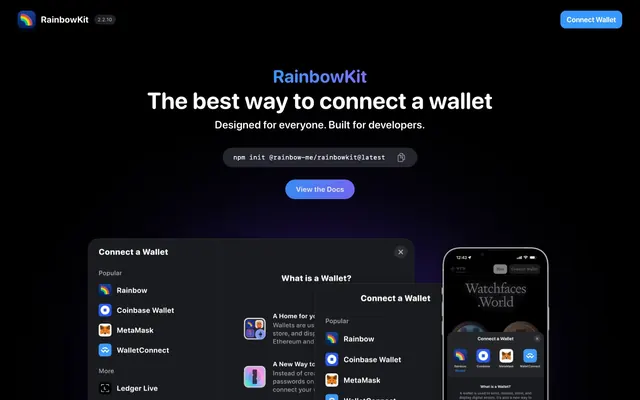
RainbowKit orchestrates a cosmic dark-mode experience with glowing accents. Most surfaces are deep, rich dark grays and blacks, providing a canvas for vibrant, saturated blues, violets, and a spectrum of other hues to punctuate interactive elements and provide visual interest. Typography is compact and precise, maintaining clarity against the dark backdrop. Components favor soft curves and subtle inner shadows, creating a sense of depth and dimensionality without harsh outlines, prioritizing a confident, playful developer-tool aesthetic.
The page primarily uses a max-width contained layout, approximately 1200px, centered on the screen. The hero section is full-bleed with a dark background, featuring a centered headline and subtext. Content flows in distinct vertical sections, often featuring alternating left-aligned text with right-aligned visuals, or vice-versa, creating a dynamic Z-pattern. Feature grids utilize a multi-column card layout, specifically a 3-column grid for partner logos. Navigation is a minimal top bar, featuring a primary 'Connect Wallet' action button, providing a clear and sparse interface.
The site predominantly relies on product screenshots and custom illustrations for visual content rather than photography. Product screenshots are typically contained within device mocks or clean cards, showing the UI in context. Illustrations are simple, often monochromatic or using a limited brand palette, with a flat and slightly geometric style. Iconography is primarily outlined, using a medium stroke weight, and integrates with the brand's vibrant accent colors for decorative and functional purposes. Imagery serves primarily to explain product features and showcase brand partners, and is well-balanced with text, avoiding an image-heavy aesthetic.
Reminiscent of Vercel, Stripe, Linear, Radix UI.
# RainbowKit — Style Reference
> Midnight Nebula Canvas

**Theme:** dark

**Site:** https://www.rainbowkit.com

RainbowKit orchestrates a cosmic dark-mode experience with glowing accents. Most surfaces are deep, rich dark grays and blacks, providing a canvas for vibrant, saturated blues, violets, and a spectrum of other hues to punctuate interactive elements and provide visual interest. Typography is compact and precise, maintaining clarity against the dark backdrop. Components favor soft curves and subtle inner shadows, creating a sense of depth and dimensionality without harsh outlines, prioritizing a confident, playful developer-tool aesthetic.

## Tokens — Colors

| Name | Value | Token | Role |
|------|------|------|------|
| Vivid Blue | `#0e76fd` | `--color-vivid-blue` | Primary action backgrounds, interactive links, selected states, key iconography — provides a strong, energetic focal point |
| Deep Violet | `#38228f` | `--color-deep-violet` | Decorative card backgrounds, accent elements, providing depth and a premium feel |
| Sky Blue | `#3898ff` | `--color-sky-blue` | Alternative action backgrounds, secondary branding elements, gradient top-color; Decorative gradient for headers and branded elements, creating a luminous effect |
| Azure Glow | `#5f5afa` | `--color-azure-glow` | Accent buttons, interactive states, part of the multi-color brand spectrum |
| Flamingo Pink | `#ff5ca0` | `--color-flamingo-pink` | Accent buttons, interactive states, part of the multi-color brand spectrum |
| Volcanic Red | `#fa423c` | `--color-volcanic-red` | Accent buttons, interactive states, part of the multi-color brand spectrum |
| Sunset Orange | `#ff801f` | `--color-sunset-orange` | Accent buttons, interactive states, part of the multi-color brand spectrum |
| Emerald Green | `#1db847` | `--color-emerald-green` | Accent buttons, interactive states, part of the multi-color brand spectrum |
| Eclipse Black | `#000000` | `--color-eclipse-black` | Page background, primary text (in light mode contexts), most interactive element borders, shadow foundations; Subtle background gradient for elevated sections, providing textural variation on dark surfaces |
| Cloud White | `#ffffff` | `--color-cloud-white` | Text on dark backgrounds, icon fills, card surfaces when a light theme is temporarily invoked (e.g. popups) |
| Slate Deep | `#1b1c1e` | `--color-slate-deep` | Elevated background surfaces, secondary text, subtle dividers |
| Charcoal Grey | `#25292e` | `--color-charcoal-grey` | Tertiary background surfaces, muted text details |

## Tokens — Typography

### SFRounded
- **Weights:** 400, 500, 600, 700, 800
- **Sizes:** 11px, 14px, 16px, 18px, 20px, 24px, 40px, 52px
- **Line height:** 1, 1.05, 1.17, 1.2, 1.25, 1.29, 1.31, 1.33
- **Letter spacing:** 0.0070em, 0.0090em, 0.0150em, 0.0170em, 0.0180em, 0.0190em, 0.0220em, 0.0250em, 0.0320em
- **Role:** Primary brand typeface for all headings, body text, and UI elements. Its rounded humanist sans-serif aesthetic contributes to the friendly, contemporary feel of the interface across all weights and sizes.

### Arial
- **Weights:** 400
- **Sizes:** 13px, 16px
- **Line height:** 1.2
- **Role:** Fallback system font primarily for button and icon labels where a generic sans-serif is sufficient and SFRounded might not be loaded, maintaining basic readability.

### system-ui
- **Weights:** 400
- **Sizes:** 20px
- **Line height:** 1.05
- **Letter spacing:** 0.0170em
- **Role:** System fallback for general body text at display sizes, ensuring content remains legible and consistent even without custom fonts.

### SFMono
- **Weights:** 400
- **Sizes:** 14px
- **Line height:** 1
- **Letter spacing:** 0.0250em
- **Role:** Monospace font for code snippets and technical text, ensuring consistent character width important for programming output and command line interfaces.

## Tokens — Type Scale

Major Third (1.25) from 16px base.

| Role | Size | Line height | Letter spacing |
|------|------|------|------|
| caption | 11px | 1.33 | 0.35px |
| body-sm | 14px | 1.29 | 0.28px |
| body | 16px | 1.25 | 0.26px |
| subheading | 18px | 1.2 | 0.32px |
| heading-sm | 20px | 1.17 | 0.34px |
| heading | 24px | 1.05 | 0.29px |
| heading-lg | 40px | 1 | 0.36px |
| display | 52px | 1 | 0.36px |

## Tokens — Spacing

- **Section gap:** 40px
- **Card padding:** 18px
- **Element gap:** 12px

## Tokens — Radius

- **Default:** 6px
- **Buttons:** 9999px
- **Cards:** 24px
- **icons:** 12px

## Tokens — Elevation

- **Modal Card (Light):** `rgba(0, 0, 0, 0.32) 0px 8px 32px 0px`
- **Button (Inset):** `rgba(255, 255, 255, 0.12) 0px 0px 0px 1px inset`
- **General Elevated Element:** `rgba(27, 29, 31, 0.1) 0px 10px 30px 0px, rgba(27, 29, 31, 0.04) 0px 5px 15px 0px`

## Layout

The page primarily uses a max-width contained layout, approximately 1200px, centered on the screen. The hero section is full-bleed with a dark background, featuring a centered headline and subtext. Content flows in distinct vertical sections, often featuring alternating left-aligned text with right-aligned visuals, or vice-versa, creating a dynamic Z-pattern. Feature grids utilize a multi-column card layout, specifically a 3-column grid for partner logos. Navigation is a minimal top bar, featuring a primary 'Connect Wallet' action button, providing a clear and sparse interface.

## Imagery

The site predominantly relies on product screenshots and custom illustrations for visual content rather than photography. Product screenshots are typically contained within device mocks or clean cards, showing the UI in context. Illustrations are simple, often monochromatic or using a limited brand palette, with a flat and slightly geometric style. Iconography is primarily outlined, using a medium stroke weight, and integrates with the brand's vibrant accent colors for decorative and functional purposes. Imagery serves primarily to explain product features and showcase brand partners, and is well-balanced with text, avoiding an image-heavy aesthetic.

## Components

### Ghost Button
*Ghost interactive element for secondary actions.*

Transparent background (`rgba(0, 0, 0, 0)`), Cloud White text, with a subtle white inset border (`rgba(245, 248, 255, 0.12) 0px 0px 0px 1px inset`). Uses a full pill radius (`9999px`) and symmetrical horizontal padding (24px right/left).

### Primary Action Button
*Main call-to-action button, conveying primary interaction.*

Filled with Vivid Blue (`#0e76fd`) background, Cloud White text, with `9999px` corner radius. Padding is `5px` top/bottom and `5px` right/left, with 12px horizontal element spacing.

### Icon Button (Circular)
*Small, circular button for actions related to icons or status.*

Semi-transparent white background (`rgba(255, 255, 255, 0.32)`), Eclipse Black text, and a `100%` border-radius for a perfect circle. Padding: `1px` top/bottom, `6px` right/left.

### Modal Card (Light)
*Elevated container primarily for interactive dialogs or pop-ups.*

Cloud White background (`#ffffff`), `24px` border-radius, and a soft, prominent shadow (`rgba(0, 0, 0, 0.32) 0px 8px 32px 0px`). Typically contains UI elements on a light canvas, contrasting with the dark page background.

### Code Snippet Container
*Container for showcasing code or command-line instructions.*

Background color `rgba(0, 0, 0, 0)` with a subtle inner border `rgba(245, 248, 255, 0.12) 0px 0px 0px 1px inset`. Text is monospaced using SFMono.

### Logo Icon
*Used for partner logos and small brand identifiers.*

Circular shape with `100%` radius, typically filled with opaque Deep Violet (`#38228f`) or other brand colors. Contains single-color or simple multi-color logos.

## Guidelines

### Do

- Prioritize Eclipse Black (#000000) for base backgrounds and Cloud White (#ffffff) for primary text on dark themes.
- Use Vivid Blue (#0e76fd) as the default for all primary calls to action and interactive elements.
- Apply `9999px` border-radius for all button elements to create a distinctive pill shape.
- Maintain comfortable vertical rhythm with `12px` element gaps and `40px` section gaps.
- Utilize SFRounded as the primary typeface for all textual content, adjusting weights for hierarchy.
- Apply the inner shadow `rgba(255, 255, 255, 0.12) 0px 0px 0px 1px inset` to interactive elements on dark backgrounds for a subtle raised effect.
- Reserve specific vibrant colors (like Azure Glow, Flamingo Pink, Volcanic Red) for accent buttons to diversify call-to-action options without diluting the primary brand blue.

### Don't

- Avoid harsh, contrasting outlines on interactive elements; prefer subtle inner shadows or transparent backgrounds.
- Do not use generic system fonts for display headings; leverage SFRounded weights for brand consistency.
- Do not use #4bd166 for UI elements; it is reserved for decorative SVG fills and not interactive components.
- Avoid dense informational blocks; ensure ample spacing (`12px` elementGap, `40px` sectionGap) between components and content.
- Do not use box-shadows excessively; only apply the specific tokenized shadows for elevation or interactive states.
- Do not introduce new color palettes outside of the defined Brand and Accent colors; decorative gradients should be limited to the defined Gradient Aura Blue and Gradient Ocean.

## Agent Prompt Guide

### Quick Color Reference
text: #ffffff
background: #000000
border: rgba(245, 248, 255, 0.12)
accent: #0e76fd
primary action: #0e76fd (filled action)

### 3-5 Example Component Prompts
1. Create a hero section: Eclipse Black background. Headline 'The best way to connect a wallet' at SFRounded 52px weight 800, Cloud White (#ffffff), letter-spacing 0.36px. Subheading 'Designed for everyone. Built for developers.' at SFRounded 24px weight 400, Cloud White (#ffffff). Include a primary action button 'View the Docs': Vivid Blue (#0e76fd) background, Cloud White text, SFRounded 16px weight 700, 9999px radius, 5px top/bottom, 5px right/left padding.
2. Create a 'Connect Wallet' modal: Light Modal Surface card (#ffffff), 24px radius, with shadow rgba(0, 0, 0, 0.32) 0px 8px 32px 0px. Inside, place a list of wallet options. Each option should be a row with an icon and text 'Rainbow' at SFRounded 16px, Eclipse Black (#000000).
3. Create a secondary ghost button: Transparent background, Cloud White text (SFRounded 16px weight 400), with an inner border rgba(245, 248, 255, 0.12) 0px 0px 0px 1px inset, 9999px radius, 24px right/left padding. Label it 'Learn More'.
4. Design a 'Code Snippet' component for `npm init` instructions: Background is transparent with `rgba(245, 248, 255, 0.12) 0px 0px 0px 1px inset` border, `9999px` radius, SFMono 14px text in Cloud White. Place a circular Icon Button 'Copy' with `rgba(255, 255, 255, 0.32)` background, `100%` radius, and Eclipse Black icon/text.
5. Create a partner logo grid section: Base Surface (#1b1c1e) background. Each logo is a circular 'Logo Icon' with Deep Violet (#38228f) background, 100% radius, containing an Eclipse Black SVG logo, arranged in a 3-column grid with 12px element gaps.
More like this



Keep what you find
A free account saves references to boards and can send you a weekly email of picks based on what you save.
To see every result, go Pro.