Preview image. Unlock full-res
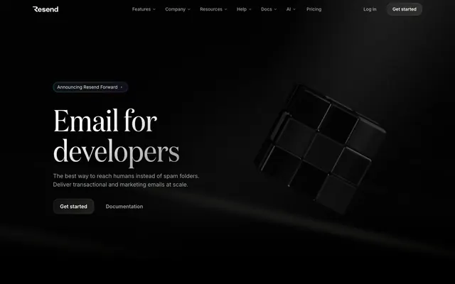
Obsidian developer terminal — every surface reads like polished black glass under a focused beam of white type.
Color palette
Blue action color for filled buttons, selected navigation states, and focused conversion moments.
Code syntax highlights, email address text in product UI, decorative icon borders — the brand's signature hue, always used inside product surfaces rather than nav or shell; Email app icon gradient from violet to purple — product identity mark
Green decorative accent for icons, marks, and small graphic details. Use as a supporting accent, not as a status color
Red decorative accent for icons, marks, and small graphic details. Use as a supporting accent, not as a status color
Yellow decorative accent for icons, marks, and small graphic details. Use as a supporting accent, not as a status color
Blue decorative accent for icons, marks, and small graphic details. Use as a supporting accent, not as a status color
Violet decorative accent for icons, marks, and small graphic details. Use as a supporting accent, not as a status color
Page canvas, card backgrounds — the dominant surface across every section
Component borders, dividers, image frames — hairline structural separation on black
Subtle secondary borders and muted text-adjacent strokes
Tertiary text, badge labels, de-emphasized body content
Secondary body text, icon strokes at reduced opacity
Primary muted body text, icon fills, badge borders
Slightly brighter secondary UI text, active badge outlines
Primary content text — headings, body copy, nav labels — the single high-contrast text color on black
Maximum-emphasis text, icon fills, active button labels
Subtle card-to-canvas gradient top — barely perceptible surface elevation on dark UI
Typography
- Weights
- 400, 500, 600
- Sizes
- 12px, 14px, 16px, 18px, 24px
- Line height
- 1.33
- Letter spacing
- normal
- Fallback
- Inter (free via Google Fonts)
All UI chrome — nav, buttons, body copy, captions, links. The workhorse that disappears into the interface. 600 weight used for interactive emphasis, 400 for running text.
- Weights
- 400
- Sizes
- 77px, 96px
- Line height
- 1
- Letter spacing
- -0.01em
- Fallback
- DM Serif Display, Playfair Display
Display-only serif for the largest hero statements and section closers. Weight 400 at near-100px is anti-convention — most dev tools use grotesque sans at this scale, the serif creates authority through editorial restraint. Tightest tracking in the system.
- Weights
- 400, 500
- Sizes
- 14px, 16px, 20px, 56px
- Line height
- 1
- Letter spacing
- -0.05em at 56px; +0.025em at smaller display sizes
- Fallback
- ABC Favorit (commercial), Söhne, GT America
Section headings and subheadings. At 56px weight 400 with -0.05em tracking, punches well above its point size. At 14-20px used for feature labels and callouts. The custom geometric grotesque gives sharper corners than Inter, distinguishing marketing headings from UI copy.
- Weights
- 400
- Sizes
- 12px, 14px, 16px
- Line height
- 1.33
- Letter spacing
- normal
- Fallback
- JetBrains Mono, Fira Code
Code samples, badge labels, filename strings, and terminal-style inline snippets. Distinguishes developer content from prose at a glance — the monospace voice signals 'this is actual code', not metaphor.
- Weights
- 400, 600, 700
- Sizes
- 14px
- Line height
- 1, 1.71
Helvetica — detected in extracted data but not described by AI
- Weights
- 400
- Sizes
- 14px
- Line height
- 1.5, 1.55
-apple-system — detected in extracted data but not described by AI
Spacing & shape
Elevation
Components
Transparent background, 1px solid #3b9eff border, 8px radius, #ffffff text at Inter 14px weight 500. Padding: 1px all sides (tight fit to border). On dark canvas the electric blue ring is the single chromatic signal in the entire nav bar, drawing the eye to the only action that matters.
Transparent background, no visible border, #f0f0f0 at 71% opacity text, Inter 14px weight 400. Padding: 4px vertical, 0px horizontal. Chevron indicator appended. Zero radius. Fades into the black nav bar, deferring attention to the CTA.
No background, no border, #fcfdff at ~94% opacity, Inter 14px weight 400. Padding: 0. Used inline beside filled/outlined actions as the quieter alternative path.
No background, no border, #a1a4a5 text, Inter 14px weight 400. Padding: 4px top/bottom. The lowest-contrast button in the system — visually recedes to a hint.
Transparent background, 1px solid #292d30 border, 16px radius, #f0f0f0 text at Inter 14px weight 400. Small arrow glyph appended. Sits above hero headline as a notification-style entry point.
Background #000000 (or near-black gradient from #1b1b1b to #030303), 16px radius, 1px solid #292d30 border, 32px padding all sides. No box-shadow. Content: icon + heading (Inter 16-18px weight 600, #ffffff) + body (Inter 14px weight 400, #a1a4a5).
Background #000000, 16px radius, 1px solid #292d30 border, 32px padding. Quote body in Inter 14px weight 400 at #f0f0f0, attribution in #a1a4a5 at 12px. Avatar image at 32px rounded-full. No shadow — sits flush in dark scroll container.
Background near-black with 1px #292d30 border, 16px radius. CommitMono 14px weight 400. Keywords and identifiers in #9281f7 (Resend Violet), email addresses in #9281f7, strings in #f0f0f0. Filename tabs use Inter 12px #a1a4a5 with #3b9eff for active file color.
No background, no border-radius. Icon + label text at 14px Inter weight 400. Delivered = #3ad389, Bounced = #ff9592, Complained = #ffca16, Opened = #70b8ff, Clicked = #baa7ff. These are the only vivid color uses in the entire product surface.
Rounded square with 24px radius, violet-to-purple gradient (linear-gradient from #9281f7 to #9a54dc in oklab colorspace). Envelope icon in white centered. Dark inner shadow creates depth. Represents the Resend email product identity.
Background #000000 with backdrop-filter blur(25px) for frosted glass behavior when content scrolls beneath. Height 59px. Left: Resend wordmark in white. Center: ghost nav buttons. Right: Log in ghost link + 'Get started' outlined blue CTA. 1px solid #292d30 bottom border separates from content.
White SVG logos (#ffffff, 60-80% opacity) on black background. No cards or borders — logos float directly on canvas. Two rows, 6 columns. Caption text above in #a1a4a5 at Inter 14px.
Guidelines
- Use #000000 as the default background for every section, card, and container — deviations must be justified by a visible elevation hierarchy via 1px #292d30 border.
- Apply Domaine weight 400 exclusively to hero display text (77-96px) and use ABCFavorit for section headings (56px) — never swap these roles.
- Reserve the six vivid status colors (#3ad389, #ff9592, #ffca16, #70b8ff, #baa7ff, #9281f7) strictly for product-UI data contexts such as email event rows or code syntax — never for decorative section backgrounds or nav elements.
- Use CommitMono for any code, filename, CLI snippet, or developer token — never Inter or ABCFavorit in code contexts.
- Keep button borders at 6px radius for action buttons and pill badges at 16px radius — maintain this distinction to separate call-to-action shape from tagging shape.
- Use #3b9eff only as the outlined border on the primary CTA button — this is the only chromatic color in the nav/shell and must remain singular.
- Set all card padding to 32px and maintain 1px solid #292d30 as the only border treatment — no shadow stacks, no color fills, no gradients on cards.
- Never use a filled colored background for action buttons — the design uses outlined (#3b9eff border) or ghost (transparent) buttons exclusively. A filled blue or violet button breaks the matte black surface language.
- Never apply Domaine or ABCFavorit to UI chrome such as nav labels, badge text, or button copy — those belong exclusively to Inter.
- Never use more than one vivid status color in a non-product-UI context — the moment a page-level section uses green or yellow as decoration, the email event system loses its meaning.
- Never add drop shadows to cards or sections — elevation is achieved through 1px border contrast on black, not shadow lifting.
- Never use a white or light background for any full-width section — even 'light' content blocks must remain on near-black (#000000 or #0b0e14).
- Never increase letter-spacing on display text — Domaine and ABCFavorit run at negative tracking (-0.01em and -0.05em respectively); positive tracking at display sizes conflicts with the editorial compression of this system.
- Never mix more than two typefaces in a single component — one font for UI copy (Inter) and one for code (CommitMono) is the maximum; headings use ABCFavorit or Domaine depending on size, never both simultaneously.
About this system
ShowHide
Resend is a pure black command surface — the canvas is #000000 with near-zero colorfulness (1%), giving the entire interface the weight of polished obsidian. Headlines use a custom serif (Domaine) at display sizes with tight -0.01em tracking, while UI copy runs in Inter and monospaced code elements appear in CommitMono, creating a three-voice typographic hierarchy that signals dev tooling without decoration. Color appears almost exclusively as functional data punctuation: violet for code identity, blue for interactive borders, and a handful of vivid status colors (green, red, yellow, light blue) that function as email event indicators — never as decoration. The system uses subtle border-based elevation (1px hairlines at #292d30) rather than shadows, keeping all surfaces flush and matte on black.
Max-width approximately 1200px centered on a full-bleed black canvas. Hero is full-viewport dark — left-aligned headline block with announcement pill above, two action buttons below, and a right-positioned 3D rendered object floating in the dark field. Section rhythm is seamless black-on-black with only hairline dividers (1px #292d30) separating bands — no alternating light/dark sections, no distinct color shifts between sections. Feature sections use left-text / right-product-video two-column layouts at roughly 40/60 split, alternating which side holds the visual. Social proof uses a horizontal scroll card strip. Code showcase sections use a centered stack with the code panel as the hero visual. The navigation is a fixed top bar at 59px. Footer is minimal — two links only. Overall the page feels vertically long with generous spacing (80-120px section gaps) and very low content density per viewport, pushing focus onto each individual product moment.
Resend's visual language centers on high-fidelity 3D-rendered objects — the hero shows a black modular cube cluster rendered with physically-based lighting on pure black, casting no visible floor shadow. Objects have a lacquered, almost ceramic finish: deep black with subtle specular highlights that emerge from the scene's single directional light. There is no lifestyle photography, no people, no abstract patterns. Product screenshots (email analytics tables, code editors) appear as contained UI panels inside dark card frames, treated as flat surfaces rather than floating mockups. The email app icon uses a violet-to-purple gradient as its only chromatic surface. Icon style is outlined with consistent ~1.5px stroke weight, monochromatic white or gray — never filled with color. Overall image density is low: one hero 3D object, one or two product video panels per section, white company logos on black. The site is text and code dominant; imagery serves as punctuation, not wallpaper.
Reminiscent of Linear, Vercel, Raycast, Planetscale, Loops.
# Resend — Style Reference
> Obsidian developer terminal — every surface reads like polished black glass under a focused beam of white type.

**Theme:** dark

**Site:** https://resend.com

Resend is a pure black command surface — the canvas is #000000 with near-zero colorfulness (1%), giving the entire interface the weight of polished obsidian. Headlines use a custom serif (Domaine) at display sizes with tight -0.01em tracking, while UI copy runs in Inter and monospaced code elements appear in CommitMono, creating a three-voice typographic hierarchy that signals dev tooling without decoration. Color appears almost exclusively as functional data punctuation: violet for code identity, blue for interactive borders, and a handful of vivid status colors (green, red, yellow, light blue) that function as email event indicators — never as decoration. The system uses subtle border-based elevation (1px hairlines at #292d30) rather than shadows, keeping all surfaces flush and matte on black.

## Tokens — Colors

| Name | Value | Token | Role |
|------|------|------|------|
| Electric Blue | `#3b9eff` | `--color-electric-blue` | Blue action color for filled buttons, selected navigation states, and focused conversion moments. |
| Resend Violet | `#9281f7` | `--color-resend-violet` | Code syntax highlights, email address text in product UI, decorative icon borders — the brand's signature hue, always used inside product surfaces rather than nav or shell; Email app icon gradient from violet to purple — product identity mark |
| Delivered Green | `#3ad389` | `--color-delivered-green` | Green decorative accent for icons, marks, and small graphic details. Use as a supporting accent, not as a status color |
| Bounced Red | `#ff9592` | `--color-bounced-red` | Red decorative accent for icons, marks, and small graphic details. Use as a supporting accent, not as a status color |
| Complained Yellow | `#ffca16` | `--color-complained-yellow` | Yellow decorative accent for icons, marks, and small graphic details. Use as a supporting accent, not as a status color |
| Opened Blue | `#70b8ff` | `--color-opened-blue` | Blue decorative accent for icons, marks, and small graphic details. Use as a supporting accent, not as a status color |
| Clicked Lavender | `#baa7ff` | `--color-clicked-lavender` | Violet decorative accent for icons, marks, and small graphic details. Use as a supporting accent, not as a status color |
| Void Black | `#000000` | `--color-void-black` | Page canvas, card backgrounds — the dominant surface across every section |
| Graphite Rail | `#292d30` | `--color-graphite-rail` | Component borders, dividers, image frames — hairline structural separation on black |
| Smoke | `#464a4d` | `--color-smoke` | Subtle secondary borders and muted text-adjacent strokes |
| Ash | `#6c6c6c` | `--color-ash` | Tertiary text, badge labels, de-emphasized body content |
| Steel | `#6e727a` | `--color-steel` | Secondary body text, icon strokes at reduced opacity |
| Fog | `#a1a4a5` | `--color-fog` | Primary muted body text, icon fills, badge borders |
| Mist | `#abafb4` | `--color-mist` | Slightly brighter secondary UI text, active badge outlines |
| Frost | `#f0f0f0` | `--color-frost` | Primary content text — headings, body copy, nav labels — the single high-contrast text color on black |
| Pure White | `#ffffff` | `--color-pure-white` | Maximum-emphasis text, icon fills, active button labels |
| Surface Lift | `#1b1b1b` | `--color-surface-lift` | Subtle card-to-canvas gradient top — barely perceptible surface elevation on dark UI |

## Tokens — Typography

### Inter
- **Substitute:** Inter (free via Google Fonts)
- **Weights:** 400, 500, 600
- **Sizes:** 12px, 14px, 16px, 18px, 24px
- **Line height:** 1.33
- **Letter spacing:** normal
- **Role:** All UI chrome — nav, buttons, body copy, captions, links. The workhorse that disappears into the interface. 600 weight used for interactive emphasis, 400 for running text.

### Domaine
- **Substitute:** DM Serif Display, Playfair Display
- **Weights:** 400
- **Sizes:** 77px, 96px
- **Line height:** 1
- **Letter spacing:** -0.01em
- **Role:** Display-only serif for the largest hero statements and section closers. Weight 400 at near-100px is anti-convention — most dev tools use grotesque sans at this scale, the serif creates authority through editorial restraint. Tightest tracking in the system.

### ABCFavorit
- **Substitute:** ABC Favorit (commercial), Söhne, GT America
- **Weights:** 400, 500
- **Sizes:** 14px, 16px, 20px, 56px
- **Line height:** 1
- **Letter spacing:** -0.05em at 56px; +0.025em at smaller display sizes
- **Role:** Section headings and subheadings. At 56px weight 400 with -0.05em tracking, punches well above its point size. At 14-20px used for feature labels and callouts. The custom geometric grotesque gives sharper corners than Inter, distinguishing marketing headings from UI copy.

### CommitMono
- **Substitute:** JetBrains Mono, Fira Code
- **Weights:** 400
- **Sizes:** 12px, 14px, 16px
- **Line height:** 1.33
- **Letter spacing:** normal
- **Role:** Code samples, badge labels, filename strings, and terminal-style inline snippets. Distinguishes developer content from prose at a glance — the monospace voice signals 'this is actual code', not metaphor.

### Helvetica
- **Weights:** 400, 600, 700
- **Sizes:** 14px
- **Line height:** 1, 1.71
- **Role:** Helvetica — detected in extracted data but not described by AI

### -apple-system
- **Weights:** 400
- **Sizes:** 14px
- **Line height:** 1.5, 1.55
- **Role:** -apple-system — detected in extracted data but not described by AI

## Tokens — Type Scale

Perfect Fourth (1.333) from 16px base.

| Role | Size | Line height | Letter spacing |
|------|------|------|------|
| caption | 12px | 1.33 | — |
| body-sm | 14px | 1.43 | — |
| body | 16px | 1.5 | — |
| subheading | 18px | 1.6 | — |
| heading-sm | 20px | 1.3 | — |
| heading | 24px | 1.33 | — |
| heading-lg | 56px | 1 | -2.8px |
| display | 96px | 1 | -0.96px |

## Tokens — Spacing

- **Max width:** 1200px
- **Section gap:** 80-120px
- **Card padding:** 32px
- **Element gap:** 16px

## Tokens — Radius

- **Buttons:** 6px
- **Cards:** 16px
- **badges:** 6px
- **large:** 24px
- **modals:** 16px
- **tags:** 10px

## Tokens — Elevation

- **Icon ring:** `rgba(176, 199, 217, 0.145) 0px 0px 0px 1px`
- **Dropdown / popover:** `rgba(0, 0, 0, 0.1) 0px 1px 3px 0px, rgba(0, 0, 0, 0.1) 0px 1px 2px -1px`
- **Focus ring / outline:** `rgb(0, 0, 0) 0px 0px 0px 8px`

## Layout

Max-width approximately 1200px centered on a full-bleed black canvas. Hero is full-viewport dark — left-aligned headline block with announcement pill above, two action buttons below, and a right-positioned 3D rendered object floating in the dark field. Section rhythm is seamless black-on-black with only hairline dividers (1px #292d30) separating bands — no alternating light/dark sections, no distinct color shifts between sections. Feature sections use left-text / right-product-video two-column layouts at roughly 40/60 split, alternating which side holds the visual. Social proof uses a horizontal scroll card strip. Code showcase sections use a centered stack with the code panel as the hero visual. The navigation is a fixed top bar at 59px. Footer is minimal — two links only. Overall the page feels vertically long with generous spacing (80-120px section gaps) and very low content density per viewport, pushing focus onto each individual product moment.

## Imagery

Resend's visual language centers on high-fidelity 3D-rendered objects — the hero shows a black modular cube cluster rendered with physically-based lighting on pure black, casting no visible floor shadow. Objects have a lacquered, almost ceramic finish: deep black with subtle specular highlights that emerge from the scene's single directional light. There is no lifestyle photography, no people, no abstract patterns. Product screenshots (email analytics tables, code editors) appear as contained UI panels inside dark card frames, treated as flat surfaces rather than floating mockups. The email app icon uses a violet-to-purple gradient as its only chromatic surface. Icon style is outlined with consistent ~1.5px stroke weight, monochromatic white or gray — never filled with color. Overall image density is low: one hero 3D object, one or two product video panels per section, white company logos on black. The site is text and code dominant; imagery serves as punctuation, not wallpaper.

## Components

### Primary Outlined Action Button
*Main CTA — 'Get started' in nav and hero*

Transparent background, 1px solid #3b9eff border, 8px radius, #ffffff text at Inter 14px weight 500. Padding: 1px all sides (tight fit to border). On dark canvas the electric blue ring is the single chromatic signal in the entire nav bar, drawing the eye to the only action that matters.

### Ghost Navigation Button
*Nav dropdowns — Features, Company, Resources, Help, Docs, AI*

Transparent background, no visible border, #f0f0f0 at 71% opacity text, Inter 14px weight 400. Padding: 4px vertical, 0px horizontal. Chevron indicator appended. Zero radius. Fades into the black nav bar, deferring attention to the CTA.

### Ghost Text Link Button
*Secondary actions — Documentation, Log in, View on GitHub*

No background, no border, #fcfdff at ~94% opacity, Inter 14px weight 400. Padding: 0. Used inline beside filled/outlined actions as the quieter alternative path.

### Muted Secondary Button
*Tertiary navigation links — Pricing*

No background, no border, #a1a4a5 text, Inter 14px weight 400. Padding: 4px top/bottom. The lowest-contrast button in the system — visually recedes to a hint.

### Announcement Badge / Pill
*Inline announcement tag — 'Announcing Resend Forward'*

Transparent background, 1px solid #292d30 border, 16px radius, #f0f0f0 text at Inter 14px weight 400. Small arrow glyph appended. Sits above hero headline as a notification-style entry point.

### Feature Card
*Product feature highlight panels in section grids*

Background #000000 (or near-black gradient from #1b1b1b to #030303), 16px radius, 1px solid #292d30 border, 32px padding all sides. No box-shadow. Content: icon + heading (Inter 16-18px weight 600, #ffffff) + body (Inter 14px weight 400, #a1a4a5).

### Testimonial Card
*Social proof quote cards in horizontal scroll section*

Background #000000, 16px radius, 1px solid #292d30 border, 32px padding. Quote body in Inter 14px weight 400 at #f0f0f0, attribution in #a1a4a5 at 12px. Avatar image at 32px rounded-full. No shadow — sits flush in dark scroll container.

### Code Snippet Block
*Inline product demo code panels in feature sections*

Background near-black with 1px #292d30 border, 16px radius. CommitMono 14px weight 400. Keywords and identifiers in #9281f7 (Resend Violet), email addresses in #9281f7, strings in #f0f0f0. Filename tabs use Inter 12px #a1a4a5 with #3b9eff for active file color.

### Status Event Badge
*Email event row indicators in analytics product UI*

No background, no border-radius. Icon + label text at 14px Inter weight 400. Delivered = #3ad389, Bounced = #ff9592, Complained = #ffca16, Opened = #70b8ff, Clicked = #baa7ff. These are the only vivid color uses in the entire product surface.

### Email App Icon
*Brand product mark shown in logo/hero sections*

Rounded square with 24px radius, violet-to-purple gradient (linear-gradient from #9281f7 to #9a54dc in oklab colorspace). Envelope icon in white centered. Dark inner shadow creates depth. Represents the Resend email product identity.

### Navigation Bar
*Site-wide sticky top bar*

Background #000000 with backdrop-filter blur(25px) for frosted glass behavior when content scrolls beneath. Height 59px. Left: Resend wordmark in white. Center: ghost nav buttons. Right: Log in ghost link + 'Get started' outlined blue CTA. 1px solid #292d30 bottom border separates from content.

### Logo / Partner Wordmark Strip
*Trust signal section — company logo grid*

White SVG logos (#ffffff, 60-80% opacity) on black background. No cards or borders — logos float directly on canvas. Two rows, 6 columns. Caption text above in #a1a4a5 at Inter 14px.

## Guidelines

### Do

- Use #000000 as the default background for every section, card, and container — deviations must be justified by a visible elevation hierarchy via 1px #292d30 border.
- Apply Domaine weight 400 exclusively to hero display text (77-96px) and use ABCFavorit for section headings (56px) — never swap these roles.
- Reserve the six vivid status colors (#3ad389, #ff9592, #ffca16, #70b8ff, #baa7ff, #9281f7) strictly for product-UI data contexts such as email event rows or code syntax — never for decorative section backgrounds or nav elements.
- Use CommitMono for any code, filename, CLI snippet, or developer token — never Inter or ABCFavorit in code contexts.
- Keep button borders at 6px radius for action buttons and pill badges at 16px radius — maintain this distinction to separate call-to-action shape from tagging shape.
- Use #3b9eff only as the outlined border on the primary CTA button — this is the only chromatic color in the nav/shell and must remain singular.
- Set all card padding to 32px and maintain 1px solid #292d30 as the only border treatment — no shadow stacks, no color fills, no gradients on cards.

### Don't

- Never use a filled colored background for action buttons — the design uses outlined (#3b9eff border) or ghost (transparent) buttons exclusively. A filled blue or violet button breaks the matte black surface language.
- Never apply Domaine or ABCFavorit to UI chrome such as nav labels, badge text, or button copy — those belong exclusively to Inter.
- Never use more than one vivid status color in a non-product-UI context — the moment a page-level section uses green or yellow as decoration, the email event system loses its meaning.
- Never add drop shadows to cards or sections — elevation is achieved through 1px border contrast on black, not shadow lifting.
- Never use a white or light background for any full-width section — even 'light' content blocks must remain on near-black (#000000 or #0b0e14).
- Never increase letter-spacing on display text — Domaine and ABCFavorit run at negative tracking (-0.01em and -0.05em respectively); positive tracking at display sizes conflicts with the editorial compression of this system.
- Never mix more than two typefaces in a single component — one font for UI copy (Inter) and one for code (CommitMono) is the maximum; headings use ABCFavorit or Domaine depending on size, never both simultaneously.

## Agent Prompt Guide

**Quick Color Reference**
- text (primary): #f0f0f0
- text (secondary): #a1a4a5
- background: #000000
- border: #292d30
- accent / brand: #9281f7 (violet, code/product contexts only)
- primary action: #3b9eff (filled action)

**Example Component Prompts**

1. **Nav Bar**: Black background (#000000), height 59px, 1px solid #292d30 bottom border, backdrop-filter blur(25px). Left: 'Resend' wordmark in #ffffff Inter 500 16px. Center: ghost links (#f0f0f0 71% opacity, Inter 400 14px, chevron appended, 0 radius). Right: 'Log in' ghost text (#f0f0f0, Inter 400 14px) + 'Get started' button (transparent bg, 1px solid #3b9eff border, 8px radius, #ffffff Inter 500 14px, 8px vertical / 16px horizontal padding).

2. **Hero Section**: Full-bleed black (#000000). Left column: announcement pill (transparent bg, 1px solid #292d30 border, 16px radius, #f0f0f0 Inter 400 14px, '→' glyph). Below: headline in ABCFavorit weight 400 56px #ffffff letter-spacing -0.05em, line-height 1.0. Subtext: Inter 400 18px #a1a4a5 line-height 1.6. Two buttons below: 'Get started' (transparent, 1px #3b9eff border, 6px radius, #ffffff Inter 500 14px) + 'Documentation' ghost text (#f0f0f0 Inter 400 14px). Right column: 3D rendered black cube object, no background or shadow.

3. **Feature Card**: Background #000000, 1px solid #292d30 border, 16px radius, 32px padding. Monochrome icon in #ffffff at 24px. Heading Inter 600 16px #ffffff, margin-top 16px. Body text Inter 400 14px #a1a4a5, line-height 1.5, margin-top 8px. No box-shadow.

4. **Code Block Panel**: Background #000000, 1px solid #292d30 border, 16px radius. Tab bar: Inter 12px #a1a4a5 filename, active file in #3b9eff. Code body: CommitMono 400 14px, line-height 1.5. Identifiers/keywords: #9281f7. String values and normal text: #f0f0f0. Email addresses: #9281f7. Status values (delivered/bounced): use respective semantic colors (#3ad389 / #ff9592).

5. **Testimonial Card**: Background #000000, 1px solid #292d30 border, 16px radius, 32px padding. Quote text Inter 400 14px #f0f0f0 line-height 1.6. Attribution row: 32px circular avatar + name Inter 500 14px #ffffff + role Inter 400 12px #a1a4a5. No shadow, no gradient.

## Motion Philosophy

Animation is functional and fast, not decorative. Primary durations: 0.15s for hover state transitions (color, border-color, background-color via ease), 0.2s for component entrance animations (opacity + transform). Named animations include hero-text-slide-up-fade (text entering viewport from below), header-slide-down-fade (nav appearing on scroll), and open-scale-up-fade (dropdowns expanding). The scroll-x animation drives the horizontal logo marquee. All interactive state transitions use ease (not ease-in-out) — this gives hover responses a slightly snappier feel on the way in, preventing the 'sticky' sensation of symmetric easing on fast micro-interactions.

## Status Color System

Six vivid colors exist exclusively as email event status indicators within the product analytics UI. They follow a consistent pattern: icon + label, no background fill, icon outlined at ~1px with the status color as borderColor and fill. Green (#3ad389) = delivered, Red (#ff9592) = bounced, Yellow (#ffca16) = complained, Light blue (#70b8ff) = opened, Lavender (#baa7ff) = clicked, Violet (#9281f7) = general code/identity marker. These six colors must never appear as section backgrounds, illustration fills, or button colors — their scarcity on the black canvas is what gives them signal strength.
More like this




Keep what you find
A free account saves references to boards and can send you a weekly email of picks based on what you save.
To see every result, go Pro.