Preview image. Unlock full-res
Editorial White-glove Service

Color palette
Page backgrounds, primary text, icon fills, card borders, dark overlay areas — used as the foundational dark neutral
Content surfaces, button text on dark backgrounds, secondary backgrounds, separator lines; Decorative background gradient used for abstract elements or soft transitions
Primary action button background — a soft dark gray for filled buttons
Muted text, secondary body copy, subtle borders
Hairline borders, subtle background tints, deactivated text
Typography
- Weights
- 300, 400, 500
- Sizes
- 12px, 13px, 14px, 15px, 20px, 26px, 40px, 64px, 72px
- Line height
- 0.93, 1, 1.2, 1.4
- Letter spacing
- -0.06em, -0.05em, -0.04em, -0.02em, -0.01em, -0.001em
- Fallback
- Open Sans
Primary typeface for all headings, body text, and interactive elements. Its variable weights and precise letter-spacing create a sophisticated, modern feel, prioritizing clarity and presence.
- Weights
- 400
- Sizes
- 26px
- Line height
- 1
- Letter spacing
- -0.02em
- Fallback
- Playfair Display
Used for specific stylized headings, providing a classic, elegant contrast to the primary sans-serif. Distinctive for its unique letter-spacing at its size.
- Weights
- 400
- Sizes
- 16px
- Line height
- 1.2
- Fallback
- system-ui
Fallback for system text, used rarely, primarily for accessibility or default browser styles where custom fonts may fail to load.
Spacing & shape
Components
Background: Graphite (#2f2f2f), Text: Canvas White (#ffffff), Border Radius: 8px, Padding: 24px horizontal, 24px vertical.
Background: transparent, Text: Absolute Zero (#000000), Border: 0px, Padding: 0px.
Background: transparent, Text: Absolute Zero (#000000), Border: 0px, Border Radius: 100px, Padding: 12px vertical, 16px horizontal.
Background: Absolute Zero (#000000), Border Radius: 0px, No shadow. Padding: 16px top, 48px horizontal, 40px bottom.
Background: transparent, Border Radius: 8px, No shadow, Padding: 0px.
Background: Canvas White (#ffffff), Text: Absolute Zero (#000000), Border: 0px, Border Radius: 0px, Padding: 24px horizontal, 24px vertical.
Background: rgba(255, 255, 255, 0.2), Text: Canvas White (#ffffff), Border: transparent, Border Radius: 8px, Padding: 0px.
Guidelines
- Use Absolute Zero (#000000) as the default background for hero sections and footer areas to establish a premium, high-contrast feel.
- Apply Clarkson font consistently for all text, varying weights (300, 400, 500) and sizes according to the type scale to maintain stylistic unity.
- Utilize 8px border radius for all cards, standard buttons, and input fields to ensure a subtle, consistent softness.
- Implement a 100px border radius for pill-shaped elements like tags or category buttons.
- Maintain 12px as the standard `elementGap` for horizontal and vertical spacing between small elements.
- Reserve Graphite (#2f2f2f) for primary actions, ensuring its distinction against the black and white palette.
- Ensure headings use negative letter-spacing from Clarkson font (-0.06em to -0.001em depending on size) to create a tight, editorial look.
- Avoid using bright or overly saturated colors, as the palette is largely monochromatic with controlled accents.
- Do not use heavy shadows or deep elevation for components; surfaces should remain flat or subtly defined with borders.
- Do not introduce new font families; the system relies on Clarkson and Clarkson Serif for all typographic needs.
- Avoid arbitrary border radii; stick to 8px, 100px, 3px, and 30px as defined by the system for specific components.
- Do not use generic padding values; adhere to the specified spacing tokens like 12px, 16px, 24px, and 40px.
- Refrain from using color to indicate states (success/error) unless explicitly defined; rely on text and icons for such feedback.
- Do not break the light content / dark hero pattern; this contrast is central to the visual identity.
About this system
ShowHide
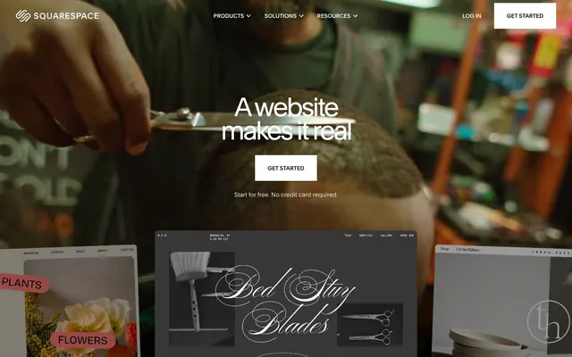
Squarespace embodies a refined, editorial aesthetic with a stark contrast between a dominant dark mode hero and a light canvas for content. Typography relies on a precise, custom sans-serif with subtle letter-spacing variations to convey authority. Components are understated, often ghost-like or subtly outlined, emphasizing content over heavy ornamentation. The system prioritizes functional clarity and a premium, minimalist feel.
The page structure heavily employs a full-bleed layout for hero sections, transitioning to a maximum-width contained layout (approximately 1200px) for most content sections. The hero typically features a dramatic background image with centered, large typography. Section rhythm alternates between full-bleed dark blocks and contained white sections, creating distinct visual breaks. Content is predominantly arranged in centered stacks or two-column layouts where text and visuals alternate. Feature sections often use a grid of cards, maintaining an overall spacious yet dense presentation. The navigation is a fixed top bar on dark backgrounds, becoming a fixed, visually neutral bar on light sections.
The site uses a mix of high-quality photography and stylized product illustrations. Photography is generally moody and rich, often appearing as full-bleed background imagery with a dark overlay, framing content. Product illustrations are minimal, often 3D renders or abstract shapes, rendered in a subdued, almost monochromatic palette, designed to integrate seamlessly with the UI rather than stand out. Icons are simple, monochrome outlines, used functionally for navigation and features, maintaining a lightweight feel. Imagery serves to establish atmosphere and showcase elegant product usage, rather than being purely decorative.
Reminiscent of Apple, Stripe, Linear, Framer.
# Squarespace — Style Reference
> Editorial White-glove Service

**Theme:** light

**Site:** https://www.squarespace.com

Squarespace embodies a refined, editorial aesthetic with a stark contrast between a dominant dark mode hero and a light canvas for content. Typography relies on a precise, custom sans-serif with subtle letter-spacing variations to convey authority. Components are understated, often ghost-like or subtly outlined, emphasizing content over heavy ornamentation. The system prioritizes functional clarity and a premium, minimalist feel.

## Tokens — Colors

| Name | Value | Token | Role |
|------|------|------|------|
| Absolute Zero | `#000000` | `--color-absolute-zero` | Page backgrounds, primary text, icon fills, card borders, dark overlay areas — used as the foundational dark neutral |
| Canvas White | `#ffffff` | `--color-canvas-white` | Content surfaces, button text on dark backgrounds, secondary backgrounds, separator lines; Decorative background gradient used for abstract elements or soft transitions |
| Graphite | `#2f2f2f` | `--color-graphite` | Primary action button background — a soft dark gray for filled buttons |
| Silver Mist | `#898989` | `--color-silver-mist` | Muted text, secondary body copy, subtle borders |
| Light Gray | `#dddddd` | `--color-light-gray` | Hairline borders, subtle background tints, deactivated text |

## Tokens — Typography

### Clarkson
- **Substitute:** Open Sans
- **Weights:** 300, 400, 500
- **Sizes:** 12px, 13px, 14px, 15px, 20px, 26px, 40px, 64px, 72px
- **Line height:** 0.93, 1, 1.2, 1.4
- **Letter spacing:** -0.06em, -0.05em, -0.04em, -0.02em, -0.01em, -0.001em
- **Role:** Primary typeface for all headings, body text, and interactive elements. Its variable weights and precise letter-spacing create a sophisticated, modern feel, prioritizing clarity and presence.

### Clarkson Serif
- **Substitute:** Playfair Display
- **Weights:** 400
- **Sizes:** 26px
- **Line height:** 1
- **Letter spacing:** -0.02em
- **Role:** Used for specific stylized headings, providing a classic, elegant contrast to the primary sans-serif. Distinctive for its unique letter-spacing at its size.

### sans-serif
- **Substitute:** system-ui
- **Weights:** 400
- **Sizes:** 16px
- **Line height:** 1.2
- **Role:** Fallback for system text, used rarely, primarily for accessibility or default browser styles where custom fonts may fail to load.

## Tokens — Type Scale

Perfect Fourth (1.333) from 12px base.

| Role | Size | Line height | Letter spacing |
|------|------|------|------|
| caption | 12px | 1.4 | — |
| body-lg | 15px | 1.4 | — |
| subheading | 20px | 1.2 | — |
| heading-sm | 26px | 1 | -0.52px |
| heading | 40px | 1 | -0.4px |
| heading-lg | 64px | 0.93 | -0.64px |
| display | 72px | 0.93 | -0.72px |

## Tokens — Spacing

- **Section gap:** 40px
- **Card padding:** 32px
- **Element gap:** 12px

## Tokens — Radius

- **Default:** 3px
- **Buttons:** 8px
- **Cards:** 8px
- **input:** 8px
- **largeButtons:** 30px
- **pills:** 100px

## Layout

The page structure heavily employs a full-bleed layout for hero sections, transitioning to a maximum-width contained layout (approximately 1200px) for most content sections. The hero typically features a dramatic background image with centered, large typography. Section rhythm alternates between full-bleed dark blocks and contained white sections, creating distinct visual breaks. Content is predominantly arranged in centered stacks or two-column layouts where text and visuals alternate. Feature sections often use a grid of cards, maintaining an overall spacious yet dense presentation. The navigation is a fixed top bar on dark backgrounds, becoming a fixed, visually neutral bar on light sections.

## Imagery

The site uses a mix of high-quality photography and stylized product illustrations. Photography is generally moody and rich, often appearing as full-bleed background imagery with a dark overlay, framing content. Product illustrations are minimal, often 3D renders or abstract shapes, rendered in a subdued, almost monochromatic palette, designed to integrate seamlessly with the UI rather than stand out. Icons are simple, monochrome outlines, used functionally for navigation and features, maintaining a lightweight feel. Imagery serves to establish atmosphere and showcase elegant product usage, rather than being purely decorative.

## Components

### Primary Filled Button
*Main call-to-action button for initiating key user flows.*

Background: Graphite (#2f2f2f), Text: Canvas White (#ffffff), Border Radius: 8px, Padding: 24px horizontal, 24px vertical.

### Ghost Button
*Subtle, secondary action button, often used in navigation or alongside a primary button.*

Background: transparent, Text: Absolute Zero (#000000), Border: 0px, Padding: 0px.

### Pill Button
*Decorative or categorized action, such as tags or filter buttons.*

Background: transparent, Text: Absolute Zero (#000000), Border: 0px, Border Radius: 100px, Padding: 12px vertical, 16px horizontal.

### Dark Card
*Content container for featured sections against a light background.*

Background: Absolute Zero (#000000), Border Radius: 0px, No shadow. Padding: 16px top, 48px horizontal, 40px bottom.

### Default Card
*Standard content container, visually distinct through a soft radius.*

Background: transparent, Border Radius: 8px, No shadow, Padding: 0px.

### Outline Large Button
*Alternative call-to-action with a larger, more pronounced border.*

Background: Canvas White (#ffffff), Text: Absolute Zero (#000000), Border: 0px, Border Radius: 0px, Padding: 24px horizontal, 24px vertical.

### White Text Input
*Input fields used primarily on dark backgrounds.*

Background: rgba(255, 255, 255, 0.2), Text: Canvas White (#ffffff), Border: transparent, Border Radius: 8px, Padding: 0px.

## Guidelines

### Do

- Use Absolute Zero (#000000) as the default background for hero sections and footer areas to establish a premium, high-contrast feel.
- Apply Clarkson font consistently for all text, varying weights (300, 400, 500) and sizes according to the type scale to maintain stylistic unity.
- Utilize 8px border radius for all cards, standard buttons, and input fields to ensure a subtle, consistent softness.
- Implement a 100px border radius for pill-shaped elements like tags or category buttons.
- Maintain 12px as the standard `elementGap` for horizontal and vertical spacing between small elements.
- Reserve Graphite (#2f2f2f) for primary actions, ensuring its distinction against the black and white palette.
- Ensure headings use negative letter-spacing from Clarkson font (-0.06em to -0.001em depending on size) to create a tight, editorial look.

### Don't

- Avoid using bright or overly saturated colors, as the palette is largely monochromatic with controlled accents.
- Do not use heavy shadows or deep elevation for components; surfaces should remain flat or subtly defined with borders.
- Do not introduce new font families; the system relies on Clarkson and Clarkson Serif for all typographic needs.
- Avoid arbitrary border radii; stick to 8px, 100px, 3px, and 30px as defined by the system for specific components.
- Do not use generic padding values; adhere to the specified spacing tokens like 12px, 16px, 24px, and 40px.
- Refrain from using color to indicate states (success/error) unless explicitly defined; rely on text and icons for such feedback.
- Do not break the light content / dark hero pattern; this contrast is central to the visual identity.

## Agent Prompt Guide

Quick Color Reference:
text: #000000
background: #ffffff
border: #dddddd
accent: no distinct accent color
primary action: #2f2f2f (filled action)

Example Component Prompts:
Create a primary action button: Background Graphite (#2f2f2f), text Canvas White (#ffffff), Clarkson 400 at 16px, border radius 8px, padding 24px horizontal, 24px vertical.
Create a card for a feature section: Background transparent, border radius 8px, padding 0px.
Create a hero section headline: Text Absolute Zero (#000000), Clarkson 300 at 72px, line height 0.93, letter spacing -0.72px.
Create a muted body text element: Text Silver Mist (#898989), Clarkson 400 at 14px, line height 1.4.
Create a simple navigation link: Text Absolute Zero (#000000), Clarkson 400 at 16px, padding 0px.
More like this










Keep what you find
A free account saves references to boards and can send you a weekly email of picks based on what you save.
To see every result, go Pro.