Preview image. Unlock full-res
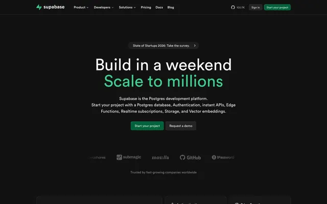
Midnight Terminal Interface — a dark, organized, and quietly powerful workspace.
Color palette
Subtle border for primary action buttons, hover states that deepen the brand green.
Primary call-to-action button background. Opaque and declarative.
Link hover states, subtle accent in decorative elements if needed.
Rare background color, likely for specific brand moments or deep elements.
Deepest background elements, occasional graphic fill.
Primary page background, base surface for components.
Alternative surface background, button background for secondary actions, subtle borders.
Input borders, dividers, subtle separators.
Subtle text, icon strokes, secondary graphic elements, subtle borders.
Muted body text, secondary information, disabled states.
Lightest neutral text for contrast on dark backgrounds, secondary navigation items.
Primary headings, body text, interactive text on buttons, icons. High contrast for critical information.
Typography
- Weights
- 400, 500
- Sizes
- 12px, 14px, 16px, 18px, 24px, 36px, 72px
- Line height
- 1, 1.11, 1.2, 1.25, 1.33, 1.38, 1.43, 1.5, 1.56
- Letter spacing
- -0.0070em
- Fallback
- Inter
Primary UI font for all headings, body text, labels, and buttons. Offers excellent readability and a strong character with its subtly humanist touch.
- Weights
- 400
- Sizes
- 12px
- Line height
- 1.33
- Letter spacing
- 0.1000em
- Fallback
- Menlo
Monospaced font for code snippets, technical data, or whenever a fixed-width, precise feel is required.
Spacing & shape
Components
backgroundColor: transparent, color: #fafafa, border: none, borderRadius: 6px, padding: 8px.
backgroundColor: #242424, color: #fafafa, borderColor: #393939, borderRadius: 6px, padding: 8px 16px.
backgroundColor: #006239, color: #fafafa, borderColor: rgba(62, 207, 142, 0.3), borderRadius: 6px, padding: 8px 16px.
backgroundColor: #121212, color: #fafafa, borderColor: #2e2e2, borderRadius: 9999px, padding: 8px 32px.
backgroundColor: #121212, borderRadius: 16px, boxShadow: none, padding: 24px.
backgroundColor: rgba(250, 250, 250, 0.027), color: #fafafa, borderColor: #393939, borderRadius: 6px, padding: 8px. Focus state likely uses a #3ecf8 border or shadow.
Guidelines
- Use 'Circular' font at weight 400 or 500 for all UI text, except code blocks.
- Adopt #fafafa for primary text and headings against dark backgrounds to ensure AAA contrast.
- Apply #3ecf8 ('Supabase Green') exclusively for active states, primary links, and key brand affirmations.
- Maintain a clear visual hierarchy by utilizing #121212 as the base surface and #2e2e2 for elevated cards and modals.
- Utilize 6px radius for interactive elements like buttons and inputs, transitioning to 16px for larger content cards.
- Employ the 9999px radius sparingly, only for 'Pill Buttons' that act as prominent announcements or unique navigational elements.
- Ensure all interactive elements have a clear visual feedback using either a color change to 'Glow Green' or a subtle border change to 'Deep Sea Green'.
- Avoid arbitrary color usage; every color should map to a defined role in the palette.
- Do not use shadows for elevation; rely on background color changes from #121212 to #2e2e2 to differentiate surface levels.
- Do not apply `Source Code Pro` for general body text or headlines; reserve it specifically for code or data display.
- Refrain from using mixed color backgrounds or gradients unless explicitly defined as a brand graphical element.
- Do not break the established spacing scale; maintain 8px increments or derived values (e.g., 24px, 32px) for consistency.
- Avoid excessive text decoration; links are identified by color ('Supabase Green') rather than underlines or heavy styling.
About this system
ShowHide
Supabase embodies a technical, deeply functional aesthetic like a high-performance terminal where every element serves a clear purpose. Dark, layered surfaces create a sense of depth and focus, akin to illuminated code on a dark screen. The primary green accent color, `Supabase Green`, acts as a confident highlight, drawing attention to interactive elements without being overwhelming. Typography prioritizes clarity and a dense information hierarchy, ensuring readability even with intricate data displays.
The page adheres to a mostly full-bleed layout, particularly in hero sections, with content centered within an implied max-width. The hero section is characterized by a full-width dark background with a large, centered headline that uses two distinct colors (`Whiteout` and `Supabase Green`) for visual emphasis. Content sections alternate between visually seamless dark backgrounds and slightly lighter dark surfaces for cards. There's a clear rhythm of stacked content blocks and feature sections that often alternate between text on one side and a visual or conceptual graphic on the other. Card grids, typically 3-column, are used to present features, maintaining consistent padding. Navigation is a sticky top bar, minimal and persistent. The overall density is comfortable, providing breathing room around critical information.
The visual language for imagery is primarily functional and technical. Product shots are minimalist, showcasing UI directly against dark backgrounds, often with code-like visual elements. Illustrations, where present, are abstract and geometric, utilizing line art and flat fills in shades of gray and `Supabase Green`. Icons are outlined, minimal, and mono-colored, complementing the overall technical aesthetic. Photography is absent, replaced by stylized graphics or product UI snippets. Images serve an explanatory or demonstrative role rather than decorative one, maintaining a high density of visual information without clutter. The elephant logo is abstracted and used as a subtle background texture.
Reminiscent of Vercel, GitHub, Linear, Stripe (dark mode examples).
# Supabase — Style Reference
> Midnight Terminal Interface — a dark, organized, and quietly powerful workspace.

**Theme:** dark

**Site:** https://supabase.com

Supabase embodies a technical, deeply functional aesthetic like a high-performance terminal where every element serves a clear purpose. Dark, layered surfaces create a sense of depth and focus, akin to illuminated code on a dark screen. The primary green accent color, `Supabase Green`, acts as a confident highlight, drawing attention to interactive elements without being overwhelming. Typography prioritizes clarity and a dense information hierarchy, ensuring readability even with intricate data displays.

## Tokens — Colors

| Name | Value | Token | Role |
|------|------|------|------|
| Deep Sea Green | `#1f4b37` | `--color-deep-sea-green` | Subtle border for primary action buttons, hover states that deepen the brand green. |
| Forest Call to Action | `#006239` | `--color-forest-call-to-action` | Primary call-to-action button background. Opaque and declarative. |
| Glow Green | `#00c573` | `--color-glow-green` | Link hover states, subtle accent in decorative elements if needed. |
| Shadow Green | `#002918` | `--color-shadow-green` | Rare background color, likely for specific brand moments or deep elements. |
| Midnight Abyss | `#000000` | `--color-midnight-abyss` | Deepest background elements, occasional graphic fill. |
| Ebony Canvas | `#121212` | `--color-ebony-canvas` | Primary page background, base surface for components. |
| Graphite Base | `#242424` | `--color-graphite-base` | Alternative surface background, button background for secondary actions, subtle borders. |
| Carbon Border | `#393939` | `--color-carbon-border` | Input borders, dividers, subtle separators. |
| Iron Outline | `#4d4d4d` | `--color-iron-outline` | Subtle text, icon strokes, secondary graphic elements, subtle borders. |
| Mid-Gray Text | `#898989` | `--color-mid-gray-text` | Muted body text, secondary information, disabled states. |
| Silver Highlight | `#b4b4b4` | `--color-silver-highlight` | Lightest neutral text for contrast on dark backgrounds, secondary navigation items. |
| Whiteout | `#fafafa` | `--color-whiteout` | Primary headings, body text, interactive text on buttons, icons. High contrast for critical information. |

## Tokens — Typography

### Circular
- **Substitute:** Inter
- **Weights:** 400, 500
- **Sizes:** 12px, 14px, 16px, 18px, 24px, 36px, 72px
- **Line height:** 1, 1.11, 1.2, 1.25, 1.33, 1.38, 1.43, 1.5, 1.56
- **Letter spacing:** -0.0070em
- **Role:** Primary UI font for all headings, body text, labels, and buttons. Offers excellent readability and a strong character with its subtly humanist touch.

### Source Code Pro
- **Substitute:** Menlo
- **Weights:** 400
- **Sizes:** 12px
- **Line height:** 1.33
- **Letter spacing:** 0.1000em
- **Role:** Monospaced font for code snippets, technical data, or whenever a fixed-width, precise feel is required.

## Tokens — Type Scale

Perfect Fourth (1.333) from 16px base.

| Role | Size | Line height | Letter spacing |
|------|------|------|------|
| caption | 12px | 1.56 | -0.007em |
| body-sm | 14px | 1.5 | -0.007em |
| body | 16px | 1.43 | -0.007em |
| subheading | 18px | 1.38 | -0.007em |
| heading | 24px | 1.33 | -0.007em |
| heading-lg | 36px | 1.25 | -0.007em |
| display | 72px | 1.11 | -0.007em |

## Tokens — Spacing

- **Card padding:** 24px

## Tokens — Radius

- **Buttons:** 6px
- **Inputs:** 6px
- **Cards:** 16px
- **pillButtons:** 9999px

## Layout

The page adheres to a mostly full-bleed layout, particularly in hero sections, with content centered within an implied max-width. The hero section is characterized by a full-width dark background with a large, centered headline that uses two distinct colors (`Whiteout` and `Supabase Green`) for visual emphasis. Content sections alternate between visually seamless dark backgrounds and slightly lighter dark surfaces for cards. There's a clear rhythm of stacked content blocks and feature sections that often alternate between text on one side and a visual or conceptual graphic on the other. Card grids, typically 3-column, are used to present features, maintaining consistent padding. Navigation is a sticky top bar, minimal and persistent. The overall density is comfortable, providing breathing room around critical information.

## Imagery

The visual language for imagery is primarily functional and technical. Product shots are minimalist, showcasing UI directly against dark backgrounds, often with code-like visual elements. Illustrations, where present, are abstract and geometric, utilizing line art and flat fills in shades of gray and `Supabase Green`. Icons are outlined, minimal, and mono-colored, complementing the overall technical aesthetic. Photography is absent, replaced by stylized graphics or product UI snippets. Images serve an explanatory or demonstrative role rather than decorative one, maintaining a high density of visual information without clutter. The elephant logo is abstracted and used as a subtle background texture.

## Components

### CTA Button Group

### Feature Cards Grid

### Testimonial Cards

### Ghost Button
*secondary action*

backgroundColor: transparent, color: #fafafa, border: none, borderRadius: 6px, padding: 8px.

### Secondary Button
*secondary action*

backgroundColor: #242424, color: #fafafa, borderColor: #393939, borderRadius: 6px, padding: 8px 16px.

### Primary Call to Action Button
*primary action*

backgroundColor: #006239, color: #fafafa, borderColor: rgba(62, 207, 142, 0.3), borderRadius: 6px, padding: 8px 16px.

### Alert Pill Button (State of Startups)
*informational alert*

backgroundColor: #121212, color: #fafafa, borderColor: #2e2e2, borderRadius: 9999px, padding: 8px 32px.

### Feature Card
*content container*

backgroundColor: #121212, borderRadius: 16px, boxShadow: none, padding: 24px.

### Text Input (with focus ring)
*data entry*

backgroundColor: rgba(250, 250, 250, 0.027), color: #fafafa, borderColor: #393939, borderRadius: 6px, padding: 8px. Focus state likely uses a #3ecf8 border or shadow.

## Guidelines

### Do

- Use 'Circular' font at weight 400 or 500 for all UI text, except code blocks.
- Adopt #fafafa for primary text and headings against dark backgrounds to ensure AAA contrast.
- Apply #3ecf8 ('Supabase Green') exclusively for active states, primary links, and key brand affirmations.
- Maintain a clear visual hierarchy by utilizing #121212 as the base surface and #2e2e2 for elevated cards and modals.
- Utilize 6px radius for interactive elements like buttons and inputs, transitioning to 16px for larger content cards.
- Employ the 9999px radius sparingly, only for 'Pill Buttons' that act as prominent announcements or unique navigational elements.
- Ensure all interactive elements have a clear visual feedback using either a color change to 'Glow Green' or a subtle border change to 'Deep Sea Green'.

### Don't

- Avoid arbitrary color usage; every color should map to a defined role in the palette.
- Do not use shadows for elevation; rely on background color changes from #121212 to #2e2e2 to differentiate surface levels.
- Do not apply `Source Code Pro` for general body text or headlines; reserve it specifically for code or data display.
- Refrain from using mixed color backgrounds or gradients unless explicitly defined as a brand graphical element.
- Do not break the established spacing scale; maintain 8px increments or derived values (e.g., 24px, 32px) for consistency.
- Avoid excessive text decoration; links are identified by color ('Supabase Green') rather than underlines or heavy styling.

## Agent Prompt Guide

### Quick Color Reference
- Text (Primary): `#fafafa`
- Background (Canvas): `#121212`
- CTA (`Supabase Green`): `#006239`
- Border (Input/Secondary): `#393939`
- Accent (Heading/Link): `#3ecf8e`

### 3 Example Component Prompts
1. Create a hero section with `Ebony Canvas` background. Headline 'Build in a weekend' in `Whiteout` and 'Scale to millions' in `Supabase Green`, both `Circular` font, 72px size, 1.11 lineHeight, -0.007em letterSpacing. Below, create a `Primary Call to Action Button` and a `Secondary Button`.
2. Design a feature card: Use `Steel Surface` background, 16px borderRadius, 24px padding. Inside, place a 'Circular' font, 18px size, 1.38 lineHeight heading in `Whiteout`, followed by 'Circular' font, 14px size, 1.5 lineHeight body text in `Mid-Gray Text`.
3. Implement a navigation bar item: Text 'Pricing' `Circular` font, 16px size, 1.43 lineHeight in `Whiteout`. On hover, the text color changes to `Supabase Green` (`#3ecf8e`).
More like this






Keep what you find
A free account saves references to boards and can send you a weekly email of picks based on what you save.
To see every result, go Pro.