Preview image. Unlock full-res
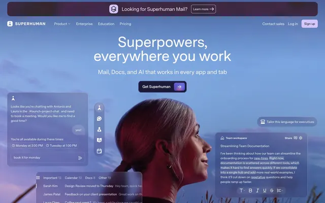
Cinematic cockpit behind warm parchment — a productivity instrument panel where atmospheric photography meets structured cream-toned UI surfaces.
Color palette
Announcement banner background, footer background — deep muted red that brackets the page top and bottom
SVG icon fills and border accents within dark brand surfaces
Ghost/outlined action borders, link text, focus rings — the only chromatic accent across light UI surfaces; outlined ghost 'Get the suite' button uses this as its border and text
Focus shadow on primary CTA links (inset ring depth cue)
Sign-up button fill on dark hero — soft violet chip against dark photography
Full-viewport hero background gradient overlaying the dusk photography; pastel violet-to-blue-to-purple sweep
Primary page background below the hero; the warm, slightly toasted off-white that distinguishes this from sterile white SaaS canvases
Primary text, borders, nav labels — near-black with a warm brown undertone instead of pure black
Card surfaces, hero text, button text on dark backgrounds
Subtle UI dividers, light button borders, tab backgrounds
Secondary dividers and section rule lines
Secondary body text — feature descriptions and supporting copy beneath headings
Typography
- Weights
- 460, 500, 540, 600, 700
- Sizes
- 12px, 14px, 16px, 18px, 19px, 20px, 22px, 26px, 28px, 48px, 64px
- Line height
- 0.76, 1.2
- Letter spacing
- -0.028em at 64px, -0.027em at 48px, -0.022em at 28px, -0.020em at 26px, -0.014em at 22px, -0.008em at 18-20px
- Fallback
- Inter Variable or Neue Haas Grotesk
The sole typeface for all text — headlines, body, nav, buttons, captions. Custom variable font with tight negative tracking baked into large sizes: -0.028em at 64px collapses letterforms until display text reads as a single compressed block. Weight 460 is the default body weight; 600–700 reserved for headlines. The variable weight axis allows granular fine-tuning not possible with static weights.
Spacing & shape
Elevation
Components
Background #421d24, white text at 14px weight 500, 12px vertical padding, 16px radius on inner button. Contains ghost text link 'Learn more' with no border. Full bleed edge-to-edge above the nav.
White background, Ink (#292827) nav labels at 16px weight 460. Logo left-aligned. 'Sign up' uses Lavender Chip (#d4c7ff) background, Ink text, 8px radius, 6px/12px padding. 'Log in' and 'Contact sales' are ghost text links with no border. Nav transitions from transparent over hero to white with backdrop-blur on scroll (animation: page_header-fade-in).
Full-bleed dusk photography with linear-gradient(to left bottom, rgba(168,164,216,0.5), rgba(107,165,232,0.5), rgba(176,112,192,0.6), rgba(144,136,208,0.5)) overlay. White display text at 64px weight 600, line-height 0.96, letter-spacing -1.79px, centered. Subheadline at 18-20px weight 460. CTA 'Get Superhuman' is a white-background pill with Ink text, 8px radius, Iris inset shadow on focus, animated gradient rotation on hover (hero-button-gradient-angle-rotate).
Background #ffffff, text #292827 at 16px weight 500, 8px radius, 12px vertical / 24px horizontal padding. Focus ring: rgb(113,76,182) 0px 0px 0px 1px inset. Includes a small arrow icon with Iris (#714cb6) tint. Animated gradient halo on hover.
Background #d4c7ff (Lavender Chip), text #292827 (Ink), 8px border-radius, 6px top/bottom padding, 12px left/right padding. No border. Sits in top-right nav cluster.
Background transparent, border 1px solid #714cb6, text #714cb6, 8px radius, 6px/12px padding. Used for 'Get the suite' on the parchment canvas section.
Active state: #e3e3e2 background, Ink text, 999px radius pill, 12px vertical padding. Inactive state: transparent background, Ink text, same radius. 16px horizontal padding. Icon precedes label at 16px.
White card surface, 1px solid #e3e3e2 border, 0px radius (sharp edges), logos in Ink at roughly 80-120px wide each, evenly distributed in a single row. Parchment canvas background behind. 36px vertical padding.
White background, 16px radius, 16px padding all sides, 1px solid #e3e3e2 border. Contains product label at 12px weight 500 with Iris icon, heading at 28px weight 600, body at 16px Graphite (#666666), and a link at 14px Iris (#714cb6).
Background rgba(255,255,255,0.13), backdrop-filter blur(12px), 999px radius on pill-shaped variants or 24px on rectangular panels, 12px/16px padding. White text inside. These appear as layered floating cards over the hero photograph.
Background #421d24, white text throughout. Nav links at 14px weight 460. Brand logo top-left. Four column layout. 32px horizontal padding, 36px top/bottom padding.
Guidelines
- Use #f2f0eb as the page canvas for all content sections below the hero — never plain white (#ffffff) as the canvas background.
- Apply Super Sans VF at weight 600–700 for all headings with letter-spacing -0.022em to -0.028em at sizes 28px and above.
- Use #714cb6 exclusively as outlined ghost button borders and link colors on light surfaces — never as a filled button background.
- Reserve #421d24 only for the announcement banner and footer — it must bracket the page without appearing in content sections.
- Set border-radius 8px for inline buttons and badges, 16px for cards, 999px for pill tabs and floating UI chips.
- Use backdrop-filter: blur(12px) on any UI panel that overlaps the hero photography to maintain the glassmorphic depth effect.
- Pair display headlines (64px) with line-height 0.96 — sub-1.0 line-height at display sizes is the signature compression of this system.
- Don't use a pure white (#ffffff) page background for content sections — the parchment (#f2f0eb) canvas is what separates this from generic SaaS.
- Don't apply #714cb6 as a filled button background — evidence shows it appears only as outlined borders and link text, never as a button fill.
- Don't use letter-spacing at 0 or positive values for headings — all heading sizes use negative tracking; flat tracking breaks the compressed headline aesthetic.
- Don't introduce additional typefaces — Super Sans VF handles every text role; mixing in system fonts or other typefaces breaks the typographic cohesion.
- Don't use standard box-shadow elevation for cards — depth is achieved through overlapping layout and backdrop-blur, not drop shadows.
- Don't place the aubergine (#421d24) in mid-page content sections, feature cards, or UI components — its role is structural framing (banner + footer) only.
- Don't use rounded corners smaller than 8px on interactive elements — the minimum radius in this system is 8px; sharp 0px borders only appear on flat content containers and logo bars.
About this system
ShowHide
Superhuman feels like a cinematic productivity cockpit — moody atmospheric photography bleeds behind glassmorphic UI panels while the page itself stays anchored in warm parchment neutrals. The hero is a full-viewport dusk photograph with overlapping product panels floating at various depths, then the page snaps to a warm off-white (#f2f0eb) canvas for feature content. Custom variable font 'Super Sans VF' is the entire typographic system — tight negative tracking at display sizes (-0.028em at 64px) makes headlines feel compressed and urgent. Violet (#714cb6) is the sole chromatic system accent, appearing as outlined ghost buttons and focus rings against otherwise achromatic surfaces. The dark muted-red (#421d24) surfaces only in the announcement banner and footer, creating a bracketed frame around the entire page.
Max-width approximately 1200px centered, but hero is full-bleed edge-to-edge with no container. Hero occupies 100vh with centered headline stack and CTA, product UI panels float asymmetrically left and right over the photography. Below hero: white/parchment alternating bands with 64px section gaps. Logo bar is a single full-width row with sharp borders. Suite section uses a tab switcher (pill tabs) above a large product panel — single column centered. Feature sections use 2-column text-left / product-right alternating layout. Navigation is a fixed top bar that starts transparent over the hero and fades to white with blur on scroll. Footer is 4-column grid at full width in dark aubergine. Overall rhythm is spacious with 64px between sections and 36px internal section padding.
Superhuman uses full-bleed cinematic lifestyle photography in the hero — dark-toned dusk and evening skies with human subjects (woman looking upward, silhouetted figures) that read as contemplative rather than corporate. Photography is high-contrast with deep cool blues and magentas, treated with semi-transparent gradient overlays in pastel violet/blue/pink (the hero gradient system). Product UI screenshots are embedded as floating glassmorphic panels directly over the photography — not contained in device frames, just floating at depth. Below the hero, imagery shifts to pure product: email UI, document surfaces, and AI suggestions shown in white-background card panels. Illustrated abstract geometric compositions appear in promotional sections (stacked rectangle frames, golden-ratio wireframes) as editorial art rather than UI. Icons throughout are outlined mono-color at ~16-20px, using Iris (#714cb6) tint on light surfaces and white on dark surfaces. The design is moderately image-heavy in the hero and text-dominant in feature sections.
Reminiscent of Linear, Notion, Loom, Arc Browser.
# Superhuman — Style Reference
> Cinematic cockpit behind warm parchment — a productivity instrument panel where atmospheric photography meets structured cream-toned UI surfaces.

**Theme:** mixed

**Site:** https://superhuman.com

Superhuman feels like a cinematic productivity cockpit — moody atmospheric photography bleeds behind glassmorphic UI panels while the page itself stays anchored in warm parchment neutrals. The hero is a full-viewport dusk photograph with overlapping product panels floating at various depths, then the page snaps to a warm off-white (#f2f0eb) canvas for feature content. Custom variable font 'Super Sans VF' is the entire typographic system — tight negative tracking at display sizes (-0.028em at 64px) makes headlines feel compressed and urgent. Violet (#714cb6) is the sole chromatic system accent, appearing as outlined ghost buttons and focus rings against otherwise achromatic surfaces. The dark muted-red (#421d24) surfaces only in the announcement banner and footer, creating a bracketed frame around the entire page.

## Tokens — Colors

| Name | Value | Token | Role |
|------|------|------|------|
| Aubergine | `#421d24` | `--color-aubergine` | Announcement banner background, footer background — deep muted red that brackets the page top and bottom |
| Aubergine Deep | `#4e242c` | `--color-aubergine-deep` | SVG icon fills and border accents within dark brand surfaces |
| Iris | `#714cb6` | `--color-iris` | Ghost/outlined action borders, link text, focus rings — the only chromatic accent across light UI surfaces; outlined ghost 'Get the suite' button uses this as its border and text |
| Indigo Glow | `#353088` | `--color-indigo-glow` | Focus shadow on primary CTA links (inset ring depth cue) |
| Lavender Chip | `#d4c7ff` | `--color-lavender-chip` | Sign-up button fill on dark hero — soft violet chip against dark photography |
| Hero Dusk Gradient | `#a8a4d8` | `--color-hero-dusk-gradient` | Full-viewport hero background gradient overlaying the dusk photography; pastel violet-to-blue-to-purple sweep |
| Parchment Canvas | `#f2f0eb` | `--color-parchment-canvas` | Primary page background below the hero; the warm, slightly toasted off-white that distinguishes this from sterile white SaaS canvases |
| Ink | `#292827` | `--color-ink` | Primary text, borders, nav labels — near-black with a warm brown undertone instead of pure black |
| Bone | `#ffffff` | `--color-bone` | Card surfaces, hero text, button text on dark backgrounds |
| Fog | `#e3e3e2` | `--color-fog` | Subtle UI dividers, light button borders, tab backgrounds |
| Driftwood | `#dcd7d3` | `--color-driftwood` | Secondary dividers and section rule lines |
| Graphite | `#666666` | `--color-graphite` | Secondary body text — feature descriptions and supporting copy beneath headings |

## Tokens — Typography

### Super Sans VF
- **Substitute:** Inter Variable or Neue Haas Grotesk
- **Weights:** 460, 500, 540, 600, 700
- **Sizes:** 12px, 14px, 16px, 18px, 19px, 20px, 22px, 26px, 28px, 48px, 64px
- **Line height:** 0.76, 1.2
- **Letter spacing:** -0.028em at 64px, -0.027em at 48px, -0.022em at 28px, -0.020em at 26px, -0.014em at 22px, -0.008em at 18-20px
- **Role:** The sole typeface for all text — headlines, body, nav, buttons, captions. Custom variable font with tight negative tracking baked into large sizes: -0.028em at 64px collapses letterforms until display text reads as a single compressed block. Weight 460 is the default body weight; 600–700 reserved for headlines. The variable weight axis allows granular fine-tuning not possible with static weights.

## Tokens — Type Scale

Major Third (1.25) from 16px base.

| Role | Size | Line height | Letter spacing |
|------|------|------|------|
| caption | 12px | 1.5 | — |
| body-sm | 14px | 1.5 | — |
| body | 16px | 1.5 | — |
| subheading | 18px | 1.3 | -0.14px |
| heading-sm | 22px | 1.25 | -0.31px |
| heading | 28px | 1.2 | -0.62px |
| heading-lg | 48px | 1 | -1.3px |
| display | 64px | 0.96 | -1.79px |

## Tokens — Spacing

- **Max width:** 1200px
- **Section gap:** 64px
- **Card padding:** 16px
- **Element gap:** 8px

## Tokens — Radius

- **Buttons:** 8px
- **Cards:** 16px
- **announcementBanner:** 16px
- **cardsLarge:** 24px
- **links:** 12px
- **pills:** 999px

## Tokens — Elevation

- **Outlined Ghost Button (Iris focus state):** `rgb(113, 76, 182) 0px 0px 0px 1px inset`

## Layout

Max-width approximately 1200px centered, but hero is full-bleed edge-to-edge with no container. Hero occupies 100vh with centered headline stack and CTA, product UI panels float asymmetrically left and right over the photography. Below hero: white/parchment alternating bands with 64px section gaps. Logo bar is a single full-width row with sharp borders. Suite section uses a tab switcher (pill tabs) above a large product panel — single column centered. Feature sections use 2-column text-left / product-right alternating layout. Navigation is a fixed top bar that starts transparent over the hero and fades to white with blur on scroll. Footer is 4-column grid at full width in dark aubergine. Overall rhythm is spacious with 64px between sections and 36px internal section padding.

## Imagery

Superhuman uses full-bleed cinematic lifestyle photography in the hero — dark-toned dusk and evening skies with human subjects (woman looking upward, silhouetted figures) that read as contemplative rather than corporate. Photography is high-contrast with deep cool blues and magentas, treated with semi-transparent gradient overlays in pastel violet/blue/pink (the hero gradient system). Product UI screenshots are embedded as floating glassmorphic panels directly over the photography — not contained in device frames, just floating at depth. Below the hero, imagery shifts to pure product: email UI, document surfaces, and AI suggestions shown in white-background card panels. Illustrated abstract geometric compositions appear in promotional sections (stacked rectangle frames, golden-ratio wireframes) as editorial art rather than UI. Icons throughout are outlined mono-color at ~16-20px, using Iris (#714cb6) tint on light surfaces and white on dark surfaces. The design is moderately image-heavy in the hero and text-dominant in feature sections.

## Components

### Announcement Banner

### Suite Tab Selector

### Get Superhuman CTA Button Group

### Announcement Banner
*Full-width top-of-page notification strip*

Background #421d24, white text at 14px weight 500, 12px vertical padding, 16px radius on inner button. Contains ghost text link 'Learn more' with no border. Full bleed edge-to-edge above the nav.

### Primary Navigation
*Sticky top navigation bar*

White background, Ink (#292827) nav labels at 16px weight 460. Logo left-aligned. 'Sign up' uses Lavender Chip (#d4c7ff) background, Ink text, 8px radius, 6px/12px padding. 'Log in' and 'Contact sales' are ghost text links with no border. Nav transitions from transparent over hero to white with backdrop-blur on scroll (animation: page_header-fade-in).

### Hero Section
*Full-viewport brand opening*

Full-bleed dusk photography with linear-gradient(to left bottom, rgba(168,164,216,0.5), rgba(107,165,232,0.5), rgba(176,112,192,0.6), rgba(144,136,208,0.5)) overlay. White display text at 64px weight 600, line-height 0.96, letter-spacing -1.79px, centered. Subheadline at 18-20px weight 460. CTA 'Get Superhuman' is a white-background pill with Ink text, 8px radius, Iris inset shadow on focus, animated gradient rotation on hover (hero-button-gradient-angle-rotate).

### Get Superhuman CTA Button
*Primary hero call-to-action*

Background #ffffff, text #292827 at 16px weight 500, 8px radius, 12px vertical / 24px horizontal padding. Focus ring: rgb(113,76,182) 0px 0px 0px 1px inset. Includes a small arrow icon with Iris (#714cb6) tint. Animated gradient halo on hover.

### Sign Up Button
*Nav-level signup action*

Background #d4c7ff (Lavender Chip), text #292827 (Ink), 8px border-radius, 6px top/bottom padding, 12px left/right padding. No border. Sits in top-right nav cluster.

### Ghost Outlined Button (Iris)
*Secondary action on light surfaces*

Background transparent, border 1px solid #714cb6, text #714cb6, 8px radius, 6px/12px padding. Used for 'Get the suite' on the parchment canvas section.

### Suite Tab Button
*Product switcher tabs (Mail / Grammarly / Coda / Go)*

Active state: #e3e3e2 background, Ink text, 999px radius pill, 12px vertical padding. Inactive state: transparent background, Ink text, same radius. 16px horizontal padding. Icon precedes label at 16px.

### Social Proof Logo Bar
*Trust logos strip*

White card surface, 1px solid #e3e3e2 border, 0px radius (sharp edges), logos in Ink at roughly 80-120px wide each, evenly distributed in a single row. Parchment canvas background behind. 36px vertical padding.

### Product Feature Card
*Per-product detail panel inside tab sections*

White background, 16px radius, 16px padding all sides, 1px solid #e3e3e2 border. Contains product label at 12px weight 500 with Iris icon, heading at 28px weight 600, body at 16px Graphite (#666666), and a link at 14px Iris (#714cb6).

### Glassmorphic Hero Panel
*Product UI preview panels floating in hero*

Background rgba(255,255,255,0.13), backdrop-filter blur(12px), 999px radius on pill-shaped variants or 24px on rectangular panels, 12px/16px padding. White text inside. These appear as layered floating cards over the hero photograph.

### Footer
*Full-width site footer*

Background #421d24, white text throughout. Nav links at 14px weight 460. Brand logo top-left. Four column layout. 32px horizontal padding, 36px top/bottom padding.

## Guidelines

### Do

- Use #f2f0eb as the page canvas for all content sections below the hero — never plain white (#ffffff) as the canvas background.
- Apply Super Sans VF at weight 600–700 for all headings with letter-spacing -0.022em to -0.028em at sizes 28px and above.
- Use #714cb6 exclusively as outlined ghost button borders and link colors on light surfaces — never as a filled button background.
- Reserve #421d24 only for the announcement banner and footer — it must bracket the page without appearing in content sections.
- Set border-radius 8px for inline buttons and badges, 16px for cards, 999px for pill tabs and floating UI chips.
- Use backdrop-filter: blur(12px) on any UI panel that overlaps the hero photography to maintain the glassmorphic depth effect.
- Pair display headlines (64px) with line-height 0.96 — sub-1.0 line-height at display sizes is the signature compression of this system.

### Don't

- Don't use a pure white (#ffffff) page background for content sections — the parchment (#f2f0eb) canvas is what separates this from generic SaaS.
- Don't apply #714cb6 as a filled button background — evidence shows it appears only as outlined borders and link text, never as a button fill.
- Don't use letter-spacing at 0 or positive values for headings — all heading sizes use negative tracking; flat tracking breaks the compressed headline aesthetic.
- Don't introduce additional typefaces — Super Sans VF handles every text role; mixing in system fonts or other typefaces breaks the typographic cohesion.
- Don't use standard box-shadow elevation for cards — depth is achieved through overlapping layout and backdrop-blur, not drop shadows.
- Don't place the aubergine (#421d24) in mid-page content sections, feature cards, or UI components — its role is structural framing (banner + footer) only.
- Don't use rounded corners smaller than 8px on interactive elements — the minimum radius in this system is 8px; sharp 0px borders only appear on flat content containers and logo bars.

## Agent Prompt Guide

**Quick Color Reference**
- text: #292827 (Ink)
- background (canvas): #f2f0eb (Parchment)
- card surface: #ffffff
- border: #e3e3e2 (light) / #dcd7d3 (divider)
- accent / outlined action border: #714cb6 (Iris)
- secondary text: #666666 (Graphite)
- dark frame (banner/footer): #421d24
- primary action: #421d24 (filled action)

**Example Component Prompts**

1. Hero Section: Full-bleed dusk photograph with linear-gradient(to left bottom, rgba(168,164,216,0.5), rgba(107,165,232,0.5), rgba(176,112,192,0.6), rgba(144,136,208,0.5)) overlay. Center-aligned headline: 'Superpowers, everywhere you work' in Super Sans VF (substitute: Inter Variable) weight 600, 64px, line-height 0.96, letter-spacing -1.79px, color #ffffff. Sub-headline at 20px weight 460, #ffffff, letter-spacing -0.16px. CTA button: background #ffffff, text #292827, 8px radius, 12px/24px padding, weight 500, 16px. Iris inset ring on focus: rgb(113,76,182) 0px 0px 0px 1px inset.

2. Feature Section on Parchment: Background #f2f0eb. Section heading at 48px Super Sans VF weight 600, #292827, letter-spacing -1.30px, line-height 1.0. Body text at 16px weight 460, #666666, line-height 1.5. 'Get the suite' ghost button: transparent background, 1px solid #714cb6 border, text #714cb6, 8px radius, 6px/12px padding.

3. Product Feature Card: Background #ffffff, 1px solid #e3e3e2 border, 16px border-radius, 16px padding. Label at 12px weight 500, #714cb6 with Iris icon. Heading at 28px weight 600, #292827, letter-spacing -0.62px. Body at 16px weight 460, #666666. Link at 14px weight 500, #714cb6, underline on hover.

4. Announcement Banner: Full-width, background #421d24, 12px vertical padding, 32px horizontal padding. Text: 'Looking for Superhuman Mail?' at 14px weight 500, #ffffff. Inline 'Learn more' link in white, 16px radius inner button, no border.

5. Suite Tab Switcher: Row of pill tabs, 999px radius. Active: background #e3e3e2, text #292827, 12px/16px padding. Inactive: transparent background, #292827 text. All tabs: 16px, weight 500, Super Sans VF.

## Gradient System

Four radial spotlight gradients animate behind the hero section, positioned at different edges to simulate colored lighting on the photography:
- Violet spotlight: radial-gradient(circle at 68% 50%, rgba(133,125,250,0.6) 0px, rgba(0,0,0,0) 50%)
- Pink spotlight: radial-gradient(circle at 50% 98%, rgba(255,51,102,0.6) 0px, rgba(0,0,0,0) 50%)
- Blue spotlight: radial-gradient(circle at 93% 50%, rgba(75,105,227,0.5) 0px, rgba(0,0,0,0) 50%)
- Cyan spotlight: radial-gradient(circle at 50% 75%, rgba(104,222,255,0.5) 0px, rgba(0,0,0,0) 50%)

These stack via multiple background layers to produce the cinematic dusk atmosphere. The CTA button also has a rotating gradient animation (hero-button-gradient-angle-rotate) on hover — a slow rotation of the violet-blue palette around the button border.

## Motion Philosophy

Motion is expressive but controlled. Base transition: 0.2s ease on color, border-color, background-color, box-shadow. Slower 0.3s for layout shifts (gap changes). Hero entrance uses fade-slide sequences: fade-slide-down-from-transparent (headline) and fade-slide-up-from-transparent (subtext), creating a cinematic reveal. The navigation bar transitions from transparent+blur-0 to white+blur on scroll (page_header-fade-in, page_header-remove-blur). Asset grids use fade-in/fade-out (0.5s) for tab switching. The signature CTA micro-interaction is hero-button-gradient-angle-rotate — a continuous slow rotation of the gradient behind the button border on hover. Easing is overwhelmingly ease (780×) with no linear transitions — everything accelerates and decelerates.
More like this








Keep what you find
A free account saves references to boards and can send you a weekly email of picks based on what you save.
To see every result, go Pro.