Preview image. Unlock full-res
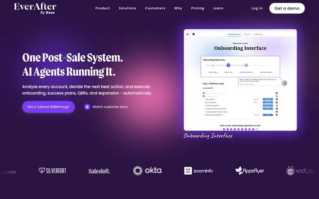
Violet Gradient Command Center – a luminous digital workspace with shimmering accents.
Color palette
Primary text, deep backgrounds for hero sections and footers, UI borders and structural elements. The foundational color setting a dramatic, digital atmosphere
Gradient primary color, subtle background accents in dark sections
Primary action buttons, active states, key highlights for cards and interactive elements. Its vibrancy cuts through the deep violet base
Background gradient for hero sections and large visual modules, creating a dynamic backdrop
Decorative card highlights, accent elements within UI for visual interest
Decorative card highlights, accent elements, UI iconography
Decorative elements, iconography, and subtle graphic strokes within UI illustrations
Page backgrounds, card surfaces, input fields, and all text on dark backgrounds. Provides necessary contrast and airiness for content
Secondary page backgrounds, subtle surface elevation for cards and sections. A very subtle off-white that prevents starkness
Subtle borders for content sections, hairline dividers between elements, input field borders
Secondary text, muted link text
Iconography, strong graphic elements, occasionally for very dark text that needs maximum contrast
Typography
- Weights
- 400, 600, 700
- Sizes
- 36px, 40px, 42px, 50px, 56px
- Line height
- 1.15, 1.2
- Letter spacing
- -0.0190em
- Fallback
- Georgia, serif
Distinctive serif typeface used for all main headings (h1-h3) across most sizes, conveying a sense of established authority and unique brand identity. The consistent letter-spacing across sizes enhances its presence.
- Fallback
- Helvetica Neue, Arial, sans-serif
Clean and legible sans-serif for body text, navigation items, buttons, and subheadings. Ensures readability and maintains a modern, functional aesthetic against the more expressive Moret headlines.
- Weights
- 400
- Sizes
- 36px
- Line height
- 1.2
Moret 400 — detected in extracted data but not described by AI
Spacing & shape
Elevation
Components
Filled button with background #793cfb, text #fefefe (Canvas White). Padding 5px vertical, 36px horizontal. Radius 999px.
Transparent background, text #221437 (Midnight Orchid), border color #221437. Radius 999px. Padding 0px. Text is a smaller font size than primary actions.
Transparent background, text #221437 (Midnight Orchid), default border color is absent. Radius 0px. Padding 0px.
Background #fcfcff (Canvas White), border radius 24px, no shadow, padding 42px on all sides.
Background #ffffff (Canvas White), text #221437 (Midnight Orchid), border #221437 (Midnight Orchid) at 8% opacity. Radius 999px. Padding 8px vertical, 12px horizontal, with possible 29.6px left padding for icon.
Background #ff7aba (Rose Bloom), border radius 999px, no shadow, 0px padding. Used for small, illustrative elements.
Background #ffd633 (Sunshine Yellow), border radius 999px, no shadow, 0px padding. Used for small, illustrative elements.
Guidelines
- Use Moret font for all headlines, applying `letterSpacing: -0.0190em` consistently for high impact.
- Apply Electric Violet (#793cfb) only for primary interactive elements, reserving its vividness for key actions.
- Ensure all buttons and inputs have a 999px border-radius, creating a soft, approachable pill-shaped appearance.
- Maintain a clear visual hierarchy by using Midnight Orchid (#221437) for primary text and Canvas White (#ffffff) for page backgrounds in light sections.
- Separate sections with a minimum of 186px vertical spacing, and content blocks with 42px internal card padding to ensure readability and spaciousness.
- Utilize Ghost Marble (#f8f5ff) as a subtle background for secondary content sections or slightly elevated interface elements to add depth without heaviness.
- Apply the Hero Gradient (linear gradient from #e7cae4 to #f8f5ff) specifically for prominent banner areas and large hero sections to build visual drama.
- Do not use saturated colors on anything other than accent tags or primary calls to action; maintain a mostly neutral palette for content.
- Avoid applying heavy drop shadows; the system favors subtle elevation cues like background color changes or faint shadow tints.
- Do not deviate from the established border radii; the combination of 999px for interactive elements and 24px for cards is a signature element.
- Refrain from tight spacing; an ample use of a minimum 8px element gap and much larger section gaps defines the spacious aesthetic.
- Do not mix Moret with other serif typefaces; stick to Moret for display and Inter for body copy.
- Avoid using any black (#000000) for body text; it's reserved for specific graphic elements or very large, impactful text against light backgrounds.
- Do not introduce new border styles; the design primarily uses subtle 1px solid borders or relies on background contrast for separation.
About this system
ShowHide
EverAfter projects a refined, intelligent digital environment using a deep violet primary color accented by vibrant, almost neon, hues. Typography is a confident mix of a distinctive serif for headings and a clean sans-serif for body text, establishing an authoritative yet approachable tone. Surfaces are predominantly light and spacious, juxtaposed with the dramatic dark hero sections, creating clear visual hierarchy and drawing attention to key AI product features. Interaction elements are clearly defined with ample padding and generously rounded corners, suggesting a user-friendly, modern experience.
The page primarily uses a max-width contained layout of 1440px, with content centered. The hero section often features a full-bleed dark background with a dramatic gradient, hosting a large, centered headline and calls to action. Subsequent sections alternate between light (#f8f5ff) and dark (#221437) backgrounds, creating a clear visual rhythm. Content is arranged in a fluid text-left/visual-right pattern, or centered stacks. Card grids are used for features and testimonials, typically in a 3-column layout. The overall density is spacious, with significant vertical padding between sections (186px) to give elements room to breathe. Navigation is a consistent top bar that remains visible, featuring clear product categories and prominent 'Log In' and 'Get a demo' actions.
Imagery primarily consists of product screenshots featuring clean, modern UI designs, often placed within a device mockup on a plain or subtly gradient background. These are explanatory and product-focused, showcasing the software's functionality rather than lifestyle. Abstract, geometric illustrations with a distinct visual style (e.g., mazes, data visualizations) are used decoratively to explain complex concepts. Icons are generally filled and monochromatic, supporting quick visual cues. Imagery plays a significant role in conveying information and product value, occupying substantial visual space, especially in the hero and feature sections, but always with a contained, structured presentation rather than full-bleed.
Reminiscent of Rippling, Webflow, Intercom, Monday.com.
# Everafter — Style Reference
> Violet Gradient Command Center – a luminous digital workspace with shimmering accents.

**Theme:** mixed

**Site:** https://www.everafter.ai

EverAfter projects a refined, intelligent digital environment using a deep violet primary color accented by vibrant, almost neon, hues. Typography is a confident mix of a distinctive serif for headings and a clean sans-serif for body text, establishing an authoritative yet approachable tone. Surfaces are predominantly light and spacious, juxtaposed with the dramatic dark hero sections, creating clear visual hierarchy and drawing attention to key AI product features. Interaction elements are clearly defined with ample padding and generously rounded corners, suggesting a user-friendly, modern experience.

## Tokens — Colors

| Name | Value | Token | Role |
|------|------|------|------|
| Midnight Orchid | `#221437` | `--color-midnight-orchid` | Primary text, deep backgrounds for hero sections and footers, UI borders and structural elements. The foundational color setting a dramatic, digital atmosphere |
| Astral Purple | `#2a1244` | `--color-astral-purple` | Gradient primary color, subtle background accents in dark sections |
| Electric Violet | `#793cfb` | `--color-electric-violet` | Primary action buttons, active states, key highlights for cards and interactive elements. Its vibrancy cuts through the deep violet base |
| Hero Gradient | `#e7cae4` | `--color-hero-gradient` | Background gradient for hero sections and large visual modules, creating a dynamic backdrop |
| Rose Bloom | `#ff7aba` | `--color-rose-bloom` | Decorative card highlights, accent elements within UI for visual interest |
| Sunshine Yellow | `#ffd633` | `--color-sunshine-yellow` | Decorative card highlights, accent elements, UI iconography |
| Deep Teal | `#205779` | `--color-deep-teal` | Decorative elements, iconography, and subtle graphic strokes within UI illustrations |
| Canvas White | `#ffffff` | `--color-canvas-white` | Page backgrounds, card surfaces, input fields, and all text on dark backgrounds. Provides necessary contrast and airiness for content |
| Ghost Marble | `#f8f5ff` | `--color-ghost-marble` | Secondary page backgrounds, subtle surface elevation for cards and sections. A very subtle off-white that prevents starkness |
| Ash Outline | `#e2e2e2` | `--color-ash-outline` | Subtle borders for content sections, hairline dividers between elements, input field borders |
| Smoke Gray | `#333333` | `--color-smoke-gray` | Secondary text, muted link text |
| Graphite | `#000000` | `--color-graphite` | Iconography, strong graphic elements, occasionally for very dark text that needs maximum contrast |

## Tokens — Typography

### Moret
- **Substitute:** Georgia, serif
- **Weights:** 400, 600, 700
- **Sizes:** 36px, 40px, 42px, 50px, 56px
- **Line height:** 1.15, 1.2
- **Letter spacing:** -0.0190em
- **Role:** Distinctive serif typeface used for all main headings (h1-h3) across most sizes, conveying a sense of established authority and unique brand identity. The consistent letter-spacing across sizes enhances its presence.

### Inter
- **Substitute:** Helvetica Neue, Arial, sans-serif
- **Role:** Clean and legible sans-serif for body text, navigation items, buttons, and subheadings. Ensures readability and maintains a modern, functional aesthetic against the more expressive Moret headlines.

### Moret 400
- **Weights:** 400
- **Sizes:** 36px
- **Line height:** 1.2
- **Role:** Moret 400 — detected in extracted data but not described by AI

## Tokens — Type Scale

Major Third (1.25) from 18px base.

| Role | Size | Line height | Letter spacing |
|------|------|------|------|
| caption | 14px | 1.5 | — |
| body-sm | 16px | 1.5 | — |
| body | 18px | 1.6 | — |
| heading-sm | 36px | 1.2 | -0.68px |
| heading | 42px | 1.2 | -0.8px |
| heading-lg | 50px | 1.15 | -0.95px |
| display | 56px | 1.15 | -1.06px |

## Tokens — Spacing

- **Max width:** 1440px
- **Section gap:** 186px
- **Card padding:** 42px
- **Element gap:** 8px

## Tokens — Radius

- **Buttons:** 999px
- **Inputs:** 999px
- **Cards:** 24px
- **decorative_elements:** 28px
- **small_elements:** 11px
- **tags:** 999px

## Tokens — Elevation

- **Button Shadow:** `rgba(255, 255, 255, 0.2) 0px 1px 1px 0px, rgba(255, 255, 255, 0.12) 0px 6px 12px 0px, rgba(8, 8, 8, 0.2) 0px 1px 2px 0px, rgba(8, 8, 8, 0.08) 0px 4px 4px 0px`

## Layout

The page primarily uses a max-width contained layout of 1440px, with content centered. The hero section often features a full-bleed dark background with a dramatic gradient, hosting a large, centered headline and calls to action. Subsequent sections alternate between light (#f8f5ff) and dark (#221437) backgrounds, creating a clear visual rhythm. Content is arranged in a fluid text-left/visual-right pattern, or centered stacks. Card grids are used for features and testimonials, typically in a 3-column layout. The overall density is spacious, with significant vertical padding between sections (186px) to give elements room to breathe. Navigation is a consistent top bar that remains visible, featuring clear product categories and prominent 'Log In' and 'Get a demo' actions.

## Imagery

Imagery primarily consists of product screenshots featuring clean, modern UI designs, often placed within a device mockup on a plain or subtly gradient background. These are explanatory and product-focused, showcasing the software's functionality rather than lifestyle. Abstract, geometric illustrations with a distinct visual style (e.g., mazes, data visualizations) are used decoratively to explain complex concepts. Icons are generally filled and monochromatic, supporting quick visual cues. Imagery plays a significant role in conveying information and product value, occupying substantial visual space, especially in the hero and feature sections, but always with a contained, structured presentation rather than full-bleed.

## Components

### Primary Action Button
*Main call to action, highlighted with the brand's Electric Violet.*

Filled button with background #793cfb, text #fefefe (Canvas White). Padding 5px vertical, 36px horizontal. Radius 999px.

### Ghost Button (Brand Focus)
*Secondary action button, uses brand text/border against transparent background for less emphasis.*

Transparent background, text #221437 (Midnight Orchid), border color #221437. Radius 999px. Padding 0px. Text is a smaller font size than primary actions.

### Ghost Button (Neutral Text)
*Least emphasized action, often for navigation or tertiary actions.*

Transparent background, text #221437 (Midnight Orchid), default border color is absent. Radius 0px. Padding 0px.

### Default Card
*Standard content containers for features, testimonials, or data displays.*

Background #fcfcff (Canvas White), border radius 24px, no shadow, padding 42px on all sides.

### Product Interface Input
*User input fields within forms or interface controls.*

Background #ffffff (Canvas White), text #221437 (Midnight Orchid), border #221437 (Midnight Orchid) at 8% opacity. Radius 999px. Padding 8px vertical, 12px horizontal, with possible 29.6px left padding for icon.

### Accent Tag - Rose Bloom
*Small, decorative tags or status indicators.*

Background #ff7aba (Rose Bloom), border radius 999px, no shadow, 0px padding. Used for small, illustrative elements.

### Accent Tag - Sunshine Yellow
*Small, decorative tags or status indicators.*

Background #ffd633 (Sunshine Yellow), border radius 999px, no shadow, 0px padding. Used for small, illustrative elements.

## Guidelines

### Do

- Use Moret font for all headlines, applying `letterSpacing: -0.0190em` consistently for high impact.
- Apply Electric Violet (#793cfb) only for primary interactive elements, reserving its vividness for key actions.
- Ensure all buttons and inputs have a 999px border-radius, creating a soft, approachable pill-shaped appearance.
- Maintain a clear visual hierarchy by using Midnight Orchid (#221437) for primary text and Canvas White (#ffffff) for page backgrounds in light sections.
- Separate sections with a minimum of 186px vertical spacing, and content blocks with 42px internal card padding to ensure readability and spaciousness.
- Utilize Ghost Marble (#f8f5ff) as a subtle background for secondary content sections or slightly elevated interface elements to add depth without heaviness.
- Apply the Hero Gradient (linear gradient from #e7cae4 to #f8f5ff) specifically for prominent banner areas and large hero sections to build visual drama.

### Don't

- Do not use saturated colors on anything other than accent tags or primary calls to action; maintain a mostly neutral palette for content.
- Avoid applying heavy drop shadows; the system favors subtle elevation cues like background color changes or faint shadow tints.
- Do not deviate from the established border radii; the combination of 999px for interactive elements and 24px for cards is a signature element.
- Refrain from tight spacing; an ample use of a minimum 8px element gap and much larger section gaps defines the spacious aesthetic.
- Do not mix Moret with other serif typefaces; stick to Moret for display and Inter for body copy.
- Avoid using any black (#000000) for body text; it's reserved for specific graphic elements or very large, impactful text against light backgrounds.
- Do not introduce new border styles; the design primarily uses subtle 1px solid borders or relies on background contrast for separation.

## Agent Prompt Guide

Quick Color Reference:
text: #221437
background: #f8f5ff
border: #e2e2e2
accent: #ff7aba
primary action: #793cfb (filled action)

Example Component Prompts:
Create a primary call to action button: background #793cfb, text #ffffff, padding 5px 36px, radius 999px, 'Get a demo' label.
Create a ghost button: background transparent, text #221437, border #221437, padding 0px, radius 999px, 'Watch customer story' label.
Create a default content card: background #ffffff, padding 42px, radius 24px, no shadow.
Create an input field: background #ffffff, text #221437, border rgba(34, 14, 54, 0.08), radius 999px, padding 8px 12px.
More like this








Keep what you find
A free account saves references to boards and can send you a weekly email of picks based on what you save.
To see every result, go Pro.