Preview image. Unlock full-res
Deep Space Command Center
Color palette
Teal action color for filled buttons, selected navigation states, and focused conversion moments.
Secondary brand accent for ghost button borders, decorative icons, and call-to-action text that requires a different emphasis
Vivid decorative element, background in specific highlight cards, and an essential part of abstract background graphics
Primary page background, footer, deep surface elements. Creates a high-contrast canvas for bright accents; Background gradient for hero sections and large content blocks, adding depth to the primary dark canvas
Subtle light background color for cards and sections, providing visual breathing room on the dark canvas
Primary text color for headlines and core content on dark backgrounds, selected button text within accents
Muted secondary text color, body copy, and helper text. Provides sufficient contrast against lighter backgrounds
Subtle borders, dividers, ghost button outlines, and inactive iconography. Offers soft visual separation without harsh lines
Text color against very light backgrounds, such as button text on the cyan accent
Typography
- Weights
- 400
- Sizes
- 14px, 16px
- Line height
- 1.43, 1.5
ui-sans-serif — detected in extracted data but not described by AI
- Weights
- 300, 400, 500
- Sizes
- 40px, 48px, 64px, 72px, 96px
- Line height
- 1
- Letter spacing
- -1.44px at 40px, -0.86px at 72px, -0.64px at 64px
- Fallback
- system-ui
Primary display font for hero headlines and impactful section titles. Its light weight (300) at large sizes creates authority through restraint, avoiding the shouting typical of bold headings.
- Weights
- 400, 500, 600, 700
- Sizes
- 10px, 12px, 14px, 16px, 18px, 20px, 28px, 40px
- Line height
- 1, 1.3, 1.33, 1.5, 1.56, 1.71, 2.4
- Letter spacing
- -0.72px at 40px, -0.4px at 20px, -0.28px at 14px
- Fallback
- Arial, sans-serif
Used for all subheadings, body copy, and navigation labels. Its versatility in weights and sizes manages hierarchy across various content types, keeping readability high.
- Weights
- 400, 500
- Sizes
- 12px, 14px, 16px, 18px
- Line height
- 1.2, 1.43, 1.56, 1.71
- Letter spacing
- 0.8px at 16px, 0.7px at 14px
- Fallback
- monospace
Monospaced font for code snippets, tags, and secondary action buttons, providing a technical, precise feel. The letter-spacing adds clarity to often dense content.
Spacing & shape
Components
Filled rectangular button with Neon Cyan background (#34e8bb), Charcoal Black text (#0b100f), 2px border radius, and padding of 16px vertical, 24px horizontal. Uses DM Sans font, typically weight 500.
Transparent background with a border and text in Electric Magenta (#fb9ce5). Text is DM Sans, 16px, with no padding or border radius. Used for 'Explore Features' or 'Learn more' links.
Large button with Neon Cyan background (#34e8bb), Charcoal Black text (#003326 - a very dark teal close to black), 0px radius, with generous horizontal padding (40px) and no vertical padding. Uses DM Mono font for a technical feel.
Cards can have a subtle Arctic Mist background (#f8f1e5) or transparent. Corner radius is 8px. Internal padding is 12px. No visible shadow by default.
Features a full border radius (9999px) making it pill-shaped. Examples include 'New Introducing Windsurf 2.0' where the background is transparent and text is Electric Magenta.
Transparent background with White text (#ffffff). Border is Ash Border (#c0c1c6). No radius, offering a sharp, functional edge.
Guidelines
- Always use Midnight Ink (#011c42) for large background surfaces to maintain the deep, dark theme.
- Apply Neon Cyan (#34e8bb) consistently as the background for primary call-to-action buttons.
- Headlines should leverage tomatoGrotesk (weights 300-500) for impactful presence, especially the distinctive light 300 weight at larger sizes.
- Text against dark backgrounds should primarily use Platinum White (#ffffff) for readability, reserving Slate Text (#696962) for secondary, less prominent text.
- Utilize Electric Magenta (#fb9ce5) for ghost button borders and decorative elements to provide secondary visual interest without overshadowing the primary cyan.
- Implement a 2px border radius for all filled buttons and a 8px radius for cards to distinguish interaction elements from content blocks.
- Ensure generous vertical spacing between sections (64px) to provide ample breathing room between content blocks on the dark canvas.
- Do not introduce new saturated primary colors; stick to the Neon Cyan and Electric Magenta for brand accents.
- Avoid heavy drop shadows on individual elements; prefer subtle surface shifts or border accents for depth.
- Do not use bold weights for tomatoGrotesk headlines; the system relies on lighter weights for its distinctive authority.
- Refrain from using excessively small text sizes (below 12px) for DM Sans to maintain legibility on the dark background.
- Do not apply large, rounded corners globally; save 9999px radius primarily for small tags and pills.
- Avoid dense, unbroken blocks of text; break content with imagery or concise paragraphs to suit the high-contrast display.
- Do not default to generic monospace fonts; specifically use DM Mono for code-related text to maintain brand consistency.
About this system
ShowHide
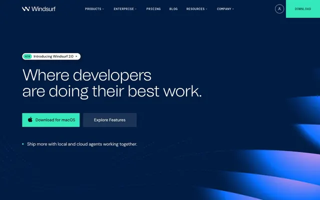
Windsurf operates with a high-contrast, dark-mode scheme, using a deep navy background that evokes a professional, sophisticated environment. A vibrant, almost neon cyan serves as the primary accent, signaling interactive elements and highlighting key information, complemented by a softer magenta for secondary accents. Typography is a blend of impactful, large-scale headlines with subtly tracked small text, creating a dynamic yet precise visual hierarchy. Components are lightweight and often borderless, preferring subtle color shifts and soft corners over heavy shadows or solid fills.
The page structure is full-bleed with content often centered or presented in distinct, spacious horizontal blocks. The hero section is full-width, featuring a prominent centered headline over the abstract dark gradient background, accompanied by a cluster of call-to-action buttons. Subsequent sections alternate between clear content blocks and sometimes integrate background graphics seamlessly. Features and descriptions typically use a two-column layout (text-left/visual-right or vice-versa) or stacked centered content. Navigation is a persistent top bar, with interactive elements highlighted by the brand's accent colors. Vertical spacing is generous between sections.
The visual language predominantly features abstract, generative graphics with undulating wave patterns, often with colorful gradients (like the Plasma Pink Gradient) against the deep navy backdrop. These serve a decorative, atmospheric role rather than explanatory. Product screenshots, when present, are clean, full-bleed, and often framed directly into the dark UI without additional ornamentation, showcasing the software itself. Icons are minimal, either solid white or using the Electric Magenta or Neon Cyan accents, maintaining a high-tech, functional aesthetic. The density is image-light, focusing more on crisp UI and typography.
Reminiscent of Vercel, Replit, Cursor, GitHub Copilot.
# Windsurf — Style Reference
> Deep Space Command Center

**Theme:** dark

**Site:** https://windsurf.com

Windsurf operates with a high-contrast, dark-mode scheme, using a deep navy background that evokes a professional, sophisticated environment. A vibrant, almost neon cyan serves as the primary accent, signaling interactive elements and highlighting key information, complemented by a softer magenta for secondary accents. Typography is a blend of impactful, large-scale headlines with subtly tracked small text, creating a dynamic yet precise visual hierarchy. Components are lightweight and often borderless, preferring subtle color shifts and soft corners over heavy shadows or solid fills.

## Tokens — Colors

| Name | Value | Token | Role |
|------|------|------|------|
| Neon Cyan | `#34e8bb` | `--color-neon-cyan` | Teal action color for filled buttons, selected navigation states, and focused conversion moments. |
| Electric Magenta | `#fb9ce5` | `--color-electric-magenta` | Secondary brand accent for ghost button borders, decorative icons, and call-to-action text that requires a different emphasis |
| Plasma Pink Gradient | `#a95af8` | `--color-plasma-pink-gradient` | Vivid decorative element, background in specific highlight cards, and an essential part of abstract background graphics |
| Midnight Ink | `#011c42` | `--color-midnight-ink` | Primary page background, footer, deep surface elements. Creates a high-contrast canvas for bright accents; Background gradient for hero sections and large content blocks, adding depth to the primary dark canvas |
| Arctic Mist | `#f8f1e5` | `--color-arctic-mist` | Subtle light background color for cards and sections, providing visual breathing room on the dark canvas |
| Platinum White | `#ffffff` | `--color-platinum-white` | Primary text color for headlines and core content on dark backgrounds, selected button text within accents |
| Slate Text | `#696962` | `--color-slate-text` | Muted secondary text color, body copy, and helper text. Provides sufficient contrast against lighter backgrounds |
| Ash Border | `#c0c1c6` | `--color-ash-border` | Subtle borders, dividers, ghost button outlines, and inactive iconography. Offers soft visual separation without harsh lines |
| Charcoal Black | `#0b100f` | `--color-charcoal-black` | Text color against very light backgrounds, such as button text on the cyan accent |

## Tokens — Typography

### ui-sans-serif
- **Weights:** 400
- **Sizes:** 14px, 16px
- **Line height:** 1.43, 1.5
- **Role:** ui-sans-serif — detected in extracted data but not described by AI

### tomatoGrotesk
- **Substitute:** system-ui
- **Weights:** 300, 400, 500
- **Sizes:** 40px, 48px, 64px, 72px, 96px
- **Line height:** 1
- **Letter spacing:** -1.44px at 40px, -0.86px at 72px, -0.64px at 64px
- **Role:** Primary display font for hero headlines and impactful section titles. Its light weight (300) at large sizes creates authority through restraint, avoiding the shouting typical of bold headings.

### DM Sans
- **Substitute:** Arial, sans-serif
- **Weights:** 400, 500, 600, 700
- **Sizes:** 10px, 12px, 14px, 16px, 18px, 20px, 28px, 40px
- **Line height:** 1, 1.3, 1.33, 1.5, 1.56, 1.71, 2.4
- **Letter spacing:** -0.72px at 40px, -0.4px at 20px, -0.28px at 14px
- **Role:** Used for all subheadings, body copy, and navigation labels. Its versatility in weights and sizes manages hierarchy across various content types, keeping readability high.

### DM Mono
- **Substitute:** monospace
- **Weights:** 400, 500
- **Sizes:** 12px, 14px, 16px, 18px
- **Line height:** 1.2, 1.43, 1.56, 1.71
- **Letter spacing:** 0.8px at 16px, 0.7px at 14px
- **Role:** Monospaced font for code snippets, tags, and secondary action buttons, providing a technical, precise feel. The letter-spacing adds clarity to often dense content.

## Tokens — Type Scale

| Role | Size | Line height | Letter spacing |
|------|------|------|------|
| caption | 10px | 1.71 | — |
| body | 14px | 1.5 | -0.28px |
| heading-sm | 20px | 1.5 | -0.4px |
| heading | 40px | 1 | -1.44px |
| heading-lg | 48px | 1 | — |
| display | 64px | 1 | -0.64px |

## Tokens — Spacing

- **Section gap:** 64px
- **Card padding:** 12px
- **Element gap:** 8px

## Tokens — Radius

- **Buttons:** 2px
- **Cards:** 8px
- **navigation:** 9999px
- **tags:** 9999px

## Layout

The page structure is full-bleed with content often centered or presented in distinct, spacious horizontal blocks. The hero section is full-width, featuring a prominent centered headline over the abstract dark gradient background, accompanied by a cluster of call-to-action buttons. Subsequent sections alternate between clear content blocks and sometimes integrate background graphics seamlessly. Features and descriptions typically use a two-column layout (text-left/visual-right or vice-versa) or stacked centered content. Navigation is a persistent top bar, with interactive elements highlighted by the brand's accent colors. Vertical spacing is generous between sections.

## Imagery

The visual language predominantly features abstract, generative graphics with undulating wave patterns, often with colorful gradients (like the Plasma Pink Gradient) against the deep navy backdrop. These serve a decorative, atmospheric role rather than explanatory. Product screenshots, when present, are clean, full-bleed, and often framed directly into the dark UI without additional ornamentation, showcasing the software itself. Icons are minimal, either solid white or using the Electric Magenta or Neon Cyan accents, maintaining a high-tech, functional aesthetic. The density is image-light, focusing more on crisp UI and typography.

## Components

### Primary Action Button
*Calls to action that drive key user behavior (e.g., download, submit).*

Filled rectangular button with Neon Cyan background (#34e8bb), Charcoal Black text (#0b100f), 2px border radius, and padding of 16px vertical, 24px horizontal. Uses DM Sans font, typically weight 500.

### Ghost Accent Button
*Secondary actions or links that need visual emphasis without overwhelming the primary action.*

Transparent background with a border and text in Electric Magenta (#fb9ce5). Text is DM Sans, 16px, with no padding or border radius. Used for 'Explore Features' or 'Learn more' links.

### Download Banner Button
*Prominent, often full-width or oversized, call to action in hero sections.*

Large button with Neon Cyan background (#34e8bb), Charcoal Black text (#003326 - a very dark teal close to black), 0px radius, with generous horizontal padding (40px) and no vertical padding. Uses DM Mono font for a technical feel.

### Content Card
*Container for feature descriptions, process steps, or grouped information.*

Cards can have a subtle Arctic Mist background (#f8f1e5) or transparent. Corner radius is 8px. Internal padding is 12px. No visible shadow by default.

### Tag/Pill
*Small, distinct labels for categories, statuses, or new features.*

Features a full border radius (9999px) making it pill-shaped. Examples include 'New Introducing Windsurf 2.0' where the background is transparent and text is Electric Magenta.

### Code Input Field
*User input fields, primarily for code or technical information.*

Transparent background with White text (#ffffff). Border is Ash Border (#c0c1c6). No radius, offering a sharp, functional edge.

## Guidelines

### Do

- Always use Midnight Ink (#011c42) for large background surfaces to maintain the deep, dark theme.
- Apply Neon Cyan (#34e8bb) consistently as the background for primary call-to-action buttons.
- Headlines should leverage tomatoGrotesk (weights 300-500) for impactful presence, especially the distinctive light 300 weight at larger sizes.
- Text against dark backgrounds should primarily use Platinum White (#ffffff) for readability, reserving Slate Text (#696962) for secondary, less prominent text.
- Utilize Electric Magenta (#fb9ce5) for ghost button borders and decorative elements to provide secondary visual interest without overshadowing the primary cyan.
- Implement a 2px border radius for all filled buttons and a 8px radius for cards to distinguish interaction elements from content blocks.
- Ensure generous vertical spacing between sections (64px) to provide ample breathing room between content blocks on the dark canvas.

### Don't

- Do not introduce new saturated primary colors; stick to the Neon Cyan and Electric Magenta for brand accents.
- Avoid heavy drop shadows on individual elements; prefer subtle surface shifts or border accents for depth.
- Do not use bold weights for tomatoGrotesk headlines; the system relies on lighter weights for its distinctive authority.
- Refrain from using excessively small text sizes (below 12px) for DM Sans to maintain legibility on the dark background.
- Do not apply large, rounded corners globally; save 9999px radius primarily for small tags and pills.
- Avoid dense, unbroken blocks of text; break content with imagery or concise paragraphs to suit the high-contrast display.
- Do not default to generic monospace fonts; specifically use DM Mono for code-related text to maintain brand consistency.

## Agent Prompt Guide

**Quick Color Reference:**
text: #ffffff
background: #011c42
border: #c0c1c6
accent: #fb9ce5
primary action: #34e8bb (filled action)

**3-5 Example Component Prompts:**
1. Create a Primary Action Button: #34e8bb background, #0b100f text, 9999px radius, compact pill padding. Use this filled treatment for the main CTA.
2. Design a feature card: background "Arctic Mist" (#f8f1e5), 8px border-radius, 12px internal padding. Title should be "Cascade" using DM Sans, weight 700, size 40px, text Charcoal Black (#0b100f). Body text in DM Sans, weight 400, size 16px, text Slate Text (#696962).
3. Create a navigation link for "Pricing" using DM Sans, weight 500, size 16px, text Platinum White (#ffffff), with no background or border, and 9999px radius if applicable for very active/highlighted state as a visual indicator similar to tags.
4. Produce a pill-shaped tag reading "New Introducing Windsurf 2.0" with transparent background, Electric Magenta (#fb9ce5) text, and 9999px border radius, using DM Mono, weight 500, size 14px, letter-spacing 0.7px.
More like this




Keep what you find
A free account saves references to boards and can send you a weekly email of picks based on what you save.
To see every result, go Pro.