Preview image. Unlock full-res
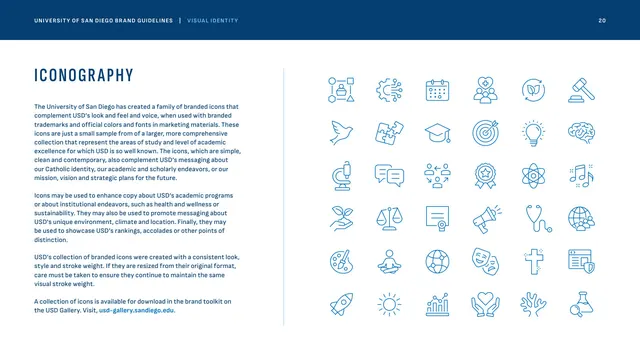
A six-by-six grid of line icons in Immaculata Blue spanning academics, faith, sustainability and campus life, with consistent stroke weight.
Summary
The iconography page, presenting a unified family of thin-line Immaculata Blue icons in a large grid, sampling academic, spiritual, sustainability and campus-life themes.
Visual description
This page sits in a slightly wider format. Left column: "ICONOGRAPHY" in tracked condensed Founders Blue caps and several paragraphs on the icon family's role complementing the marks, the need to preserve stroke weight when resizing, and a bright-blue toolkit link. The right two-thirds is a 6x6 grid of simple single-weight line icons in Immaculata Blue on white: a dove, mortarboard, microscope, scales of justice, Celtic cross, globe, rocket, sun, bar chart, cupped hands, lightbulb, gavel, brain, and many more spanning study areas, faith, wellness and climate. All share a consistent thin stroke and open, contemporary style.
Key takeaway
A broad but visually consistent icon set, one stroke weight, one color, one level of detail, gives marketing a flexible vocabulary that still reads as a system. Explicitly warning to preserve stroke weight on resize heads off the most common way icon sets fall apart.
Reuse notes
A clean reference for documenting a line-icon library at a glance. The single-weight, single-color grid is directly transferable to any brand wanting cohesive iconography. Pairs naturally with the stats-and-numbers page, which uses the same restrained styling.
From this deck: Iconography system
View deck





More like this






Keep what you find
A free account saves references to boards and can send you a weekly email of picks based on what you save.
To see every result, go Pro.