Preview image. Unlock full-res
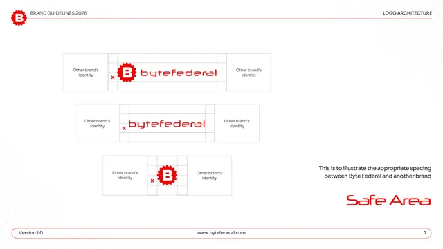
Safe-area page showing the spacing to keep between the Byte Federal logo and another brand's identity, across all three lockups.
Summary
The co-branding safe area: three stacked diagrams demonstrate the minimum gap to leave between the logo and a neighbouring brand's identity.
Visual description
White page under "LOGO ARCHITECTURE." Three left-aligned diagrams stack vertically, each flanked by light gray boxes labeled "Other brand's identity" on both sides, with the Byte Federal logo (primary lockup, then wordmark, then icon) centered between them and a dashed "x" grid marking the spacing unit. A short right-hand gray note reads "This is to illustrate the appropriate spacing between Byte Federal and another brand." "Safe Area" is set large in red display type lower right; the pill footer shows page "7."
Key takeaway
Explicitly diagramming the gap to a neighbouring brand (not just to page edges) is a useful, often-skipped rule for logos that share lockups or partner walls. Reusing the same "x" unit established on the structure page keeps the spacing system consistent.
Reuse notes
Reach for this when a brand frequently appears alongside partners, sponsors, or co-brands and needs a stated separation. The neutral "other brand's identity" placeholder boxes make the rule legible without naming a real partner.
From this deck: Byte Federal safe area between brands
View deck












More like this





Keep what you find
A free account saves references to boards and can send you a weekly email of picks based on what you save.
To see every result, go Pro.