Preview image. Unlock full-res
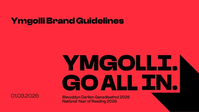
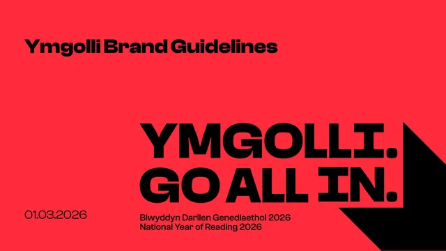
Bilingual Welsh reading-campaign brand guideline built on a punchy black wordmark with a long chevron drop-shadow, a multi-hue palette led by signature red, and Clash Display type.
Summary
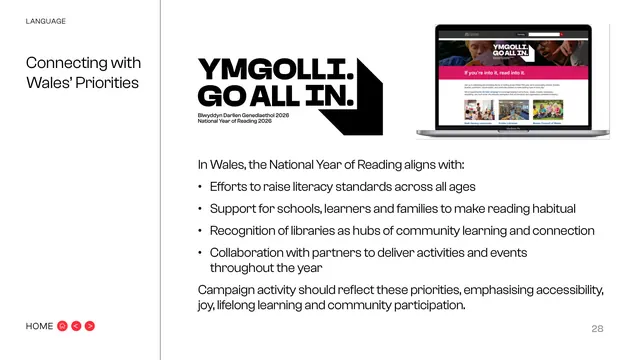
Brand guideline for Ymgolli, the Welsh-language identity of the UK "Go All In" National Year of Reading 2026 campaign. The whole system hangs off one device: a heavy black wordmark whose long offset shadow folds into a downward chevron, set against a loud multi-colour palette led by a signature red.
Visual description
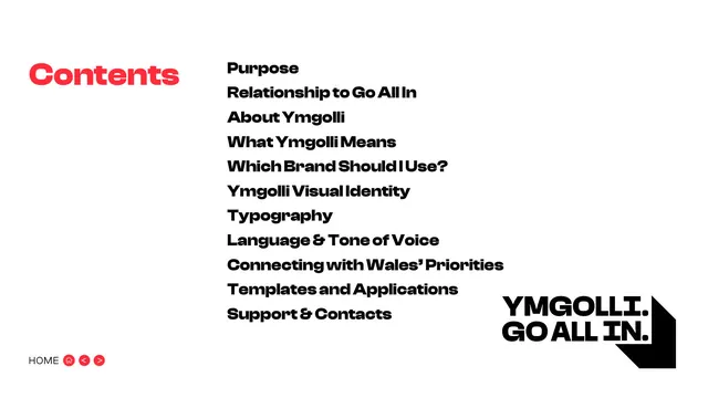
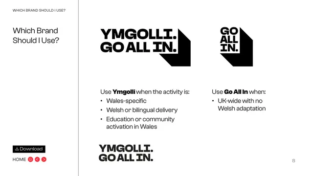
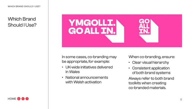
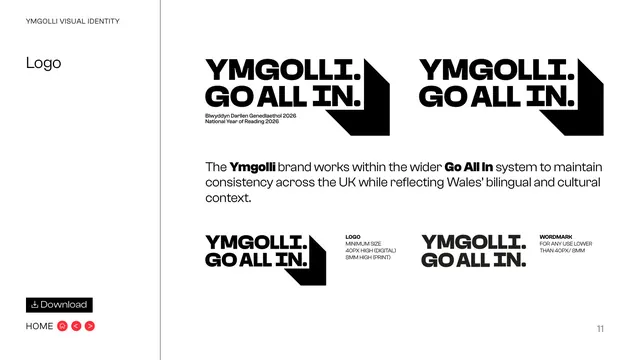
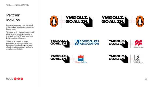
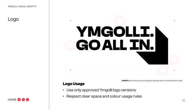
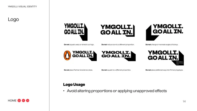
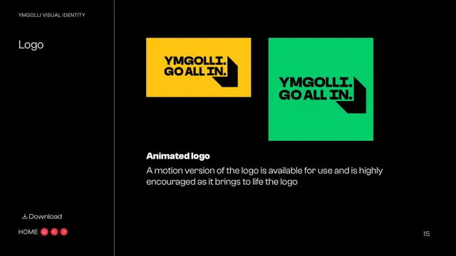
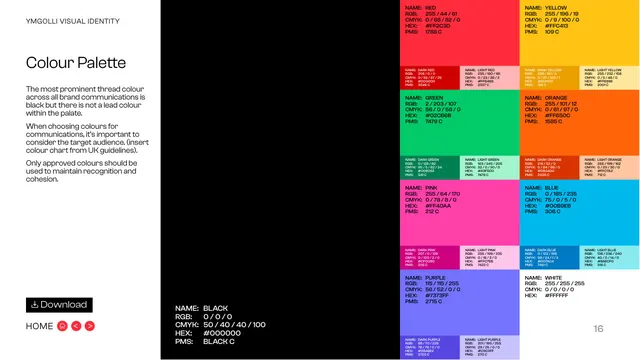
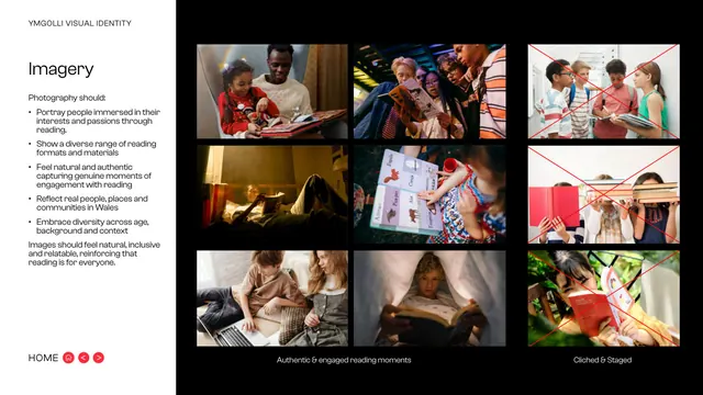
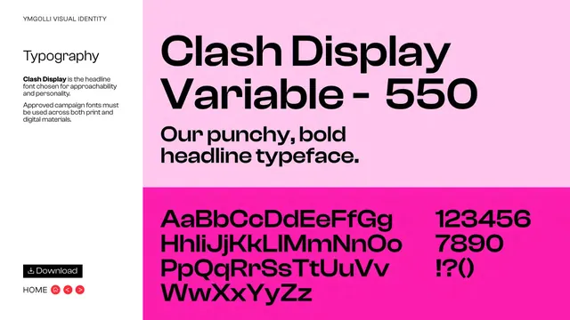
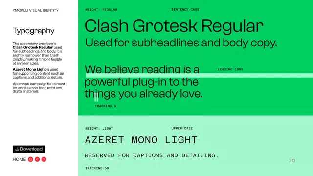
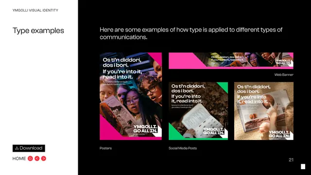
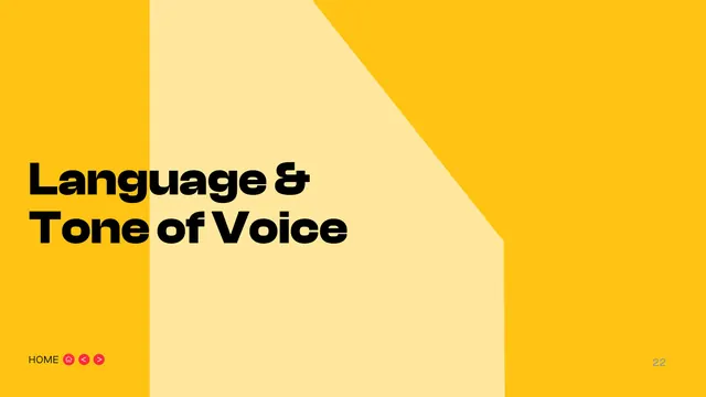
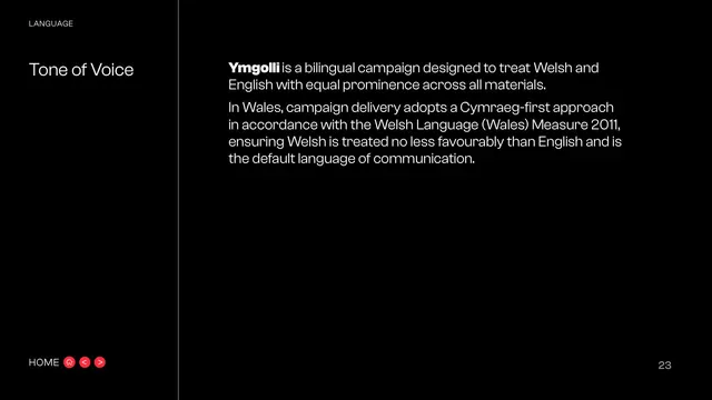
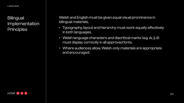
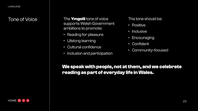
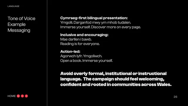
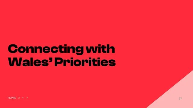
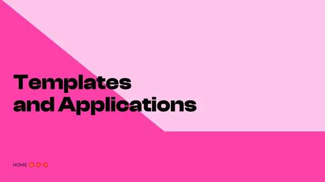
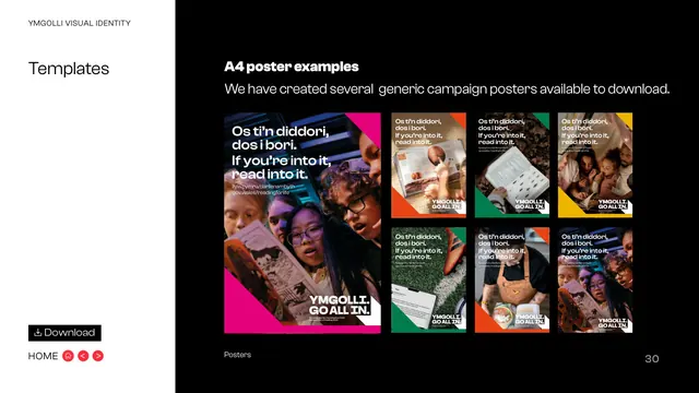
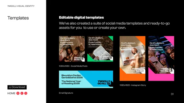
The identity is built on a bold, geometric sans wordmark reading "YMGOLLI. GO ALL IN." in solid black, trailed by an exaggerated long drop-shadow that bends into an arrow/chevron pointing down and right. That shadow shape is the recurring motif: it reappears as angled, full-bleed colour blocks on every section-divider page. Content pages run a consistent grammar, a narrow left sidebar carrying a small all-caps section eyebrow and a large mixed-weight section title, separated from the right-hand text column by a thin vertical hairline rule. Navigation sits bottom-left as the word "HOME" beside three small red circular pill buttons (home, previous, next), with a muted page number bottom-right. Body pages alternate between pure-black backgrounds with white text and white backgrounds with black text. Divider pages are saturated single-colour fields (red, periwinkle, cyan, yellow, pink) carrying only the next section title and the angled chevron cut. The colour system is broad: red #FF2C3D, yellow #FFC413, green #02CB6B, orange #FF650C, pink #FF40AA, blue #00B9EB, purple #7373FF, plus black and white, each with dark and light tints documented on a full swatch page; black is described as the most prominent thread colour rather than a lead. Type is Clash Display Variable 550 for punchy headlines, Clash Grotesk Regular for subheads and body, and Azeret Mono Light, all-caps and tracked, for captions and detailing. Imagery is candid documentary photography of real people reading, with a clear do/do-not page rejecting staged, cliched book-over-face shots.
Key takeaway
The long folded drop-shadow turning a flat wordmark into a directional graphic device, then reusing that exact shadow geometry as the section-divider shape so the logo and the layout share one form. The disciplined page chassis, sidebar eyebrow plus oversized title, hairline rule, persistent corner nav and page number, makes a long bilingual document feel templated and calm despite a very loud colour range. Pairing a variable display face with a mono caption face for a confident campaign voice.
Reuse notes
A strong reference for government, cultural, education or civic campaigns that need energy and a big colour palette but still have to behave across long, bilingual, accessibility-conscious documents. The single-device-becomes-layout-shape trick is reusable for any wordmark with a strong silhouette. Note the system leans on a specific licensed type stack (Clash Display, Clash Grotesk, Azeret Mono) and a Cymraeg-first bilingual setup, so borrow the structure rather than the exact assets.