Preview image. Unlock full-res
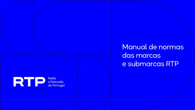
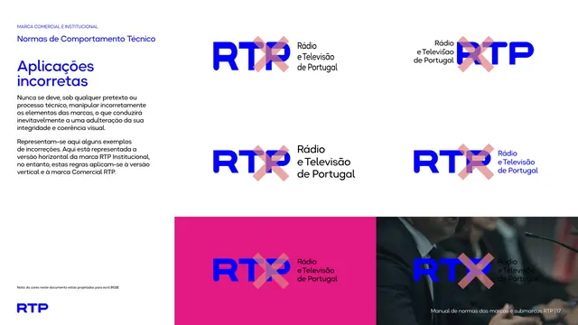
Visual-identity manual for Portuguese broadcaster RTP and its sub-brands, built on an electric-blue palette, the Okta Neue typeface and a recurring half-circle "D" graphic motif.
Summary
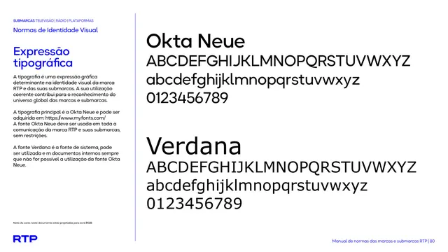
The 2026 visual-identity manual for RTP, Portugal's public radio and television broadcaster, defining the master RTP mark and a large family of color-coded sub-brands. The system is anchored by one electric blue, the geometric Okta Neue typeface, and a recurring half-circle "D" graphic device.
Visual description
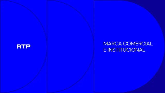
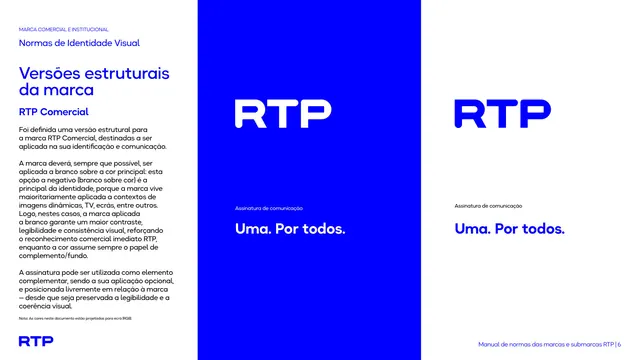
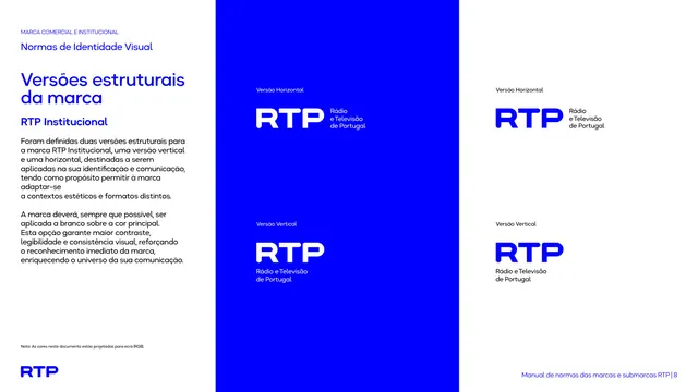
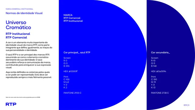
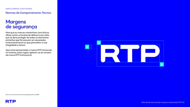
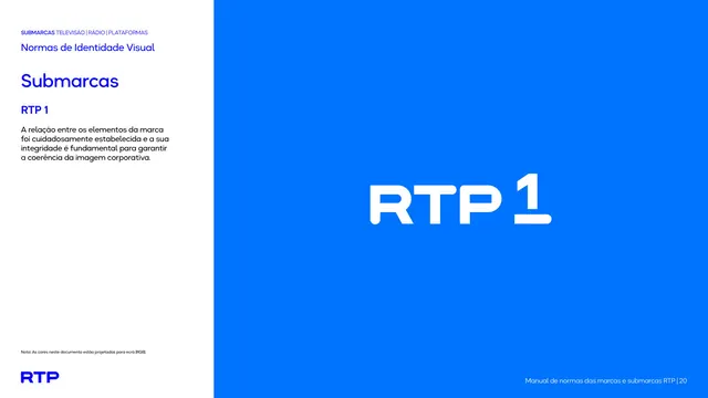
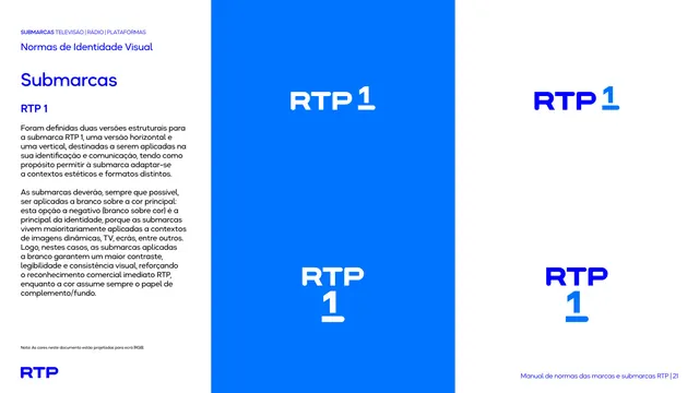
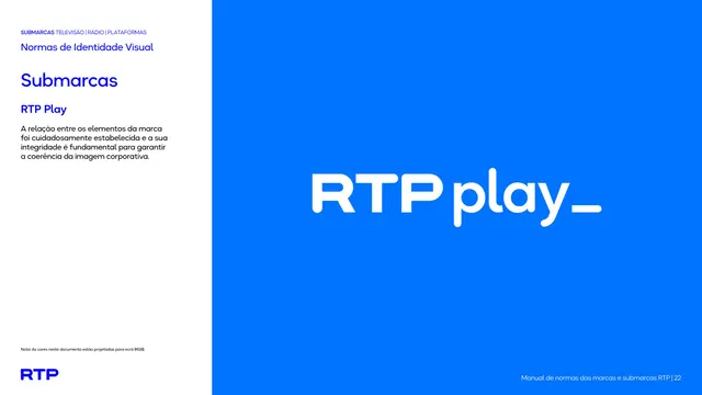
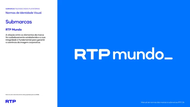
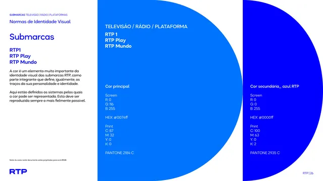
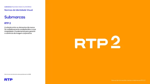
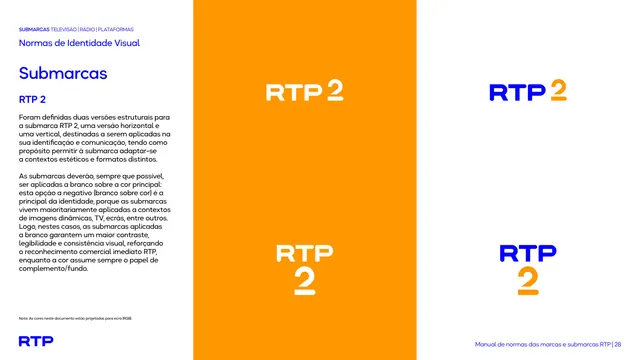
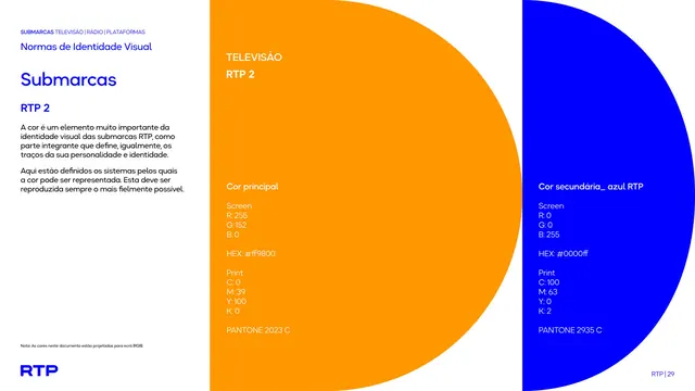
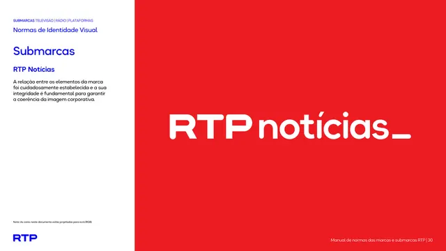
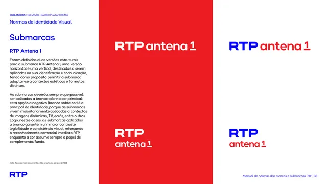
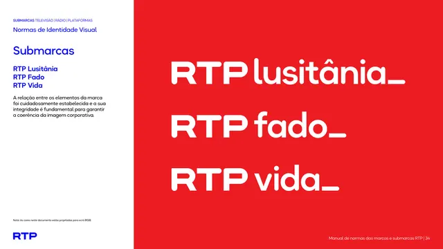
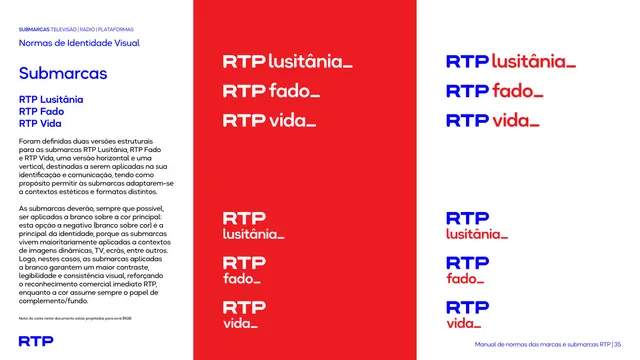
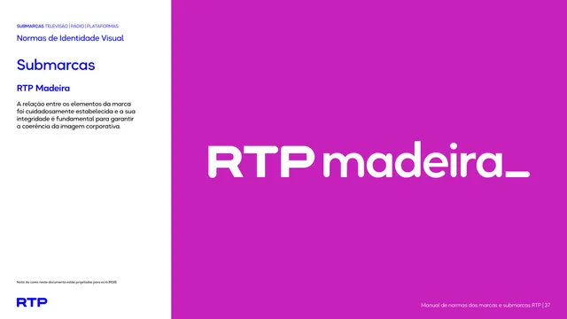
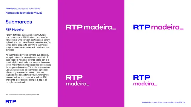
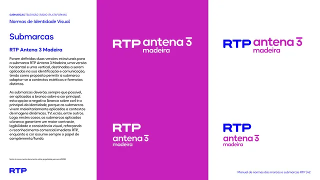
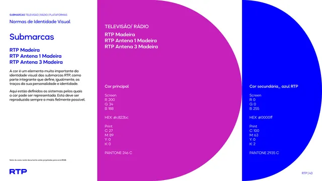
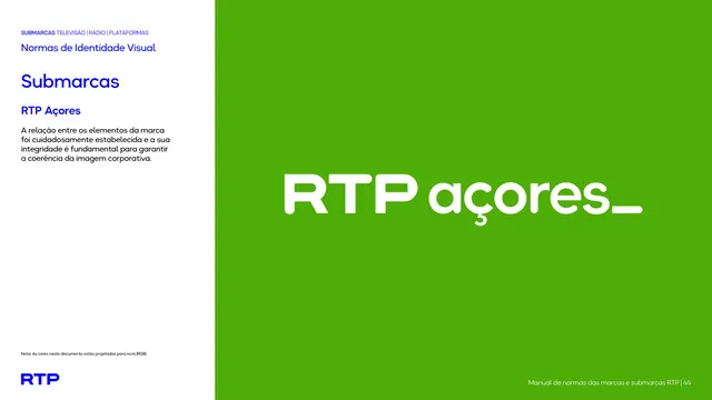
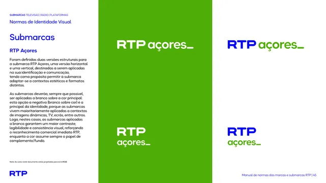
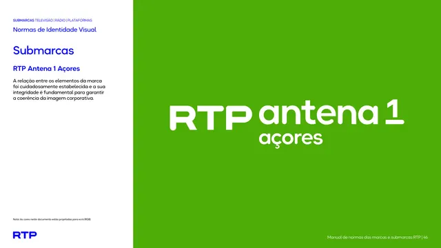
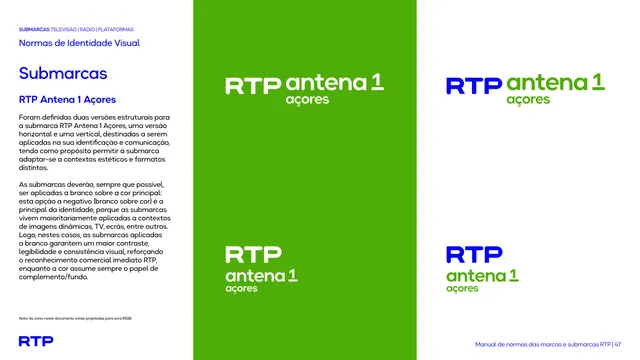
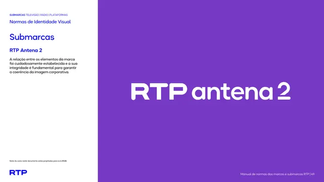
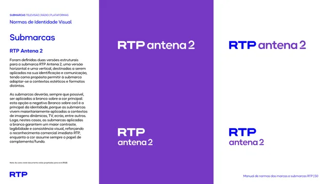
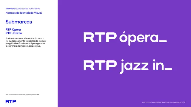
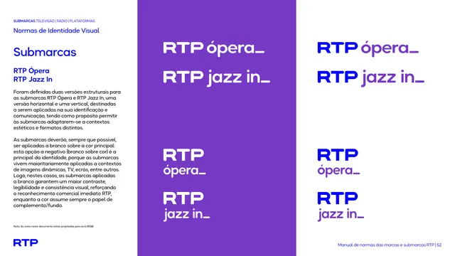
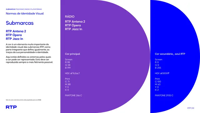
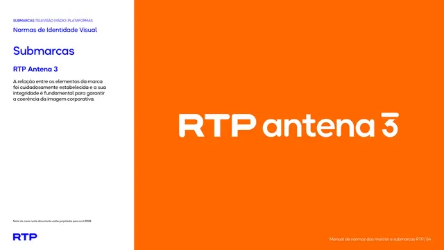
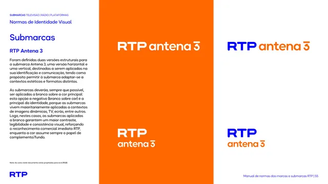
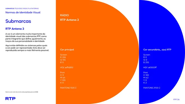
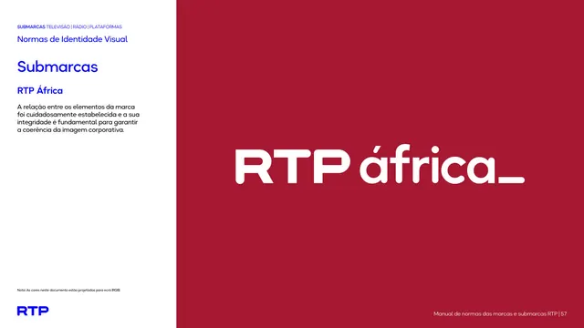
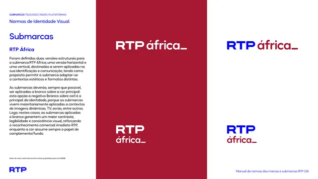
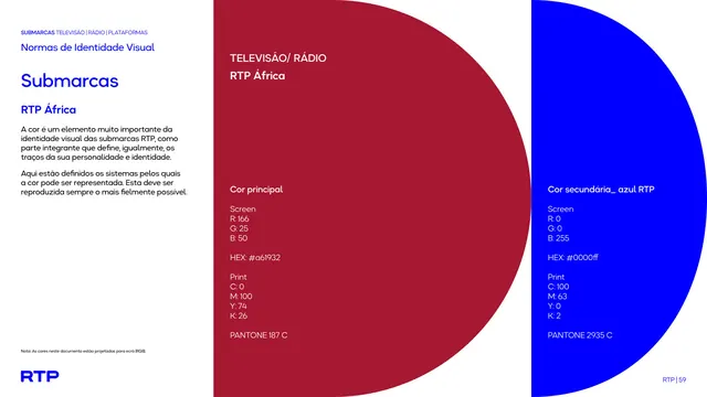
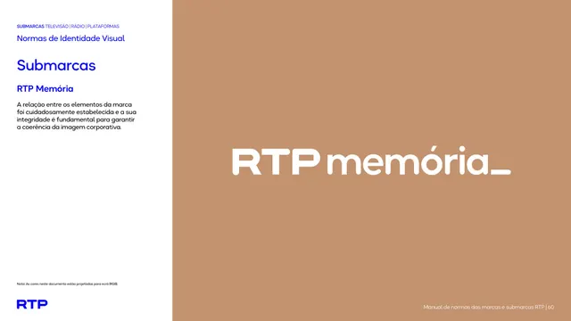
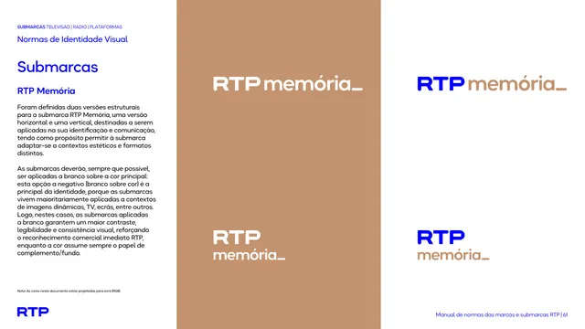
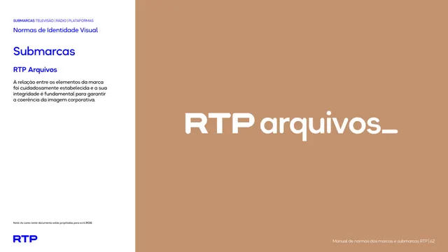
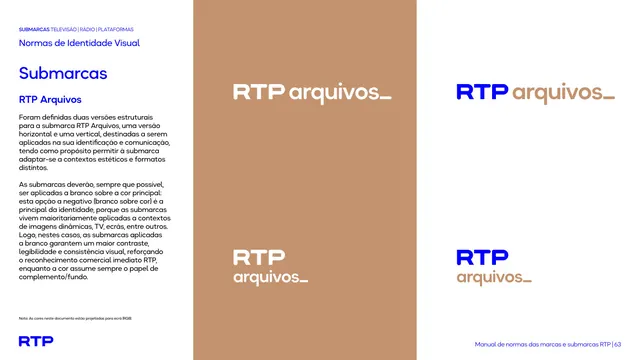
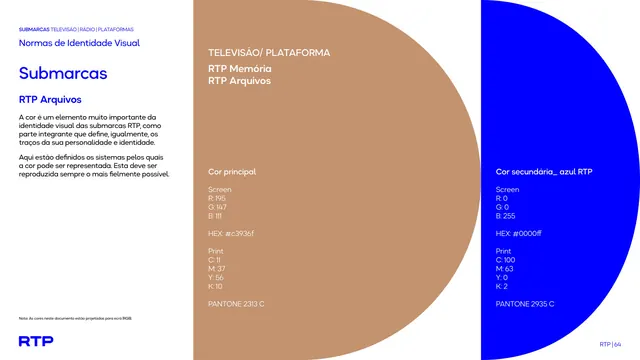
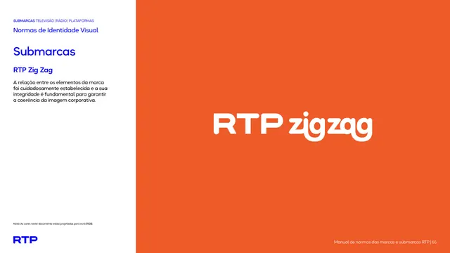
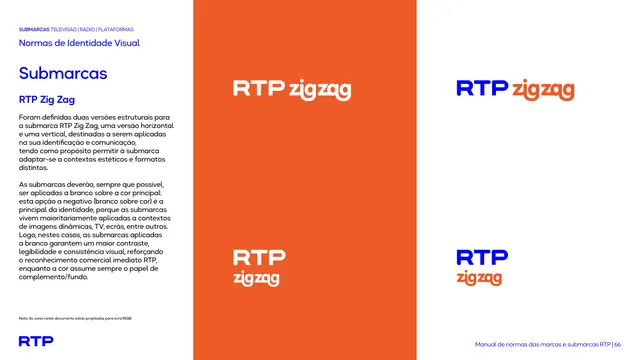
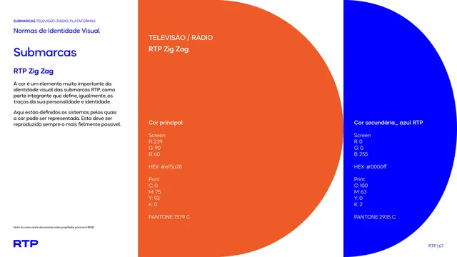
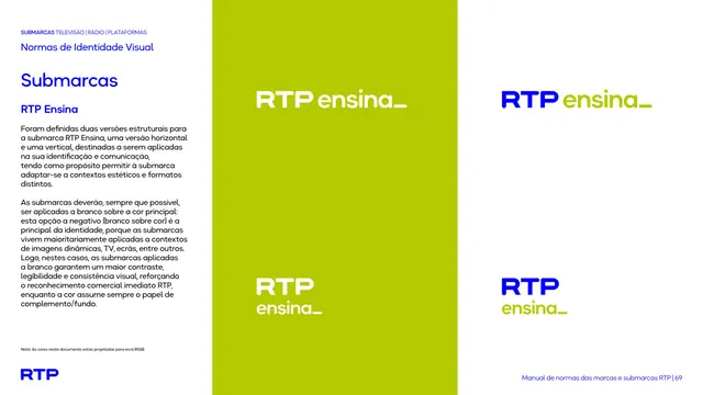
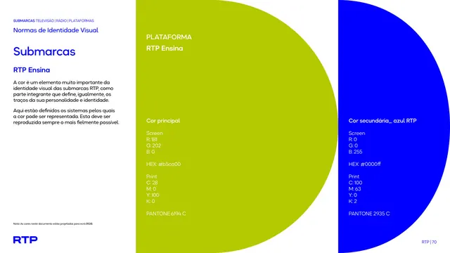
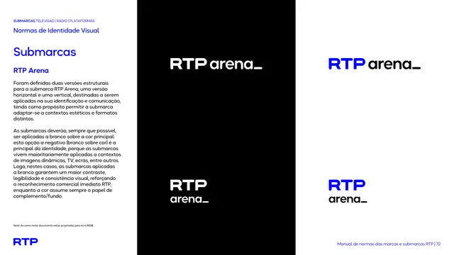
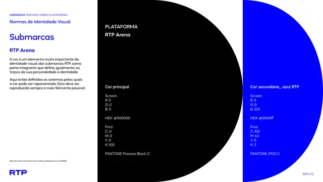
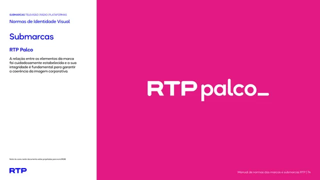
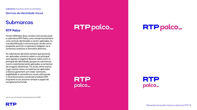
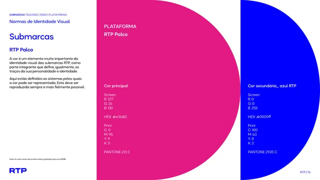
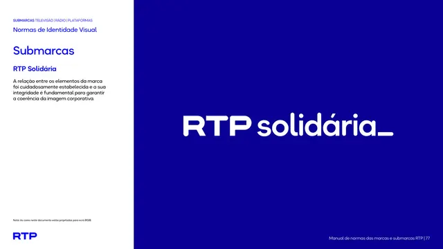
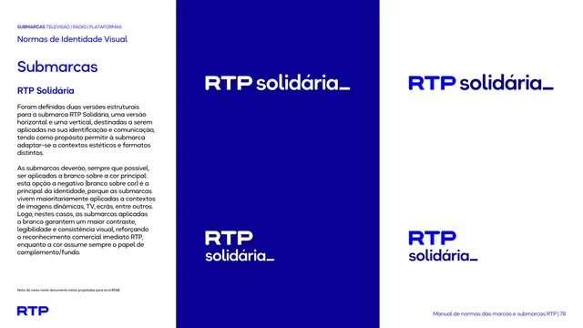
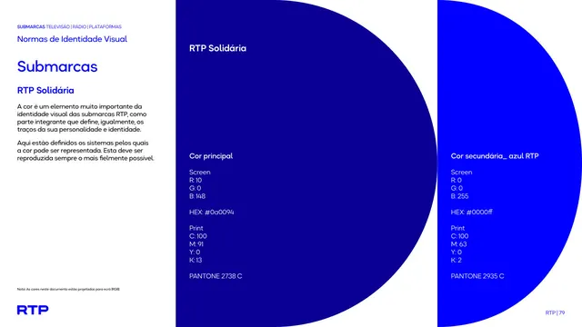
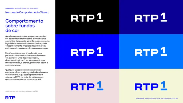
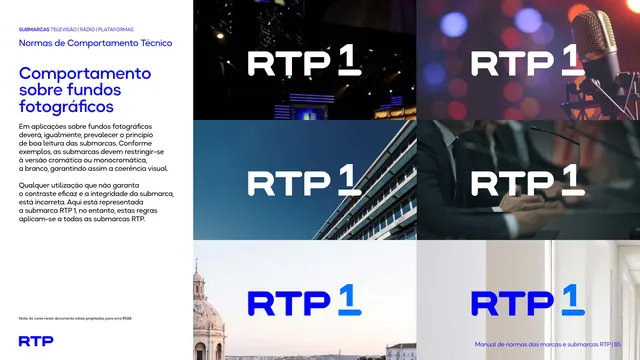
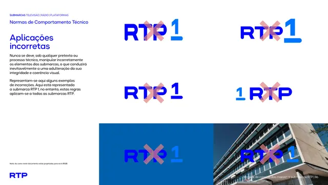
A two-mode document. Divider and cover pages run full-bleed in saturated electric blue (#0000FF) with thin navy outline arcs that assemble a repeating half-circle / "D" motif, the RTP logo reversed to white, and section titles set in white Okta Neue. Content pages flip to a white left column carrying a small blue eyebrow label, a blue Okta Neue heading and a short black body paragraph, beside a large blue (or sub-brand color) panel showing the relevant mark or specimen. The master brand uses white-on-blue as the primary lockup, with a secondary darker blue (#0A0094). Each sub-brand is assigned its own flat color field: RTP1 keeps blue, RTP Play and RTP Mundo use a lighter blue (#0074FF), RTP2 orange (#FF9800), RTP Notícias / Antena 1 / Lusitânia / Fado / Vida red (#ED1C24), the Madeira family magenta (#C822BC) and RTP Açores green. Logos are wordmark lockups: "RTP" in a bold geometric cut joined to a lighter-weight lowercase descriptor (mundo_, play_, notícias_) often ending in an underscore, or a numeral set (1, 2, 3). Color-spec pages pair two large half-circles (the sub-brand color plus the blue) listing RGB / HEX / CMYK / Pantone values. The footer carries a small "RTP" mark and a running "Manual de normas das marcas e submarcas RTP | NN" line.
Key takeaway
The half-circle "D" motif used as a structural system: outlined arcs on color tile together into a flexible cover and divider grammar that reads as a custom shape without a literal logo. The disciplined two-zone content layout (white text column plus full-color specimen panel) makes a long manual scannable. And the color-coding strategy, where every sub-brand inherits the same wordmark construction and Okta Neue type but swaps a single flat brand color, is a clean way to unify a sprawling brand family.
Reuse notes
A strong reference for broadcaster, media-network or any multi-brand house that needs one master identity plus many sub-brands kept visually consistent. The wordmark-plus-lowercase-descriptor lockup with trailing underscore is a reusable pattern for naming product or channel variants. Works best when one hero color does the heavy lifting and supporting brand colors are introduced only on their own pages. Note the layout leans heavily on the Okta Neue typeface and a single high-saturation blue, so it needs that bold flat-color confidence to land.
From this deck: RTP brand and submarcas guidelines 2026
View deck








More like this







Keep what you find
A free account saves references to boards and can send you a weekly email of picks based on what you save.
To see every result, go Pro.