Preview image. Unlock full-res
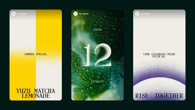
Three vertical story frames on a dark green field showing a summer drink drop, a product taste frame and a Pride message in the same stipple gradient system.
More like this
See all
Summary
Three rounded vertical story frames side by side, each running a different message but the same stipple gradient, tiny circular avatar lockup and heavy serif caps at the foot.
Visual description
The three cards float on a near black green background with generous space between them. Each carries a small circular "12" avatar and the handle "12.matcha" in the top left. The left card splits vertically into yellow and off white halves that trade places across a stippled seam, with "SUMMER SPECIAL" in small letterspaced caps at the middle and "YUZU MATCHA LEMONADE" set large in a high contrast serif across two lines at the bottom. The center card is a full bleed photograph of condensation and green liquid, with "TASTE" near the top, "VITALITY" near the bottom and a large white serif "12" centered, its right numeral dissolving into spray. The right card is off white at the top and grades into a purple stippled arc rising from the bottom edge, with "COME CELEBRATE PRIDE WITH US." in small caps in the upper third and "RISE TOGETHER" in large serif caps running the full width at the base.
Key takeaway
A story template with three fixed slots, handle top left, a small caps line in the middle band, and one oversized serif headline locked to the bottom edge, so the layout survives a swap of color, photo or campaign. Recoloring the same stipple gradient purple is enough to signal a Pride post without introducing a different graphic language.
Reuse notes
Reach for this when a brand needs a social system that stays recognizable across seasonal drops, product shots and cultural moments. The bottom locked headline wants a display serif with real weight; a neutral sans will look under-designed in that slot. Type sits close to the card edges, so check safe areas before publishing to platforms with UI overlays.