Preview image. Unlock full-res
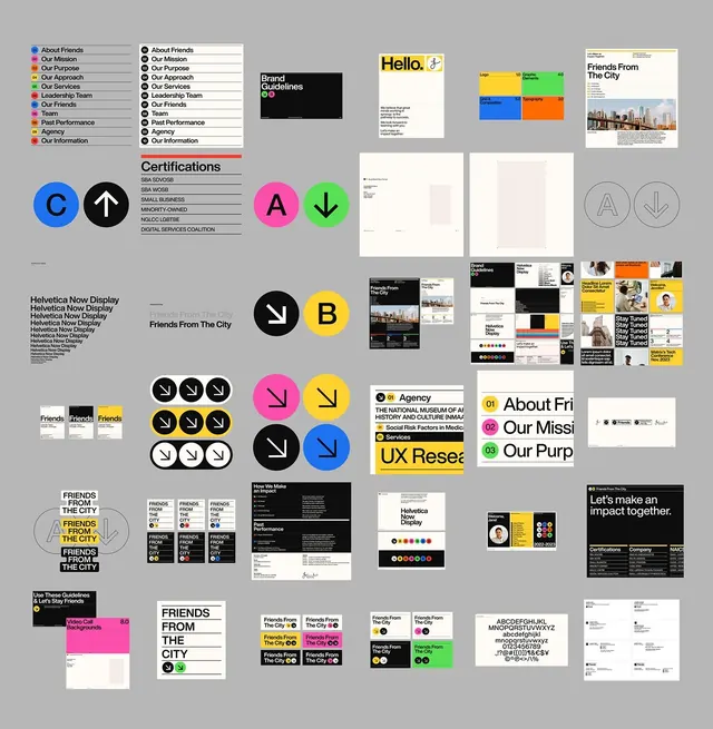
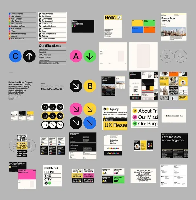
A modular geometric identity system for an arts and cultural organization, anchored by dynamic colored circles, bold sans-serif typography, and a restricted color palette of electric blue, vibrant magenta, yellow, and green.
Summary
A grid-based identity system for Friends From The City featuring modular, single-colored circles as logo marks, each combined with directional arrows and applied across posters, business cards, and collateral.
Visual description
A flat-lay montage on neutral gray background showing a comprehensive brand system. At top left: a vertical list of organization departments in sans-serif capitals (About Friends, Our Mission, Our Approach, Our Values, Leadership Team, Our Friends, Instagram, Contact Info, Past Performance, Agency, Our Information), each with a corresponding colored circle. Color palette spans six vibrant hues: primary blue circle with upward arrow, black circle with upward arrow, bright magenta circle with downward arrow, lime green circle with downward arrow, yellow circle with downward arrow, and solid black and white logo variations. Typography is uniform sans-serif, set in uppercase weights. System applications include identity guidelines (certification badges), stationery (letterheads), posters featuring "Hello," and a color grid test card. Bottom section shows business card applications with "Friends From The City" wordmark and repeated mark systems in grid arrangements.
Key takeaway
The strength is in modularity: each department gets a unique colored circle pairing with a directional arrow, scaling this one move across business cards, posters, and guidelines without losing coherence. The palette is highly restricted but memorable, and the geometric single-color marks are flexible enough to work at icon scale and billboard scale. The grid-based layout system communicates system rigor without visual density.
Reuse notes
Ideal for nonprofits, cultural organizations, or agencies needing a playful-yet-serious visual identity that scales across print, digital, and wayfinding. The colored-mark approach works especially well when the same few colors need to signal taxonomy or department distinctions. Works best with confidence in sans-serif weight variation for hierarchy; avoid if the mark needs to carry the brand's sole visual personality.
More like this


Keep what you find
A free account saves references to boards and can send you a weekly email of picks based on what you save.
To see every result, go Pro.