Preview image. Unlock full-res
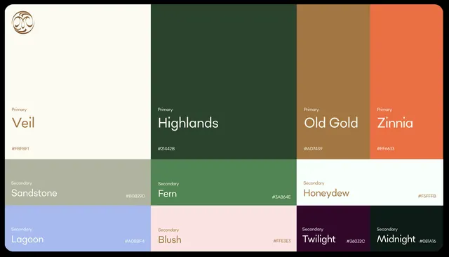
Structured color palette specimen showing four primary hues and four secondary tones organized in a clean grid, labeling each with name and hex value.
Summary
A curated color palette presenting four primary hues and four supporting tones in a clean grid, each labeled with name and hex code, demonstrating systematic color organization for premium branding.
Visual description
Eight color blocks arranged in a rounded-corner grid: top row shows a cream-white base (Veil, light), then three primaries—deep olive green (Highlands), warm caramel-tan (Old Gold), and burnt coral (Zinnia)—each labeled "Primary" with name and hex. Bottom row pairs four secondary tones in smaller blocks: muted sage (Fern, green), warm sandy-beige (Honeydew, tan), soft lavender-blue (Lagoon), and dusty pink (Blush). A sixth block shows deep purple-black (Twilight) and forest green (Midnight). The palette emphasizes warm earth tones and jewel-like depth without saturation, suggesting textile, cosmetic, or interior-focused applications.
Key takeaway
The systematic labeling and hierarchy: four primaries establish personality, four secondaries provide harmony and restraint. The cream base prevents the palette from feeling heavy. Color naming strategy (descriptive, single-word) is easily applied to design systems and communication.
Reuse notes
Essential for crafting cosmetic, textile, interior, or lifestyle brand systems. The palette resists trendiness; muted depths pair well with modern minimal layouts or traditional luxury packaging. Works equally for dark-background digital or light-background print applications.
More like this


Keep what you find
A free account saves references to boards and can send you a weekly email of picks based on what you save.
To see every result, go Pro.