Preview image. Unlock full-res
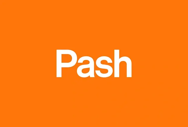
Minimalist brand wordmark "Pash" in bold white sans-serif typography on a saturated orange field.
Summary
A clean brand wordmark "Pash" rendered in bold white sans-serif letters centered on a bright, fully saturated orange background.
Visual description
Horizontal composition, nearly square. A vibrant, warm orange fills the entire background—the kind of pure, primary orange used in high-energy branding. Centered in white is the word "Pash" in a bold, geometric sans-serif typeface. The letters are substantial and confident, with generous letter-spacing. The contrast between white and orange is maximum, creating immediate legibility and visual pop. No additional design elements, graphics, or texture—pure color and type.
Key takeaway
Color and contrast as branding fundamentals. This wordmark works because of its boldness: the vibrant orange is impossible to ignore, and the white letterforms have weight and presence. Minimal design done well looks simple but is strategically confident.
Reuse notes
Strong reference for vibrant startup branding, consumer-facing brands targeting youth/energy, or food/beverage brands wanting warmth and approachability. The orange-plus-white combo is energetic without being corporate. The geometric sans-serif reads modern. Works across digital and physical media due to high contrast and simplicity. Avoid over-contextualizing—the strength is in the purity of the statement.