Preview image. Unlock full-res
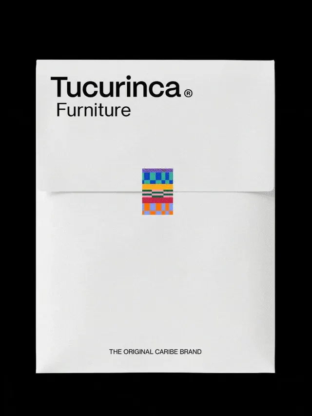
Furniture brand identity using stark typography, ample negative space, and a small woven textile swatch to signal artisanal heritage.
Summary
Furniture brand identity using stark typography, ample negative space, and a small woven textile swatch to signal artisanal heritage.
Visual description
Square format card, cream/off-white background with centered dark type. "Tucurinca" in bold sans-serif (possibly black or near-black weight), registered trademark symbol; beneath, "Furniture" in lighter weight. Bottom tagline in small sans-serif: "THE ORIGINAL CARIBE BRAND". Centered between title and tagline is a small textile swatch roughly 2x2 inches, showing geometric pattern in bright blue, orange, yellow, magenta, and black in blocky rows (woven or printed textile fragment). Composition is symmetrical and vertically centered; typography occupies top quarter, swatch middle, tagline bottom.
Key takeaway
The restraint of letting one small, colorful material artifact carry all the visual interest in an otherwise austere layout; the way a heritage typographic treatment (display sans-serif in display size) combined with tonal minimalism reads as authentic and premium; the strategic use of negative space to create breathing room and direct focus.
Reuse notes
Strong template for furniture, home goods, or heritage-craft retail branding. The woven swatch positions the brand as artisanal and culturally rooted without relying on imagery or narrative copy. Best suited for print collateral (stationery, hang tags, catalog covers) or e-commerce hero sections where heritage matters. The restraint assumes the brand story is known or discovered elsewhere; not ideal for cold awareness or unfamiliar audiences.
More like this
![[Be] Life. brand wordmark, minimal, swiss, dark](https://images.vasa.works/_t/graphics/ae6d55b3e71b64d50aa463d6e9390702.webp)


Keep what you find
A free account saves references to boards and can send you a weekly email of picks based on what you save.
To see every result, go Pro.