Preview image. Unlock full-res
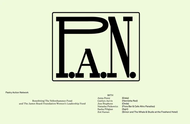
Nonprofit identity featuring a bold, outlined monogram of stacked initials P-A-N inside a bordered square on a pale yellow ground.
Summary
Nonprofit branding monogram stacking P, A, N in thin-stroke outline letters inside a bordered square on a cream background.
Visual description
A pale yellow ground hosts a centered black-outlined square frame. Within the frame, three capital letters are stacked and tightly spaced: P above A above N, rendered in a sans-serif display weight with thin, even strokes. The letters appear as outlines only, uncolored, relying on negative space and letterform geometry for visual impact. Beneath the monogram appears smaller text reading "Pastry Action Network" and supporting text listing partner organizations and beneficiary funds. The composition is symmetrical and heavily structured, with spare typography conveying institutional authority and refinement without ornament.
Key takeaway
The outlined monogram technique: using thin strokes and letterform negative space rather than solid fills, which gives elegance and legibility at any scale. The contained square border as an institutional frame device that grounds and legitimizes the mark. The cream ground as a neutral alternative to white that softens high contrast while maintaining clarity.
Reuse notes
Ideal for foundations, nonprofits, or civic organizations that need authority and trust without appearing corporate or commercial. Monogram stacking works well for acronymic names or initials. The outlined/hollow treatment is especially effective at small sizes (websites, seals) and prints reproducibly in one color. Not recommended for brands targeting youth audiences or requiring visual warmth. Works across printed annual reports, letterheads, and digital applications. The pale yellow ground is unusual; substitute white or off-white for broader application.
More like this


Keep what you find
A free account saves references to boards and can send you a weekly email of picks based on what you save.
To see every result, go Pro.