Preview image. Unlock full-res
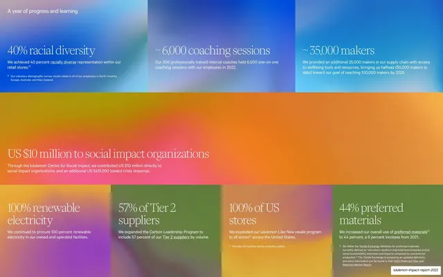
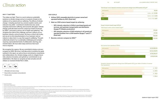
A full-bleed grid of color-blocked gradient panels, each holding a serif headline statistic, banded blue, orange-pink and green by topic.
Summary
A full-bleed outcomes dashboard: gradient-filled color blocks, each carrying an oversized serif statistic, are banded by topic into a blue row, an orange-pink band, and a green row.
Visual description
The page is entirely covered by adjoining gradient color panels with no cream margin. A top band of three blue gradient blocks holds "40% racial diversity", "~6,000 coaching sessions" and "~35,000 makers". A central full-width orange-to-pink gradient band carries one large figure, "US $10 million to social impact organizations". A bottom row of four green gradient blocks holds "100% renewable electricity", "57% of Tier 2 suppliers", "100% of US stores" and "44% preferred materials". Every figure is set in a light serif in near-white, each with a one-line caption and occasional footnote beneath. Footnotes sit in the lower-right block.
Key takeaway
The color-blocked stat wall: a full-bleed mosaic of gradient panels where color bands group the metrics by theme (people, contribution, planet) and oversized white serif numerals pop against the saturated fields. Breaking the middle into one wide hero figure varies the rhythm and spotlights the headline number.
Reuse notes
A high-impact "results at a glance" or KPI-summary layout for reports and decks that want a bold, scannable scoreboard. The gradient panels carry the brand without any photo. Banding by color only works if the metrics group naturally into a few themes. Keep figures in one type style and limit each block to one number plus a short caption so the wall stays readable.
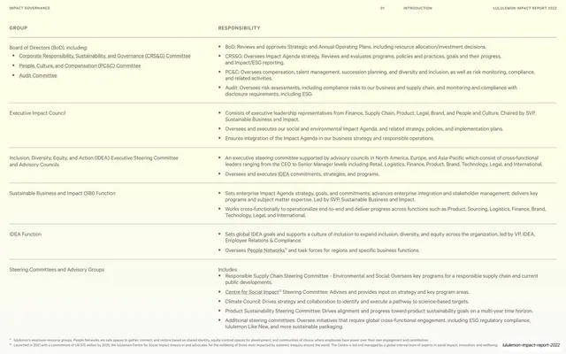
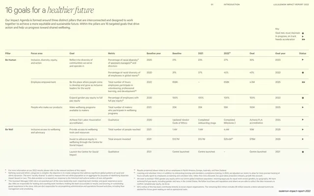
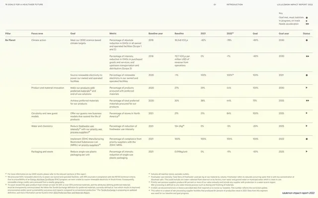
From this deck: Key 2022 outcomes color-blocked stats
View deck

















More like this




Keep what you find
A free account saves references to boards and can send you a weekly email of picks based on what you save.
To see every result, go Pro.