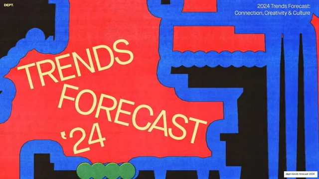
Preview image. Unlock full-res
A 71-slide agency trends report that alternates dark and warm-cream editorial slides, runs a persistent section-nav across every page, and pairs oversized all-caps section headlines and serif pull-quotes with risograph-grain illustrations.
Summary
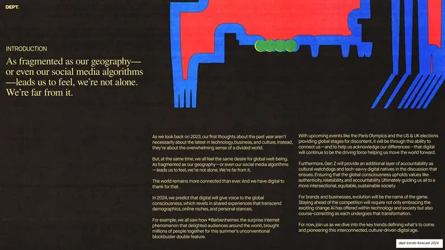
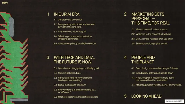
DEPT.'s 71-slide 2024 trends report, structured around five numbered domains (AI, Personalisation, Tech and Data, Impact, Looking Ahead). Its personality comes from a strict editorial system: every interior slide carries a persistent section-nav bar, slides alternate between near-black and warm cream, and oversized all-caps headlines and serif pull-quotes are paced against risograph-grain illustrations and flat-color diagrams. This description is based on the cover, intro, contents and the section-one (1.1 to 1.5) slides.
Visual description
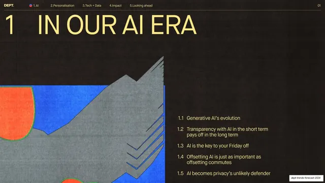
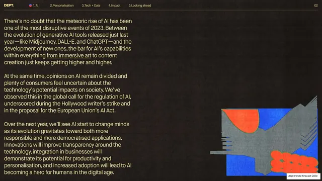
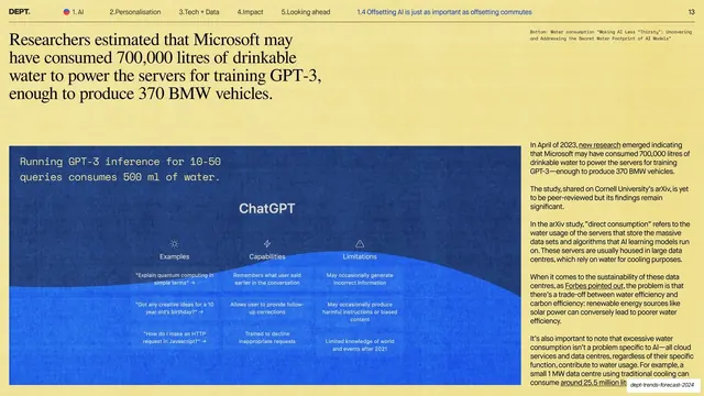
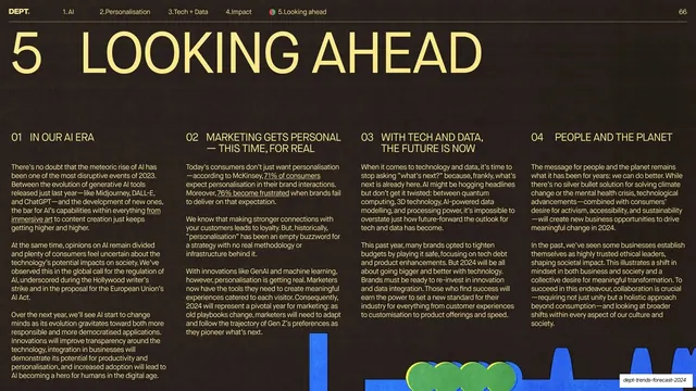
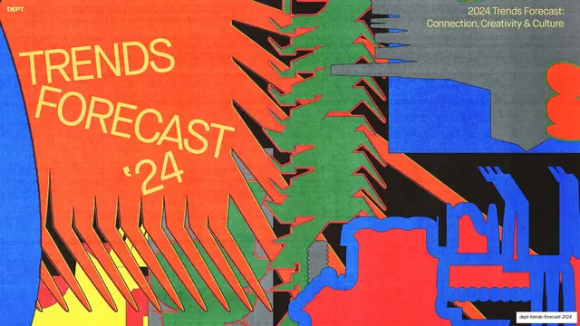
Slides run 16:9. The palette swaps between a near-black ground (used for the cover surround, intro, contents and chapter dividers) and a warm pale-yellow cream (used for sub-section dividers and most reading slides), with a single high-energy accent that flips by ground: bright cream-yellow type on dark, dark ink and a cobalt blue on cream. The cover is a full-bleed risograph-style illustration in red, blue and black with a tilted cream display headline. From the first interior slide on, a thin top bar runs across every page listing the five sections ("1.AI", "2.Personalisation", "3.Tech + Data", "4.Impact", "5.Looking ahead") with a small red-blue active dot, the active sub-section title, and a numeric page index, all on a hairline rule, with a small "DEPT." wordmark top-left.
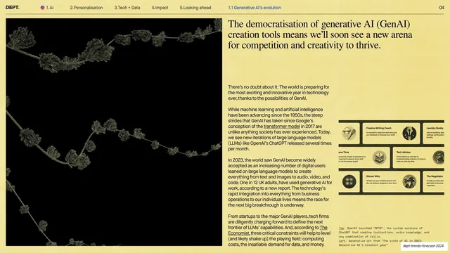
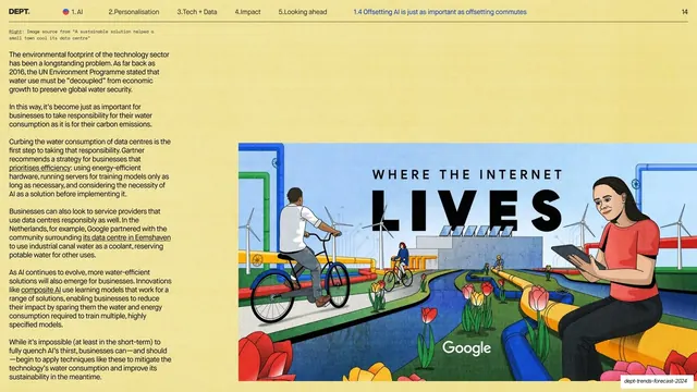
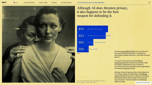
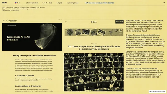
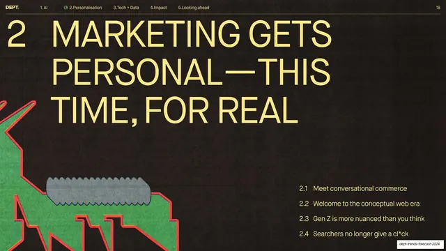
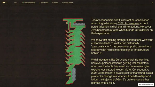
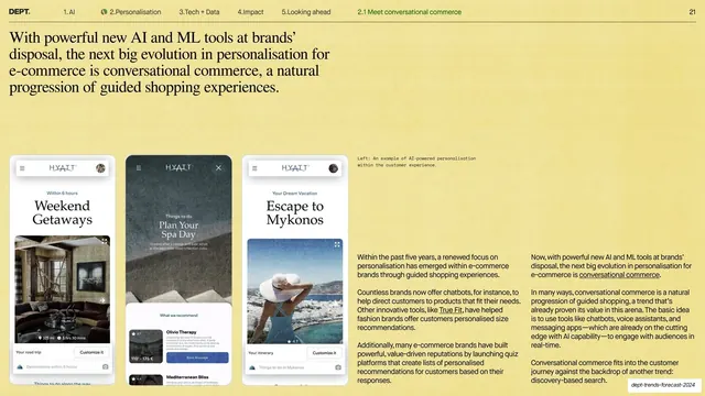
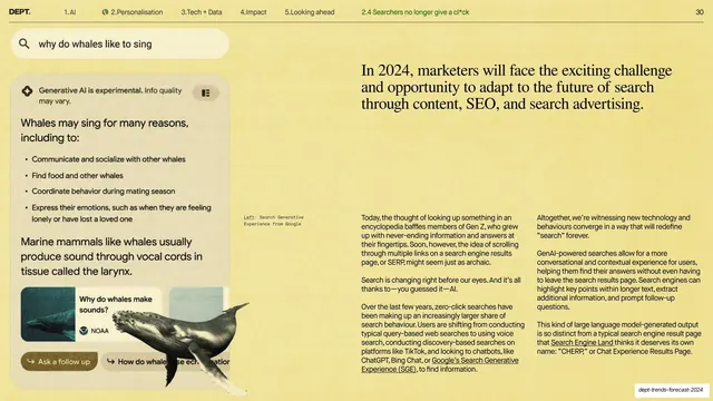
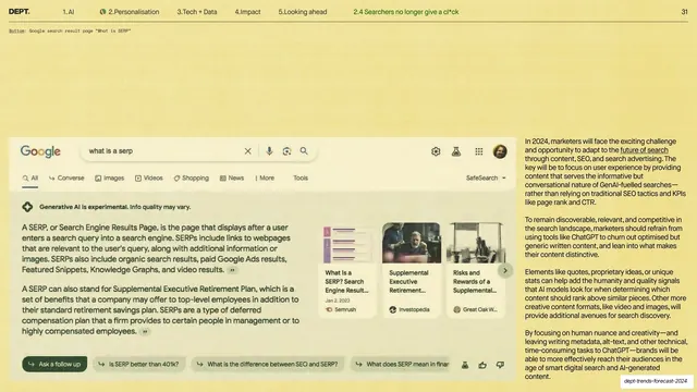
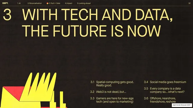
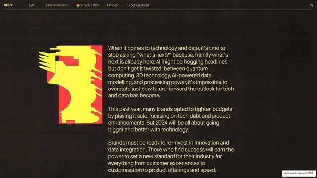
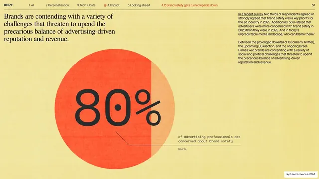
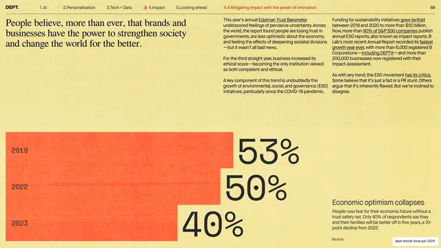
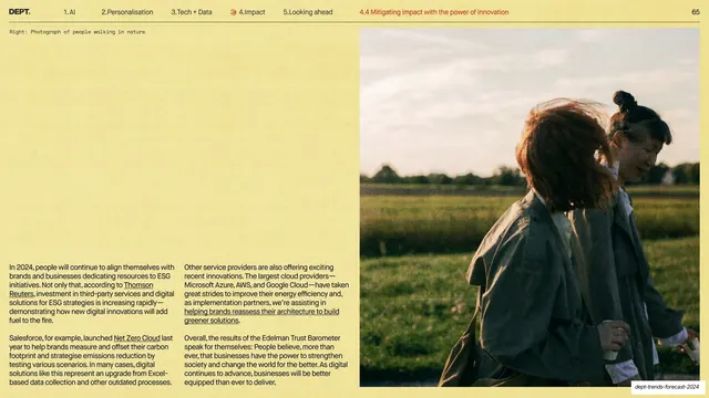
Type mixes three voices: an all-caps sans set very large for section and sub-section headlines; a serif used for editorial pull-quotes and the lead sentence of reading slides; and a monospace used for figure captions, source notes and diagram labels. Recurring layouts include: chapter dividers (a giant numeral plus all-caps headline on dark, with a sub-item list); sub-section dividers (a small index like "1.2" beside an oversized all-caps headline on cream, with a cropped edge illustration); reading slides (a serif lead sentence over two or three columns of small body copy with underlined inline links); and data or example slides (flat single-color diagrams such as a two-circle Venn or an iceberg panel, photographic panels with overlaid product-UI cards, AI-generated photo pairs, and one oversized percentage stat dropped over a duotone photo). A consistent illustration motif recurs as a left-edge crop: layered gray mountain or arrow forms over a blue band with clustered orange shapes, plus a green circuit-board on the contents page, all carrying a printed grain.
Key takeaway
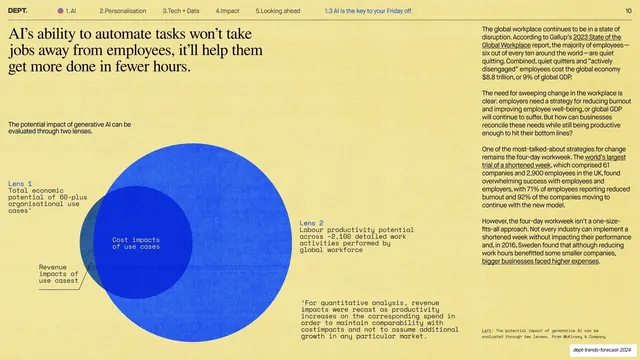
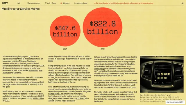
The persistent top section-nav with an active-state dot and page index, which keeps a 71-slide report navigable on every single page. The disciplined alternation of dark and cream grounds that paces a long deck without decoration. And the three-register type system, oversized all-caps for structure, serif for argument, monospace for evidence, that lets dense, sourced content stay editorial instead of corporate. Dressing plain charts as metaphors (Venn for two lenses, iceberg for hidden cost) is a repeatable way to make data slides memorable.
Reuse notes
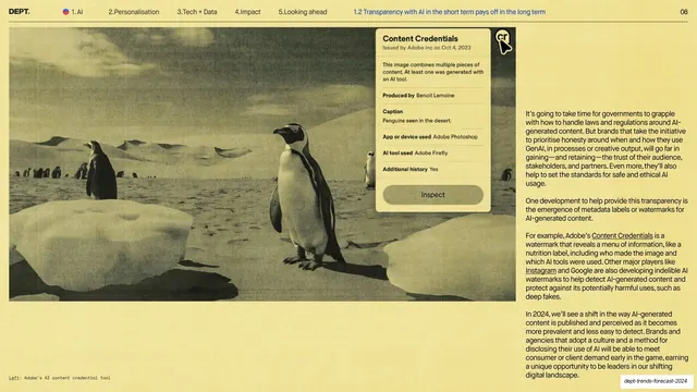
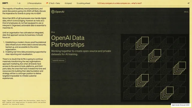
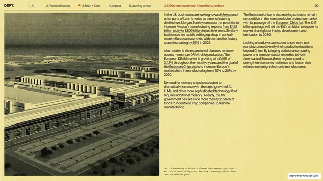
A strong reference for trends reports, agency or research whitepapers, and any long, text-heavy deck that must stay legible and on-brand across dozens of slides. The divider system (numbered chapter openers on dark, indexed sub-section openers on cream) and the reading-slide template (serif lead plus columned body plus one diagram, photo or stat) are directly reusable. It leans on commissioned risograph illustrations and good editorial writing to carry it; swap the artwork and keep the type and nav system. Note that several example images and screenshots are third-party (Adobe, Google, OpenAI) sourced material rather than original assets.
From this deck: DEPT. Trends Forecast 2024
View deck




















More like this










Keep what you find
A free account saves references to boards and can send you a weekly email of picks based on what you save.
To see every result, go Pro.