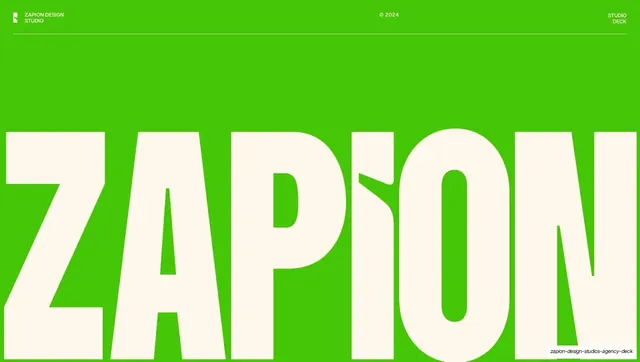
Preview image. Unlock full-res
A 22-slide studio capabilities deck set mostly on warm cream, leading with oversized neutral-grotesque headlines and a heavy condensed wordmark, with three case studies each themed in its client's brand color.
Summary
A 22-slide capabilities deck for Zapion Design Studios (a Code & Hue subsidiary). Its personality comes from a warm cream ground carrying oversized neutral-grotesque headlines, a heavy condensed display wordmark for the brand name, and three client case studies that each adopt their own brand accent color over one fixed template.
Visual description
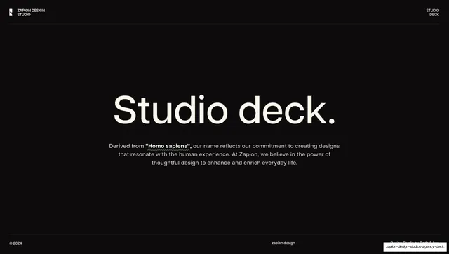
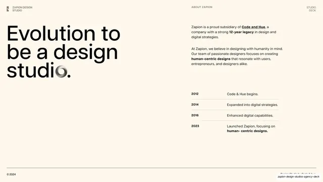
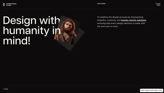
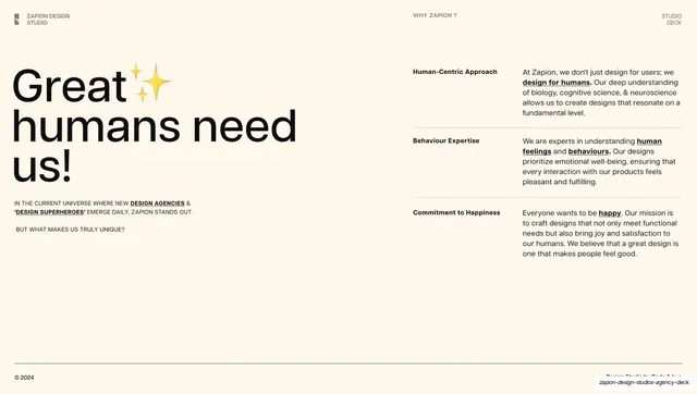
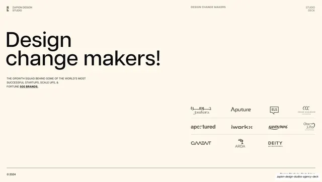
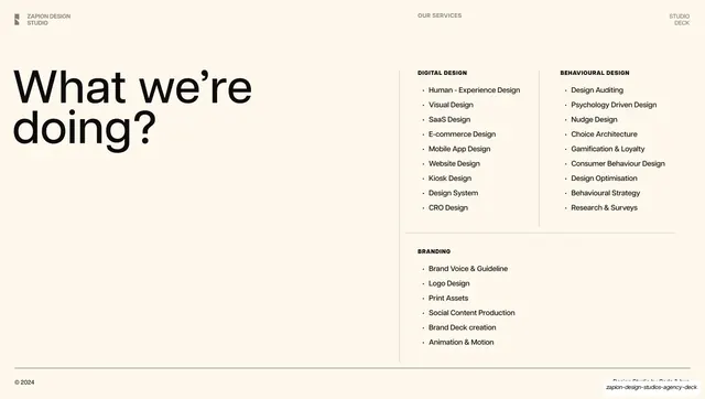
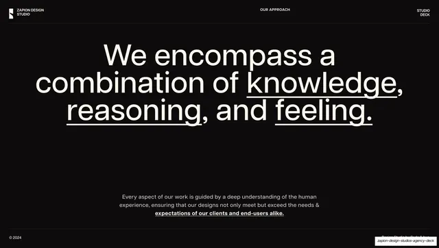
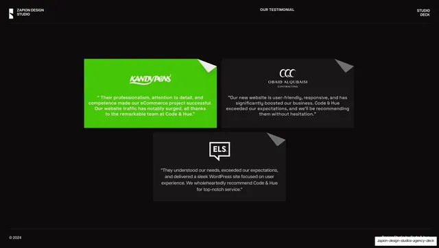
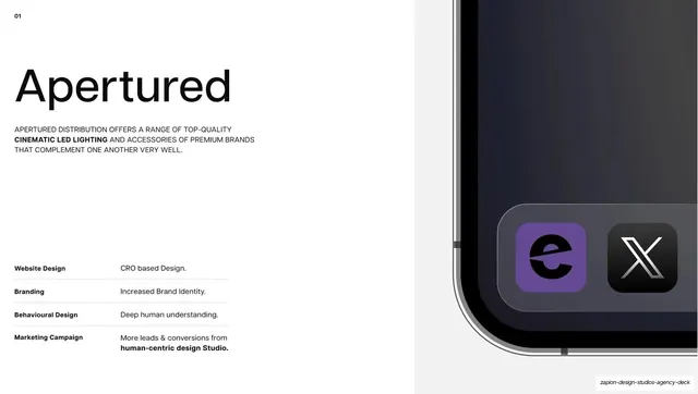
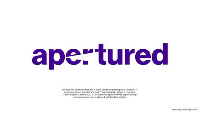
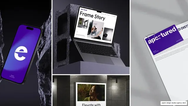
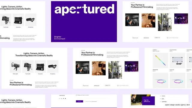
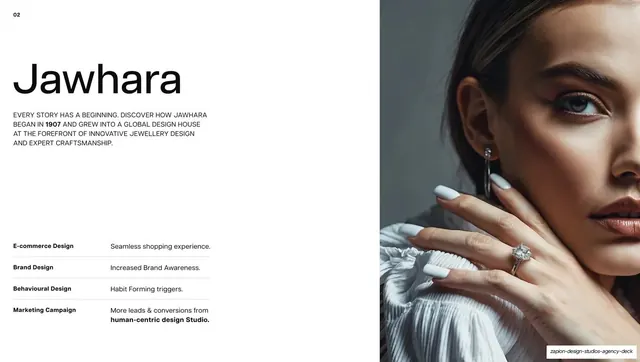
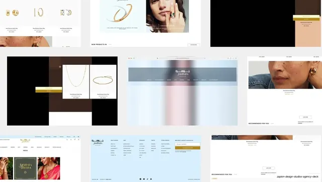
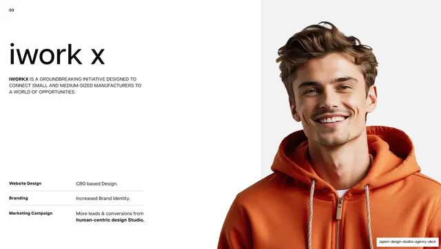
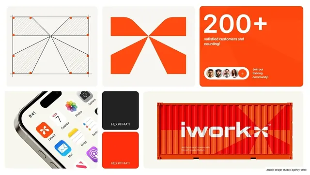
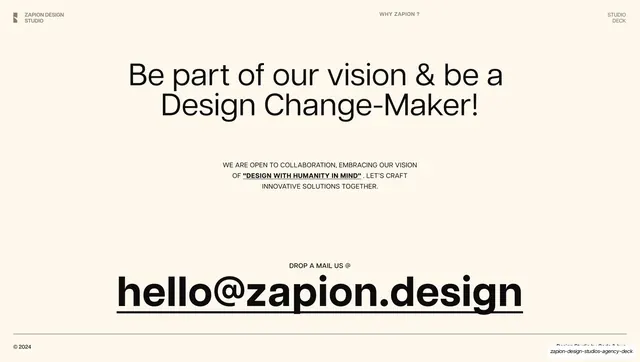
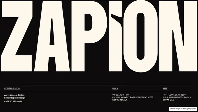
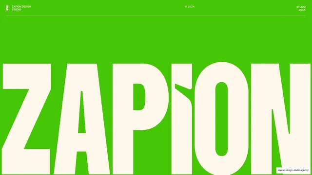
Slides run 16:9. The default ground is a warm cream (#F7EFE3) with near-black text, inverted to near-black backgrounds with cream text on a few key slides (the "Studio deck." intro, the testimonial row, the iWorkX logo reveal, the closing contact slide, and the final wordmark). A lime-green house accent (#48C209) appears on the cover field and on one testimonial card. Headlines use a neutral grotesque sans (Helvetica-like) set very large, mixing lowercase questions ending in a period ("What we're doing?", "Be a design studio.") and statement headlines; the ZAPION cover and closing wordmarks switch to a much heavier, tightly-packed condensed display cut with a leaf shape replacing the tittle on the "i". A consistent running header (a square logo plus "ZAPION DESIGN STUDIO" left, a centered all-caps section label such as ABOUT ZAPION / OUR VISION / WHY ZAPION / OUR SERVICES, "STUDIO DECK" right) sits on a thin hairline rule; a footer carries "© 2024" left, "zapion.design" center, "Design Studio by Code & Hue" right. Recurring layouts: split headline-left / body-right text slides; a horizontal milestone timeline (2012-2023); a right-aligned client logo wall; multi-column bulleted service lists; a three-card testimonial row (one card lime green); and a repeated case-study grammar of an index number (01/02/03), big lowercase client name, an all-caps intro paragraph and a four-row results table (Website Design / Branding / Behavioural Design / Marketing Campaign), paired with a full-bleed portrait or product photo, followed by a centered logo-reveal slide and a bento brand-system grid per client. The three case studies are color-themed: Apertured in indigo-violet, Jawhara in gold, iWorkX in orange.
Key takeaway
The warm cream ground as a softer alternative to the usual dark agency deck, paced by a handful of inverted black slides for emphasis. The pairing of one oversized neutral headline against tiny all-caps utility labels on hairline rules. And the strongest idea: theming each case study in the client's own brand color while keeping one fixed layout template (index number, lowercase name, results table, hero photo, logo reveal, bento brand-system grid), so variety and consistency coexist across the portfolio section.
Reuse notes
A strong reference for agency, studio, or B2B service capabilities decks, especially ones that want warmth instead of a dark theme. The case-study template is directly reusable for portfolio or sales decks: index number, brand name, results table, full-bleed hero, logo reveal, and a bento grid of brand assets. Needs genuinely good photography and client mockups to carry the full-bleed image halves. The condensed display wordmark is bespoke to Zapion; swap it for your own logotype.
From this deck: Zapion Design Studios Agency Deck 2024
View deck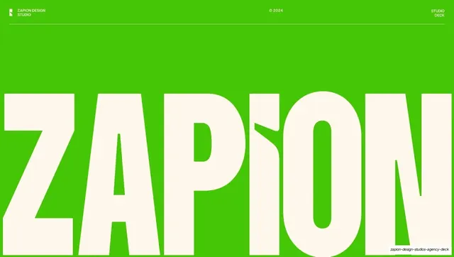
More like this








Keep what you find
A free account saves references to boards and can send you a weekly email of picks based on what you save.
To see every result, go Pro.