Preview image. Unlock full-res
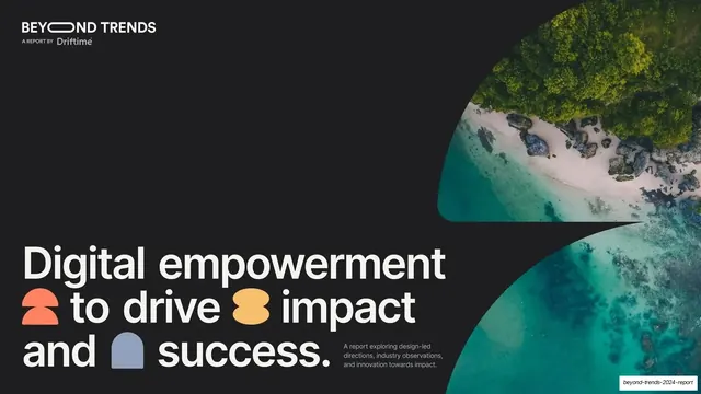
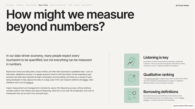
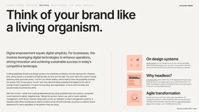
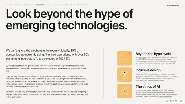
A 32-slide design-and-impact trends report that alternates near-black and warm-cream full-bleed slides, leads with oversized black grotesque headlines, and pairs body text with right-hand stacks of three labeled cards on colored square icons.
Summary
A 32-slide trends report from creative studio Driftime on design, impact and innovation. Its personality comes from a tight editorial system: full-bleed slides alternate between near-black and warm cream, oversized black grotesque headlines lead every page, and a recurring three-card sidebar on soft colored square icon-tiles carries the supporting points.
Visual description
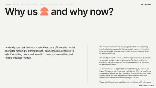
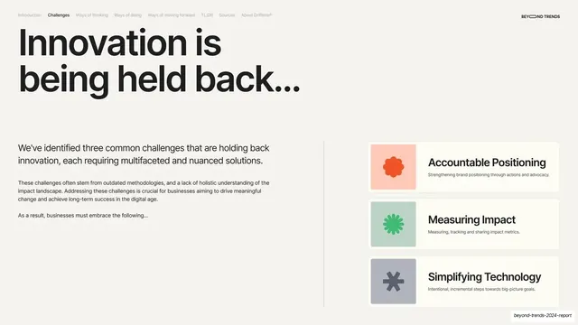
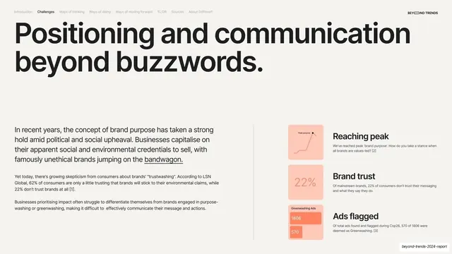
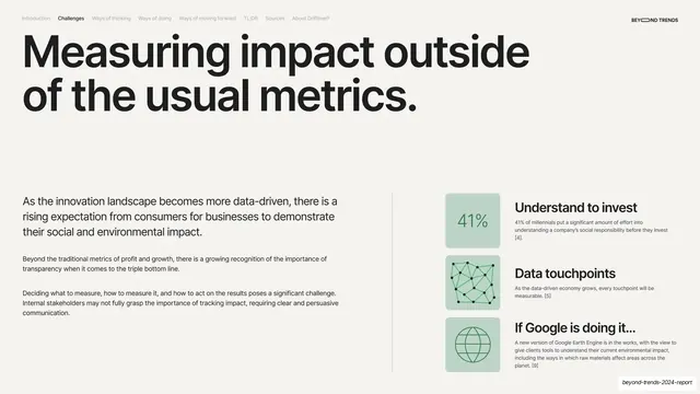
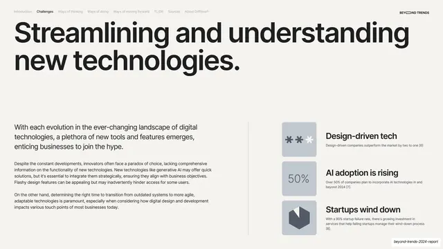
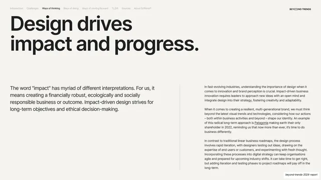
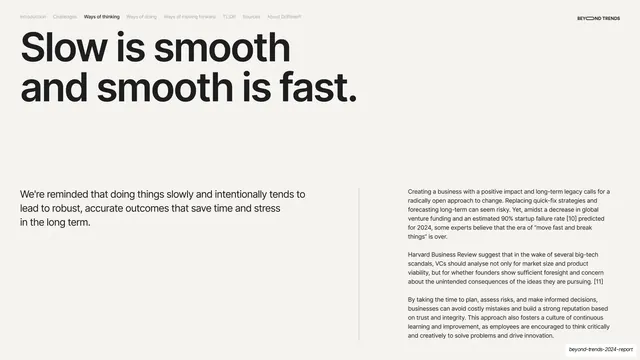
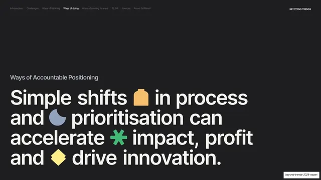
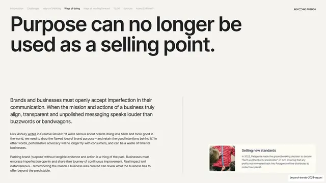
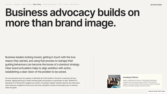
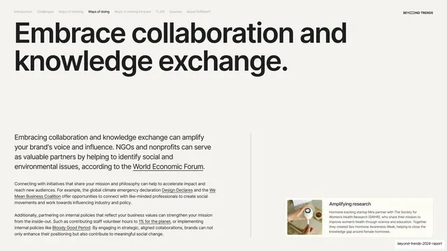
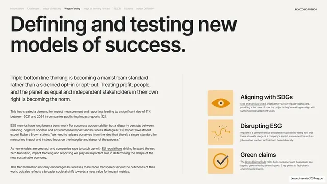
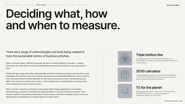
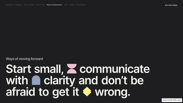
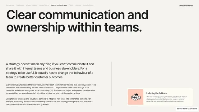
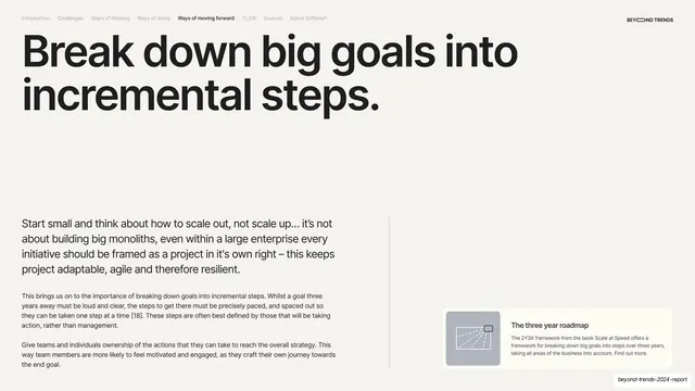
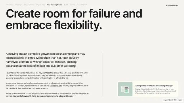
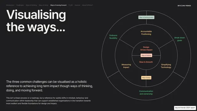
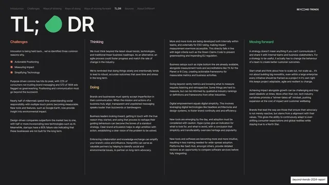
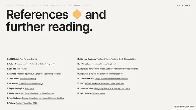
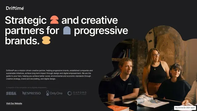
Slides run 16:9. The palette swaps between near-black (#1A1A1A) and warm off-white cream (#F2F0EB), with a small accent set of coral-orange (#F47A52), warm yellow (#F5C26B), muted blue-gray (#9BA8C8), green (#5AC07E) and a soft pink used for icon tiles and pull-quote backgrounds. A heavy geometric grotesque is set very large for headlines, almost always sentence-case and closed with a period; body copy is a lighter weight of the same family at small sizes. Two recurring chrome elements anchor every content slide: a top navigation row of section tabs (Introduction, Challenges, Ways of thinking, Ways of doing, Ways of moving forward, TL;DR, Sources, About Driftime) with the active tab in bold black, and a "BEYOND TRENDS" wordmark top-right whose first "O" is a horizontal lozenge. The dominant content layout is a big headline across the top, then a two-zone lower band split by a thin vertical hairline rule: a lead paragraph and continued body text on the left, and a right-hand vertical stack of three cards, each a soft pastel rounded square holding a simple line or solid icon (or a tiny inline data chart) beside a bold short label and one line of footnoted sub-copy. Section-divider slides invert to near-black with a small gray section label above a giant multi-line headline studded with inline colored glyphs (a coral half-circle, a yellow blob, a blue arch, a gray flower) sitting between words. Pull-quote slides go full-bleed in a single saturated color (pink, green) with oversized opening and closing quotation marks framing the quote and a small source credit bottom-left. The deck closes with a four-column TL;DR recap on dark, a two-column footnoted References list, and a radial concentric-circle framework diagram mapping the report's themes; the final slide is a Driftime sign-off with a team photo masked into an organic blob and a row of client logos.
Key takeaway
The alternating dark/light rhythm that paces a long report without decoration, and the discipline of one oversized period-terminated headline per slide. The strongest reusable system is the right-hand three-card stack: pastel square icon-tile, bold label, one footnoted line, repeated identically across many slides so dense reference material stays scannable. The inline colored glyphs dropped between headline words on the section dividers add personality to otherwise plain type. The persistent section-tab nav doubles as a progress indicator and table of contents on every page.
Reuse notes
A strong reference for trends reports, research write-ups, design-studio thought leadership, and any long-form B2B or marketing report that has to stay legible and branded across 30-plus text-heavy slides. The headline-plus-three-card layout and the full-bleed pull-quote breaks are directly transplantable. The radial framework diagram and TL;DR multi-column recap are good patterns for summarizing a long argument. Needs a confident heavy grotesque to carry the oversized headlines; the small accent glyphs depend on a defined shape set.
From this deck: Beyond Trends 2024 Report by Driftime
View deck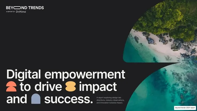






More like this








Keep what you find
A free account saves references to boards and can send you a weekly email of picks based on what you save.
To see every result, go Pro.