
Preview image. Unlock full-res
A 93-page Accenture Song trends report that pairs motion-blurred photographic dividers with clean white editorial text pages, two-tone purple headlines, and a vertical trend navigation rail.
Summary
Accenture Song's annual Life Trends 2025 report, structured as five trends across 93 pages. Its design system alternates between full-bleed, motion-blurred photographic dividers in saturated gradients and crisp white editorial reading pages, unified by Accenture's signature purple as the single accent and a persistent vertical trend-navigation rail down the right edge.
Visual description
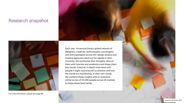
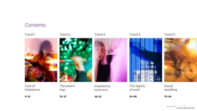
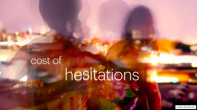
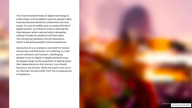
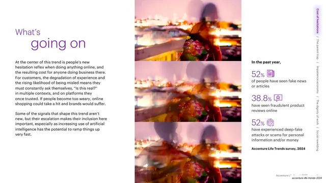
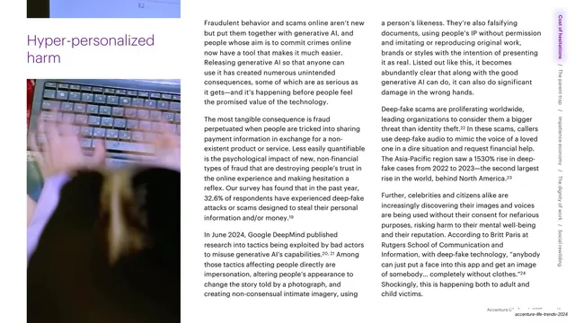
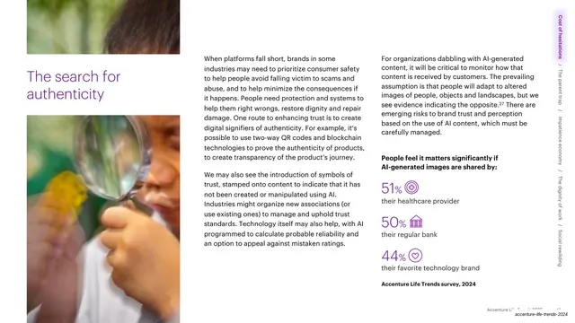
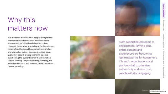
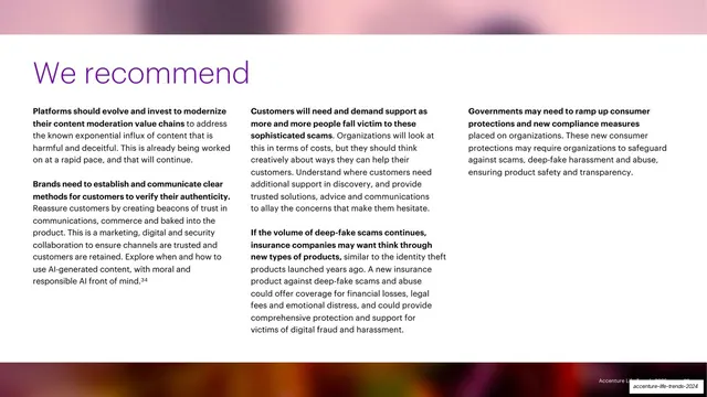
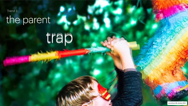
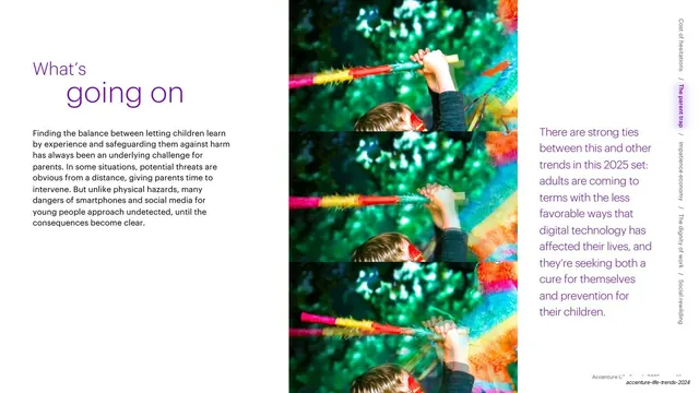
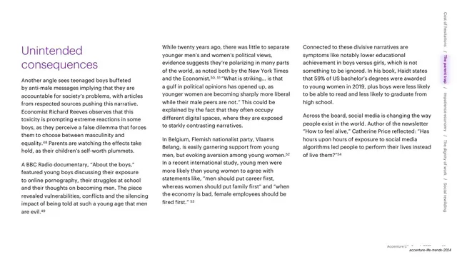
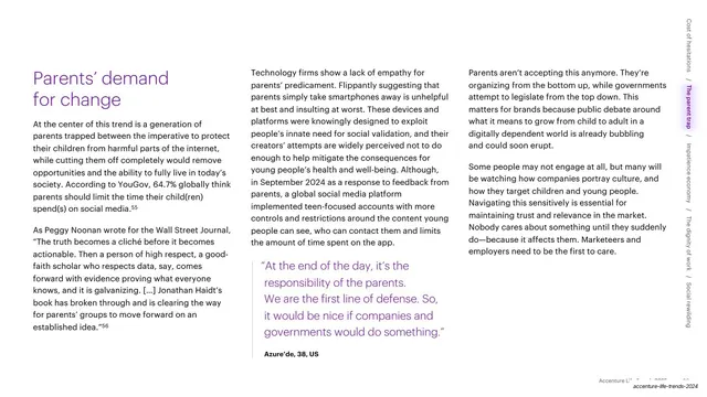
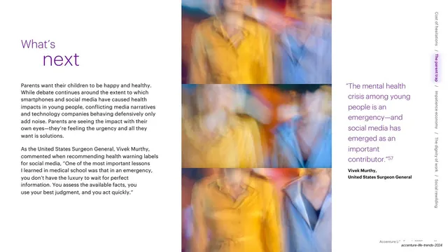
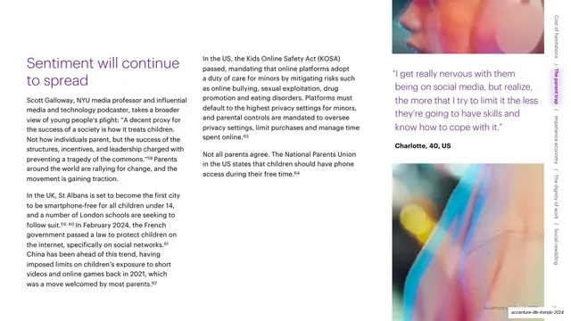
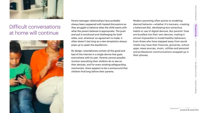
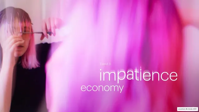
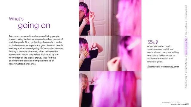
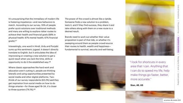
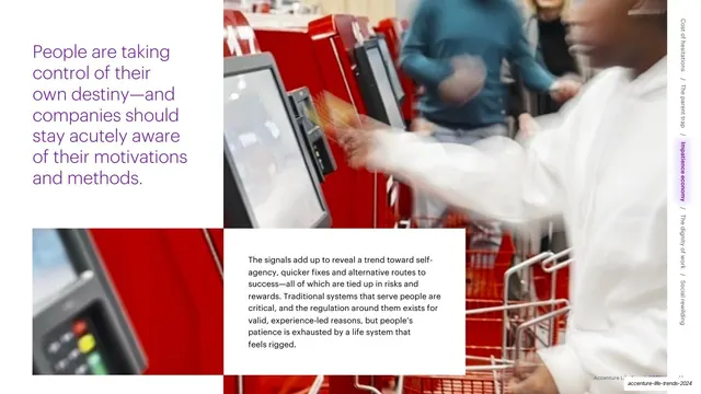
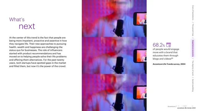
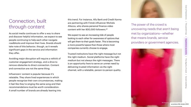
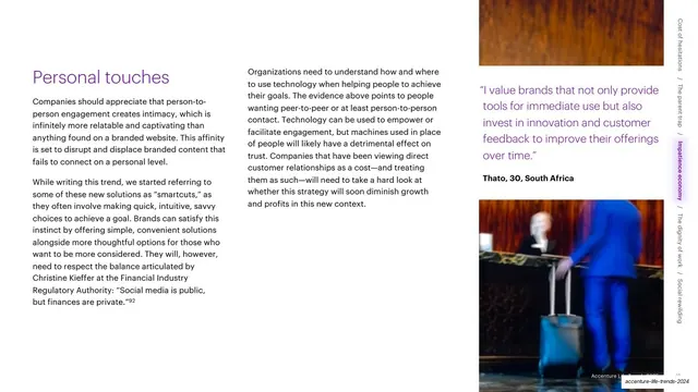
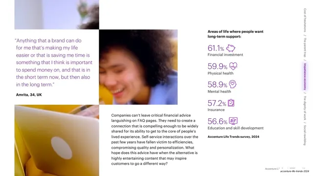
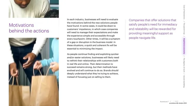
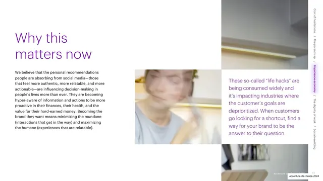
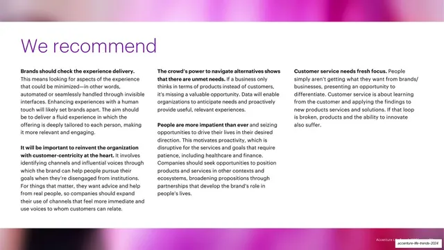
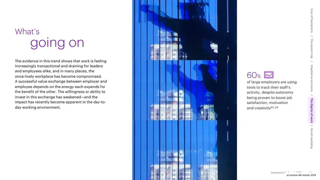
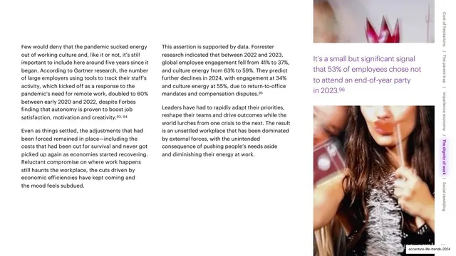
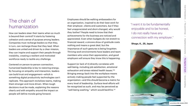
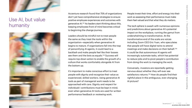
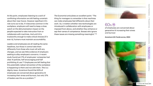
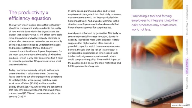
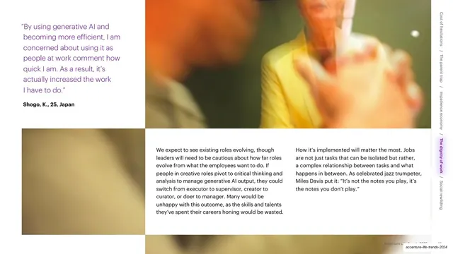
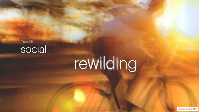
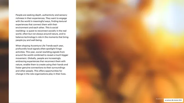
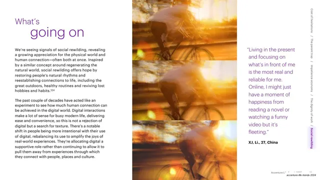
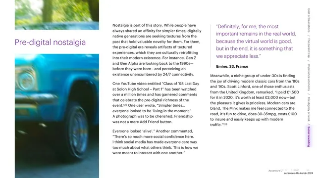
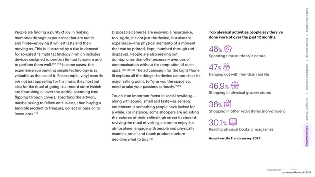
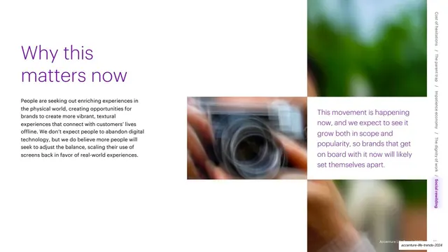
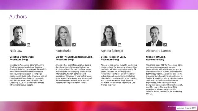
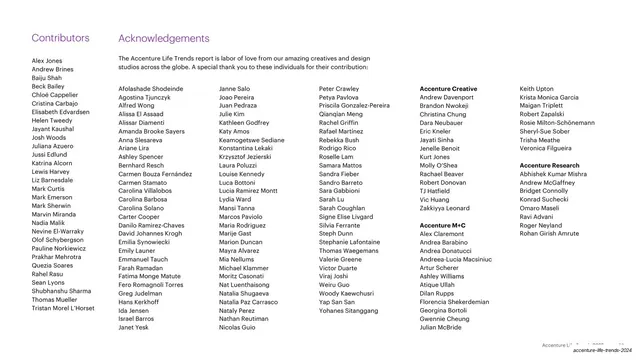
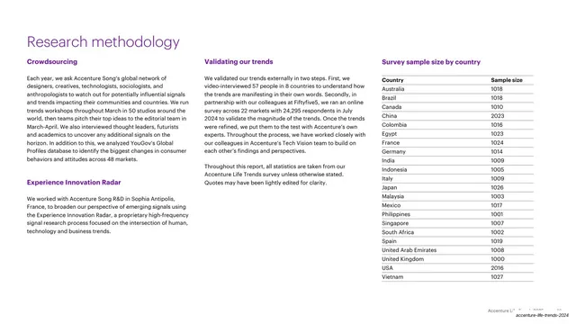
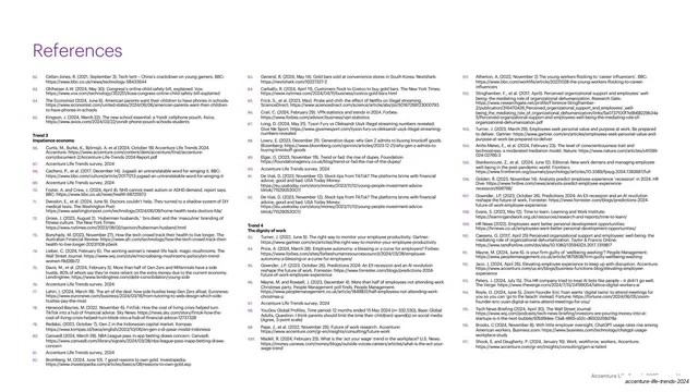
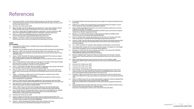
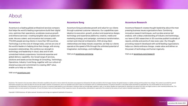
The deck runs 16:9 and splits cleanly into two page types. Divider and section pages use full-bleed photography shot with heavy motion blur and long-exposure light streaks, tinted toward magenta-purple (Trend 1, 3), green (Trend 2), blue (Trend 4) and amber-orange (Trend 5), with type laid directly over the image. Reading pages sit on white with generous margins, a purple section headline, and one to three columns of dark-grey body copy in a humanist sans. A recurring headline device sets a short word in dark grey above a second word enlarged and colored in Accenture purple (#A100FF), for example "What's / going on" and "What's / next". A vertical running rail on the right edge of interior pages lists all five trend names rotated 90 degrees, with the current trend highlighted in a rounded purple pill. Data is presented as oversized purple percentage figures paired with small purple line icons and a survey-source line. Pull quotes are set in purple with a bold attribution (name, age, country). Imagery also appears as stacked triptychs and offset mosaics of blurred photos. A faint "Accenture Life Trends 2025" footer with a page number runs bottom-right on interior pages. The cover sets a thin "Accenture Song" lockup top-left and the title "Accenture / life trends / 2025" in white over a blurred portrait.
Key takeaway
The two-mode rhythm: emotional, blurred, color-saturated photographic dividers that carry the feeling, alternating with disciplined white text pages that carry the substance, so a dense 90-page report never feels heavy. The single-accent constraint (one purple doing headlines, stats, quotes and the nav pill) holds the whole thing together. The two-tone enlarged-second-word headline is a cheap, reusable way to add emphasis without extra type styles. And the vertical trend rail doubles as a progress indicator and a table of contents on every page.
Reuse notes
A strong reference for long-form trend reports, annual reports, and research-driven thought-leadership decks where brand color is the only decoration. The motion-blur photography is the most distinctive and hardest-to-source element; it needs a committed, consistent treatment to look intentional rather than accidental. The system scales to any brand by swapping the single accent color. Best when there is real survey data to feature in the stat callouts and genuine interview quotes to anchor the pull quotes.
From this deck: Accenture Life Trends 2025 Report
View deck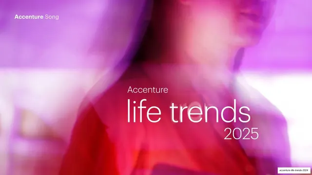


More like this






Keep what you find
A free account saves references to boards and can send you a weekly email of picks based on what you save.
To see every result, go Pro.