Preview image. Unlock full-res
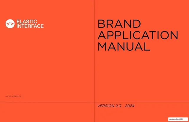
A 13-page brand application manual on a flat, technical system of saturated orange, off-black and white pages, with a uniform header rail, measured diagrams and a sans-serif uppercase voice.
More like this
See all

Summary
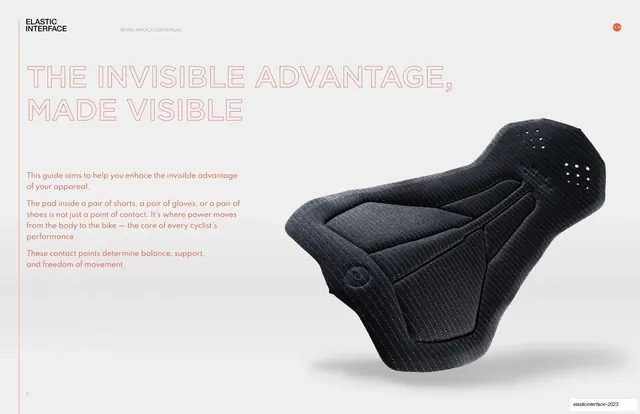
A brand application manual for a cycling component brand, built on one flat, rule-driven system: a full-bleed orange cover, white document pages with a shared header rail, and dark closing pages. The guide is typeset in a clean uppercase sans-serif and leans on measured diagrams, color spec blocks and product mockups rather than decoration.
Visual description
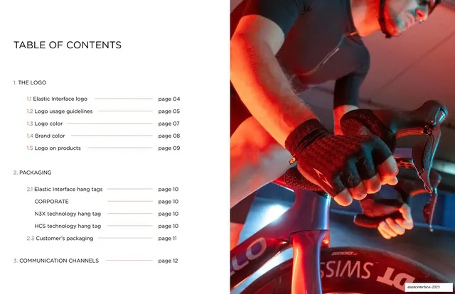
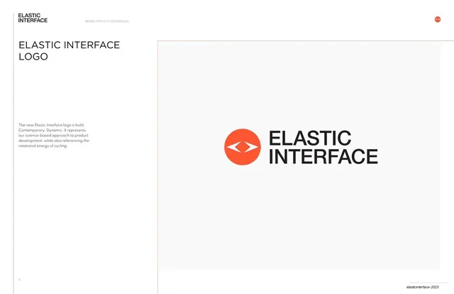
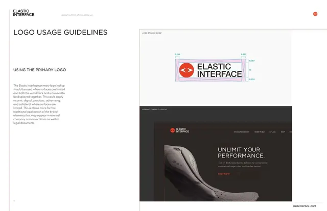
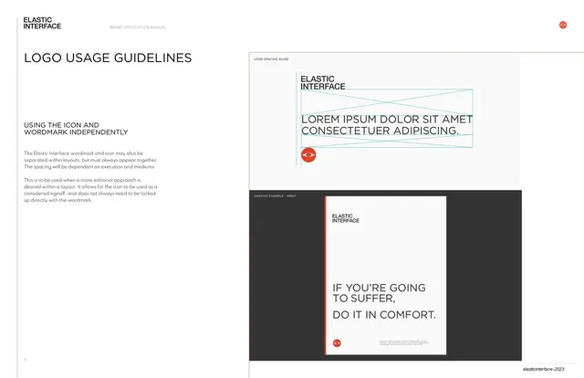
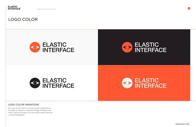
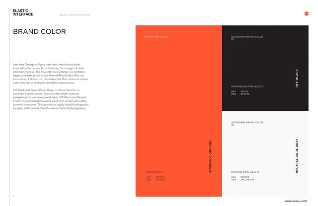
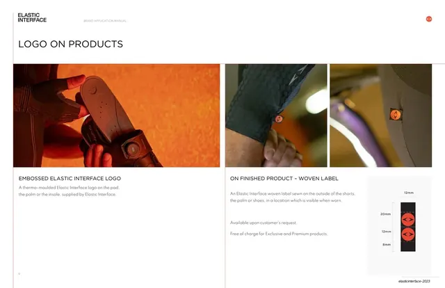
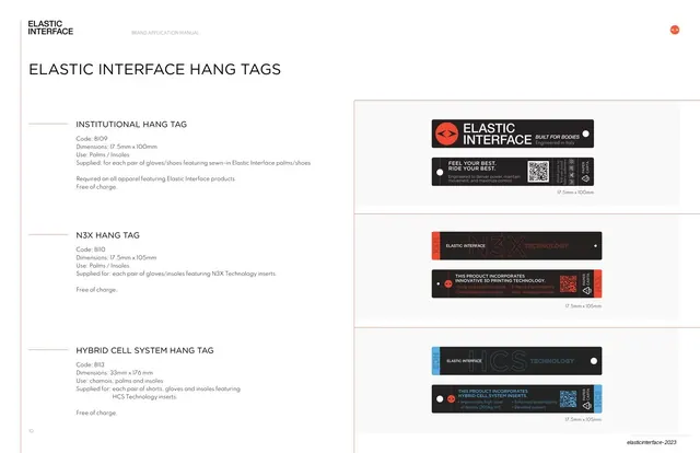
The cover is a full-bleed Interface Orange field split by a thin black vertical and horizontal rule, with the white logo lockup at top left and an oversized uppercase title stacked at right. The table of contents uses a half-and-half split: a white numbered index with orange section markers and thin leader lines on the left, and a full-height warm photograph of a rider's gloved hands on the handlebars on the right. Interior logo and application pages sit on white with a consistent frame: a small logo and running title at top left, an orange circular icon at top right, a thin orange vertical rule along the left margin, and a small page number at bottom left. Two-column layouts put a short heading and light body copy in a narrow left column and a large framed panel on the right, which holds clear-space diagrams, digital mockups or product photographs. The color page is a blocky three-part grid of orange, off-black and cool gray, each block carrying Pantone, HEX and RGB values in small caps. Product and hang tag pages use black mockups with orange and blue accents on a pale gray panel, with dimension labels underneath. The closing page inverts to off-black with a large thin orange outline graphic running across the right side and a white logo lockup with corporate notes at bottom left.
Key takeaway
The system is held together by a repeated frame (rule lines, header rail, page number) rather than by illustration, so every page reads as part of one document. Saturated orange is reserved for the cover, the logo and the color blocks, while the interior stays white and neutral, which makes the accent feel deliberate. Measured diagrams and spec blocks show the rules instead of describing them in prose.
Reuse notes
A useful reference for a brand guide or spec manual that needs to feel precise and product-led, especially for a sports or technical hardware brand with one strong accent color. It pairs well with photography that has warm or colored light, since the orange and off-black palette picks those tones up. Only the cover and closing pages carry the full brand color at scale, so copy the restraint on interior pages rather than the cover treatment. The thin outline graphic on the closing page works on dark backgrounds only.
From this deck: Elastic Interface Brand Application Manual 2024
View deck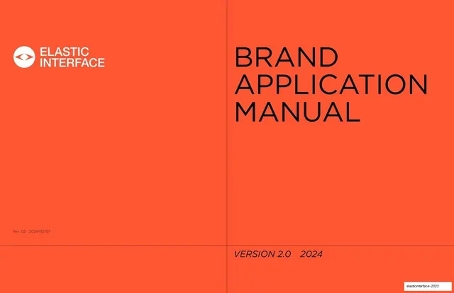
More like this

Keep what you find
A free account saves references to boards and can send you a weekly email of picks based on what you save.
To see every result, go Pro.