Preview image. Unlock full-res
A 19-slide brand guideline deck for checkout company Bolt, built on a neon Lightning Yellow, near-black, and warm-grey system with full-bleed lightning-bolt divider slides and an oversized condensed grotesque headline type.
Summary
A 19-slide brand guideline deck for Bolt, the one-click checkout technology company. Its identity rests on three things: a single acid Lightning Yellow against near-black and a stack of warm greys, an angular lightning-bolt shape that doubles as the brand mark and as full-bleed section dividers, and an oversized condensed grotesque used at billboard scale.
Visual description
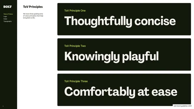
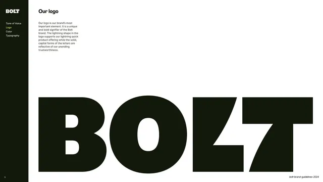
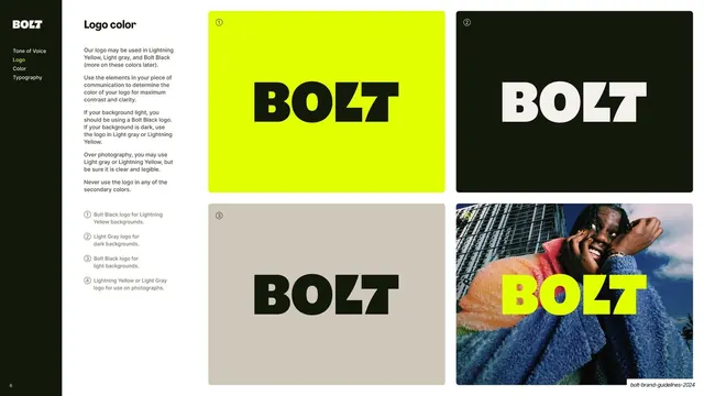
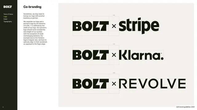
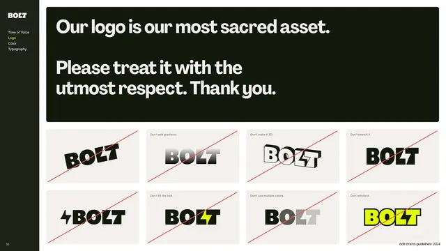
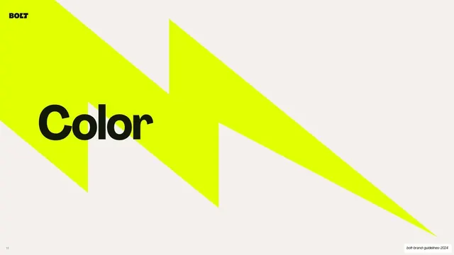
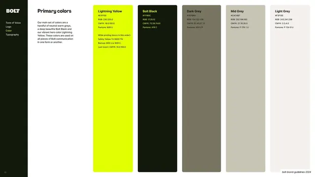
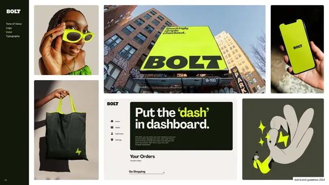
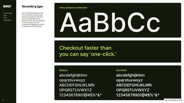
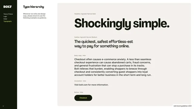
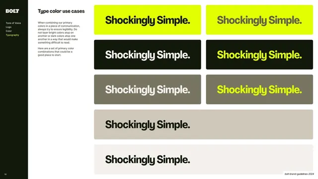
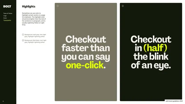
Slides run 16:9 and split into two clear modes. Section dividers are full-bleed warm off-white (#F3F1EE) slides crossed by one or more large acid-yellow (#E1FF00) lightning-bolt shapes, with a single near-black lowercase word ("Tone of Voice", "Logo", "Color", "Typography") set in a heavy condensed sans, plus the small black BOLT mark top-left and a tiny page number bottom-left. Content slides use a fixed dark sidebar on the left holding the BOLT logo and a four-item section nav (Tone of Voice / Logo / Color / Typography) with the current section highlighted in yellow; a section title and a short Inter intro paragraph sit in a second column; the right two-thirds carries the payload, usually inside dark rounded-corner cards or a grid. Recurring grammar includes oversized statement type set inside near-black rounded panels with yellow eyebrow labels, ringed reference numbers keying captions to examples, logo-on-color swatch grids, a five-column color spec table (each swatch labelled with hex, RGB, CMYK and Pantone), a moodboard-style image grid of product and lifestyle shots, and large type specimens. The custom BOLT wordmark is a chunky all-caps blackletter-influenced display logo whose "L" and "T" fuse into a lightning slash. Headlines are Agrandir Narrow Bold by Pangram Pangram (condensed, high-impact); body copy is Inter by Rasmus Andersson; yellow is used as a highlight color on single words.
Key takeaway
The lightning-bolt shape working triple duty: as the logo detail, as the recurring full-bleed divider motif, and as the brand's whole visual signature, so the deck never needs decoration beyond it. The discipline of a single hero color (one acid yellow) carried across an otherwise neutral black-and-warm-grey system. And the rigorous color-spec card (hex, RGB, CMYK, Pantone, plus print recommendations) that makes the palette production-ready.
Reuse notes
A strong template for brand or design guideline decks, especially for fintech, payments, or developer-facing SaaS brands that want an energetic but disciplined system. The divider-slide pattern (full-bleed brand shape plus one big lowercase section word) and the sidebar-nav content layout are directly reusable for any multi-chapter guideline. The acid-yellow-on-black contrast is the whole personality; on a different palette this becomes a generic Swiss guideline. Needs a distinctive brand shape (here the bolt) to carry the divider system.