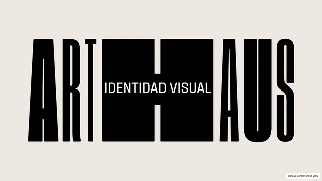
Preview image. Unlock full-res
A 54-page Spanish-language brand guideline for ARTHAUS built on an extreme black condensed display face, full-bleed color and a flexible, organic identity system.
Summary
The 2022 brand guidelines for ARTHAUS, a cultural identity. Its personality comes from one extreme typographic choice (the ultra-condensed Fixture Ultra display family) applied at poster scale, combined with hard-edged full-bleed color and a disciplined utility frame of hairline rules, rotated section labels and page numbers.
Visual description
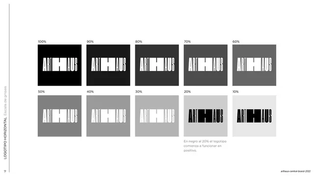
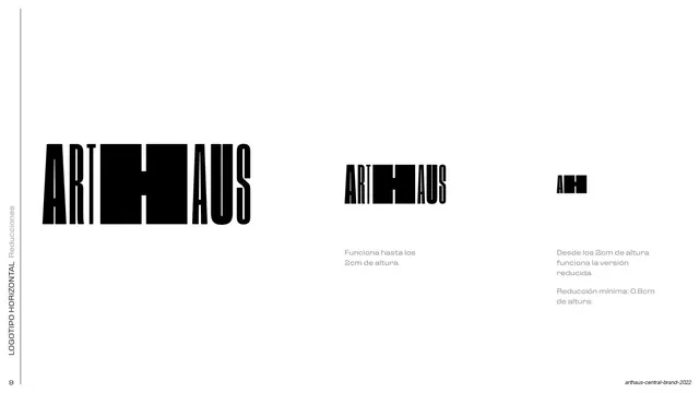
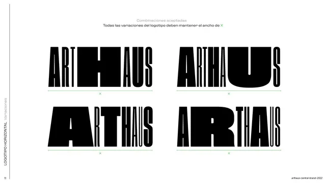
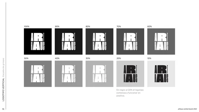
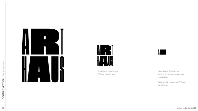
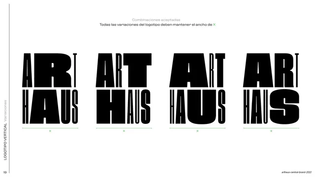
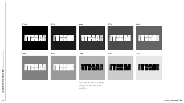
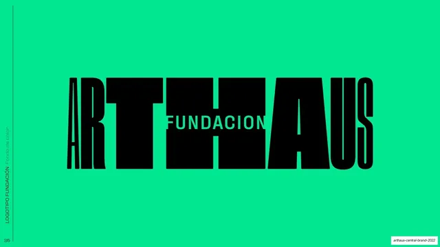
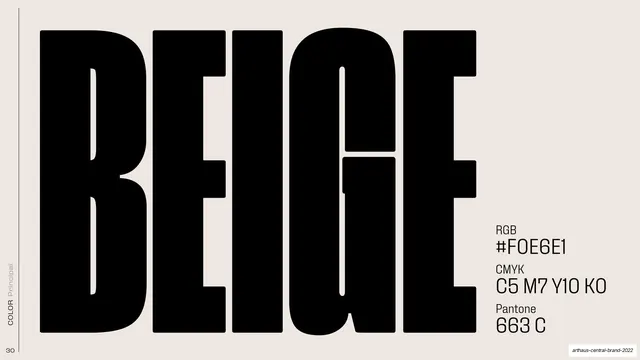
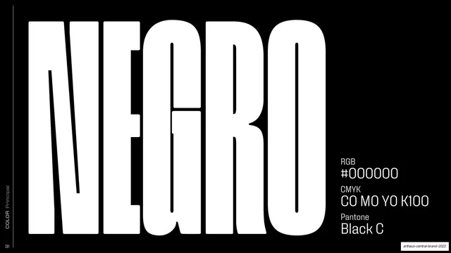
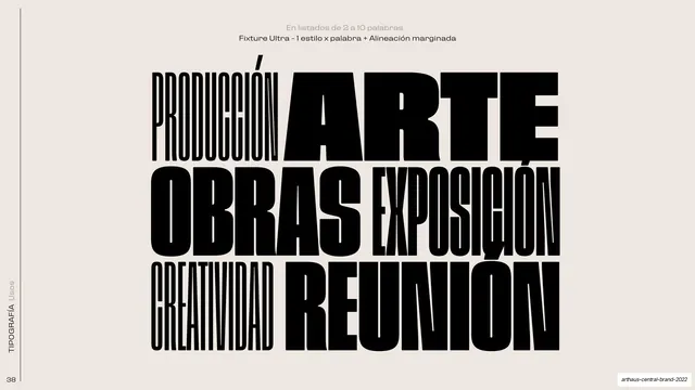
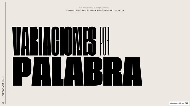
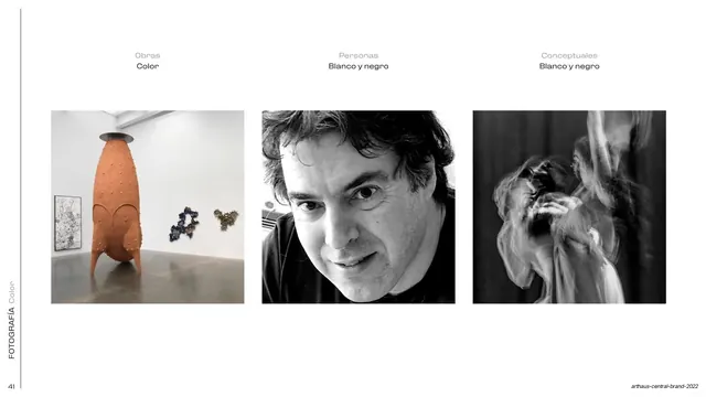
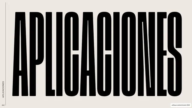
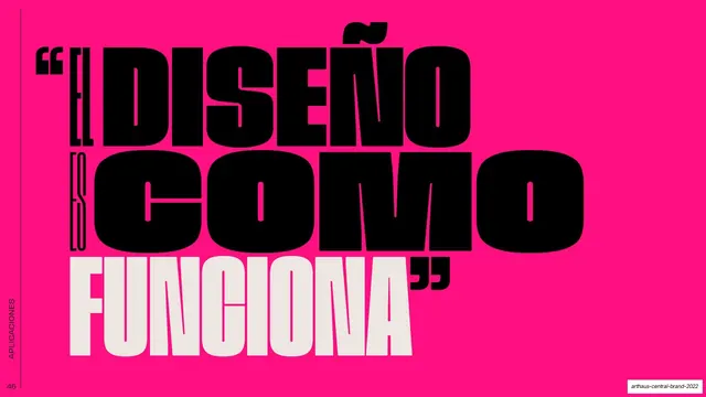
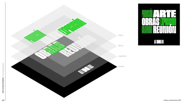
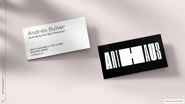
Pages run 16:9 and are written in Spanish (with some English captions). The system pairs a near-black and a warm off-white beige (#E9E3DA) base with a saturated secondary palette of fuchsia, red-orange, orange, blue, sky, aqua, green and lime, all specified with RGB, CMYK and Pantone values. The typographic backbone is Fixture Ultra, an extremely condensed grotesque display face shown across nine weights from Thin to Black; headlines and color names are set enormous, all-caps, often bleeding off an edge. A consistent utility frame recurs throughout: a thin hairline rule down the left margin, a rotated running section label in that margin (COLOR Principal, COLOR Secundario, COLOR Usos, TIPOGRAFÍA, APLICACIONES), and a page number at the bottom-left. The deck is organized into clear sections covering logo architecture (horizontal and vertical lockups, positive and negative, grayscale thresholds, safe areas, minimum sizes, misuse), the color system (per-color spec pages, the full secondary palette as full-height bands, and approved usage combinations), typography (the type family and weight specimen), photography treatment (color works, black-and-white portraits, beige filter and halftone), and applications (posters, flyers, social, stationery and mockups).
Key takeaway
Building an entire identity's voice on one extreme display face used at maximum scale, so the type itself is the brand. The full-bleed color treatment, where a swatch becomes an edge-to-edge band carrying its own name in black display type, turns dry palette pages into striking spreads. And the quiet utility frame (hairline rule, rotated section label, page number) that holds a long, loud document together without ever competing with the content.
Reuse notes
A strong reference for bold, contemporary identity and brand-guideline decks, especially for cultural, arts, media or youth-facing brands that can carry saturated color and oversized type. The per-color spec layout, the secondary-palette bands, the figure-ground usage panels and the weight-staircase type specimen are each directly reusable as guideline templates. The whole system leans on a genuinely extreme condensed typeface; substitute a comparable display family or the impact drops. Copy is Spanish, so localize for other audiences.
From this deck: ARTHAUS Brand Guidelines 2022
View deck


































More like this









Keep what you find
A free account saves references to boards and can send you a weekly email of picks based on what you save.
To see every result, go Pro.