Preview image. Unlock full-res
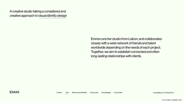
Intro slide pairing a top-left headline about a considered approach to visual identity with a lower-right paragraph on Emma's Lisbon studio and global network.
Summary
The opening statement: a headline top-left framing Emma's considered approach to visual identity, balanced by a paragraph bottom-right about the studio and its network.
Visual description
Pale mint background. A two-line headline sits top-left in a medium-weight black grotesque, "A creative studio taking a considered and creative approach to visual identity design", with "visual identity design" underlined. Diagonally opposite, lower-right, a larger paragraph reads "Emma runs her studio from Lisbon, and collaborates closely with a wide network of friends and talent worldwide depending on the needs of each project. Together, we aim to establish connected and often long-lasting relationships with clients." The fixed footer runs along the bottom: "EMMA" left, the centered nav row with "Intro" underlined, "emmaphilip.com / Contact Form" right.
Key takeaway
The diagonal placement of headline (top-left) against body (bottom-right) that activates the empty page without any graphic. Underlining the single phrase that names the service quietly directs the eye. The persistent footer nav appears here as a wayfinding spine.
Reuse notes
A good editorial intro pattern for a studio or service deck that wants to feel composed rather than salesy. Works on a generous canvas with plenty of white space; cramped layouts lose the diagonal tension.