Preview image. Unlock full-res
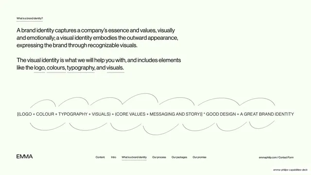
Definition slide explaining brand versus visual identity, with a hand-drawn looping line under a typographic formula equating the parts to a great brand identity.
Summary
An educational slide defining the difference between brand identity and visual identity, capped by a hand-drawn looping line and a typographic formula for a great brand identity.
Visual description
Pale mint background with a tiny underlined "What is a brand identity?" label top-left. Two stacked paragraphs in black grotesque follow: "A brand identity captures a company's essence and values, visually and emotionally; a visual identity embodies the outward appearance, expressing the brand through recognizable visuals." and "The visual identity is what we will help you with, and includes elements like the logo, colours, typography, and visuals." with "logo", "colours", "typography" and "visuals" each underlined. Below, a single continuous hand-drawn looping line runs across the full width, weaving above and below an all-caps line reading "[(LOGO + COLOUR + TYPOGRAPHY + VISUALS) + (CORE VALUES + MESSAGING AND STORY)] * GOOD DESIGN = A GREAT BRAND IDENTITY". The persistent footer sits below: "EMMA" left, nav row with "What is a brand identity" underlined, "emmaphilip.com / Contact Form" right.
Key takeaway
Turning an abstract concept into a literal typographic equation, then threading a single playful hand-drawn loop through it to keep an educational slide from feeling dry. Underlining the component nouns ties the prose directly to the formula below.
Reuse notes
A useful explainer pattern for client-education slides where you need to frame a concept before selling the service. The formula line is reusable for any "ingredients of X" idea; the hand-drawn loop is what keeps it warm rather than clinical.
From this deck: What is a brand identity
View deck






More like this





Keep what you find
A free account saves references to boards and can send you a weekly email of picks based on what you save.
To see every result, go Pro.