Preview image. Unlock full-res
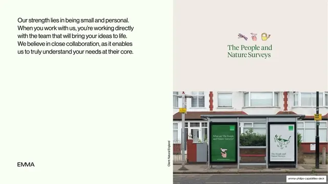
Split case-study slide for The People and Nature Surveys, pairing a left paragraph on close collaboration with a right column of the client's green logo and a bus-shelter OOH photo.
Summary
The first case study, The People and Nature Surveys: a left paragraph about small, personal collaboration, set against a right-side stack of the client's green serif logo and a real bus-shelter ad photo.
Visual description
A left third on pale mint holds a paragraph in black grotesque: "Our strength lies in being small and personal. When you work with us, you're working directly with the team that will bring your ideas to life. We believe in close collaboration, as it enables us to truly understand your needs at their core." The "EMMA" wordmark sits at the lower-left. The right two-thirds is the client's world: an upper warm-grey panel showing three small hand-drawn icons (dragonfly, hand, watering can) above the green serif lockup "The People and Nature Surveys", and a lower full-width photograph of a residential street bus shelter carrying two green Nature Surveys posters. A small vertical credit, "Client: Natural England", runs up the seam between the two halves.
Key takeaway
Introducing a case study by handing most of the slide to the client's own identity and a real-world application photo, while the studio's voice stays in a quiet left column. The vertical client-credit label on the seam is a tidy way to attribute without a heavy caption.
Reuse notes
A reusable case-study template for branding portfolios: studio commentary on one side, client logo plus in-context mockup on the other. Needs strong photography of real applications (OOH, signage, print) to land. The green serif identity here is the client's, not the deck's house style.