Preview image. Unlock full-res
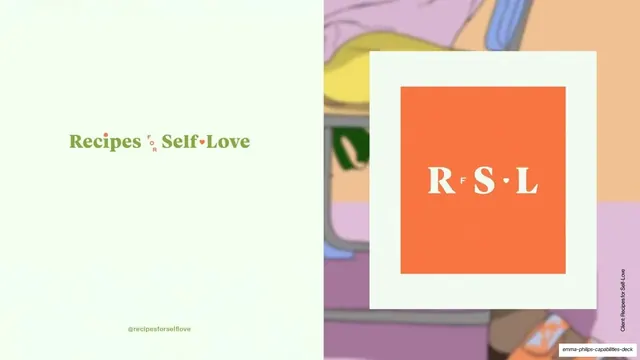
Split case-study opener for Recipes for Self-Love, pairing the green-and-orange serif wordmark on the left with a framed orange RFSL monogram over a pastel illustration on the right.
Summary
The opener for the Recipes for Self-Love case study: the green-and-orange serif wordmark on a pale left half, set against a framed orange "RFSL" monogram floating over a pastel illustration on the right.
Visual description
The slide splits roughly in half. The left half stays pale mint and centers the serif wordmark "Recipes for Self-Love", set in green with the small "F O R" and a heart dot in orange, and "@recipesforselflove" small beneath. The right half shows a soft pastel illustration (lilac and peach tones), over which a cream-bordered card holds a saturated orange square containing the white serif monogram "R F S L" with a heart between the letters. A vertical "Client: Recipes for Self-Love" credit runs up the right edge. No studio footer; the case study's identity owns the frame.
Key takeaway
The split between the studio's neutral paper and the client's saturated brand world, with the wordmark and its condensed monogram lockup shown side by side. Floating the framed orange monogram over a pastel illustration shows logo and context in one move.
Reuse notes
A reusable case-study intro for lifestyle, wellness or editorial brands with a warm, type-led identity. Pairs a primary wordmark with its monogram variant, useful for showing brand flexibility. Needs the client's actual illustration or photography to fill the right half.
From this deck: Recipes for Self-Love case study intro
View deck
More like this
Keep what you find
A free account saves references to boards and can send you a weekly email of picks based on what you save.
To see every result, go Pro.